Founder Networking Event Landing Page Template
The Convene startup panel fireside chat comparison landing page template is a dark glassmorphic single-page layout built for curated startup event series. It combines an interactive ROI estimator, a four-column comparison page, speaker credibility cards, a scrolling testimonial ticker, and a frictionless app download call to action, all designed to turn early-stage founders into engaged, committed attendees.
by Rocket studio
Quick summary
Convene is a single-page landing page template built for startup panel and fireside chat series. It leads with an interactive ROI estimator, moves through a structured comparison page arc, and closes with a mobile-first app download section. The dark glassmorphic design feels premium and data-driven. Every layout decision focuses on converting curious founders into confirmed app users.
Who this template is for
This template was designed for event organizers, startup community builders, and venture-backed platforms running curated panel discussions or fireside chat series. It fits equally well for bootstrapped founders launching their first recurring event and for teams at growth-stage companies scaling a flagship investor-founder series. The landing page speaks directly to technically minded, skeptical audiences who want proof before they commit.
- Pre-seed and seed-stage founders blocked on fundraising who need a trusted space to hear real investor perspectives and connect with guest speakers.
- Venture associates and product leads looking for high-signal, on-demand content that helps them pattern-match breakout companies and product decisions.
- Event operators who need high converting landing pages with built-in urgency mechanics and a mobile-first download flow that meets users where they already are.
What problem this template solves
Early-stage founders face a common pain points problem: the best advice is locked behind expensive masterminds, buried in noisy social feeds, or lost to cold outreach with near-zero response rates. Standard event landing pages make things worse. They are cluttered, slow to communicate value, and rarely answer the only question that matters to a skeptical founder visiting for the first time: "Is this worth my time?"
This template solves that problem with a clear storytelling approach that works like a pitch deck in reverse. It starts by naming the problem loudly and visually, then positions the Convene series as the obvious, better solution.
- It replaces vague event copy with a side-by-side comparison page that scores each advice channel against real criteria, giving visitors an immediate, clear understanding of why Convene is different.
- It reduces the cognitive load on visitors by using focused sections, measured white space, and a progressive information reveal that moves users naturally toward the desired action without overwhelming visitors.
- It eliminates registration friction entirely by reducing the app download ask to a single platform-detected tap or a ten-digit phone number, no email required.
What you get with this template
This template delivers a complete, production-ready landing page with every section pre-built and connected. The layout follows a tight narrative arc from problem identification to solution proof to download. There is no need to wire up sections or guess at the right structure. Every component is included and arranged to guide the visitor's attention from the first scroll to the final tap.
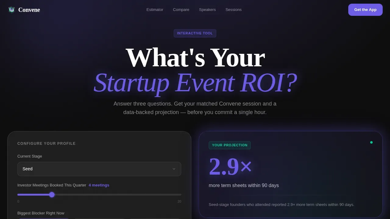
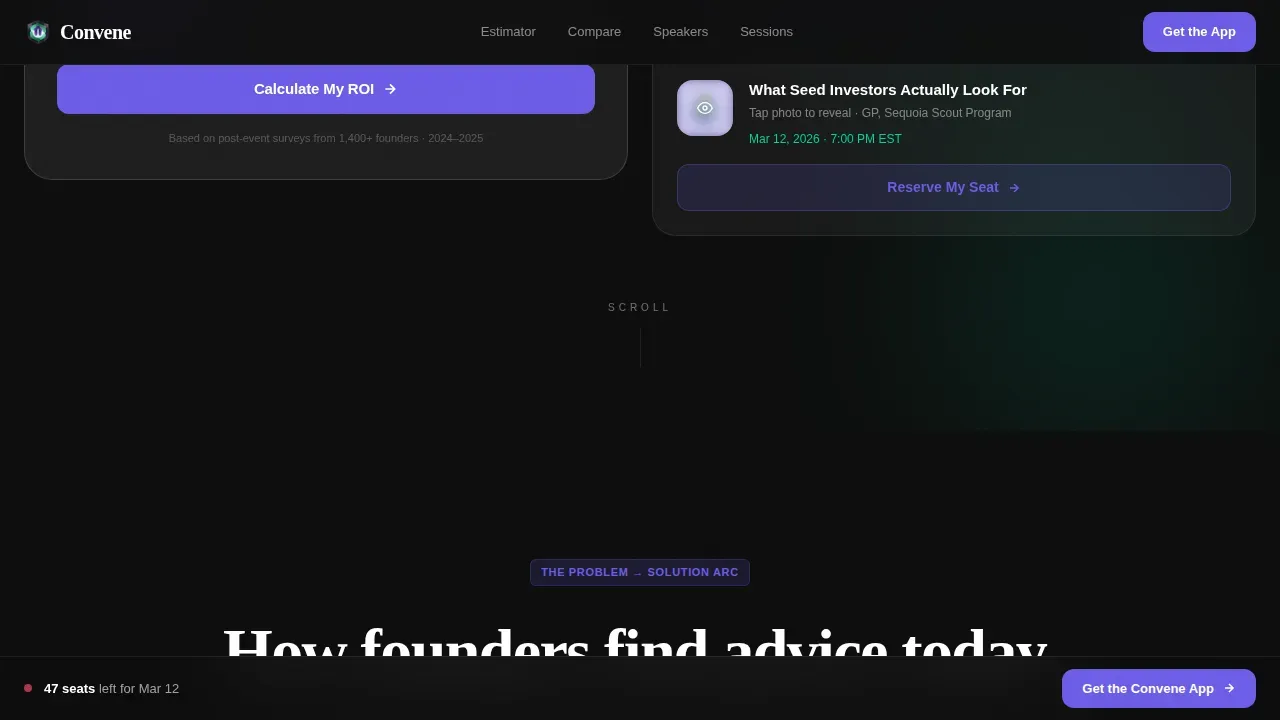
- An interactive ROI estimator hero section with glassmorphic floating output cards, a matched session preview, and a personalized panel recommendation based on the founder's current stage and biggest blocker.
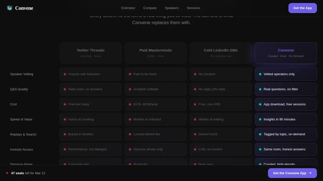
- A four-column frosted comparison page that opens on three dimmed problem columns representing Twitter threads, paid masterminds, and cold LinkedIn outreach, then reveals Convene as the glowing fourth column with green active-state indicators across every row.
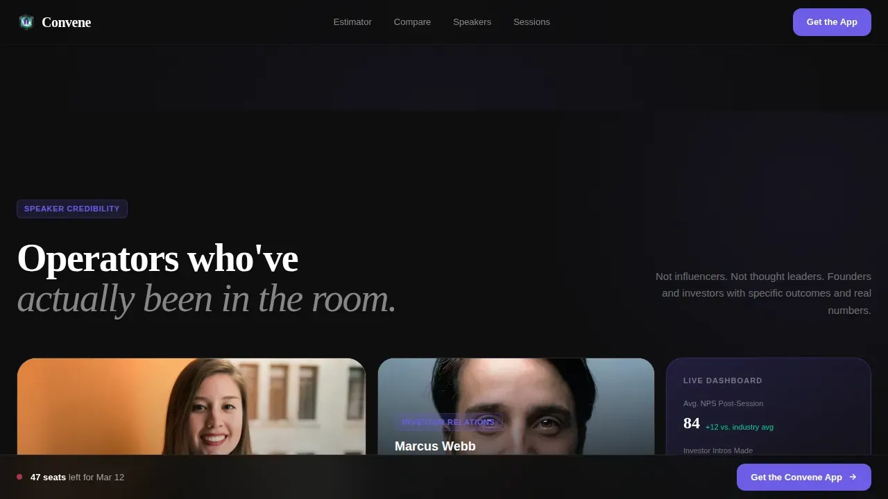
- A speaker credibility section using an asymmetric bento grid to highlight exit numbers and past session data, plus a Slack-style scrolling testimonial ticker and a full-width app download section with a live countdown timer, seats remaining indicator, and platform auto-detection with a text-message fallback.
Feature list
This template includes several pre-built features that work together as an all-in-one conversion system. Each feature was designed with a specific role in the overall sales funnel.
Interactive ROI Estimator Header
The hero section opens with a calculator-style estimator rather than a static image or video background. Visitors input their current funding stage, the number of investor meetings booked this quarter, and their biggest blocker. The tool instantly returns a personalized panel recommendation and a supporting stat, giving visitors a concrete reason to keep scrolling. This approach grabs attention from the first second and anchors the value proposition in the visitor's own situation.
Four-Column Glassmorphic Comparison Page
A comparison page is designed to showcase the differences between a service and its competition. This template's comparison section uses four frosted columns to walk users through the contrast between noisy, expensive, or low-response advice channels and the Convene solution. The first three columns appear dimmed with red indicators. The Convene column glows in electric indigo with signal green confirmations on every row. This visual contrast is one of the key elements that makes the decision feel obvious rather than argued.
Speaker Credibility Bento Grid
Panels require layouts that showcase multiple speakers and varied topics. This template uses an asymmetric bento grid to display speaker cards with exit numbers, credibility stats, and past session data rendered as live-updating dashboard widgets. The layout accommodates multiple headshots across varied roles, which is essential for panel-format pages. Fireside chat templates, by contrast, use large single headshots to create a more intimate focus. This section serves both formats depending on how organizers configure the content.
Live Countdown and Seats Ticker
Including a countdown timer on a landing page is one of the most reliable ways to create urgency for registration and drive immediate action. This template places a live countdown clock and a seats remaining indicator directly on the app download glass card. As the counter ticks down, visitors feel the real cost of waiting. This mechanic works alongside the comparison page to close the value gap with a time-sensitive signal.
Frictionless App Download Call to Action
The primary call to action is an app download, not a form. The template includes platform auto-detection to serve the correct App Store or Google Play link. A secondary path offers a text-message fallback where visitors enter only a phone number to receive a direct download link. There is no email field, no name field, and no multi-step form. This is a good example of how reducing the ask to its absolute minimum can increase conversions among mobile-first audiences.
Scrolling Testimonial Ticker and Social Proof Cards
Social proof is essential on any event landing page. This template features a Slack-style scrolling testimonial ticker that functions like a live feed of audience reactions from past sessions. Two featured testimonial cards sit alongside the ticker to highlight specific, high-credibility voices. Together, these social proof elements build the trust needed to push visitors from curious to committed without relying on persuasive copy alone.
Page sections overview
| Section | Purpose |
|---|---|
| ROI Estimator Hero | Interactive tool that personalizes panel recommendations and anchors value |
| Comparison Table Arc | Four-column frosted layout contrasting advice channels versus Convene |
| Speaker Credibility Grid | Bento grid displaying speaker exit data and session performance widgets |
| Testimonial Ticker | Slack-style scrolling feed of attendee reactions and featured quote cards |
| App Download Section | Full-width call to action with countdown timer, seats indicator, and SMS fallback |
| Ultra-Minimal Footer | Horizontal flow footer with essential links only |
Design & branding system
The design language treats data as a visual medium. The aesthetic draws from financial terminals and European digital studios, combining technical density with refined spacing. It is a clean design system that communicates seriousness without formality, and energy without noise. The color palette creates a strong visual appeal through contrast and restraint, using a consistent set of tones across every surface to maintain brand coherence from the main headline down to the footer link.
- Dark foundation: near-black background at #0D0D0D with subtle noise texture, frosted panel white at 12% opacity for glass card surfaces, and crisp white text for maximum legibility against the black background.
- Accent system: electric indigo (#6C5CE7) as the primary action color for the Convene column and interactive elements, signal green (#00D2A0) for active states and confirmations, and red indicators for the dimmed competitor columns.
- Typography: DM Sans for body copy and interface labels, Fraunces for editorial headlines, creating a balance between system precision and editorial warmth. The dark mode color system is applied consistently across all components. The layout uses deliberate white space between sections to avoid overwhelming visitors and to let each content block breathe.
Mobile & speed optimization
This template was built mobile-first. The primary call to action is an app download, which means the entire page flow is optimized for thumb-reach and single-tap conversion. A mobile-friendly design is essential for this audience, since a significant portion of users browse event pages and startup content on their phones. The layout stacks and reflows cleanly across screen sizes without breaking the visual hierarchy or losing the glassmorphic depth.
- The interactive estimator, countdown timer, and comparison page all function as client-side interactive elements, keeping static content in server components and reserving client rendering for live features only.
- Platform auto-detection in the download section serves the correct store link without asking users to identify their device, removing a common friction point for mobile visitors.
- GSAP ScrollTrigger drives staggered reveals and parallax effects that perform smoothly on modern mobile hardware, giving the page a premium feel that matches the template's editorial tone.
How this template helps you convert
Good landing page design is not only about looks. It is about the sequence of decisions you guide visitors through on the way to the desired action. This template uses a deliberate conversion architecture that turns a cold visitor into a motivated downloader by the time they reach the call to action.
- The estimator in the hero section personalizes the experience from the first interaction, replacing generic event copy with a recommendation that reflects the visitor's own stage and goals. This creates a personal investment in the outcome before the comparison page even loads, which directly supports higher sign ups and stronger audience engagement.
- The comparison page builds the case methodically. It scores competing advice channels against real criteria, creates a visible value gap, and positions Convene as the clear solution. A well-structured comparison page can guide visitors through the decision-making process effectively, and this layout does exactly that through a storytelling approach that mirrors a pitch deck arc.
- The countdown timer and seats indicator on the download section convert motivation into immediate action. Urgency techniques like these drive sign ups and reduce drop-off at the final step. The frictionless SMS fallback path gives users who hesitate at the app store an equally low-effort route to the same outcome.
Other information about this template
This template is a strong fit for teams who want a saas landing page structure adapted for the startup event niche. Many saas landing page templates focus on product feature lists and pricing tables. This one applies the same conversion logic to an event discovery context. The result is one of the more specific page examples in the startup and launch category, with a layout that can serve as a good example for other event organizers looking to create high converting landing pages without a custom build.
The template supports all standard landing page builder workflows. Sections are modular and can be reconfigured to suit different event formats. Organizers can adapt the comparison page for different competitor sets or update speaker cards between seasons. The design system includes a dark mode implementation throughout, which is increasingly expected among startup and developer audiences.
- This template is a practical solution for teams who want to create a polished landing page without extensive coding skills, thanks to its modular section structure and pre-built interactive components.
- It supports integration with google analytics for tracking sign ups, visitor behavior, and conversion rates across the landing page. Teams can use google analytics event tracking to measure how users interact with the estimator and comparison sections and feed that data into broader metrics reviews.
- The convene startup panel fireside chat comparison landing page template is one of few templates in this niche that combines a calculator-style header concept, a structured comparison page arc, and a mobile-first app download flow in a single dark glassmorphic layout, giving event companies a genuine competitive edge over generic event site pages.
- For teams running both panel and fireside chat formats, the speaker grid section can toggle between a multi-headshot panel layout and a single large-format fireside chat layout. Landing page templates for startup panel discussions differ from fireside chats in their focus on diversity of expertise versus intimacy and brand story, and this template accounts for that distinction in how the speaker section is structured.
- The template uses a video background placeholder in the speaker credibility section that can support a short teaser clip of under 60 seconds if organizers choose to add one. Research shows a teaser video of that length can increase conversion rates by up to 86% on comparable pages.
- The testimonial section covers social proof through multiple channels: the scrolling ticker, the two featured quote cards, and the speaker stat widgets. Social proof on a panel landing page features multiple testimonials or logos from previous attendees, and this template surfaces all of those signal types within a single cohesive layout.
- The main headline and hero section are structured so that key information including event topic, speaker context, and call to action is visible without scrolling, satisfying the standard that prominent logistics must be immediately accessible to visitors landing on the page.
- For teams tracking qualified leads from event sign ups, the SMS fallback path creates a separate, high-intent segment of users who provided a phone number. These users represent a different approach to lead capture than email-based flows and often convert at a higher rate for follow-up outreach.
Theme
Dashboard Pro
Creative direction
Problem→Solution Arc
Color system
Glassmorphic
Style
Comparison Table
Direction
App Download
Page Sections
Interactive ROI Estimator Hero
Four-column Glassmorphic Comparison Table
Speaker Credibility Bento Grid
Live Countdown and Seats Indicator
Frictionless App Download with SMS Fallback
Scrolling Testimonial Ticker and Social Proof Feed
Related questions
Can I use this template for a fireside chat series instead of a panel format?
Does the comparison page section require custom development to edit?
How does the countdown timer create urgency without feeling manipulative?
Is this landing page template suitable for mobile users?
Can I track sign ups and visitor behavior with this template?



