Edtech Review Blog Landing Page Template
Syllabus is a hub-and-spoke landing page template built for an edtech review blog launching with a waitlist. It combines a broadsheet newspaper masthead, an origin-story scroll narrative, a methodology reveal, and a role-segmented email form into one editorial-grade, ink-and-paper design that turns first-time visitors into list subscribers.
by Rocket studio
Quick summary
Syllabus is a coming-soon landing page template for an edtech review publication. It opens with a full-width broadsheet masthead, walks visitors through an origin story and review methodology, previews the editorial calendar, and closes with a role-segmented waitlist form. Every section is styled in a warm ink-and-paper palette that signals serious editorial credibility.
Who this template is for
This template is built for editorial founders, independent education journalists, and edtech commentators who want to launch a credible review publication and start building an audience before their first article goes live.
- Curriculum directors and procurement leads who want a trustworthy research source before it launches
- Independent tutors and educators who evaluate classroom tools regularly and want early access to rigorous reviews
- Parents and family-tech researchers who need a reliable signal amid cluttered app-store noise
What problem this template solves
The edtech content landscape is full of affiliate-linked listicles that skim press releases and call it a review. There is no clean, credible hub for people who make real purchasing decisions. This template gives an editorial team a launch presence that communicates slow, rigorous journalism from the very first page load.
- Visitors cannot tell if a new publication is serious or another content-farm spinoff; this template signals editorial depth immediately
- Most coming-soon pages throw away the pre-launch window; this template turns it into active audience segmentation
- Generic waitlist forms collect emails but no context; the built-in role toggle separates tool reviewers from institutional buyers on signup
What you get with this template
You get a fully structured, single-page hub-and-spoke layout with five clearly defined anchor sections and a fixed navigational spine. Every visual and copy decision is grounded in the editorial broadsheet metaphor, making it immediately readable and credible.
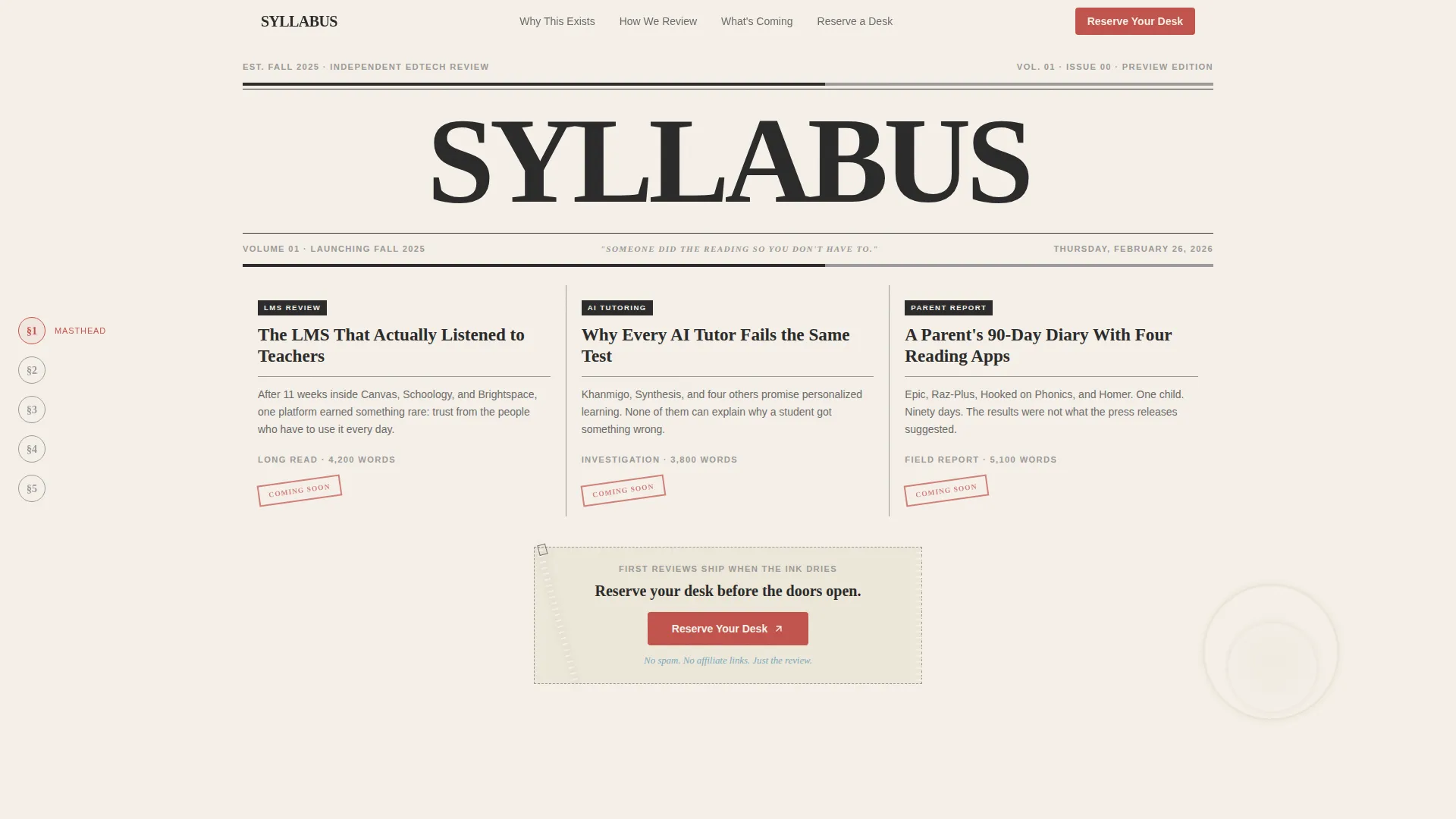
- A broadsheet masthead hero with three rotated headline columns and a torn-ticket-stub call to action
- A left-fixed anchor navigation bar styled as circled chapter-number glyphs, so visitors always know their position in the story
- A role-segmented email waitlist form with a typewritten odometer counter for live social proof
Feature list
A brief overview of the headline capabilities packed into this template.
Newspaper Masthead Hero Section
The hero spans the full page width and is set in a heavy serif typeface. Three slightly rotated headline columns tease the first planned reviews. A coffee-ring graphic and torn-ticket-stub call to action give it the feel of a freshly unfolded broadsheet rather than a startup splash screen.
Hub-and-Spoke Anchor Navigation
A fixed left-rail table of contents uses circled serif chapter-number glyphs as navigation links. Each glyph highlights in red-ink annotation color as the visitor scrolls into that spoke, providing constant orientation without interrupting the reading flow.
Origin Story Narrative Scroll
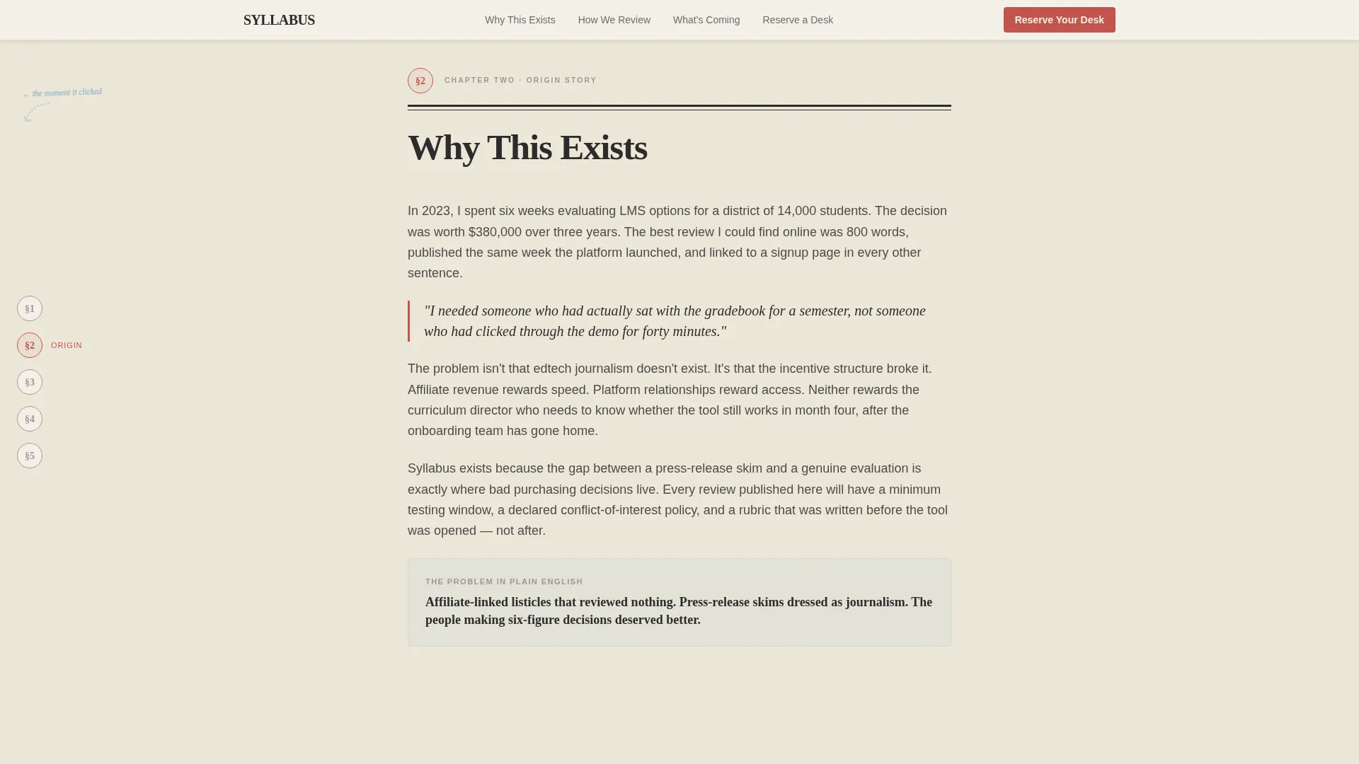
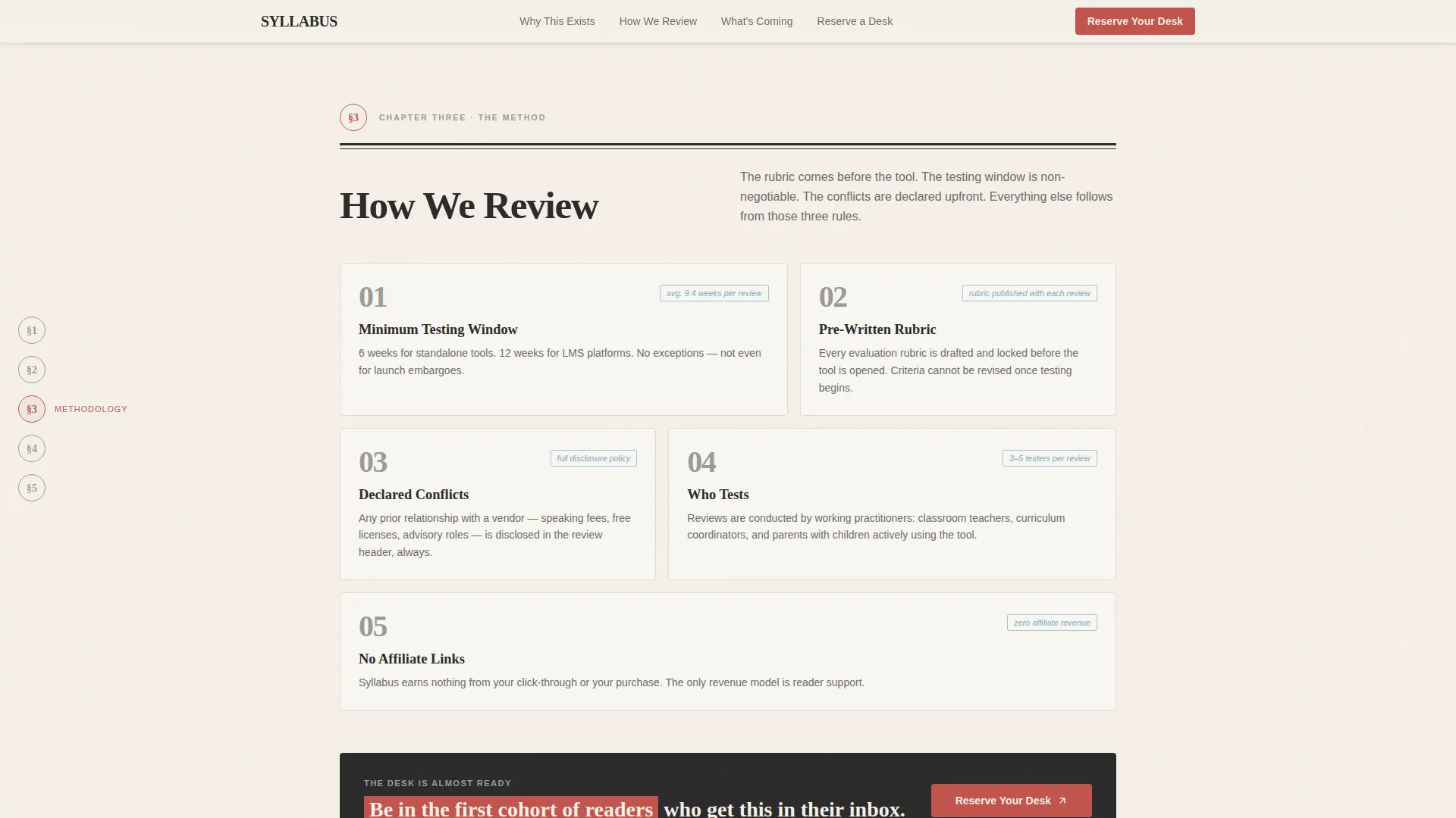
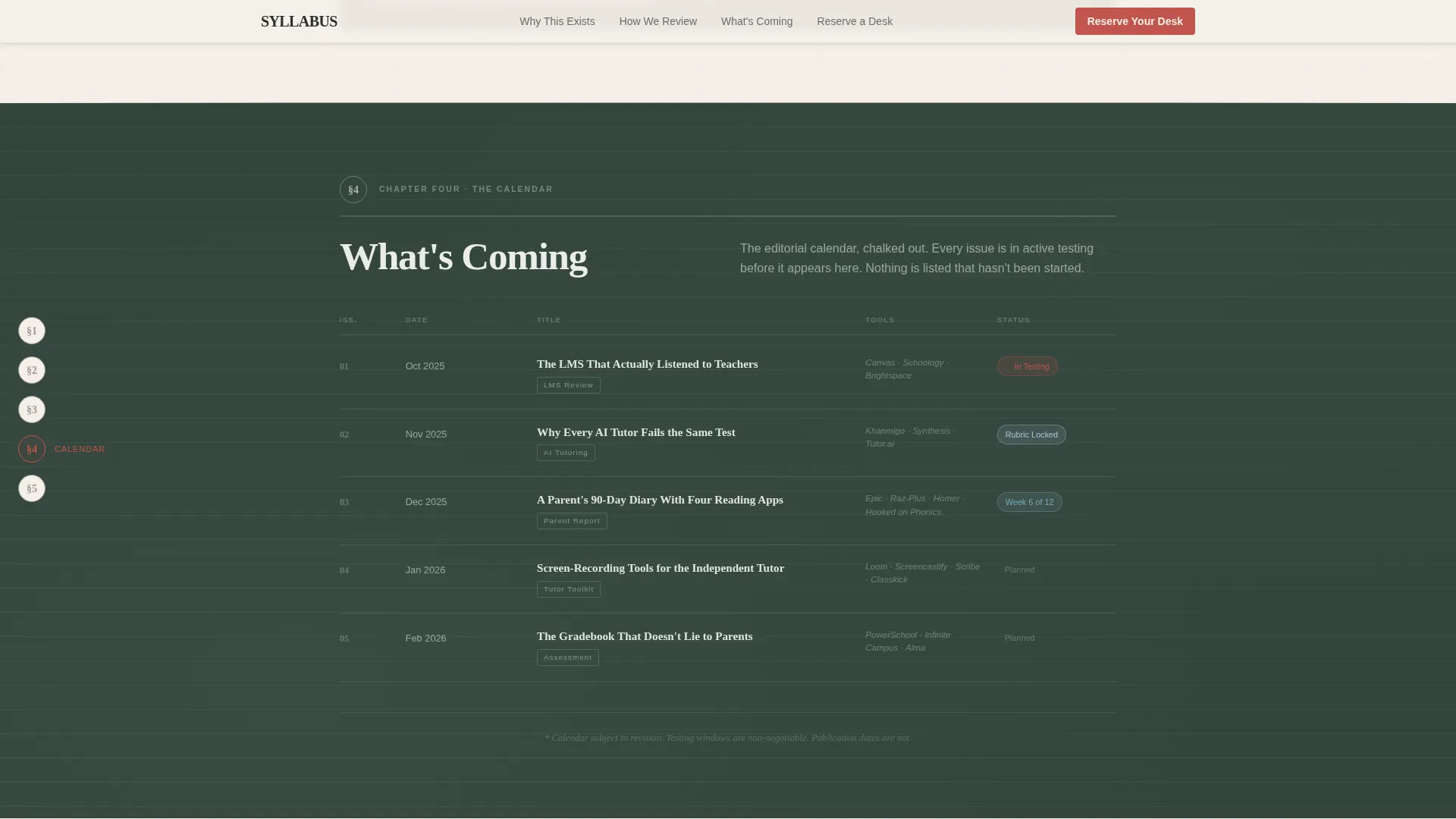
Three sequential anchor spokes carry the visitor through a personal narrative. The first answers why the publication exists, the second reveals the review rubric and testing methodology, and the third previews the editorial calendar as a chalkboard sketch. Paper-texture transitions mark each turn of the page.
Role-Segmented Waitlist Form
The email capture form includes a single toggle that asks visitors to identify as either a tool reviewer or an institutional or family buyer. This segments the list from day one without adding friction. The form appears twice: once pinned beneath the masthead and again after the methodology section.
Typewritten Odometer Social Proof Counter
A live signup counter is styled as a typewriter odometer. It shows current waitlist numbers in a tactile, analog format that builds social proof without manufactured countdown pressure.
GSAP ScrollTrigger Reveal Animations
Section entrances are driven by GSAP ScrollTrigger, creating smooth paper-reveal effects as each spoke comes into view. The animation approach is medium in intensity, meaning it adds editorial atmosphere without slowing the reading experience.
Page sections overview
| Section | Purpose |
|---|---|
| Masthead Hero | Establishes editorial identity and presents the first torn-ticket waitlist call to action |
| Origin Story Spoke | Explains why the publication exists through a personal narrative |
| Methodology Spoke | Reveals the review rubric, testing duration, and who does the testing |
| Editorial Calendar Spoke | Previews upcoming reviews in a chalkboard-sketch visual format |
| Waitlist Form Section | Captures emails, segments roles, and displays the typewritten odometer counter |
| Minimal Footer | Closes the page with a horizontal flow pattern and essential links |
Design & branding system
The visual identity is built on an Ink and Paper editorial theme using a Soft Mist color palette. Every color choice references the physical experience of reading a well-made print publication.
- Newsprint warm white (#F5F0E8), pencil-graphite gray (#4A4A4A), and faded margin blue (#A8C4D8) form the base palette for backgrounds, body text, and supporting elements
- Red-ink annotation (#C2534C) is reserved exclusively for interactive highlights, hover states, and active anchor-nav indicators
- Fraunces is used for the heavy serif masthead display type; DM Sans handles body copy for clean, comfortable reading at all sizes
Mobile & speed optimization
The template is designed desktop-first to serve curriculum directors and procurement professionals working on workstations. It remains fully responsive for mobile visitors.
- CSS-heavy visual effects reduce reliance on JavaScript, keeping the page light and fast on most devices
- Static-first architecture means the page loads without waiting for server-side rendering or external data calls
- GSAP ScrollTrigger is applied with a minimal JavaScript footprint so animations do not block the critical rendering path
How this template helps you convert
The entire page is structured as a conversion funnel that builds trust before it asks for anything.
- The masthead and origin story establish editorial credibility in the first scroll, so visitors feel they are reading a publication rather than landing on a startup pitch
- The methodology section deepens trust by showing exactly how reviews are conducted, which is the specific proof that procurement-minded readers need before committing an email address
- The role-toggle waitlist form and live odometer counter combine low-friction signup with visible social momentum, encouraging visitors to join before the launch date
Other information about this template
This template is a strong fit for edtech-focused editorial projects that sit at the intersection of journalism and education technology. A few additional details worth noting before you build.
- The page is localized for English-language audiences with US date formatting built into the dateline and editorial calendar components
- The Volume 01 dateline and "Launching Fall 2025" label in the masthead are placeholder copy ready to be updated for any launch window
- The footer follows a horizontal flow pattern with a minimal layout, keeping the end of the page clean and on-brand
- The template is well-suited for solo editorial founders as well as small newsroom teams who want to establish a publication identity before content production begins
- The hub-and-spoke structure means additional anchor spokes can be inserted into the scroll flow as the publication grows without breaking the navigation system
Theme
Ink & Paper
Creative direction
Origin Story
Color system
Soft Mist
Style
Hub & Spoke (Anchor Nav)
Direction
Waitlist/Coming Soon
Page Sections
Broadsheet Masthead Hero
Hub-and-spoke Anchor Navigation
Origin Story Narrative Sections
Role-segmented Waitlist Form
Typewritten Odometer Counter
GSAP Scrolltrigger Animations
Related questions
Who is this landing page template designed for?
Can I change the waitlist form fields?
What makes this different from a generic coming-soon page?
Does the anchor navigation work on mobile?
How many sections can I add to the anchor navigation?



