Online Learning Blog Landing Page Template
Syllabus is a single-column online learning landing page template built for editorial depth and quiet conversion. It pairs an Ink & Paper visual identity with a gallery-walk scroll flow, serving long-form guides to self-taught developers, bootcamp grads, and career-switchers. Every detail, from the manifesto header to the sticky email bar, is designed to slow readers down and earn their click.
by Rocket studio
Quick summary
Syllabus is a single-column landing page template for an online learning blog. It uses a parchment-and-graphite editorial aesthetic to present long-form guides with calm authority. The layout flows like a curated reading experience, drawing in self-taught developers, career-switchers, and curious learners who need structured depth rather than scattered video tutorials.
Who this template is for
This template is built for independent educators, content creators, and learning-focused bloggers who publish long-form written guides. It suits people who want their site to feel thoughtful and editorial rather than loud and promotional.
- Junior designers, bootcamp graduates, and career-switchers running their own learning blogs
- Teachers and self-taught developers publishing structured guides as a side project
- Online learning creators who want article click-throughs and an email subscriber list
What problem this template solves
Most blog templates are designed for speed and volume, not depth and trust. They feel interchangeable. Learners who are mid-journey and hitting a wall need something that signals that the writing is worth their time before they commit to reading.
- Generic blog layouts fail to communicate editorial care or content quality at a glance
- Video-first platforms leave behind people who need written, structured explanation
- No clear email capture moment means readers leave without a way to return
What you get with this template
You get a complete, single-column landing page designed for content-led learning blogs. Every section is pre-built and purposeful, from the opening manifesto to the sticky email capture bar.
- A hero section with a large-type manifesto quote on a bare parchment background
- A gallery-walk article card flow with ink-wash editorial illustrations, pull-quote interludes, and a topics navigation block
- A sticky bottom email capture bar that appears after the third article card
Feature list
This template includes six purpose-built features that support both reading engagement and list growth.
Manifesto Hero Header
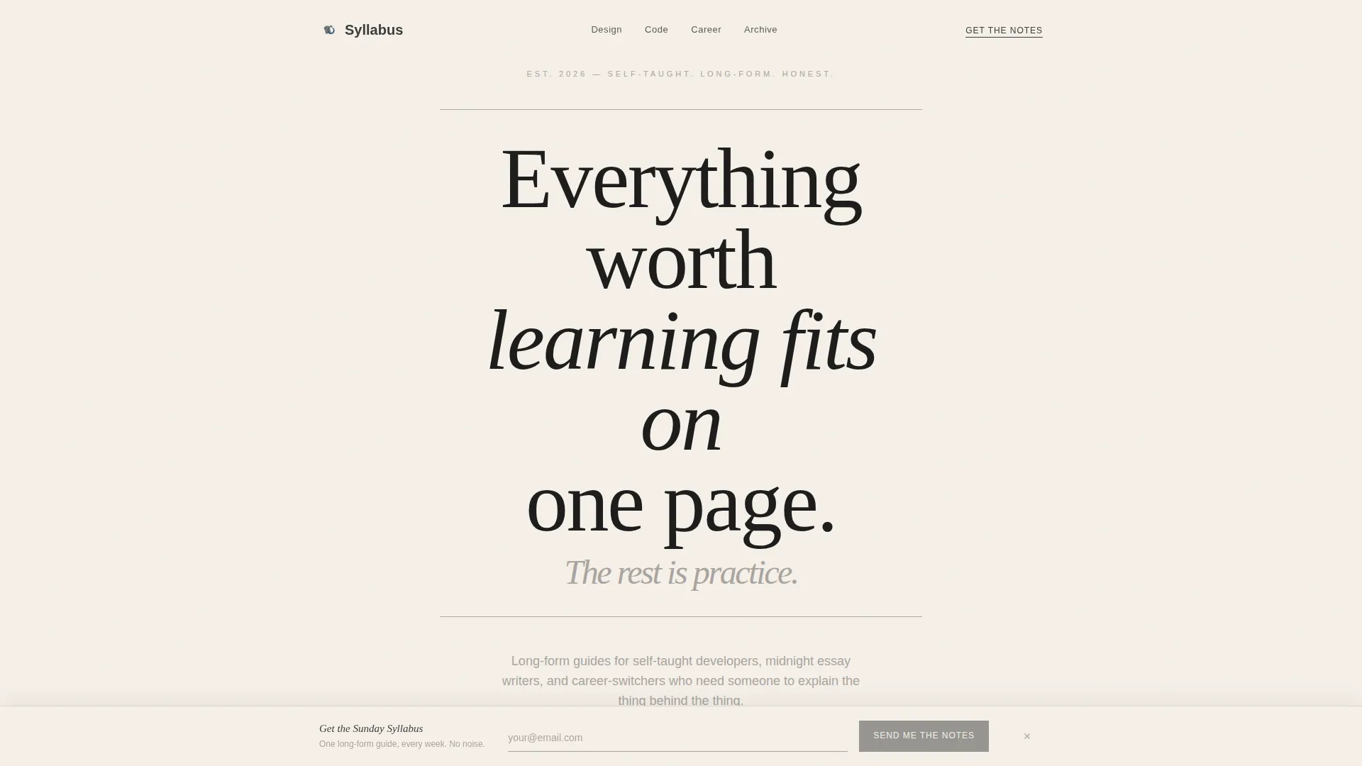
The page opens with a single bold statement set in large Cormorant Garamond serif type on a plain parchment background. Thin graphite rules frame the quote above and below. No images, no noise, just the kind of opening line a reader wants to underline.
Gallery Walk Article Cards
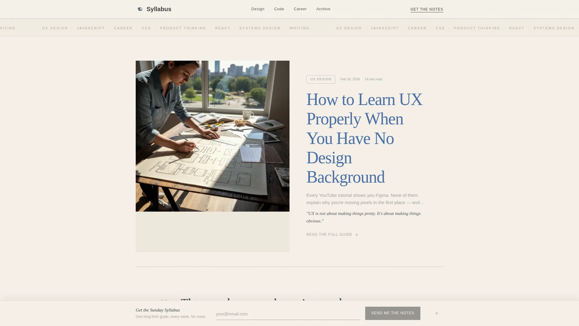
Each article is presented as a full editorial card with an ink-wash illustration, a title styled as a marginalia-blue link, a two-line excerpt that teaches something immediately, and a quiet "Read the full guide" anchor. Cards are spaced generously and separated by pencil-gray hairline dividers.
Pull-Quote Interludes
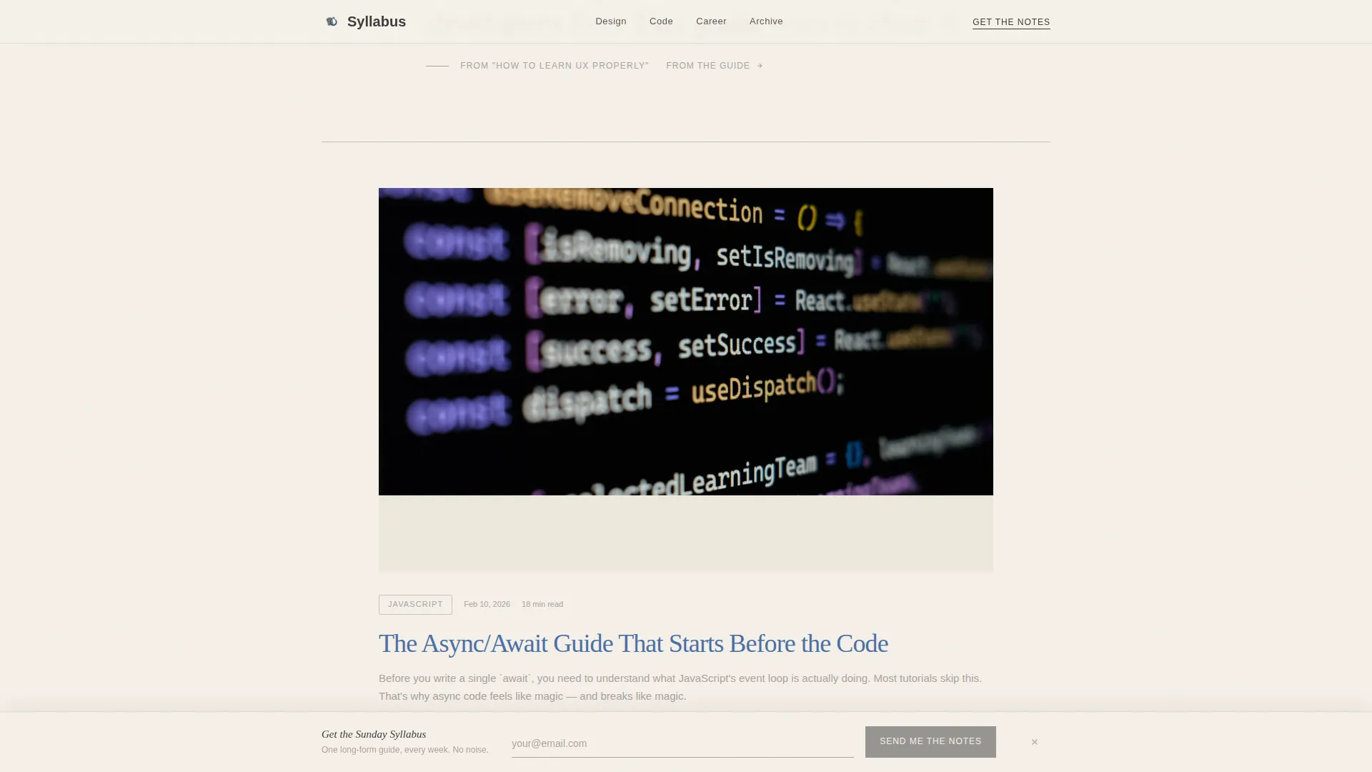
Between article cards, oversized italic serif sentences are lifted from the guides and placed inline. These interludes slow the scroll rhythm on purpose, making the page feel like browsing a curated bookshelf rather than skimming an infinite feed.
Sticky Email Capture Bar
After the third article card, a sticky bar anchors to the bottom of the viewport. It offers a weekly email digest called "Get the Sunday Syllabus" with a single email input and a button labeled "Send Me the Notes." It appears with a subtle entrance animation and stays unobtrusive while the reader scrolls.
Topics Navigation Block
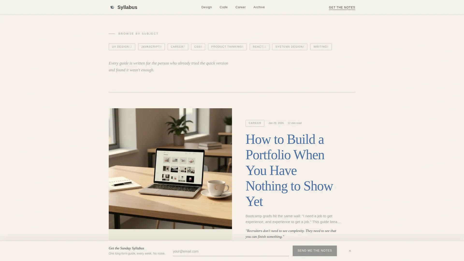
A quiet categorical section organizes article subjects for readers who want to browse by theme. The design stays minimal, using the same graphite-and-parchment palette without breaking the editorial rhythm.
Scroll Reveal Animations
Article cards, pull-quote interludes, and the sticky bar all use scroll-triggered reveal animations. Hover states on article cards and cursor micro-interactions add tactile response without distracting from the reading experience.
Page sections overview
| Section | Purpose |
|---|---|
| Manifesto Hero | Opens with a large editorial quote on parchment |
| Featured Article Cards | Gallery-walk flow of ink-wash illustrated guides |
| Pull-Quote Interludes | Oversized italic excerpts between article cards |
| Topics Navigation | Categorical browsing by subject area |
| More Articles Grid | Secondary card grid for additional guide discovery |
| Footer | Minimal horizontal flow with reader count |
| Sticky Email Bar | Email capture anchored after third article card |
Design & branding system
The visual identity follows an Ink & Paper theme using the Cloud Canvas color system. The palette feels like a well-loved textbook left open under afternoon light.
- Colors: warm parchment white (#F5F0E8) for backgrounds, graphite (#3B3B3B) for body text, soft pencil gray (#A9A4A0) for section dividers, and marginalia blue (#4A6FA5) reserved for links and hover states
- Typography: Cormorant Garamond handles all display and serif headline text; DM Sans handles body copy and user interface elements
- Illustrations use an ink-wash editorial style that reinforces the analog, handcrafted reading atmosphere
Mobile & speed optimization
The template is built with a mobile-first reading experience at its core. The audience includes learners browsing late at night on their phones, so the layout and interactions are designed to work smoothly at small screen sizes.
- Single-column flow adapts naturally to mobile without requiring layout changes
- Article card components use a server-component approach with minimal JavaScript to keep the page light
- Scroll reveal and sticky bar entrance animations are medium-weight, keeping interactions responsive without heavy script overhead
How this template helps you convert
Every design choice in this template is oriented toward two outcomes: getting readers to click into full articles and earning their email address.
- Each article card is itself the primary call to action. The title reads as a natural blue link within the excerpt, and the "Read the full guide" anchor sits quietly below. The excerpt teaches something in two lines, so the full article feels like a reward rather than a risk.
- The sticky email bar appears at exactly the right moment, after a reader has seen three article cards and already trusts the depth of the content. The single-field form and direct button copy keep friction low.
Other information about this template
This template sits at the intersection of editorial blog design and structured online learning content. A few additional details worth knowing before you build with it.
- The footer follows a minimal horizontal flow pattern and includes a reader count as a subtle form of social proof
- The template is categorized under Blog & Editorial with a focus on the Education and Career Blog subcategory
- It is built for English-language, content-led publications with a United States-centric audience in mind
- The overall intersection match score for this niche and template style combination is 13, reflecting a strong fit between editorial design and online learning content needs
- The layout direction is click-through, meaning every visual and copy decision supports moving readers deeper into the content rather than toward a purchase or sign-up wall
Theme
Ink & Paper
Creative direction
Gallery Walk
Color system
Cloud Canvas
Style
Single Column Flow
Direction
Click-Through
Page Sections
Manifesto Quote Hero Header
Gallery Walk Article Cards
Pull-quote Interludes
Sticky Email Capture Bar
Topics Navigation Block
Scroll Reveal and Hover Interactions
Related questions
Who is this template designed for?
Can I use this template to grow an email list?
How many sections does the template include?
Is this template suitable for a mobile audience?
What makes this template different from a standard blog layout?



