Unified Team Collaboration Landing Page Template
Sync is a split-screen landing page template built for team collaboration platforms. It pairs a realistic code-snippet header with a live unified timeline, problem-to-solution scroll sections, animated metrics, and a progressive freemium signup flow. The Dashboard Pro theme uses a Slate and Sky color system to give it the feel of a clean, focused workspace ready to act on Monday morning.
by Rocket studio
Quick summary
Sync is a single-page, split-screen landing page template designed for unified team collaboration platforms. It opens with a code-snippet header that immediately shows a product in motion, then drives visitors through pain-point sections, live metrics, and a frictionless trial signup. The result is a page that feels less like a brochure and more like a product demo with a sign-up button attached.
Who this template is for
This template is built for product and growth teams who need to communicate a complex collaboration platform without overwhelming their visitors. It suits founders, engineers, and product managers who want to launch fast and convert on the first visit.
- Engineering leads managing distributed teams across multiple time zones
- Product managers replacing recurring update meetings with async workflows
- Startup founders who have outgrown simple docs tools but are not ready for enterprise pricing
What problem this template solves
Teams today live across too many tools at once. Threads get lost, decisions scatter, and onboarding a new hire means handing them a map of twelve browser tabs. A collaboration platform needs a landing page that proves it solves that exact chaos before visitors scroll past the fold.
- Visitors leave before understanding the product value because the page is too generic
- No clear visual contrast between the current pain state and the resolved product state
- Weak or multi-step calls to action that slow down free trial signups
What you get with this template
You get a fully structured, single-page layout built around one core conversion goal: getting a team started on a free trial. Every section is designed to build momentum and remove hesitation before the signup moment arrives.
- A split-screen (50/50) layout with a code-snippet header and a live unified timeline on the right
- Progressive scroll sections that move from problem and solution framing to animated performance metrics
- A two-path conversion system with a primary freemium call to action and a secondary inline interactive demo
Feature list
This template ships with a focused set of layout components and conversion mechanics drawn directly from the source brief. Each one serves a specific job in the visitor journey.
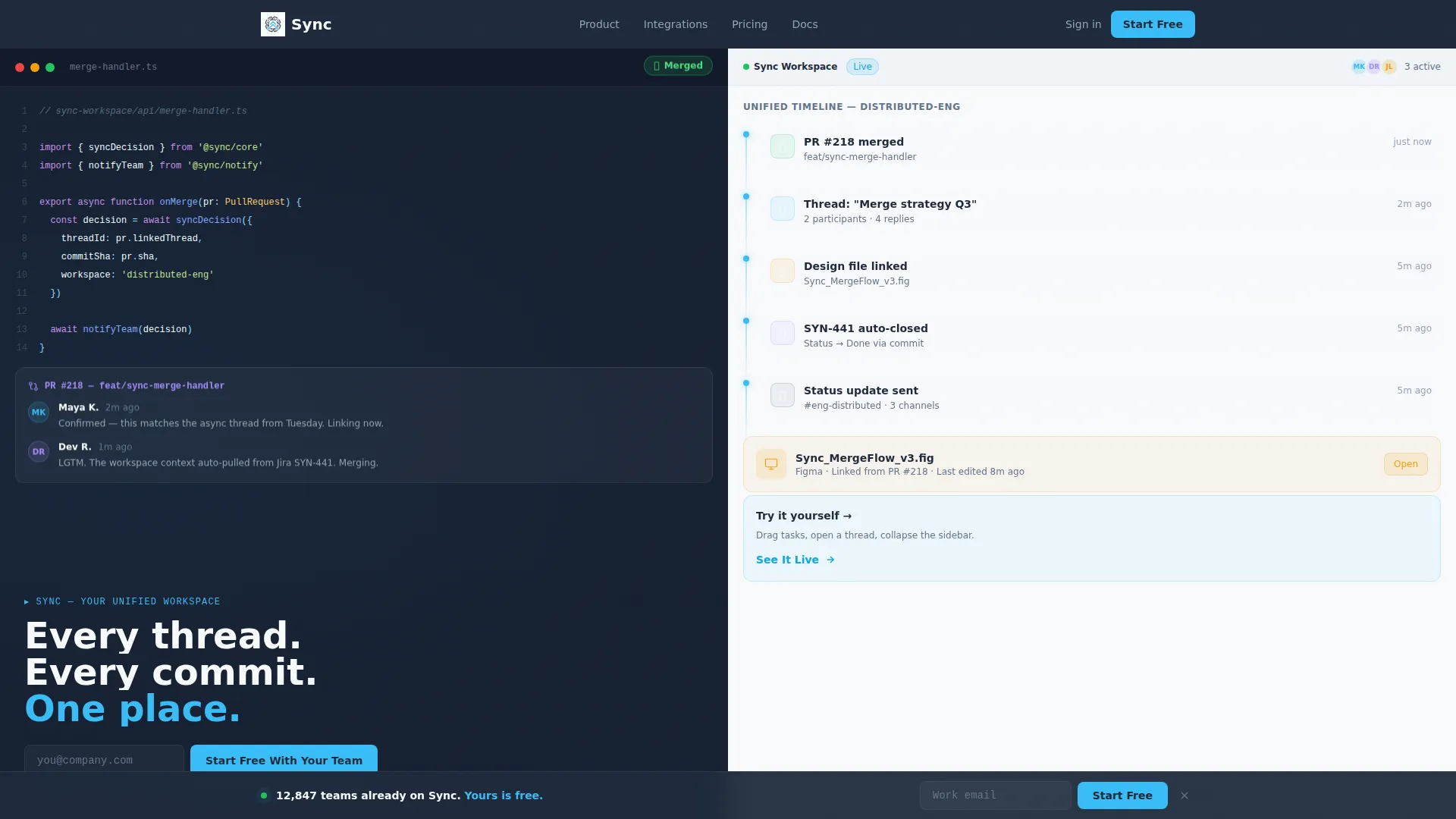
Split-Screen Code Snippet Header
The left panel shows a syntax-highlighted code block mid-commit, a pull request comment thread with two visible avatars, and a glowing green merge badge. The right panel mirrors that same moment inside the product's unified timeline, placing the commit, the conversation, the linked design file, and an automated status update in one vertical stream.
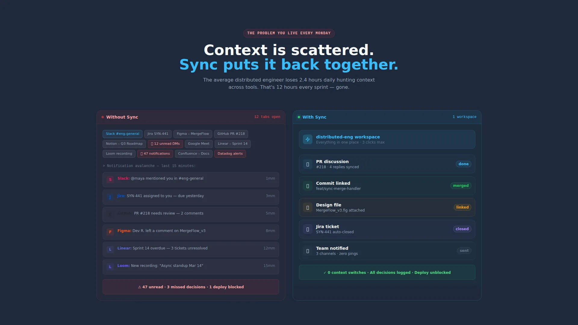
Problem and Solution Scroll Sections
After the header, each scroll section introduces a single workflow pain point on the left, rendered as a chaotic screenshot of real tool sprawl. The right side shows the resolved state inside the product. The contrast is immediate and repeatable across multiple sections.
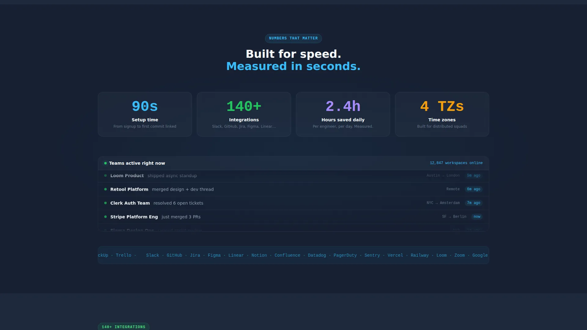
Animated Metrics and Live Feed
Scroll further and the page shifts to pure momentum: animated counters showing 90-second setup time and 140-plus integrations, plus a live-ticker-style feed displaying teams currently active on the platform. The energy makes the product feel operational, not aspirational.
Progressive Freemium Signup Form
The primary call to action asks only for a work email on the first click. The form then expands progressively to collect team size (solo, 2 to 10, 11 to 50, or 50-plus) and primary use case (engineering, product, design, or operations). Low friction at entry, meaningful data on completion.
Sticky Trial Bar
After the second scroll, a sticky bottom bar re-surfaces the "Start Free With Your Team" call to action. It follows the visitor through the rest of the page, keeping the conversion option visible without interrupting the reading experience.
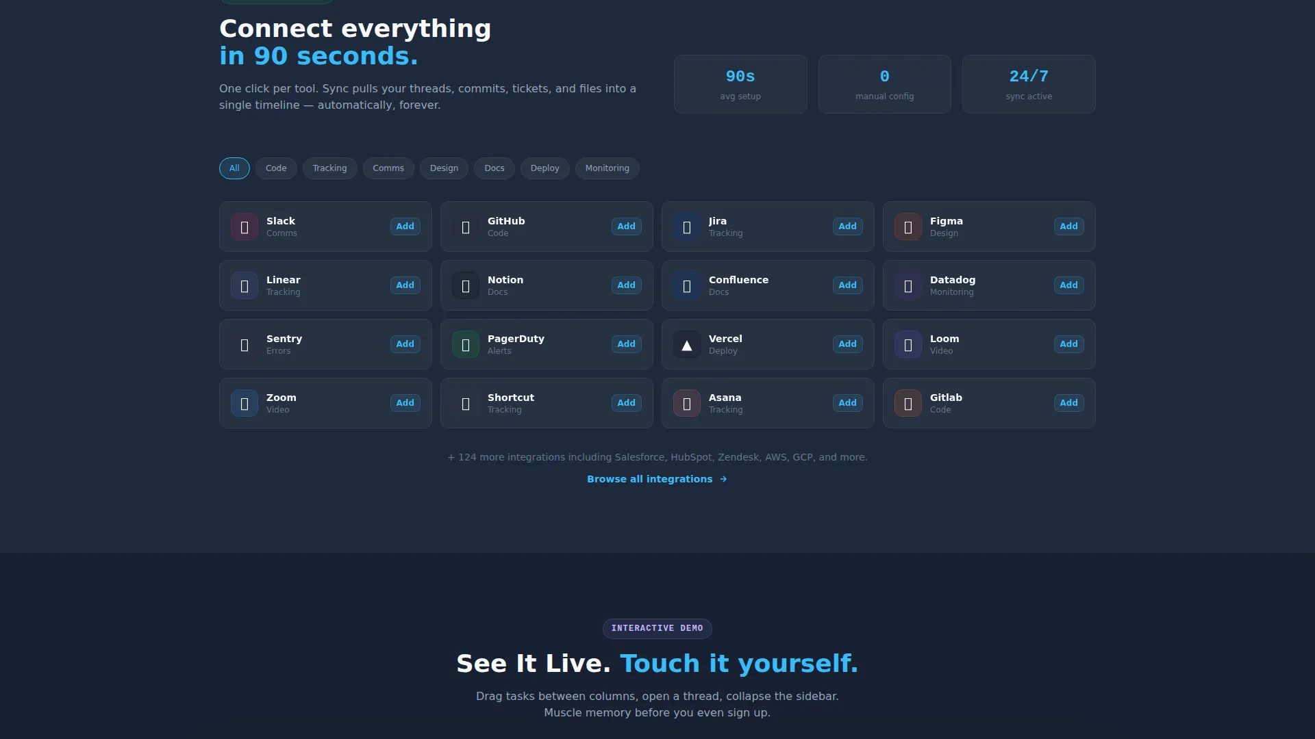
Inline Interactive Demo Path
A secondary call to action labeled "See It Live" triggers an inline demo. Visitors can drag tasks, open a mock thread, and collapse a sidebar directly on the page. This lets undecided visitors build muscle memory with the product before they ever create an account.
Page sections overview
| Section | Purpose |
|---|---|
| Split-Screen Header | Establish product context instantly with a code commit and unified timeline side by side |
| Problem Scroll Sections | Show tool sprawl on the left and the resolved product state on the right per section |
| Animated Metrics Block | Communicate speed and scale with counters for setup time and integration count |
| Live Activity Feed | Show real-time team adoption to create momentum and social proof |
| Primary call to action Block | Drive trial signups with a progressive work-email-first form |
| Sticky Bottom Bar | Keep the freemium call to action visible after the second scroll without blocking content |
| Inline Demo Trigger | Let visitors interact with a mock workspace before committing to signup |
Design & branding system
The template uses a Dashboard Pro theme built on a Slate and Sky color system. The palette is designed to feel like a well-configured developer environment at dawn: dark enough to sustain long reading sessions, bright enough to draw the eye to every live state and interactive element.
- Deep workspace slate (#1E293B) anchors the left panel backgrounds and heavy user interface frames
- Cloud-washed white (#F8FAFC) opens up the right panel and content areas for breathing room
- Active sky blue (#38BDF8) highlights every interactive element, live indicator, and call-to-action button
- Muted graphite (#64748B) handles secondary text, divider lines, and supporting labels
Mobile & speed optimization
The layout is built with a vertical reading experience in mind. On smaller screens, the split-screen stacks naturally so neither panel loses context. The progressive form and sticky bar both adapt to touch interaction without requiring pinch-zoom.
- Stacked single-column layout on mobile preserves the problem-to-solution narrative flow
- Sticky call to action bar remains accessible at the bottom of the screen on all viewport sizes
- Monospaced code typography and clean sans-serif product copy are both legible at mobile text sizes
How this template helps you convert
Every structural decision in this template is pointed toward a single outcome: turning a curious visitor into a free trial user within one page visit.
- The two-path conversion system lets action-ready visitors sign up immediately while curious visitors explore the inline demo, capturing both intent types without a separate page
- The progressive signup form reduces drop-off by asking only for a work email first, then gathering team context in a second step after initial commitment
- The animated metrics and live activity feed create a sense of momentum that makes the product feel already-in-use, reducing the perceived risk of being an early adopter
Other information about this template
This template fits naturally inside the Communication and Unified Communications subcategory of the Telecom and Connectivity space. It is purpose-built for the team collaboration platform niche where conversion depends on showing, not just telling.
- The header concept is a Code Snippet layout, making it especially resonant for engineering and product audiences
- Creative direction follows a Launch Energy principle: every section accelerates the visitor toward signup rather than slowing them down with explanatory text
- The template style is a 50/50 split screen, giving equal visual weight to the pain state and the product state throughout the scroll
- The freemium and trial landing page direction means the entire layout is oriented toward low-friction trial starts, not demos booked days later
- Typography combines monospaced fonts for the code panel with clean sans-serif for the product side, reinforcing the contrast between the old workflow and the new one
Theme
Dashboard Pro
Creative direction
Launch Energy
Color system
Slate & Sky
Style
Split Screen (50/50)
Direction
Freemium/Trial
Page Sections
Split-screen Code Snippet Header
Problem and Solution Scroll Sections
Animated Metrics and Live Activity Feed
Progressive Freemium Signup Form
Sticky Trial Call to Action Bar
Inline Interactive Demo Path
Related questions
Can I customize the color palette for my own brand?
Does the template include the interactive demo functionality?
What makes the split-screen layout effective for a collaboration platform?
Is this template suited for an early-access or beta product launch?
Who is the intended audience for this landing page template?


