Unified Communications Landing Page Template
Sync is a hub-and-spoke landing page template built for unified communications platforms. It opens with a live-stats hero dashboard, then guides visitors through five anchored spoke sections, Voice, Video, Messaging, Files, and Analytics, each resolving one collaboration pain point. The "See It Live" call to action and a "Compare Your Stack" cost calculator warm every click before commitment.
by Rocket studio
Quick summary
Sync is a single-page, anchor-nav template designed for unified communications platforms. It follows a Problem-to-Solution arc, opening with a fragmented-tools problem panel and resolving into one consolidated platform view. The Data Command visual theme, live-metrics hero, and contextual calls to action make it purpose-built for IT-facing buyers who need clarity fast.
Who this template is for
This template speaks directly to the people who feel the cost of communication sprawl every single day. It is designed for decision-makers who evaluate platforms on reliability, simplicity, and proven scale.
- IT directors managing multiple collaboration tools with separate invoices and overlapping support tickets
- Operations managers who lose critical decisions inside disappearing chat threads
- Remote-first Chief Technology Officers who need one platform that holds steady during large all-hands events
What problem this template solves
Most unified communications platforms struggle to explain their value in a single scroll. Visitors arrive skeptical, already burned by tool overload, and they need to feel the problem acknowledged before they trust any solution.
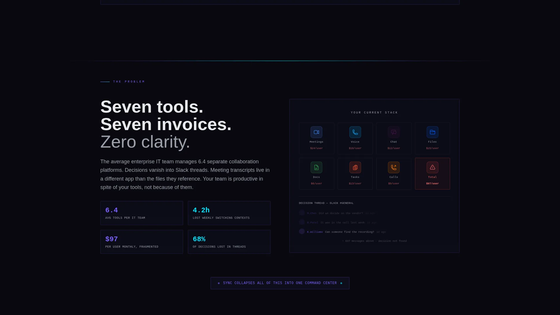
- Fragmented tool stacks create confusion, wasted spend, and no single place to find past decisions
- Generic SaaS landing pages bury the product story in marketing language instead of real data
- Visitors leave before reaching the call to action because no section earns their attention
What you get with this template
You get a fully structured, anchor-navigation landing page that takes a visitor from problem awareness to demo request without a single form. Every section is pre-built and editable.
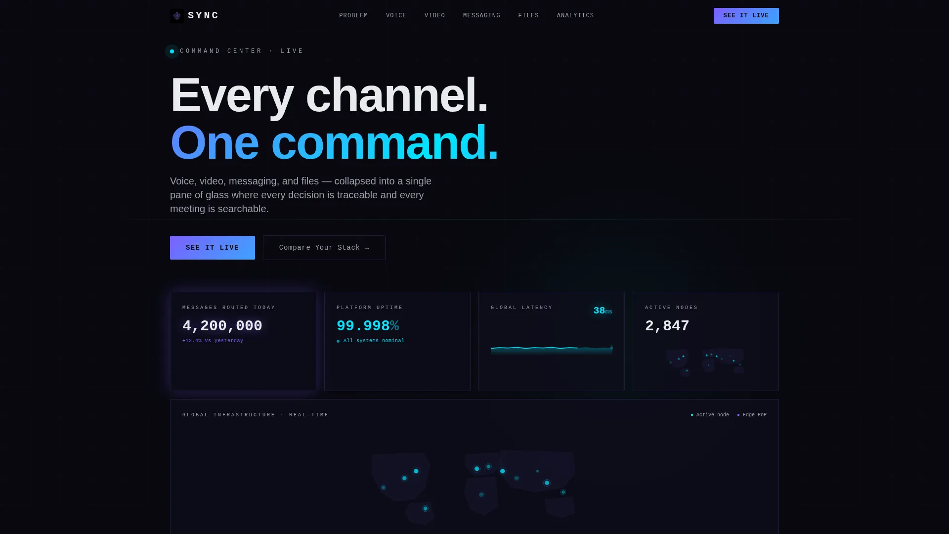
- A live-stats hero header showing platform metrics: messages routed, uptime percentage, latency, and a world connection map
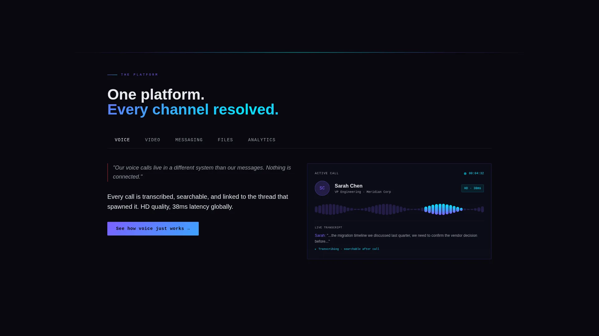
- Five spoke sections anchored in the navigation, Voice, Video, Messaging, Files, and Analytics, each pairing a frustration statement with an animated product screenshot
- A sticky "See It Live" call-to-action button in the nav bar and a "Compare Your Stack" secondary link that opens a cost-and-complexity calculator
Feature list
This section covers the core template capabilities built directly from the source brief.
Live Stats Hero Dashboard
The header is a dark canvas displaying oversized monospace metrics: 4.2 million messages routed today, a real-time uptime counter at 99.998 percent, a world map with glowing connection nodes, and a latency graph flatlined at 38ms. Each digit animates upward with a subtle counter effect, making the product the hero without a single stock photo.
Hub-and-Spoke Anchor Navigation
Five named spokes, Voice, Video, Messaging, Files, and Analytics, are anchored in a persistent top navigation bar. Each spoke is a self-contained section that resolves one specific pain point, so visitors can jump directly to the channel that matters most to them.
Problem-to-Solution Arc Layout
The scroll opens with a split-panel showing seven app icons, seven notification badges, and seven monthly invoices. As the visitor moves through each spoke, one pain point is resolved at a time. By the final spoke, the seven icons have merged into one, giving the page a satisfying narrative payoff.
Contextual Calls to Action
The primary call to action, "See It Live," appears in the sticky nav and at the close of every spoke section. Each instance carries unique micro-copy tied to that section's topic, for example "See how voice just works" or "See your meetings, searchable." There is no form on the page; every click routes to an interactive product demo.
Compare Your Stack Calculator
A secondary text link labeled "Compare Your Stack" opens a lightweight inline calculator. Visitors enter their current tools and receive a projected cost and complexity reduction. This warms the click with personal stakes before any commitment is required.
AI Iridescent Color and Animation System
Violet-to-cyan gradients pulse on hover states and progress indicators. Section dividers glow faintly, like fiber-optic lines beneath a floor. The palette shifts from void black to prismatic color on interaction, creating a visual rhythm that matches the Data Command theme without relying on illustrations or photography.
Page sections overview
| Section | Purpose |
|---|---|
| Stats Hero Header | Anchors trust with live platform metrics and a world connection map |
| Problem Split Panel | Shows the seven-tool fragmentation problem before any solution is presented |
| Voice Spoke | Resolves call-quality and routing frustrations with a product screenshot |
| Video Spoke | Addresses meeting searchability and transcription pain points |
| Messaging Spoke | Shows how decisions stay traceable instead of lost in scroll |
| Files Spoke | Demonstrates centralized file sharing within a single platform view |
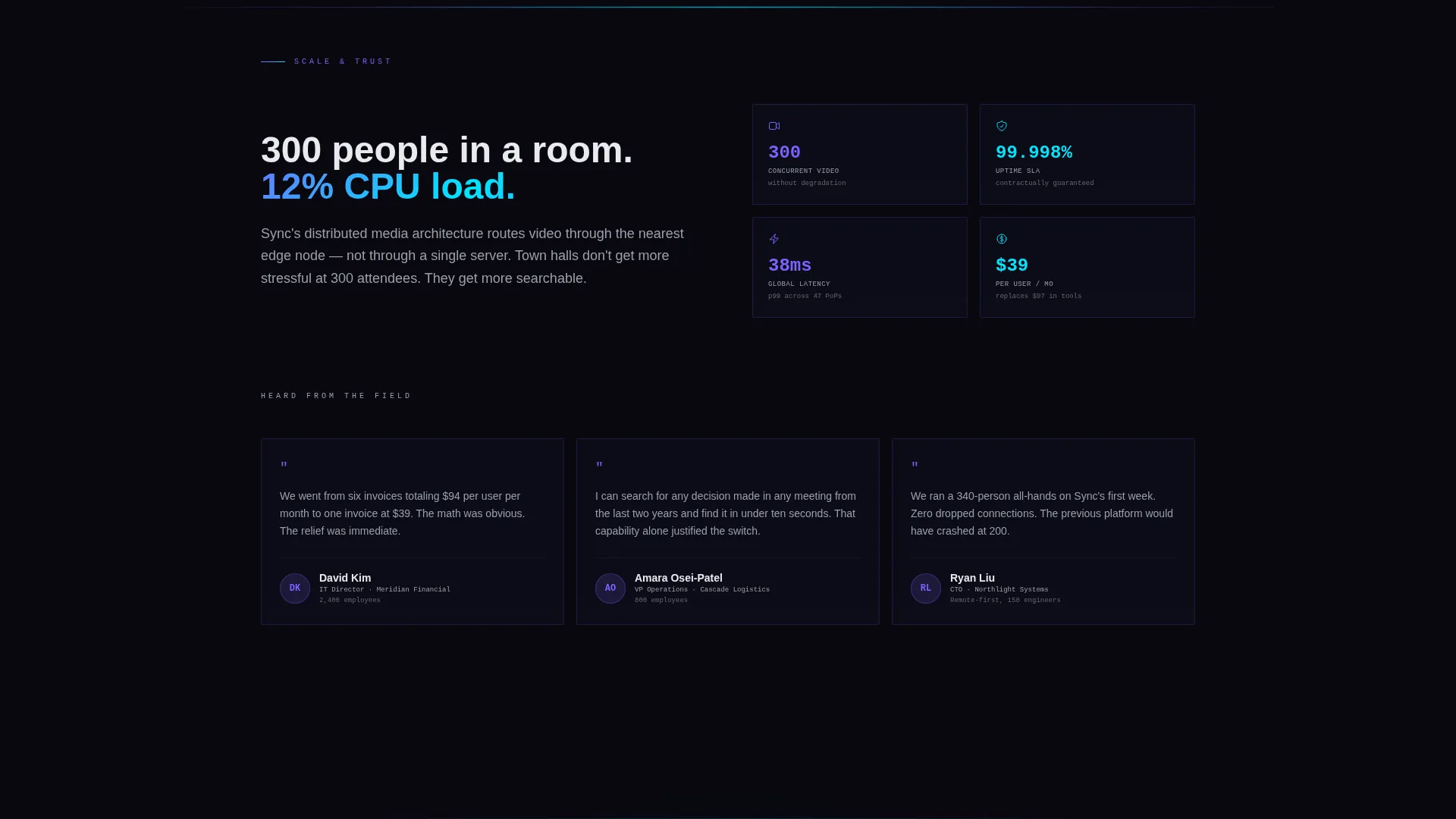
| Analytics Spoke | Closes the feature arc with usage data and platform visibility |
| Sticky Navigation Bar | Keeps anchor links and the "See It Live" button always reachable |
| Compare Your Stack | Opens the cost-and-complexity calculator via a secondary text link |
| Final Convergence Panel | Merges seven icons into one, delivering the narrative payoff |
Design & branding system
The visual identity follows a Data Command theme powered by an AI Iridescent color system. The palette is dark and precise by default, then suddenly alive with prismatic color on interaction. Every design choice reinforces the idea that complexity has been tamed.
- Core colors: void black (#09090F) for backgrounds, holographic violet (#7B61FF) and liquid cyan (#00E5FF) for interactive gradients, and neural white (#E8EAED) for body text
- Typography uses oversized monospace numerals for metric displays, creating a control-room aesthetic that feels technical without being cold
- Hover states and progress indicators use violet-to-cyan gradient pulses; section dividers glow faintly to suggest live infrastructure running beneath the surface
Mobile & speed optimization
The template is structured to remain scannable and functional on smaller screens. The hub-and-spoke layout adapts naturally because each spoke is a focused, single-topic section with minimal visual clutter.
- The sticky anchor navigation collapses cleanly on mobile, keeping the "See It Live" call to action always visible
- Oversized monospace metrics and animated counters are scoped to work within viewport constraints without breaking the Data Command aesthetic
How this template helps you convert
Sync is built around the principle that trust must be earned before a click is asked for. The page architecture is a deliberate sequence that reduces friction at every stage.
- The live-stats hero dashboard establishes platform credibility in the first three seconds, using real numbers instead of marketing claims, so skeptical buyers stay on the page
- Each spoke section adds a small dose of problem-resolution momentum, and the contextual micro-copy on every "See It Live" button makes the next step feel like a natural continuation rather than a hard sell
Other information about this template
This template is part of a niche-specific library built for the unified communications platform category. It is designed to support positioning in the telecom and connectivity space, specifically for communication and unified comms products.
- The template style is Hub and Spoke with Anchor Navigation, a structure well suited to platforms with multiple distinct feature channels
- The creative direction is a Problem-to-Solution Arc, a proven narrative format for SaaS and platform products where buyer skepticism is high
- The header concept is Stats and Metrics, reflecting the Data Command theme and the AI Iridescent color system used throughout
- The landing-page direction is Click-Through, meaning the page is optimized to route visitors to an interactive demo rather than capture a form lead
Theme
Data Command
Creative direction
Problem→Solution Arc
Color system
AI Iridescent
Style
Hub & Spoke (Anchor Nav)
Direction
Click-Through
Page Sections
Live Stats Hero Dashboard
Hub-and-spoke Anchor Navigation
Problem-to-solution Arc Layout
Contextual Sticky Calls to Action
Compare Your Stack Calculator
AI Iridescent Animation System
Related questions
Does this template include a contact form or lead capture form?
Can I change the metrics shown in the hero dashboard?
How does the Compare Your Stack calculator work within the template?
Can I remove or rename the spoke sections if my platform has fewer channels?
What type of buyer is this template designed to convert?


