Premium Drug Development Landing Page Template
Formulary is a pharmaceutical industry report blog landing page built on a masonry layout that sequences editorial intelligence like chapters in an institutional archive. Designed for medical affairs directors, healthcare journalists, and pharmacy benefit consultants, it combines a heritage editorial aesthetic with a Japanese Zen color system to deliver depth, authority, and steady conversion through every article card.
by Rocket studio
Quick summary
Formulary is a single-page pharmaceutical intelligence blog landing page. It uses a masonry card grid to present drug development reports with editorial gravity. The design draws from Japanese Zen minimalism and heritage publishing traditions. Every section, from the hero image to the scroll-triggered newsletter bar, is built to earn the trust of expert readers before asking for their email.
Who this template is for
This template is built for publishers, editors, and content strategists running serious pharmaceutical industry media. It suits organizations that publish analysis rather than press releases, and whose readers arrive already informed.
- Medical affairs directors tracking competitor drug pipelines and regulatory approvals
- Healthcare journalists and pharmacy benefit consultants who read for professional insight, not general wellness content
- Boutique intelligence publishers and healthcare communications firms producing B2B industry reports
What problem this template solves
Most blog templates flatten editorial depth into generic card grids. For a pharmaceutical industry report blog, that flatness destroys credibility. Expert readers recognize shallow design immediately and leave. This template solves the trust deficit by making the page itself feel like a primary source.
- Generic layouts offer no narrative sequence; this template guides the reader from founding editorial through to current dispatches
- Standard call-to-action patterns push before they earn; this template lets readers preview opening paragraphs directly on each card before asking for a click
- Plain newsletter bars interrupt context; here the persistent bar appears only after three seconds of scrolling, so it arrives as an offer rather than an obstacle
What you get with this template
You get a fully structured pharmaceutical blog landing page with five distinct sections, a coordinated design system, and scroll-triggered interactivity. Every element is rooted in the source brief and designed for desktop-first professional readers.
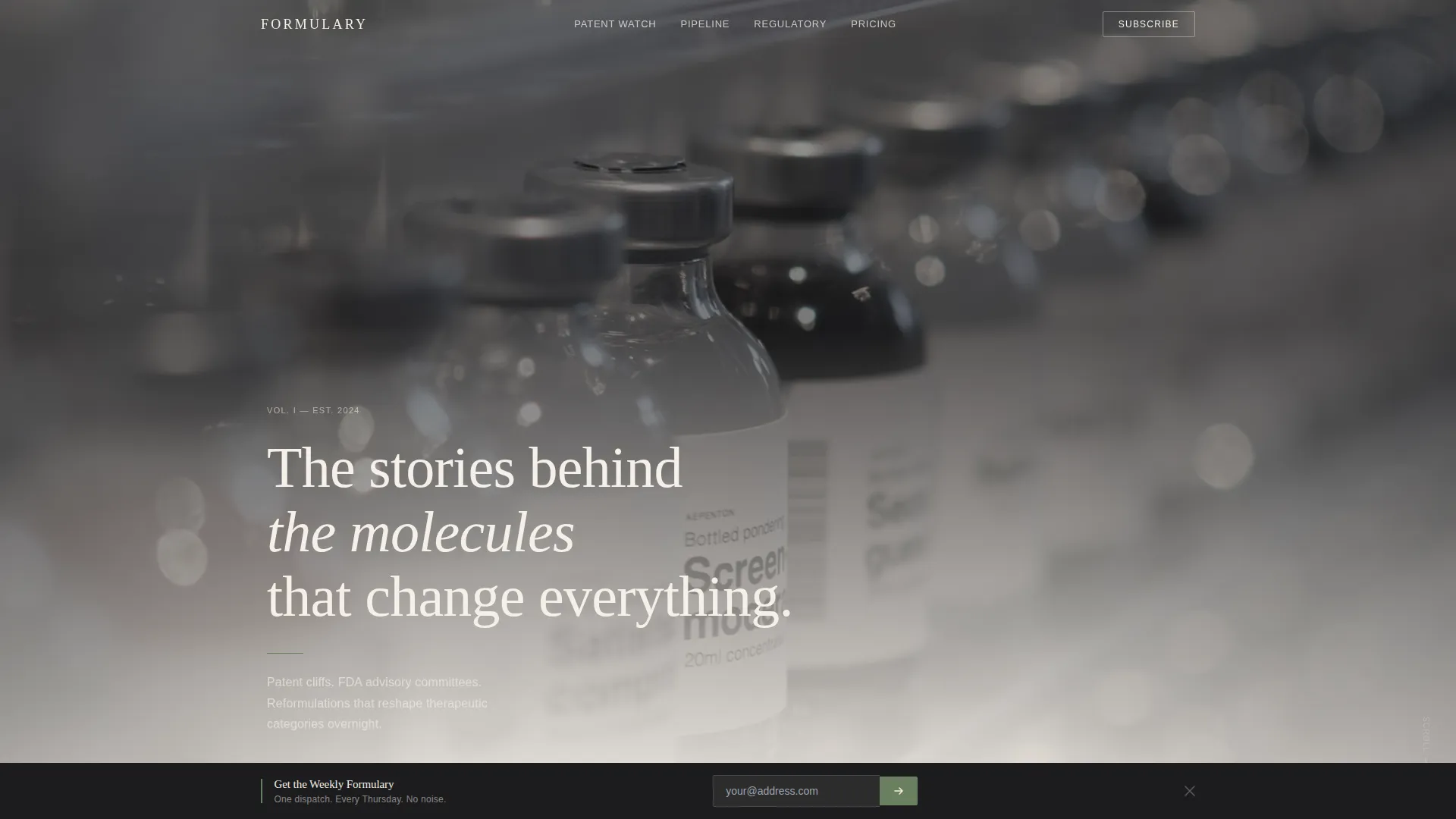
- A Type Over Image hero section with a pharmaceutical vials photograph and large serif headline, no call to action
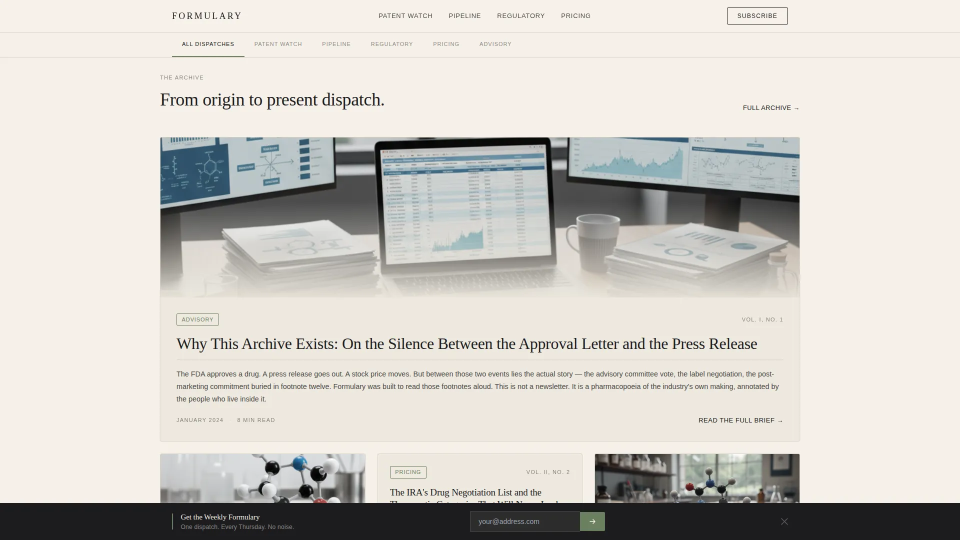
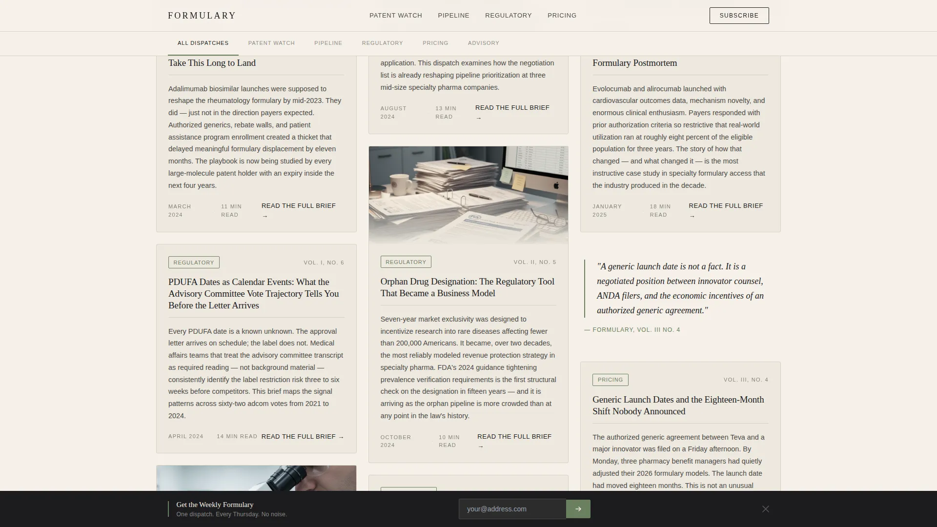
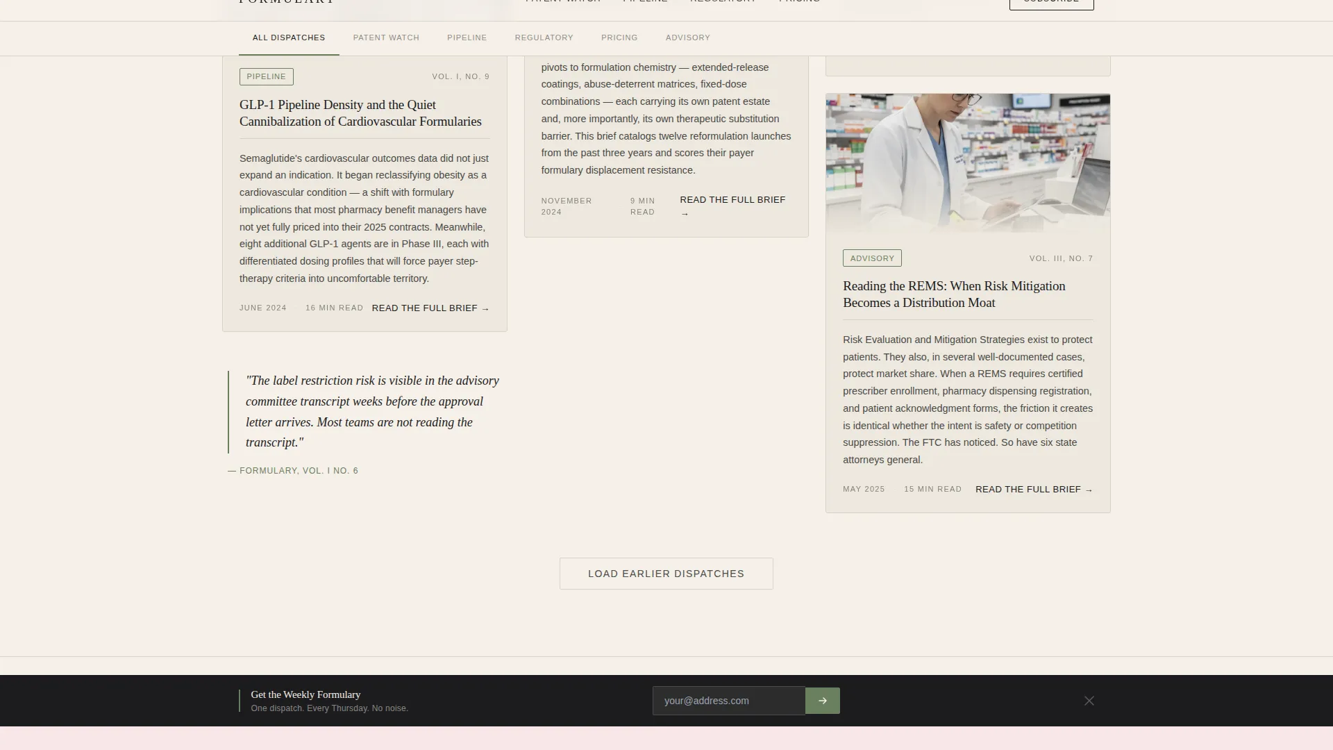
- A two-stage masonry grid that sequences founding editorial and current dispatches, with article card previews, category tags, and per-card calls to action
- A scroll-triggered persistent newsletter bar with a single email field, plus a linear single-row footer
Feature list
This template delivers six core capabilities, each grounded in the project brief.
Masonry Grid with Editorial Sequencing
The grid opens with one wide founding editorial card bordered in moss green. Below it, staggered columns carry individual reports in descending chronological order. The layout moves the reader from origin to present tense as they scroll, creating a sense of institutional depth.
Article Card Previews with Per-Card Calls to Action
Each card displays an opening paragraph excerpt directly on its face. Readers can assess depth before committing to a click. The call to action on every card reads "Read the Full Brief" in sumi ink with a moss green underline that activates on hover.
Type Over Image Hero Section
The hero places a muted, desaturated photograph of amber-lit pharmaceutical vials beneath a vertically stacked serif headline. The type is large and letterspaced, styled like a chapter title. There is no button, no overlay form, just image, words, and editorial restraint.
Floating Pull Quotes Between Card Rows
Pull quotes appear between masonry card rows as marginalia-style interruptions. They reinforce the pharmacopoeia aesthetic and give skimmers a reason to pause without breaking the scroll rhythm.
Scroll-Triggered Persistent Newsletter Bar
After three seconds of page scrolling, a bottom bar slides up and offers a single path: an email field with a send arrow and the label "Get the Weekly Formulary." No name field. No company field. Just the address. The bar earns its appearance by arriving late.
Category Tag System
Reports carry moss green category chips for Patent Watch, Pipeline, Regulatory, and Pricing. The chips behave like wax seals on archival correspondence. They help expert readers self-sort content by professional focus instantly.
Page sections overview
| Section | Purpose |
|---|---|
| Hero, Type Over Image | Sets editorial authority with vials photograph and serif headline, no call to action |
| Masonry Grid, Founding Editorial | Anchors the archive with a wide founding card bordered in moss green |
| Staggered Article Cascade | Sequences reports from archival to current with card previews and date stamps |
| Pull Quote Marginalia | Floats editorial quotes between card rows to deepen reading rhythm |
| Masonry Grid, Current Dispatches | Delivers recent reports with category tags and per-card calls to action |
| Persistent Newsletter Bar | Scroll-triggered email capture with single field and send arrow |
| Footer, Linear Single-Row | Closes the page with clean minimal navigation |
Design & branding system
The visual identity follows a Heritage and Story theme expressed through a Japanese Zen color palette. Every color carries a specific role, and restraint is the governing principle throughout.
- Washi paper cream (#F5F0E8) dominates the background; sumi ink black (#1C1C1E) anchors headlines; stone garden gray (#4A4A48) carries body text and card borders
- Medicinal moss green (#6B7F5E) is reserved for hover states, category tags, pull quote borders, and the founding editorial card border, used sparingly like a single pine branch in a scroll painting
- Typography pairs Fraunces display serif for headlines with DM Sans for body text, creating a contrast between calligraphic authority and clean readability
Mobile & speed optimization
The template is designed desktop-first for professional B2B readers at workstations, and scales responsively to mobile viewports. The technical approach prioritizes static content and minimal scripting.
- The masonry layout is driven by CSS, reducing reliance on heavy JavaScript layout engines
- Scroll-triggered animations use medium-weight stagger reveals and a slide-up bar, keeping interactivity purposeful rather than decorative
- Static content priority means the page renders core editorial content before any interactive layers activate
How this template helps you convert
This landing page is built around a click-through conversion model. Every design and copy decision is structured to move an informed reader toward a report or a subscription.
- Article cards display opening paragraph previews, so readers verify depth before clicking "Read the Full Brief," reducing bounce from unfulfilled expectations.
- The persistent newsletter bar appears after three seconds of active scrolling, targeting readers already engaged rather than first-time arrivers, which improves the quality of email submissions.
- Category tags let expert readers find their professional territory fast, shortening the path between landing and clicking through to a relevant report.
Other information about this template
This template is built for a specific publishing niche at the intersection of pharmaceutical intelligence, B2B editorial media, and institutional design. A few additional details help clarify its scope and fit.
- The date stamp system uses a journal volume number format (MM/YYYY) rather than standard blog timestamps, reinforcing the archival character of the content
- The page localization is English (US) with no currency display, suited to international B2B pharmaceutical media audiences
- The footer uses a Pattern 1 Linear Single-Row layout, keeping the close of the page as understated as the rest of the design
- The template is well suited to publishers producing pharmaceutical industry analysis, drug pipeline intelligence briefings, and regulatory affairs commentary
Theme
Heritage & Story
Creative direction
Origin Story
Color system
Japanese Zen
Style
Masonry/Pinterest
Direction
Click-Through
Page Sections
Masonry Grid with Editorial Sequencing
Article Card Previews with Per-card Ctas
Type Over Image Hero Section
Floating Pull Quote Marginalia
Scroll-triggered Persistent Newsletter Bar
Moss Green Category Tag System
Related questions
Who is this landing page template designed for?
Can I customize the category tags and article cards?
Does the newsletter bar require a third-party email service?
Is this template suitable for mobile readers?
Can I use this template for a pharmaceutical blog with multiple content categories?



