Complete Sports Blog Pre-Launch & Coming Soon Website Template
Scrum is a coming-soon landing page for a rugby blog with a warm editorial identity. Built on an asymmetric 60/40 grid, it guides visitors through an origin story before inviting them to join an email waitlist. One focused call to action, a signup counter for social proof, and a rich artisan visual palette make this template feel like a rugby journal worth waiting for.
by Rocket studio
Quick summary
Scrum is a single-page waitlist landing page for a passion-led rugby blog. It uses an asymmetric 60/40 grid to guide visitors through a personal origin story, building emotional investment before the final signup call to action. The warm artisan design feels editorial and handcrafted, like a well-thumbed match programme rather than a generic web page.
Who this template is for
This template is built for rugby writers, journalists, and passionate fans who want to launch a blog or editorial project and capture an audience before going live. It suits anyone who leads with story over statistics.
- Club-level rugby players or coaches planning a tactics and culture blog
- Expat fans and Six Nations obsessives who want to build a community before launch
- Rugby parents or volunteers turning their matchday passion into a regular journal
What problem this template solves
Most coming-soon pages feel cold and disconnected. They ask strangers to sign up for something they have no reason to trust yet. This template solves that by making the page itself the first piece of content. Visitors read the story before they are ever asked for their email.
- Removes the blank waiting room feeling common to generic coming-soon pages
- Replaces feature lists with narrative, so readers connect with the voice before launch
- Focuses all attention on one action with no distractions, reducing dropout before signup
What you get with this template
You get a fully structured, single-page layout with five distinct sections flowing from a cinematic hero to a final anchored signup. Every section has been designed to carry both story and visual texture in tandem.
- A hero section with a type-over-image header, a heavyweight serif headline, and a first email capture instance
- Three scrolling origin story sections using alternating 60/40 grid layouts and artefact-style imagery
- A full-width final call-to-action section with an email field, a "Save Me a Seat" button, and a live signup counter showing social proof
Feature list
This template includes a focused set of design and interaction features grounded in the source brief.
Asymmetric 60/40 Grid Layout
The page alternates between wide narrative columns and narrow artefact image columns. This rhythm gives the story room to breathe while keeping visual interest high throughout the scroll.
Type Over Image Hero
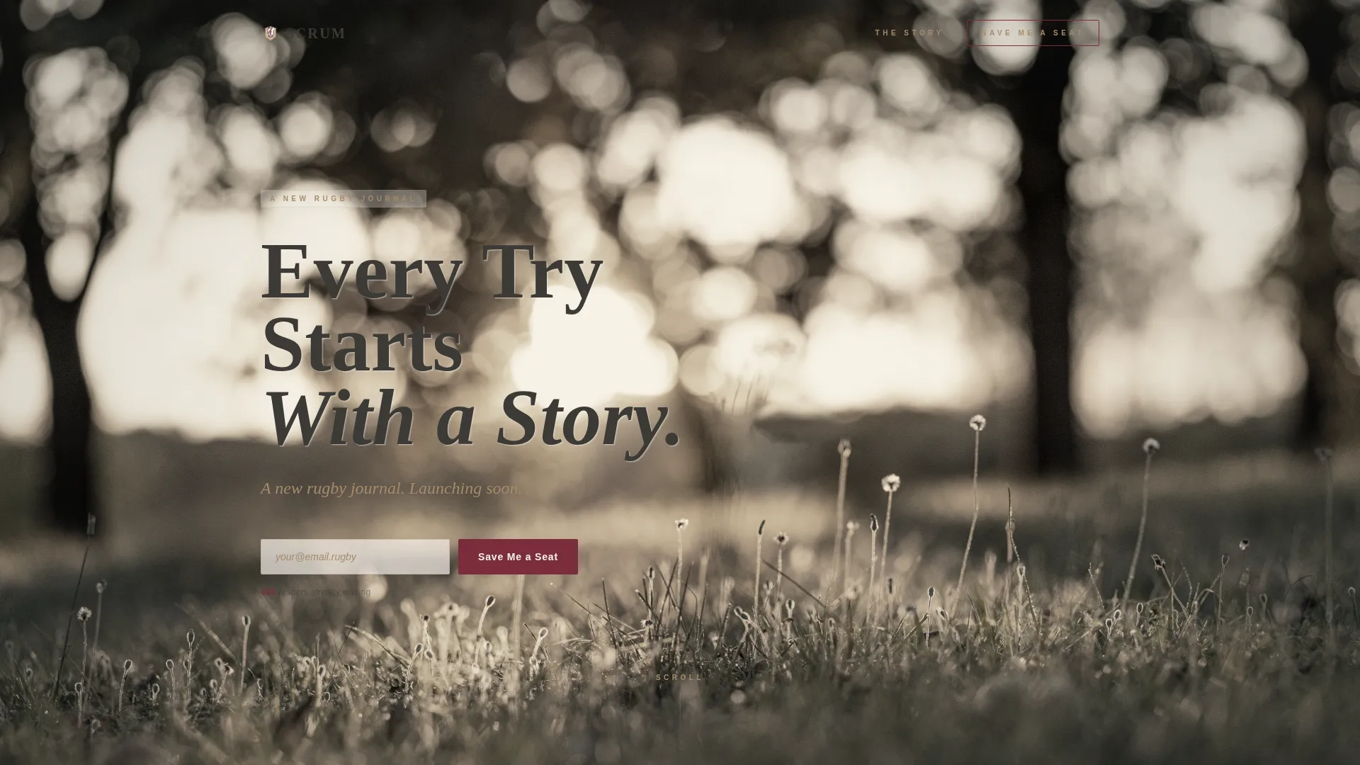
The hero section places a heavyweight serif headline directly over a grainy, desaturated golden-hour pitch photograph. The headline uses a subtle parchment text-shadow to lift the type cleanly off the image without relying on a gradient overlay.
Dual Signup Call to Action
The email signup field appears twice. A soft first instance sits directly below the hero subline for visitors who are immediately sold. The anchored second instance arrives after the origin story, where emotional buy-in is at its peak.
Signup Counter with Social Proof
A small counter below the signup form displays the current number of waitlist subscribers. The default state reads "430 readers already waiting," giving new visitors a reason to join without applying pressure.
Scroll Animation and Section Reveals
Sections animate into view using scroll-triggered transitions. Word reveals and image zoom-on-hover effects add depth and pacing without making the page feel heavy or distracting.
Warm Artisan Typography Pairing
Headlines are set in Cormorant Garamond for a broadsheet editorial feel. Body text and labels use DM Sans for clean readability. The combination feels considered and premium without being cold.
Page sections overview
| Section | Purpose |
|---|---|
| Hero with headline | Establishes the blog's voice and captures early signups |
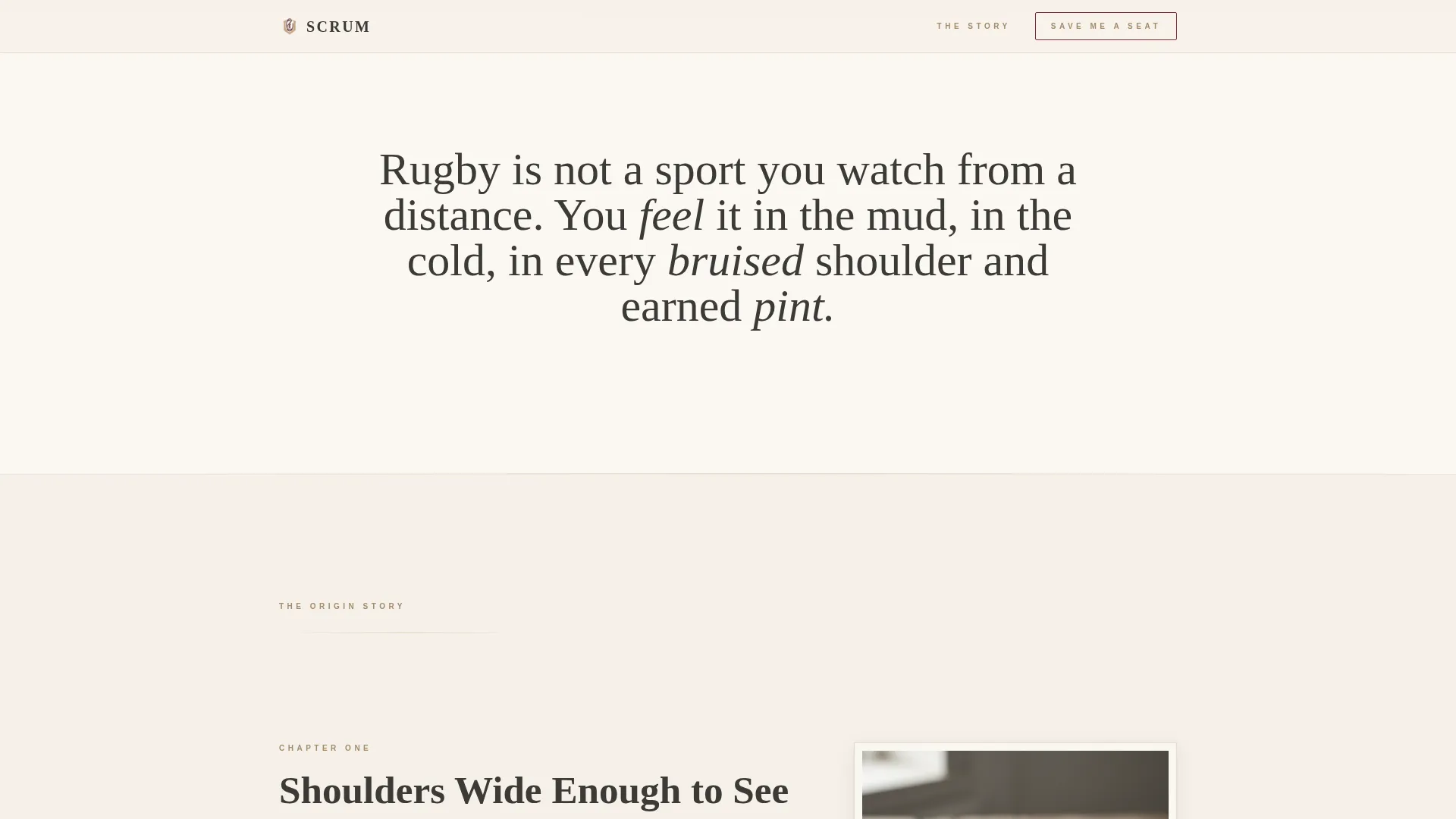
| Childhood memory grid | Opens the origin story with a torn ticket artefact and narrative text |
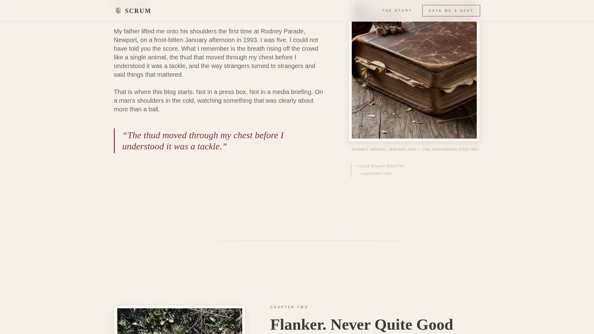
| Playing years grid | Continues the founder's story with a muddy boot image and body copy |
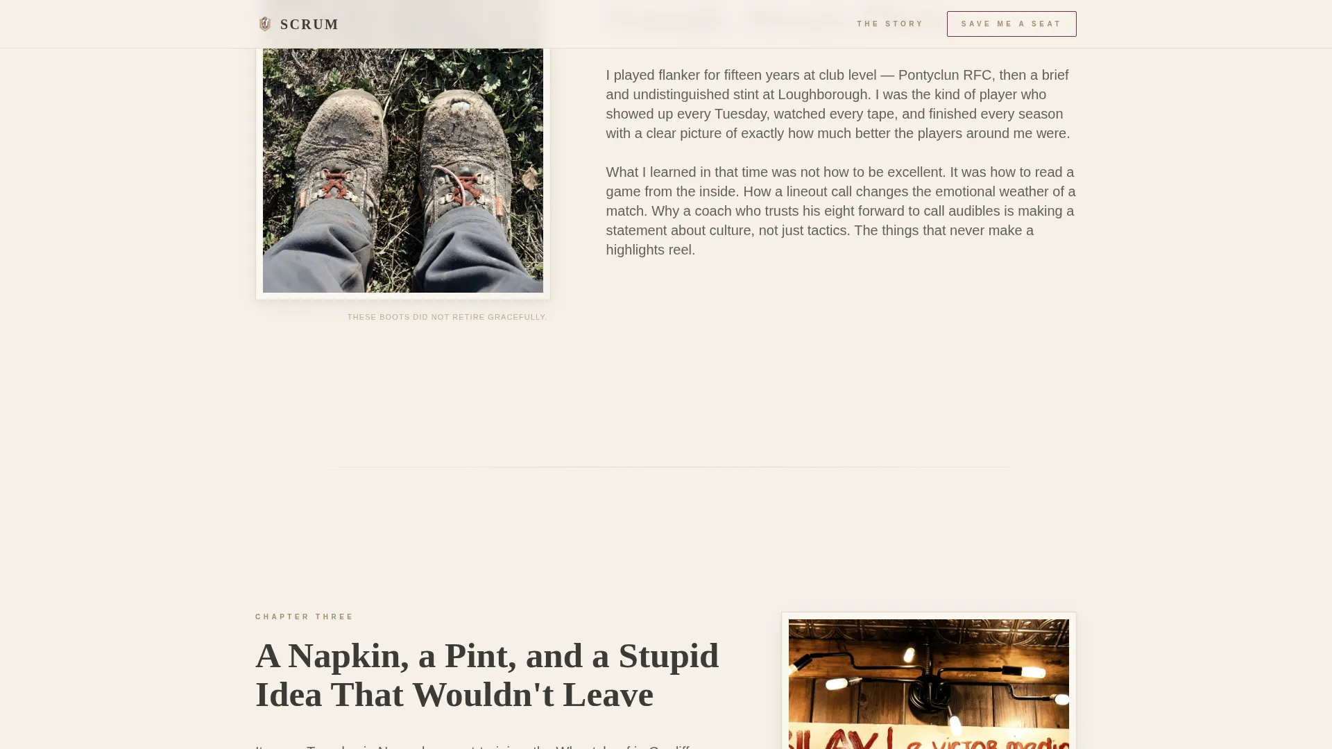
| The moment grid | Crystallises the blog idea with a tactics napkin and emotional narrative |
| Final signup block | Anchors the conversion with a full-width email form and signup counter |
| Footer | Provides minimal closing context using a horizontal flow pattern |
Design & branding system
The visual identity uses a Cloud Canvas color system built around four tones that feel warm, textured, and intentional. Nothing here looks like a standard tech template.
- Parchment (#F5F0E8) covers backgrounds; washed charcoal (#3B3A36) carries all body text; muted clay (#A68B6B) warms dividers and secondary type
- Quiet burgundy (#7B2D3B) is reserved sparingly for links, buttons, and pull quotes so every instance feels deliberate
- Cormorant Garamond drives the headline hierarchy with serif weight; DM Sans handles body and label copy for contrast and legibility
Mobile & speed optimization
The template is designed desktop-first but adapts cleanly to smaller screens. Layout and performance choices reflect a static, minimal-JavaScript approach described in the project brief.
- The hero uses a static image to avoid render-blocking media on load
- Intersection Observer drives scroll animations without heavy animation libraries
- The 60/40 grid stacks into single-column blocks on mobile, keeping narrative flow intact
How this template helps you convert
Every structural decision on this page serves the single goal of getting a visitor to submit their email. There are no secondary paths, no navigation menus leading elsewhere, and no competing calls to action.
- The origin story sections build trust and emotional investment before the final signup appears, so visitors arrive at the form already engaged
- The signup counter provides passive social proof, making the decision to join feel low-risk and validated by others
- Placing the call to action twice means both early converts and slower readers are captured at the moment they are most ready
Other information about this template
This template is well suited to editorial projects that prioritise voice and community over product launches or service pages. A few additional details worth noting are listed below.
- The page uses English in a UK/US hybrid register, making it comfortable for both British club audiences and North American expat readers
- The footer follows a horizontal flow pattern that stays minimal and does not compete with the primary conversion goal
- The mock submit interaction on the email form allows for demonstration and preview purposes before connecting a live email list
- No navigation menu is included by design; the page is a linear, scroll-led experience from header to signup
Theme
Warm Artisan
Creative direction
Origin Story
Color system
Cloud Canvas
Style
Asymmetric Grid (60/40)
Direction
Waitlist/Coming Soon
Page Sections
Asymmetric 60/40 Grid Layout
Type Over Image Hero Section
Dual-placement Email Signup
Waitlist Signup Counter
Scroll-triggered Animations
Warm Artisan Typography Pairing
Related questions
Can I change the signup counter number?
Does this template work for a blog that is already live?
Can I replace the artefact images with my own photos?
Is there only one type of call to action on this page?
Can I edit the headline and origin story text?



