Hobby & Passion Content Advanced Pre-Launch Website Template
Temper is a single-column waitlist landing page built for a home chocolatier blog and community. It tells a day-in-the-life chocolate-making story across five scroll sections, guiding visitors from bean sourcing through tempering to a waitlist sign-up form. The Ink and Paper visual identity, hand-drawn SVG illustrations, and journal-style typography give the page an unhurried, craft-first personality.
by Rocket studio
Quick summary
Temper is a waitlist landing page template for a chocolate-making hobby blog and community. It unfolds as a single scrolling narrative, from sourcing beans to mastering the temper, and converts visitors through a sense of belonging rather than urgency. The design is quiet, editorial, and built around typographic craft.
Who this template is for
This template is made for creators launching a craft-focused blog or community who want their landing page to feel like a piece of writing, not a sales pitch. It suits anyone building a waitlist around a slow, passionate hobby.
- Home chocolatiers and bean-to-bar hobbyists launching a community or newsletter
- Hobby bloggers in artisan or craft niches who want an editorial, journal-style presence
- Weekend makers and retired craft enthusiasts building an early audience before launch
What problem this template solves
Most waitlist templates feel transactional. They ask for an email before they give a reason to care. For a craft community rooted in patience and process, that approach feels wrong. This template builds trust first by telling the story, then asking for the sign-up.
- Visitors leave without joining because the value is never made tangible or personal
- Generic countdown-style pages cannot convey the texture and warmth of a craft-led brand
- A hobby audience needs to feel seen before they are willing to hand over their email
What you get with this template
You get a fully structured, single-column landing page with five distinct scroll sections, two waitlist call-to-action placements, and a footer. Every section is a scene in a morning of making chocolate, written as a journal narrative that deepens rather than escalates.
- A typographic newspaper masthead hero with an italic editor's note and hand-drawn SVG cocoa pod illustration
- Two inline waitlist forms (first name and email only), a live member counter, and a secondary PDF download call to action
- Five narrative sections covering the hero, bean sourcing, roasting, the community and tempering moment, and a closing journal entry
Feature list
This section describes the core built-in components and design capabilities included in the Temper template.
Newspaper Masthead Hero
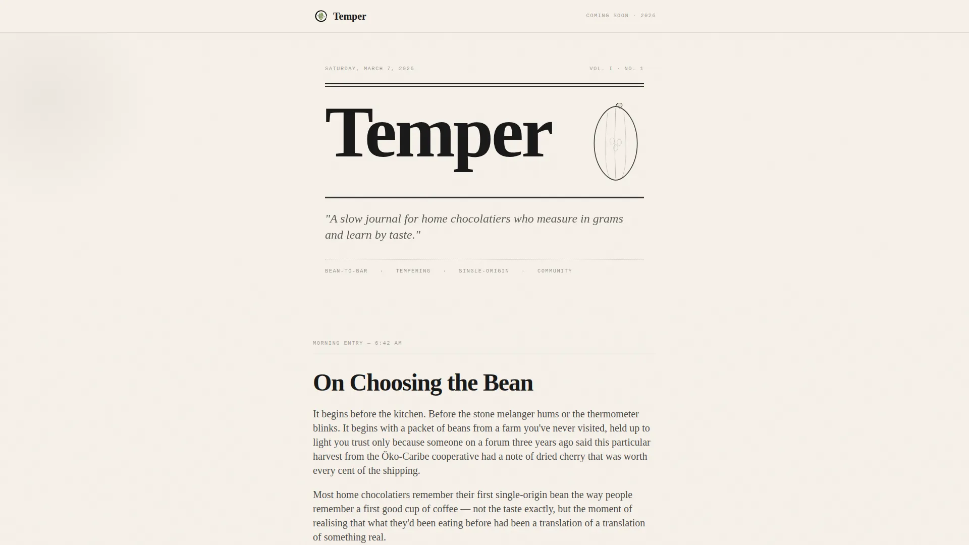
The hero is a typographic composition styled like the front page of a small-batch artisan broadsheet. The community name is set in a large serif display face, paired with a hand-drawn SVG cocoa pod illustration and a single italic subheadline reading like an editor's note. No photography is used. Generous whitespace makes the letterpress-style type the sole focal point.
Day-in-the-Life Narrative Flow
The page unfolds as a morning journal, moving through sourcing, roasting, tempering, and a closing entry. Each section is a scene rather than a feature block. The structure deepens the reader's connection with the subject before any call to action appears, making the eventual sign-up feel like a natural next step.
Dual Waitlist Call-to-Action Placement
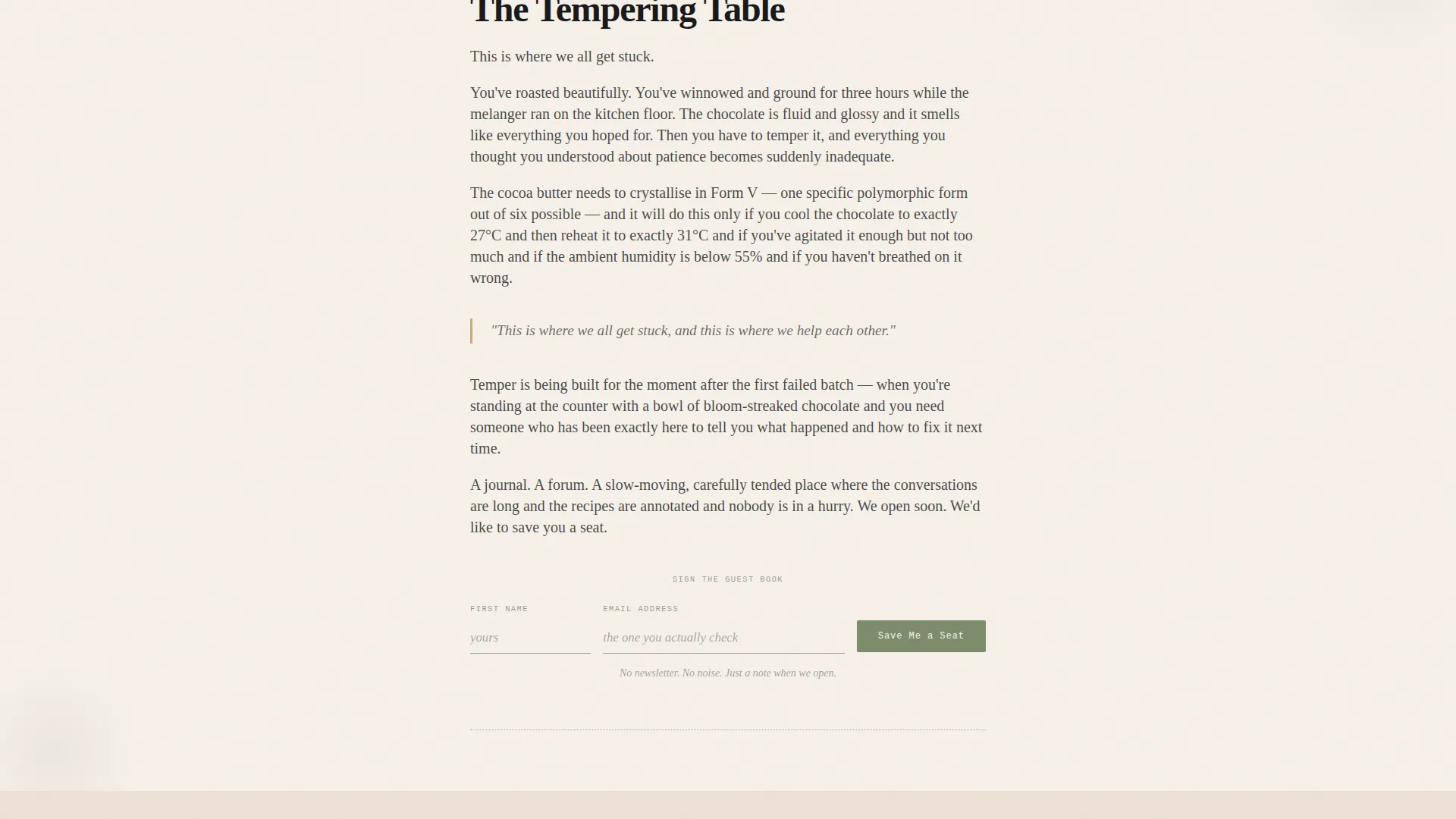
Two waitlist form placements are built into the page. The first appears mid-scroll after the community is introduced in the tempering section. The second appears at the bottom beside the closing journal entry. Each form collects only a first name and email, presented as a single inline row styled like signing a guest book.
Live Member Counter
A live counter below the waitlist form displays how many home chocolatiers have already joined the waitlist. The counter includes a subtle animation and reinforces a sense of community belonging before the platform even opens.
PDF Download Secondary Path
Below the primary waitlist form, a secondary call to action invites visitors to download the inaugural blog post on single-origin tempering as a PDF. This gives impatient visitors an immediate value exchange while keeping the waitlist as the main conversion goal.
Hand-Drawn SVG Illustrations
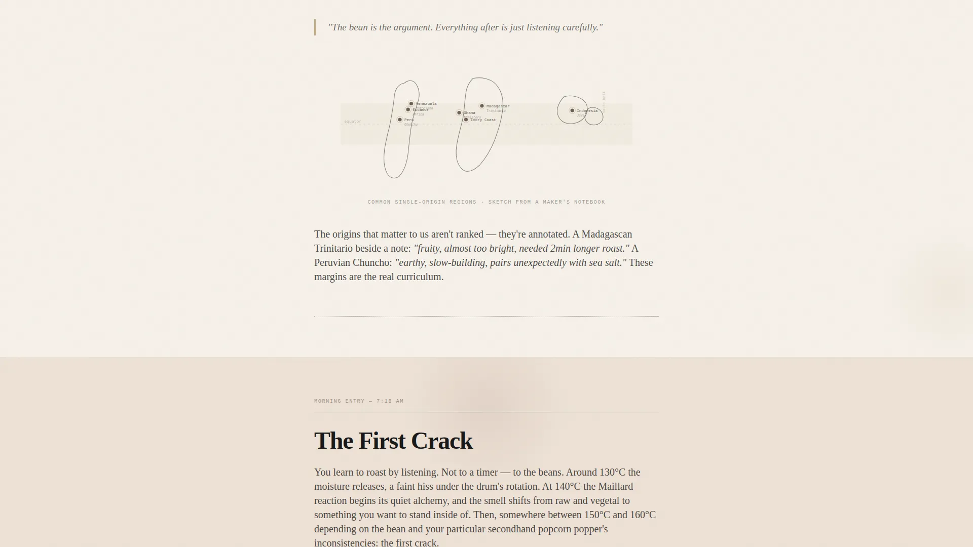
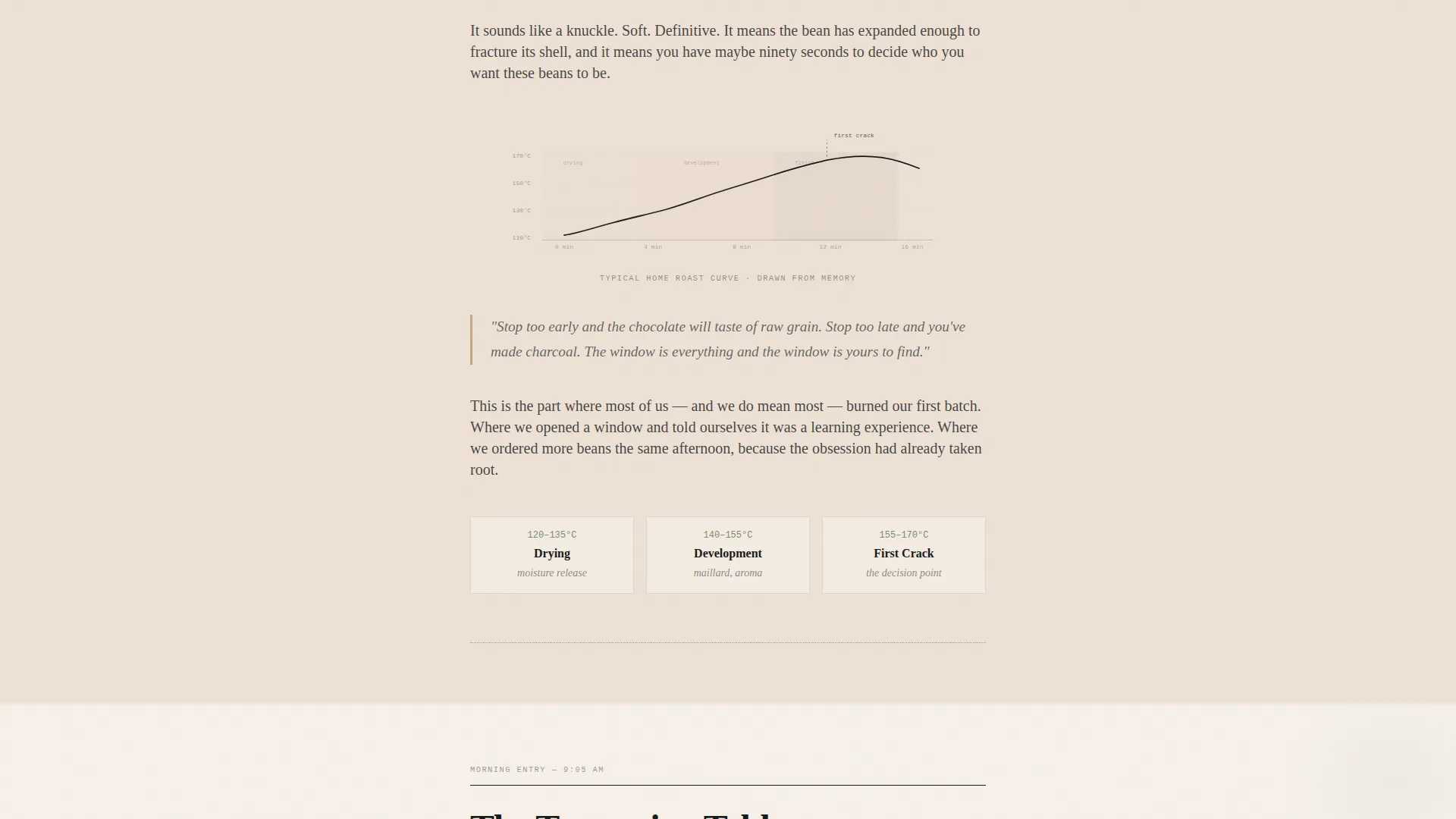
Two hand-drawn SVG illustrations are built into the page: a cocoa pod in the hero section and an origin map in the sourcing section. A minimal sumi-ink temperature curve SVG appears in the roasting section. These illustrations reinforce the handmade, journal aesthetic without relying on photography.
Page sections overview
| Section | Purpose |
|---|---|
| Hero Masthead | Establish brand voice with typographic broadsheet hero and editor's note |
| Bean Sourcing | Journal passage about choosing origins, paired with hand-drawn SVG origin map |
| Roasting Passage | Sensory prose about the roasting process, beside a sumi-ink temperature curve |
| Community and Tempering | Introduces the community with waitlist call-to-action form and live counter |
| Closing Journal Entry | Final narrative paragraph with second waitlist form and PDF download link |
| Minimal Footer | Single-row linear footer with essential links |
Design & branding system
The visual identity follows an Ink and Paper theme inspired by a Japanese Zen color system. The palette feels like a handmade chocolate box wrapped in unbleached paper: nothing shouts, everything breathes. Backgrounds alternate between washi cream and soft cacao tones. Text lives almost entirely in sumi ink. The muted matcha accent appears only on interactive elements, so every button feels like a quiet nod rather than a demand.
- Color palette: washi cream (#F5F0E8) for backgrounds, sumi ink (#1A1A1A) for text, roasted cacao (#3B2314) for accents, and muted matcha (#7D8C6C) reserved for buttons and interactive highlights
- Typography: Fraunces for the display serif hero, Crimson Text for body prose, and JetBrains Mono for labels and datelines
- Animations include staggered fade-in-up entrances, an ink-spread blob effect, a counter animation, and a floating card effect for depth
Mobile & speed optimization
The template is built desktop-first with a single-column layout that stacks gracefully on smaller screens. The generous whitespace and linear scroll structure mean the reading experience translates directly to mobile without restructuring.
- Single-column flow stacks cleanly on mobile with no horizontal overflow or layout shifts
- Static sections use server-rendered components; interactive elements such as the counter and animations are handled client-side
- SVG illustrations scale fluidly across screen sizes without quality loss
How this template helps you convert
This template converts by making visitors feel they have found their community before they are ever asked to join it. The narrative does the persuasion work; the form just collects the result.
- The day-in-the-life story builds genuine emotional investment across multiple scroll sections, so by the time the first call-to-action appears, visitors are already aligned with the community's identity.
- The dual form placement and live member counter create two natural conversion moments without adding pressure, and the PDF download offers an alternative path for visitors who want proof before committing.
Other information about this template
This template is a strong fit for any artisan or craft-hobby creator who wants a coming-soon page that stands apart from standard countdown timers and generic waitlist builders. It is built to be customized for other slow-hobby niches beyond chocolate making.
- The editorial tone and journal structure make it adaptable for fermentation blogs, ceramics communities, natural dye studios, or any craft niche that values process over speed
- The template includes a mock waitlist form submission, a PDF download link, and a live counter interaction out of the box
- Typography choices (Fraunces, Crimson Text, JetBrains Mono) are all available as web fonts and can be swapped to match a different brand voice
- The footer follows a Pattern 1 linear single-row layout, keeping the close of the page as minimal and unhurried as the rest of the scroll
Theme
Ink & Paper
Creative direction
Day-in-the-Life
Color system
Japanese Zen
Style
Single Column Flow
Direction
Waitlist/Coming Soon
Page Sections
Newspaper Masthead Hero
Day-in-the-life Narrative Structure
Dual Waitlist Form Placement
Live Member Counter
PDF Download Secondary Path
Built-in Hand-drawn SVG Illustrations
Related questions
What kind of project is this template designed for?
How many call-to-action placements does the template include?
Can I adapt this template for a craft niche other than chocolate making?
What does the waitlist form collect from visitors?
Do I need to provide my own artwork or illustrations?



