Senior Care Blog & Media Pre-Launch Website Template
Tend is a pre-launch landing page template designed for a senior caregiving how-to blog. It combines a cinematic looping video header, a scroll-driven 60/40 origin story, and a warm Ink and Paper visual identity to earn visitor trust before presenting a simple waitlist signup. The "Save Me a Seat" form collects first name and email only.
by Rocket studio
Quick summary
Tend is a single-page waitlist template built for a senior caregiving blog. It opens with an intimate looping video header, moves through a scroll-linked founder origin story, and closes with a minimal waitlist form. The design uses warm parchment tones and serif typography to feel personal rather than clinical. Visitors feel seen before they are ever asked to sign up.
Who this template is for
This template fits founders, writers, and publishers preparing to launch a caregiving-focused blog or content platform. It is especially suited to creators who want to build an audience before their first piece goes live.
- Adult caregiving advocates, hospice-trained writers, or geriatric social workers launching an editorial brand
- Content founders running a pre-launch campaign who need emotional resonance, not feature lists
- Bloggers in the senior care how-to space who want a waitlist page that qualifies readers through storytelling
What problem this template solves
Most coming-soon pages feel cold. They announce a launch date and ask for an email with nothing in return. Caregiving audiences in particular are time-poor, emotionally stretched, and skeptical of generic advice. A bare countdown page does nothing to earn their trust.
- Visitors arrive with no context and leave without signing up because the page never made them feel understood
- Founders struggle to communicate authority and warmth at the same time, especially on a pre-launch budget
- A single-section form page cannot carry the emotional weight needed to convert a caregiver who is already overwhelmed
What you get with this template
You get a fully structured single-page layout with five distinct sections, each doing specific conversion work. The layout is asymmetric throughout, using a 60/40 column split that gives narrative content the space it needs while keeping visual artifacts close and readable.
- A short-form video hero section with a serif fade-in tagline overlay
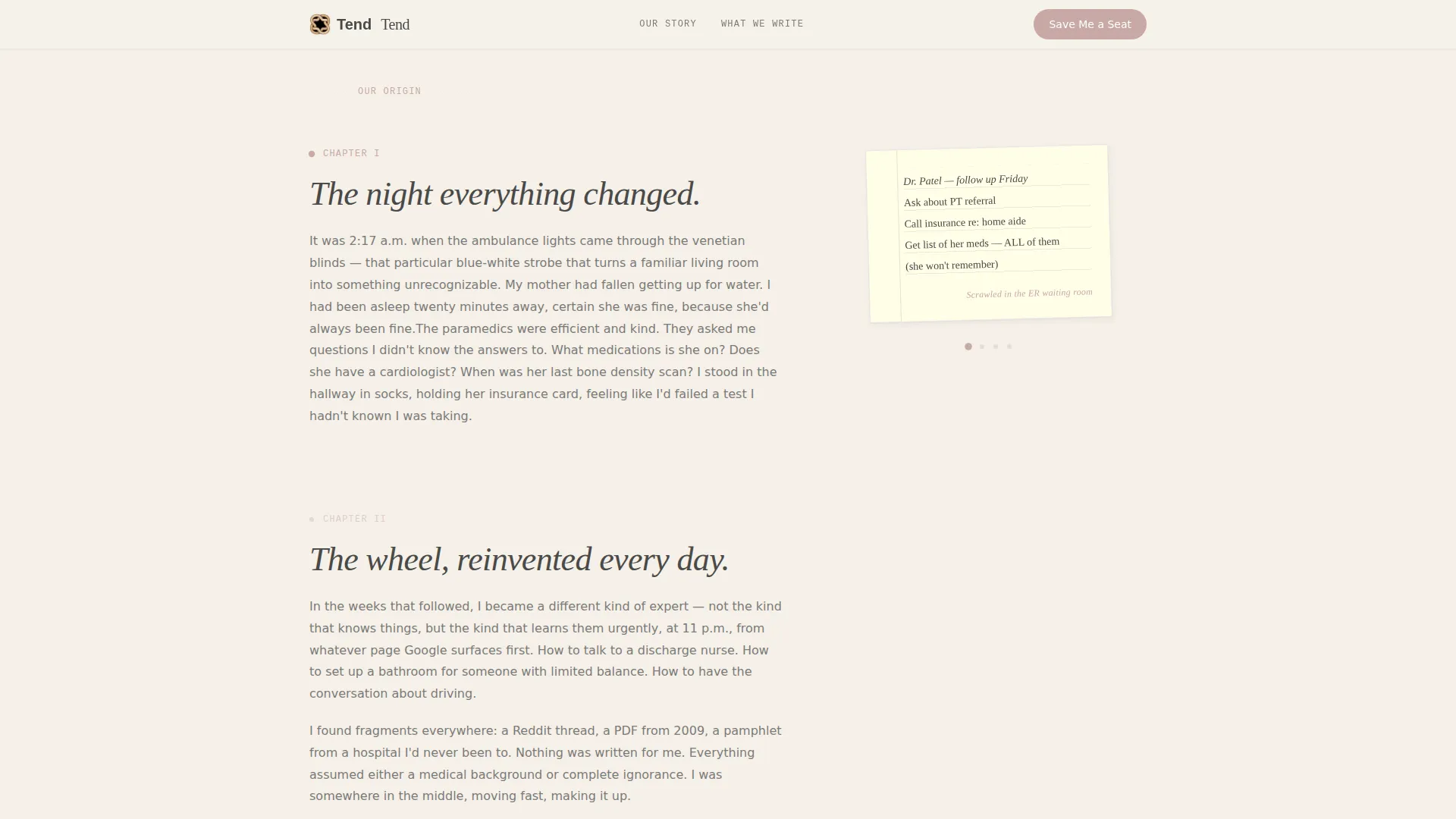
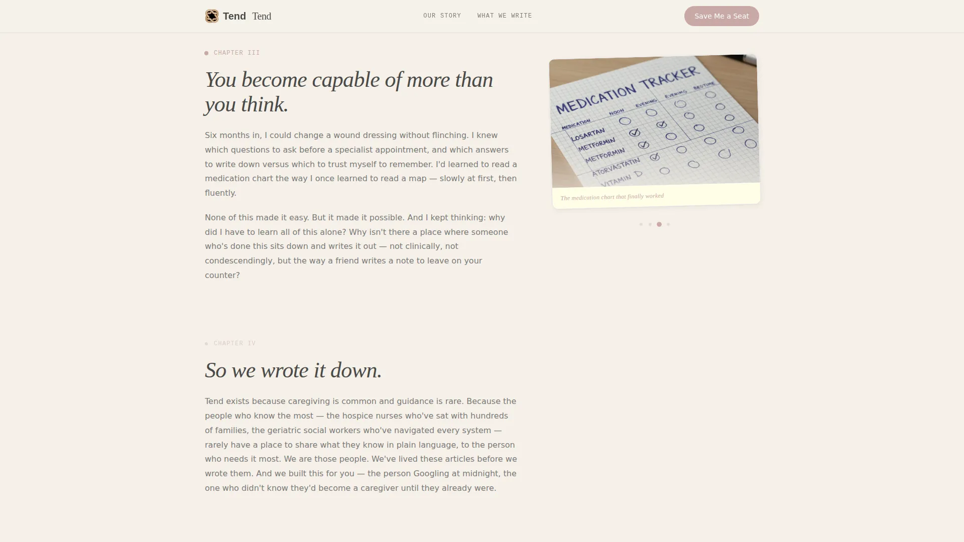
- A scroll-driven origin story section with shifting right-column artifacts such as a scanned notebook page, a medication chart, and a hand-drawn diagram
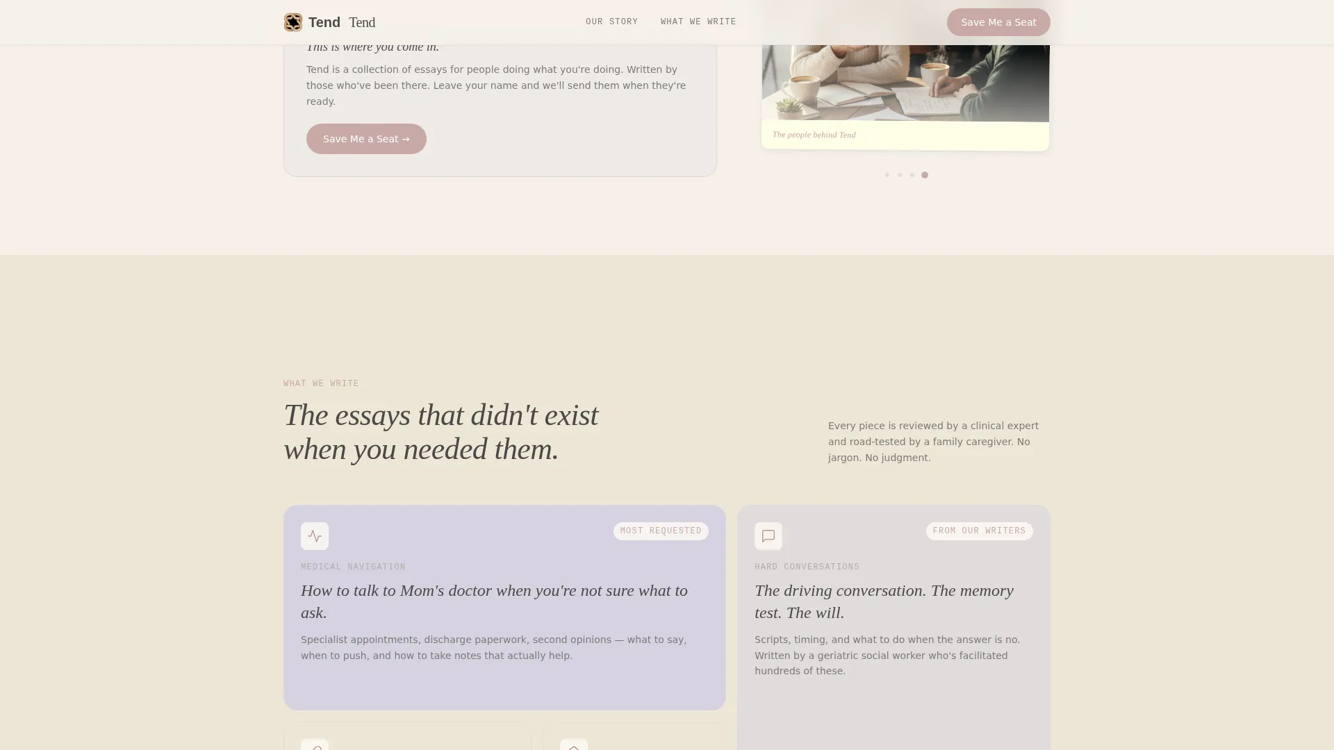
- A content topic grid, a pull-quote block, a waitlist form with a mobile fixed bar, and a linear single-row footer
Feature list
This template is built around a specific set of design and layout capabilities drawn directly from the source brief.
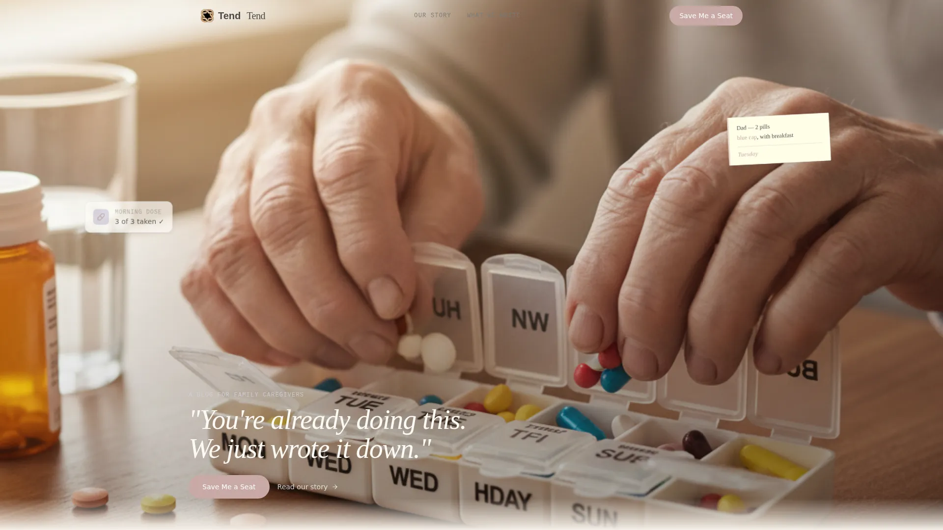
Cinematic Looping Video Header
The hero section plays a fifteen-second looping video designed to feel handheld and intimate. Natural window light and a slightly overexposed look give the footage a memory-like quality. A single serif line fades in over the final frame, setting the emotional tone immediately.
Scroll-Linked Origin Story Layout
The 60-column side carries long-form serif founder narrative across scroll chapters. The 40-column side shifts its visual artifact with each chapter, moving from a scanned notebook page to a photographed medication chart to a hand-drawn bathroom-safety diagram. The arc moves from crisis to competence to community.
Asymmetric Bento Content Grid
A dedicated section previews the blog's content topics using an asymmetric bento-style grid. This gives visitors a clear sense of what the blog will cover before it launches, reinforcing relevance for caregiving readers.
Waitlist Form with Mobile Fixed Bar
The "Save Me a Seat" form appears inline after the origin story's emotional peak. On mobile, it also appears as a fixed bottom bar so the call to action stays reachable at all times. The form asks only for a first name and email, with one optional checkbox.
Lavender Mist Pull-Quote Block
A full-width section washed in faded lavender mist carries a founder-voice pull quote. This section creates a visual and emotional pause between the story and the conversion ask, making the form feel like a natural next step rather than an interruption.
Linear Single-Row Footer
The footer follows a clean single-row pattern. It keeps the page's quiet, unhurried tone intact at the very end without adding visual noise or competing calls to action.
Page sections overview
| Section | Purpose |
|---|---|
| Video Hero Header | Opens with intimate looping footage and a serif tagline fade-in |
| Origin Story Scroll | 60/40 narrative with scroll-shifting right-column artifacts |
| Content Topics Grid | Asymmetric bento preview of planned blog subject areas |
| Founder Pull Quote | Lavender mist wash section carrying a founder-voice statement |
| Waitlist Call to Action | "Save Me a Seat" form plus a mobile fixed bottom bar |
| Linear Single-Row Footer | Clean closing row with minimal links and no competing actions |
Design & branding system
The visual identity follows an Ink and Paper theme built around the Soft Mist color system. Every color choice is intentional: warm parchment creates breathing room, pencil gray keeps text readable without feeling clinical, lavender mist marks emotional pauses, and tea-rose signals every interactive moment.
- Parchment (#F5F0E8) dominates all backgrounds, lavender mist (#D6D2E0) washes over dividers and pull-quote blocks, and tea-rose (#C9A9A6) marks links and interactive surfaces
- Typography uses Fraunces for serif headings, DM Sans for body text, and JetBrains Mono for labels and captions
- The overall aesthetic feels like a well-loved journal: pages slightly yellowed, margins softly annotated, with no sharp edges or high-contrast urgency
Mobile & speed optimization
The template is designed mobile-first, which directly reflects the target audience. Caregivers frequently search for help on phones, often late at night or between tasks. Every layout decision prioritizes that reality.
- The waitlist form reappears as a fixed bottom bar on mobile so the signup call to action is always one tap away
- The layout uses static-first rendering with client-side interaction reserved only for the waitlist form and scroll-triggered chapter shifts
- CSS keyframe animations and scroll-linked reveals keep motion purposeful without relying on heavy scripts
How this template helps you convert
This template earns the signup before it asks for one. The origin story does the qualifying work so the form feels like joining a conversation already in progress rather than responding to a marketing prompt.
- The looping video and serif tagline create immediate emotional recognition, signaling to caregiving visitors that this space was built for them specifically
- The scroll-linked origin story moves visitors from crisis to competence to community, so by the time the inline form appears they already feel understood and invested
- The minimal form (first name, email, one optional checkbox) and the reassuring line "First essays ship when they're ready, not when they're scheduled" remove friction and pressure at the moment of conversion
Other information about this template
This template is part of a broader Blog and Editorial category designed for content-first brands in the Senior Care Blog and Media subcategory. It is suited to the Senior Care How-To Blog niche, where credibility and emotional connection matter more than feature density.
- The template style is an Asymmetric Grid with a 60/40 column split, the creative direction is an Origin Story, and the header concept is a Short-Form Reel
- The landing page direction is Waitlist and Coming Soon, making it ideal for pre-launch email list building in the caregiving content space
- Writers or founders using this template can lean into the Ink and Paper theme to differentiate their brand from clinical health sites and generic lifestyle blogs
Theme
Ink & Paper
Creative direction
Origin Story
Color system
Soft Mist
Style
Asymmetric Grid (60/40)
Direction
Waitlist/Coming Soon
Page Sections
Cinematic Looping Video Header
Scroll-linked 60/40 Origin Story
Asymmetric Bento Content Grid
Waitlist Form with Mobile Fixed Bar
Founder Voice Pull-quote Block
Linear Single-row Footer
Related questions
Is this template designed for a blog that hasn't launched yet?
What does the waitlist form ask for?
How does the scroll-linked origin story section work?
Does this template work well on mobile devices?
Can I customize the color palette or typography for my own brand?



