Graduate School Blog Landing Page Template
Thesis is a cinematic editorial landing page for a graduate school blog. It guides prospective applicants through a narrative scroll from morning research to evening decision, using a Day-in-the-Life structure, an asymmetric 60/40 grid, and a six-step personalized program-finder quiz. The design blends deep black, warm parchment, and editorial red into a Moleskine-meets-film-still aesthetic.
by Rocket studio
Quick summary
Thesis is a single-page graduate school blog landing page built around a cinematic dark editorial aesthetic and a Day-in-the-Life narrative scroll. The layout uses an asymmetric 60/40 grid that shifts across three story acts: morning research, afternoon preparation, and evening decision. A six-step progressive quiz helps visitors find their best-fit graduate program before anything is asked in return.
Who this template is for
This template is built for anyone running a graduate school content platform or editorial blog aimed at prospective applicants. If your audience is self-researching late at night, drafting personal statements on lunch breaks, or navigating the process without a guide, this page speaks directly to them.
- Graduate school bloggers and content creators covering admissions, funding, and academic life
- Education platforms targeting junior undergrads, career-switchers, and first-generation applicants
- Independent advisors or communities publishing honest, experience-led graduate school resources
What problem this template solves
Prospective graduate students have no shortage of anxiety, but they often have a shortage of honest, practical content presented in a format that respects their intelligence and their timeline. Generic blog layouts feel corporate and cold when the subject matter is deeply personal.
- Readers land on a page that feels emotionally disconnected from their actual experience
- Important content like funding explanations and acceptance statistics gets buried or lost in flat layouts
- There is no structured way to move a first-time visitor from passive reading to taking a real next step
What you get with this template
You get a fully structured, single-page editorial layout designed to guide a visitor through a complete narrative arc. Every section is intentional, from the full-bleed hero to the quiz module at the climax of the scroll.
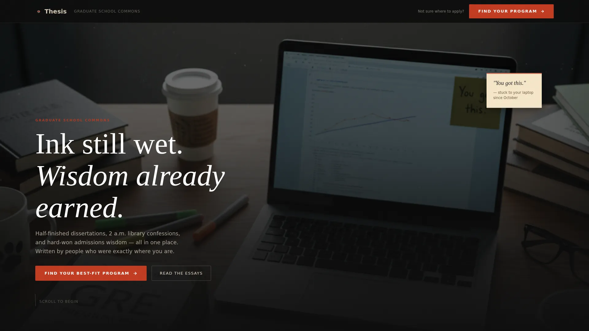
- A full-bleed hero with cinematic desk photography, serif headline, and a floating sticky-note detail
- An asymmetric 60/40 grid that reverses direction across the morning and afternoon narrative acts
- A six-step progressive quiz modal with a progress bar, reading path results, and an email-gated downloadable checklist
Feature list
This template is built around a tightly scoped set of features, each grounded in what the source brief specifies.
Full-Bleed Cinematic Hero
The hero uses a shallow depth-of-field desk photograph as its backdrop. A cinematic dark overlay frames a serif headline that fades in over the image. A floating sticky note reading "You got this." acts as the emotional anchor for the entire page.
Asymmetric 60/40 Editorial Grid
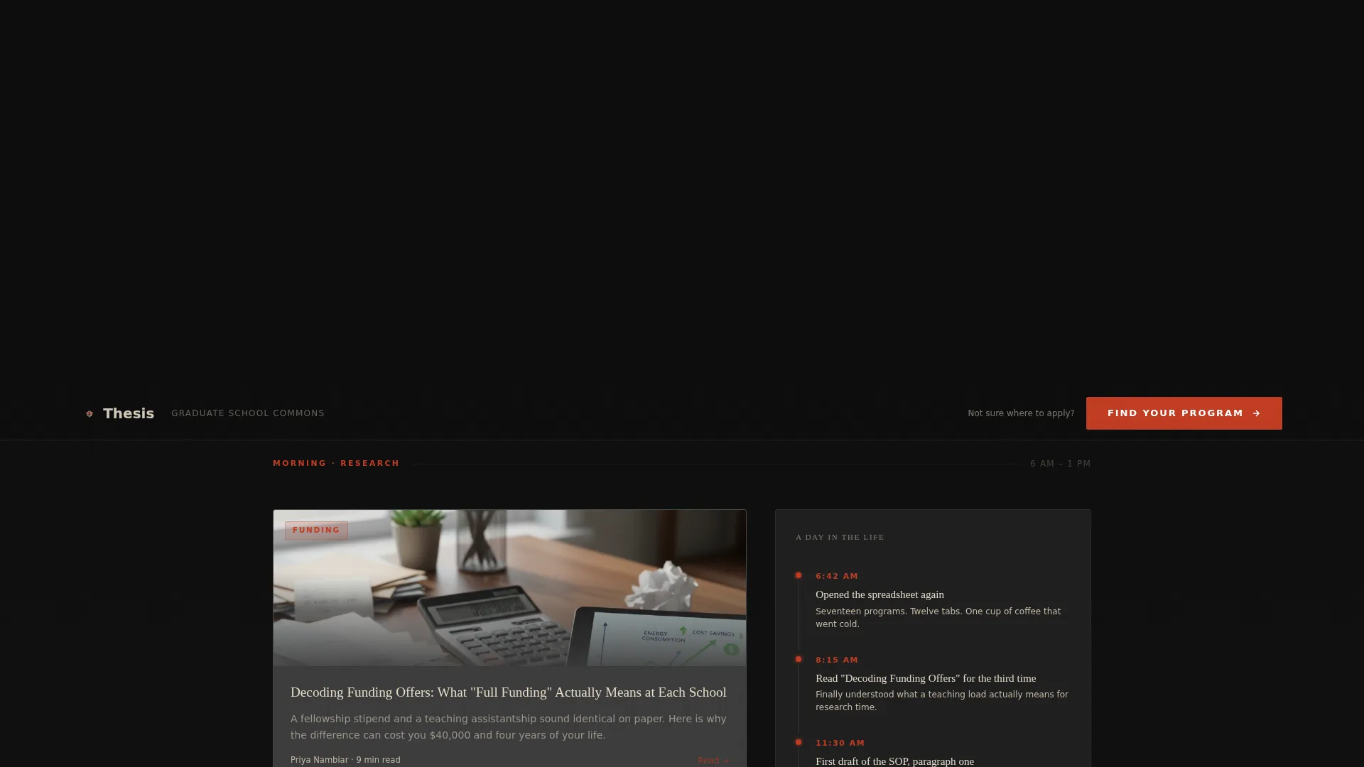
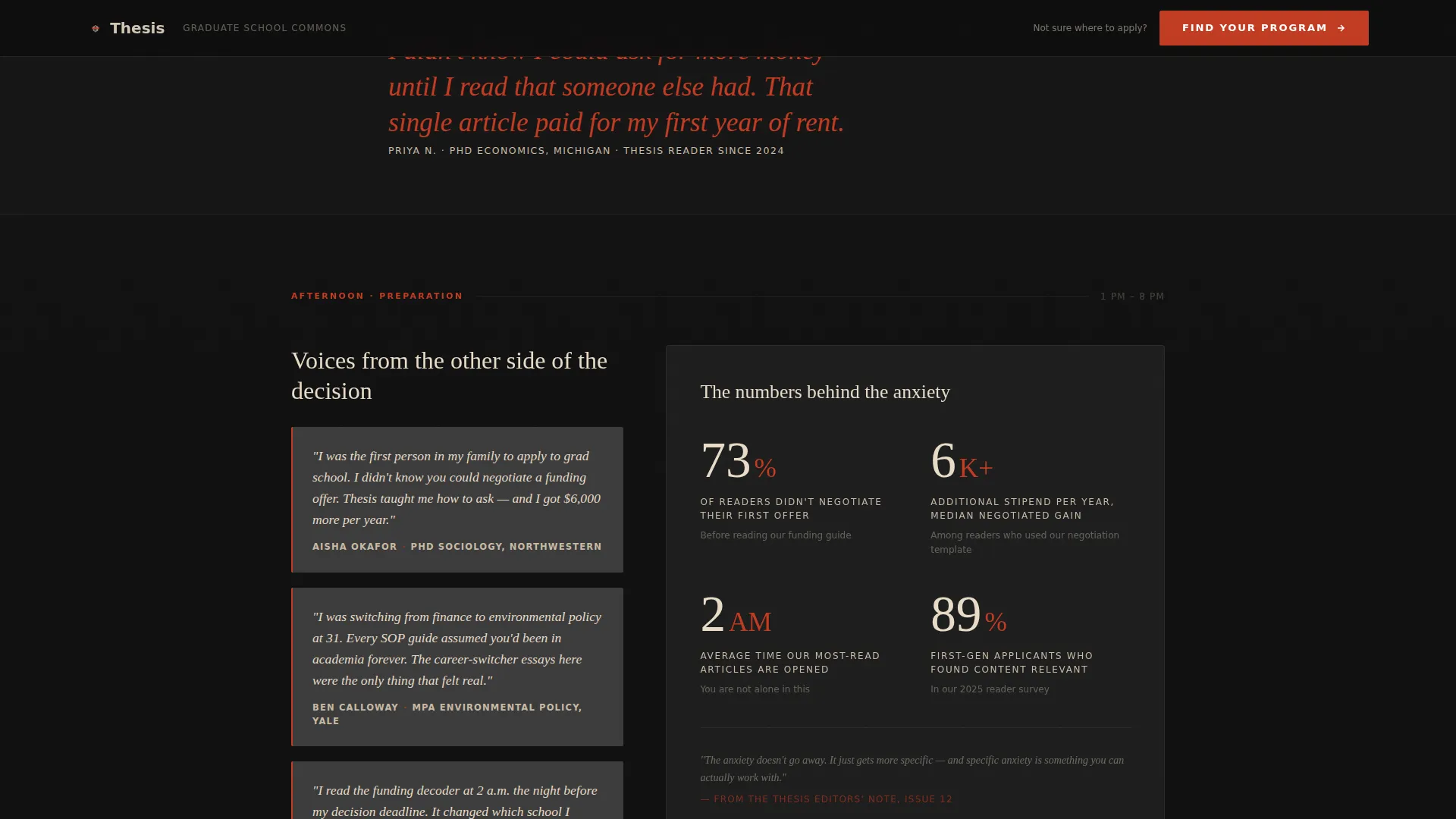
The morning section places blog article cards on the wider 60-column side and a vertical timestamp timeline on the 40-column side. In the afternoon act, the grid flips. This deliberate reversal creates visual rhythm and mirrors the shifting pace of an application day.
Day-in-the-Life Narrative Scroll
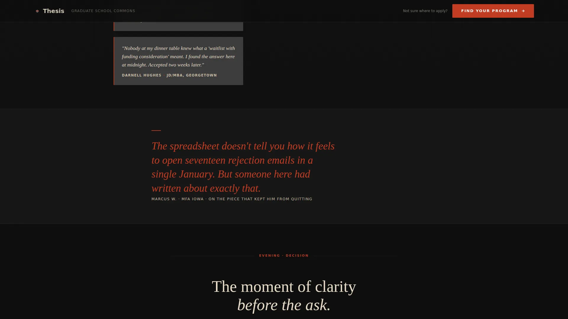
The page is structured as a single applicant's timeline moving from dawn uncertainty to midnight submission. Section transitions are scroll-linked. Each act concludes with a red italic pull quote from someone who has been through the same journey.
Six-Step Progressive Quiz Modal
The quiz opens with a single low-friction question before progressing through degree level, timeline, funding needs, and Grade Point Average range. A progress bar in editorial red tracks each of the six steps. Results deliver three personalized blog reading paths and a downloadable checklist.
Sticky Quiz Call-to-Action Bar
After the second scroll, a subtle sticky bar appears at the top of the viewport. It prompts visitors to find their best-fit program without interrupting their reading. The full quiz module then reappears as a centered, full-width section during the evening act.
Editorial Pull Quote Separators
Red italic pull quotes punctuate each major section shift. They serve as both visual breaks and emotional beats, giving voice to someone who was once in the same position as the reader.
Page sections overview
| Section | Purpose |
|---|---|
| Hero, full-bleed | Establish cinematic tone and emotional entry point |
| Morning blog grid | Display article cards beside a vertical timestamp timeline |
| Pull quote separator | Mark the transition from research to preparation |
| Afternoon flipped grid | Show testimonials alongside a statistics panel |
| Evening single column | Narrow the layout and build toward the quiz moment |
| Quiz call to action module | Deliver the full six-step program-finder experience |
| Footer | Close with horizontal flow and supporting navigation |
Design & branding system
The visual identity follows an Ink and Paper theme executed through a Cinematic Dark color palette. Typography pairs Fraunces for editorial serif headlines with DM Sans for body text, creating a reading experience that feels both literary and legible.
- Color palette: deep lecture-hall black (#0D0D0D), warm parchment (#E8DCC8), muted graphite (#3B3B3B), and editorial red (#C23B22) reserved for links, pull quotes, and the primary call to action
- Typography: Fraunces for all headline treatments; DM Sans for body copy, labels, and supporting text
- Visual mood: Moleskine-meets-film-still, every bright element earning its place against vast institutional darkness
Mobile & speed optimization
The template is desktop-first by design, built for the midnight research sessions that define the target audience. Mobile is supported with a solid responsive layout so the narrative remains coherent on smaller screens.
- Scroll-linked section transitions use Intersection Observer reveals without relying on heavier scroll libraries
- Images are optimized and CSS scroll-behavior handles smooth scrolling natively
- The six-step quiz modal is designed so each step fits on one screen at any viewport size
How this template helps you convert
The conversion strategy is embedded in the narrative itself. Visitors are never asked for anything before they receive something of real value.
- The sticky quiz bar appears after the second scroll, creating a low-friction first touchpoint that does not interrupt reading and keeps the call to action visible throughout the page.
- The quiz delivers three personalized blog reading paths and a downloadable checklist as the result, with the email field positioned as the final step so value is demonstrated before anything is requested.
Other information about this template
This template is part of a broader editorial design direction suited to education and career content platforms. A few additional details are worth noting for anyone evaluating it for their project.
- The footer uses a horizontal flow pattern, providing clean navigation closure without heavy visual weight
- Social proof is structured as named testimonials with institution and degree details, alongside concrete statistics panels covering topics like acceptance rates and funding breakdowns
- The template is scoped for English-language, United States university context with USD references where applicable
- The intersection match between the Blog and Editorial category, Education and Career Blog subcategory, and Graduate School Blog niche produces a cohesive content-to-design alignment throughout
Theme
Ink & Paper
Creative direction
Day-in-the-Life
Color system
Cinematic Dark
Style
Asymmetric Grid (60/40)
Direction
Quiz/Assessment
Page Sections
Full-bleed Cinematic Hero
Asymmetric 60/40 Editorial Grid
Day-in-the-life Narrative Scroll
Six-step Progressive Quiz Modal
Sticky Quiz Call-to-action Bar
Value-first Email Gate
Related questions
Who is the intended audience for this landing page template?
What does the quiz do, and how does it work?
What sections are included in the page layout?
Is this template suitable for a first-generation applicant community or peer support blog?
Can I customize the colors and typography in this template?



