Heritage Frugal Living Blog Landing Page Template
Thrift is a Heritage & Story landing page template built for a frugal living blog and literary newsletter. It uses a single-column scroll with an aged parchment palette, Fraunces serif typography, and an Industry Report creative direction. The page is designed to capture waitlist signups through storytelling, a live reader counter, and two strategically placed "Save Me a Seat" call-to-action forms.
by Rocket studio
Quick summary
Thrift is a single-column landing page template designed for a frugal living blog that treats money as an inherited craft, not a listicle topic. It combines literary storytelling with a waitlist-conversion structure, moving visitors through history, data, and voice before asking for an email. The visual identity feels like a handwritten household journal, warm, unhurried, and deeply specific.
Who this template is for
This template is built for writers and creators who want their newsletter or blog to feel earned. It works best when the content itself is the product, and the goal is to build an audience before launch.
- Frugal living bloggers launching a newsletter and collecting early subscribers
- Personal finance writers who lead with story and voice rather than quick tips
- Creators building anticipation around a coming-soon editorial project
What problem this template solves
Most newsletter landing pages look interchangeable. They promise value, list bullet points, and ask for an email before earning the right to. Thrift solves a different problem: it builds trust through the writing itself, so readers sign up because they already believe in the voice.
- Generic templates fail to communicate a unique editorial identity before the form
- Tip-heavy layouts attract casual browsers but rarely convert committed readers
- Coming-soon pages often feel empty rather than building genuine anticipation
What you get with this template
You get a complete single-column landing page structured as a slow, deliberate scroll. Every section builds the case for the newsletter before the second call to action appears.
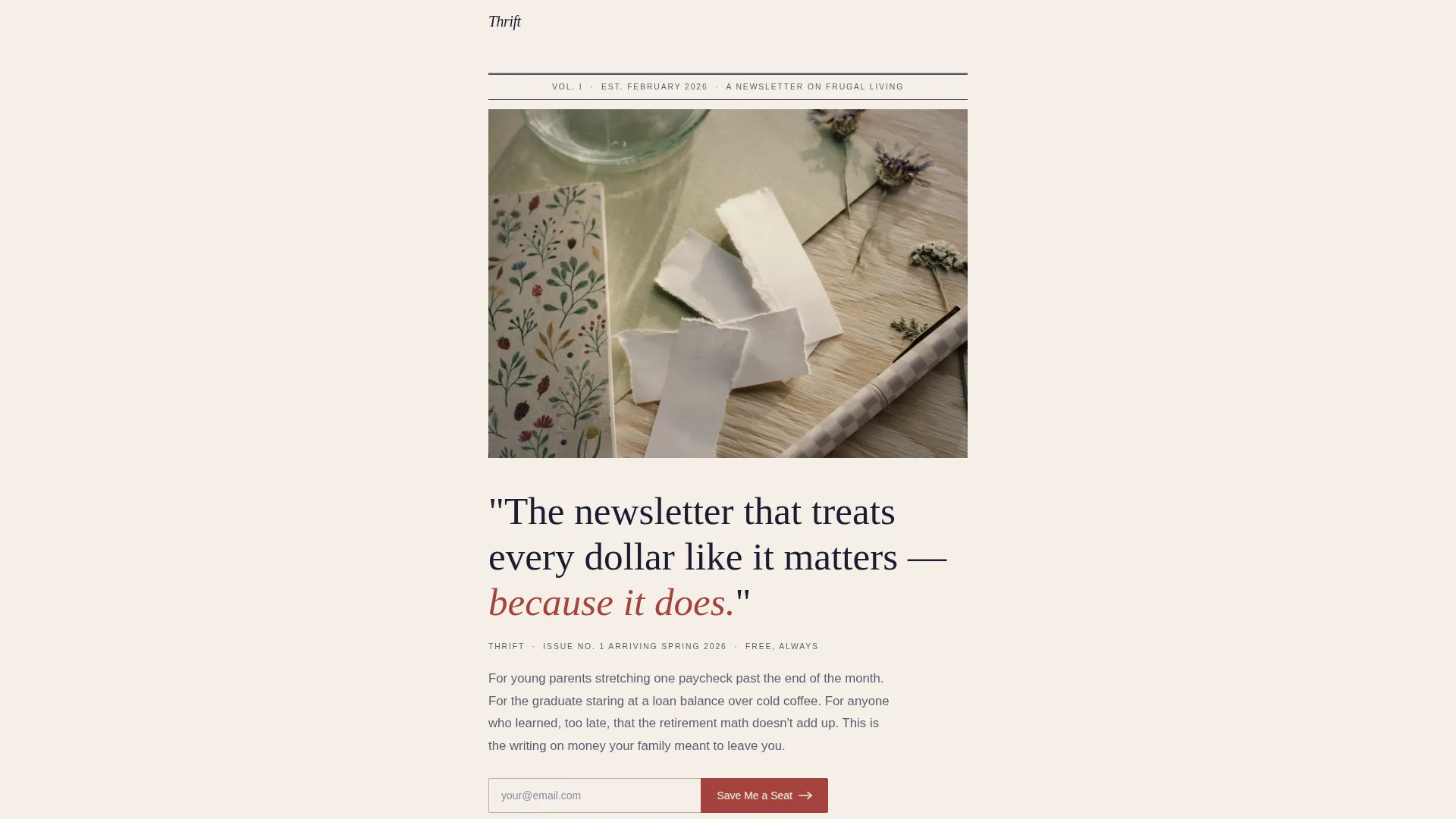
- A Half-Page Photo and Text header with a grain-textured mason jar photograph and oversized serif headline
- A full waitlist conversion flow: two "Save Me a Seat" forms, a live reader counter, and a minimal footer
- Five distinct content sections flowing from hero to origin stories to editorial table of contents to final sign-up
Feature list
This template is built around a small number of carefully chosen components. Each one serves the single goal: prove the writing is worth the wait.
Half-Page Hero with Serif Headline
The header opens with a muted, grain-textured photograph of hands holding a mason jar on a scratched wooden surface. Below it, a large Fraunces serif headline reads with unhurried confidence. A newspaper-style dateline anchors the page in a specific moment, giving it the weight of a published document rather than a promotional page.
Industry Report Statistic Section
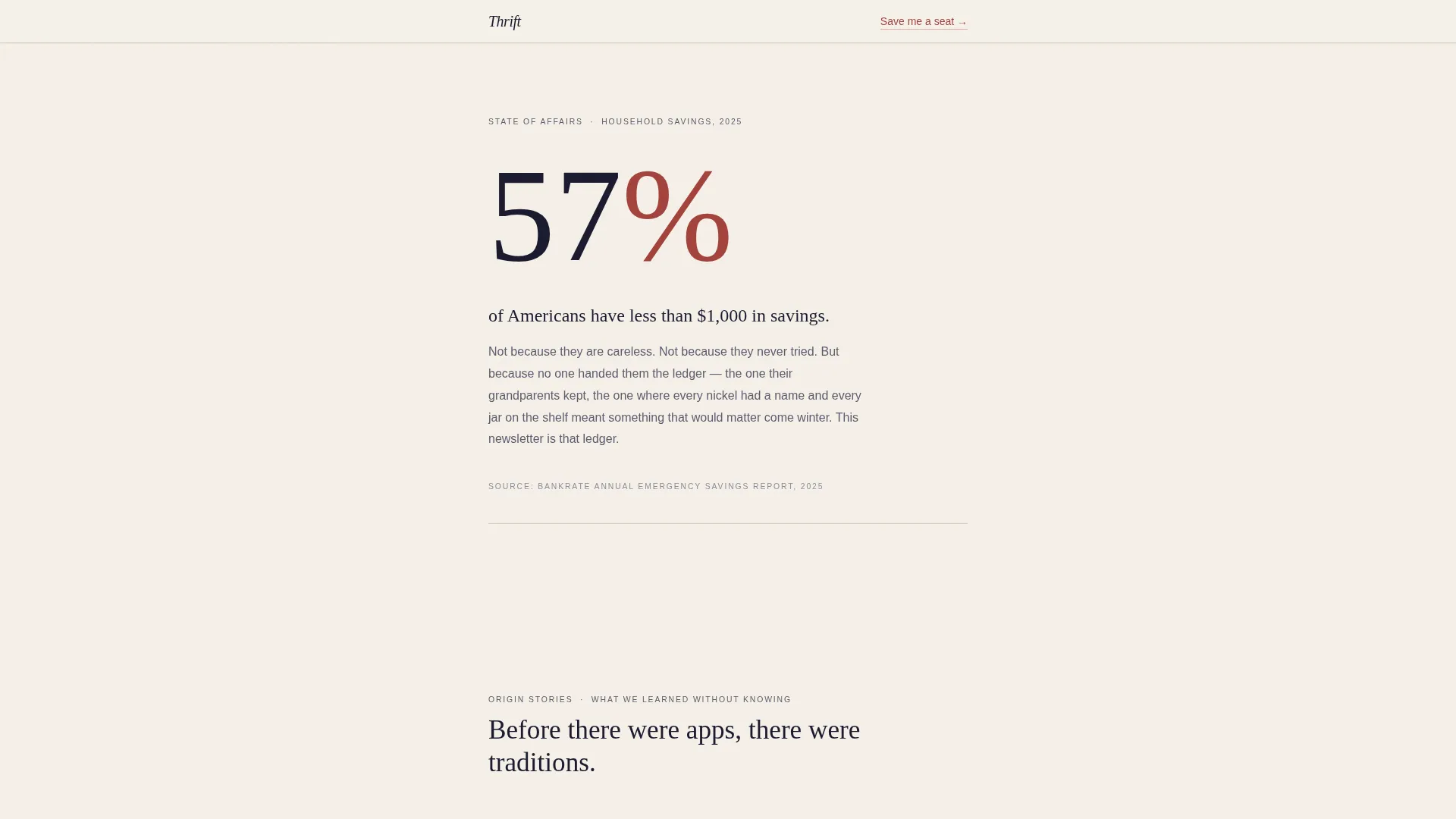
Section two renders a single, startling statistic about average American savings in oversized typography. The layout borrows from a state-of-affairs document, using scale and white space to make one number land with full force before the reader moves on.
Blockquote Origin Stories
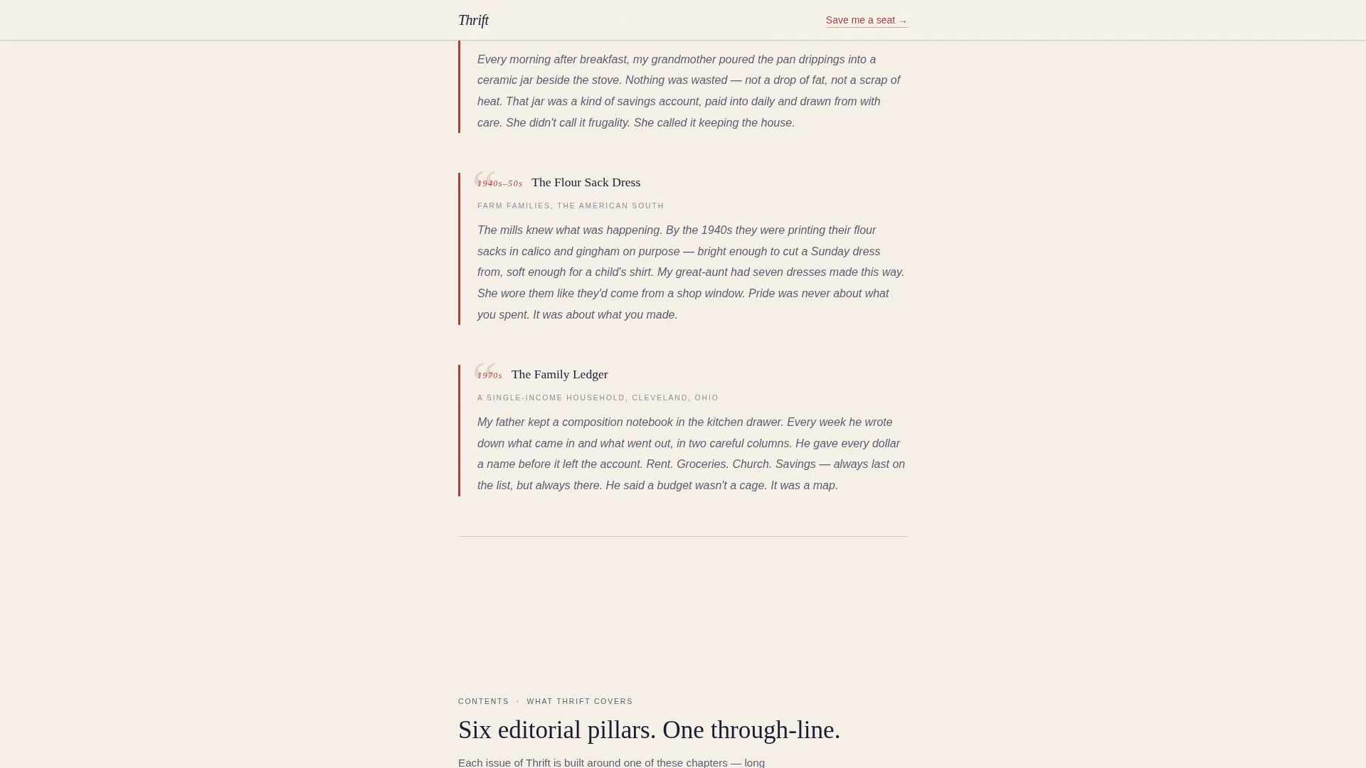
Three short frugal traditions from different American decades appear in a handwritten blockquote style. Each story is self-contained and brief, reading like a passage from a family ledger. This section builds emotional credibility before any editorial promise is made.
Table of Contents Editorial Section
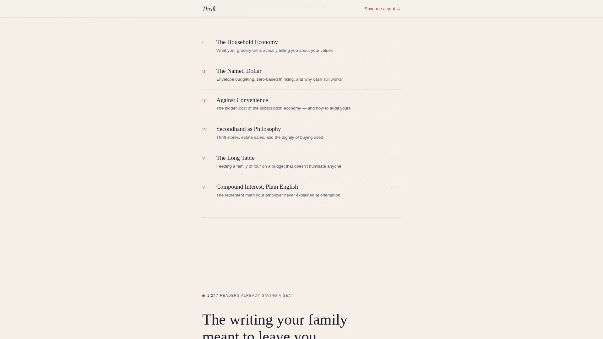
The newsletter's core pillars are presented as chapter titles in a styled table of contents. This gives prospective readers a clear sense of what the writing covers without over-explaining. It positions the newsletter as a body of knowledge with structure and depth.
Dual Waitlist Forms with Live Counter
The primary call to action appears twice: once below the header for decisive visitors, and once at the bottom after the full case has been made. A live counter displays the current number of readers already on the waitlist, adding social proof without distraction.
GSAP Scroll Reveal Animations
The template includes medium-intensity GSAP scroll reveals, blur-to-sharp transitions, and staggered text reveals. These animations support the slow, deliberate reading rhythm without overwhelming the editorial aesthetic.
Page sections overview
| Section | Purpose |
|---|---|
| Hero Header | Opens with mason jar photo, headline, dateline, and first call-to-action form |
| Savings Statistic | Presents one oversized American savings figure in Industry Report style |
| Origin Stories | Three decade-spanning blockquotes building emotional and historical credibility |
| Editorial Contents | Previews newsletter pillars as chapter titles in a table of contents layout |
| Final Call to Action | Closes with live waitlist counter and second "Save Me a Seat" signup form |
| Minimal Footer | Extreme minimal footer pattern with no social links or distracting navigation |
Design & branding system
The visual identity is built around a Heritage and Story theme using an Ink and Paper color palette. Every design decision references a leather-bound household journal left open on a farmhouse table, warm lamplight catching yellowed pages with careful margin annotations.
- Colors: aged parchment (#F5F0E8) as background, fountain pen black (#1A1A2E) for primary text, pencil graphite (#5C5C6E) for secondary text, and pressed-flower red (#A3423C) reserved for links, buttons, and pull quotes
- Typography: Fraunces serif for all headlines, DM Sans for body copy and interface elements
- Texture and grain are present in the hero photograph, reinforcing the aged paper aesthetic throughout the scroll
Mobile & speed optimization
The template is built desktop-first with full mobile responsiveness across all sections. The single-column flow adapts cleanly to smaller screens without restructuring the reading experience.
- Scroll animations use GSAP with minimal Client Components, keeping interactive weight low while maintaining visual polish
- Server Components handle all static content rendering, supporting a lean and responsive page load
How this template helps you convert
Thrift earns the signup rather than demanding it. The page is structured to convert through credibility, not pressure.
- The hero section captures decisive visitors immediately with the first "Save Me a Seat" form placed directly below the headline, before they scroll further.
- The origin stories and table of contents sections build sustained editorial trust, so visitors who need more convincing arrive at the second form already persuaded.
- The live waitlist counter adds visible social proof at the final call to action, showing that real readers have already committed to saving a seat.
Other information about this template
This template is part of the Blog and Editorial category, designed specifically for the Frugal Living Content subcategory. It is well-suited for a frugal living blog that wants to stand apart from personal finance tip content through literary voice and intentional design.
- Template style: Single Column Flow, optimized for a slow, section-by-section editorial reading experience
- Localization: English (United States), currency formatted in USD, dates in MM/DD/YYYY format
- The Superhuman Extreme Minimal footer pattern (Pattern 4) keeps the page distraction-free, with no social links or secondary navigation
- The Intersection Match Score for this template is 13, reflecting a strong alignment between the Blog and Editorial category, Frugal Living Blog niche, and the Waitlist/Coming Soon landing-page direction
Theme
Heritage & Story
Creative direction
Industry Report
Color system
Ink & Paper
Style
Single Column Flow
Direction
Waitlist/Coming Soon
Page Sections
Half-page Hero with Serif Headline
Oversized Savings Statistic Block
Blockquote Origin Stories Section
Chapter-style Table of Contents
Dual Waitlist Forms with Live Counter
GSAP Scroll Reveal Animations
Related questions
Can I change the waitlist counter to reflect my actual subscriber number?
Is this template suitable for a newsletter that has not launched yet?
Can I replace the mason jar photograph with my own image?
Do I need to keep both call-to-action forms on the page?
Is this template only for frugal living content?



