Frugal Living YouTube Channel Landing Page Template
Thrift is a masonry-style landing page built for a frugal living YouTube channel. It guides visitors through an origin story timeline of cards, then invites them to join a pre-launch waitlist. The warm, minimal design feels elevated rather than budget-constrained. A sticky waitlist bar, a live join counter, and a money-struggle toggle make it easy for viewers to sign up and feel seen.
by Rocket studio
Quick summary
Thrift is a waitlist landing page for a frugal living YouTube channel. It uses a masonry card layout to tell an origin story that builds trust with every scroll. Visitors see real milestones, pull quotes, and community proof before landing on a waitlist form that asks one honest question about their biggest money struggle.
Who this template is for
This template is built for content creators who teach practical money habits through video. It works best when the channel has a personal story to tell and an audience ready to rally behind it.
- Frugal living YouTubers preparing for a channel launch or rebrand
- Personal finance creators who want to grow a waitlist before going live
- Solo creators turning a loyal community into a pre-launch subscriber list
What problem this template solves
Most channel landing pages look either too corporate or too DIY. Neither builds the quiet confidence that a frugal living audience actually trusts. Visitors bounce before they ever reach the sign-up form.
- No clear story arc to hold a visitor's attention through the scroll
- No way to segment audience intent without building a complex form
- No social proof layer to show that real people are already on board
What you get with this template
You get a complete single-page layout that moves visitors from curiosity to commitment. Every section serves the waitlist goal without feeling pushy or cluttered.
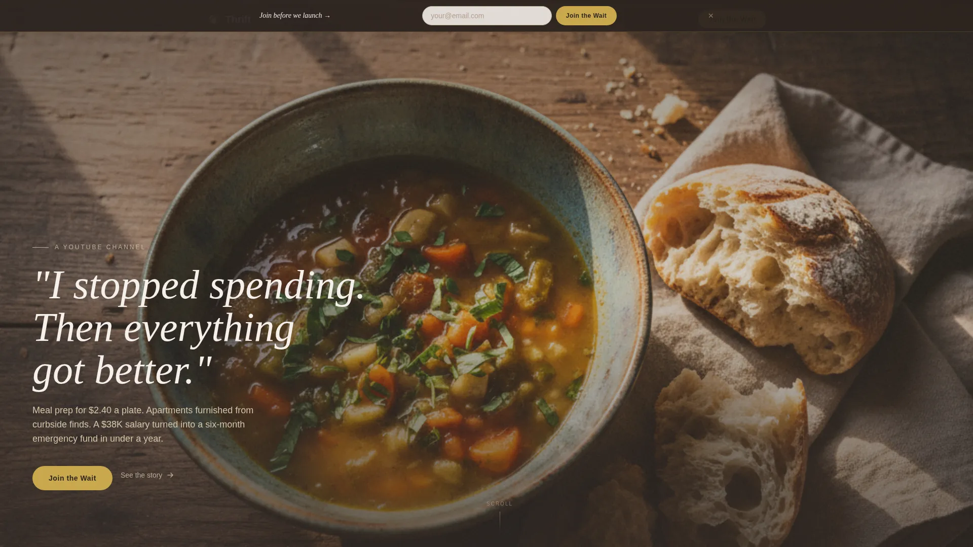
- A full-bleed hero with an overhead photo composition and a thin serif headline
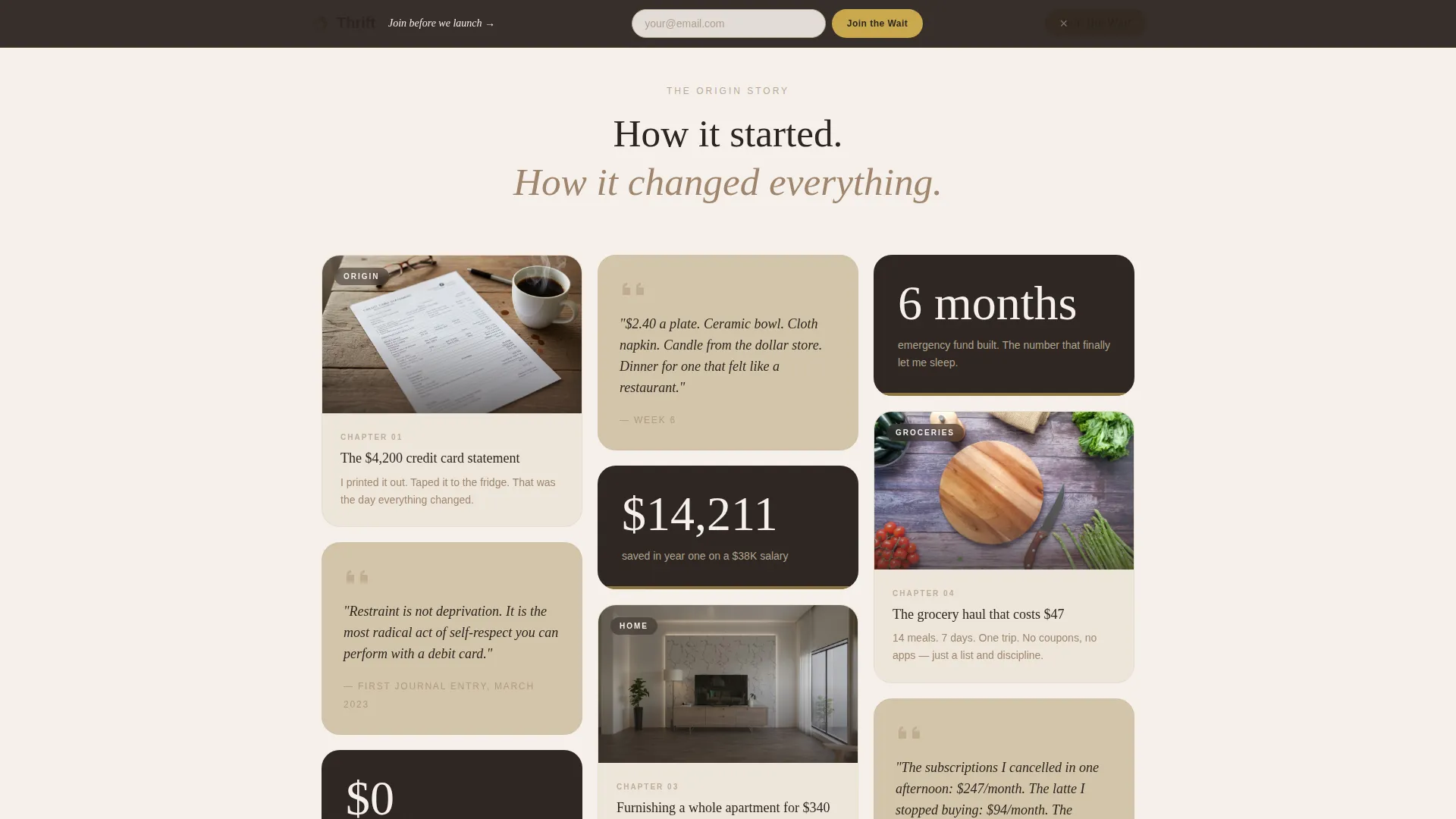
- A Pinterest-style masonry timeline of cards covering video thumbnails, pull quotes, and stat callouts
- A sticky waitlist bar, a full-width waitlist section, and a live join counter
Feature list
This template ships with a focused set of components that support both storytelling and conversion.
Masonry Origin Story Timeline
Cards are laid out in a staggered Pinterest-style grid. Each card represents one chapter of the channel's story, from the first no-buy month to subscriber milestones. Scroll-linked reveals let the narrative unfold at the reader's own pace.
Sticky Waitlist Bar
A slim bar slides into view after the visitor passes the third card. It stays visible as they continue scrolling. It holds a single email field so the sign-up moment is never more than a tap away.
Money Struggle Toggle Selector
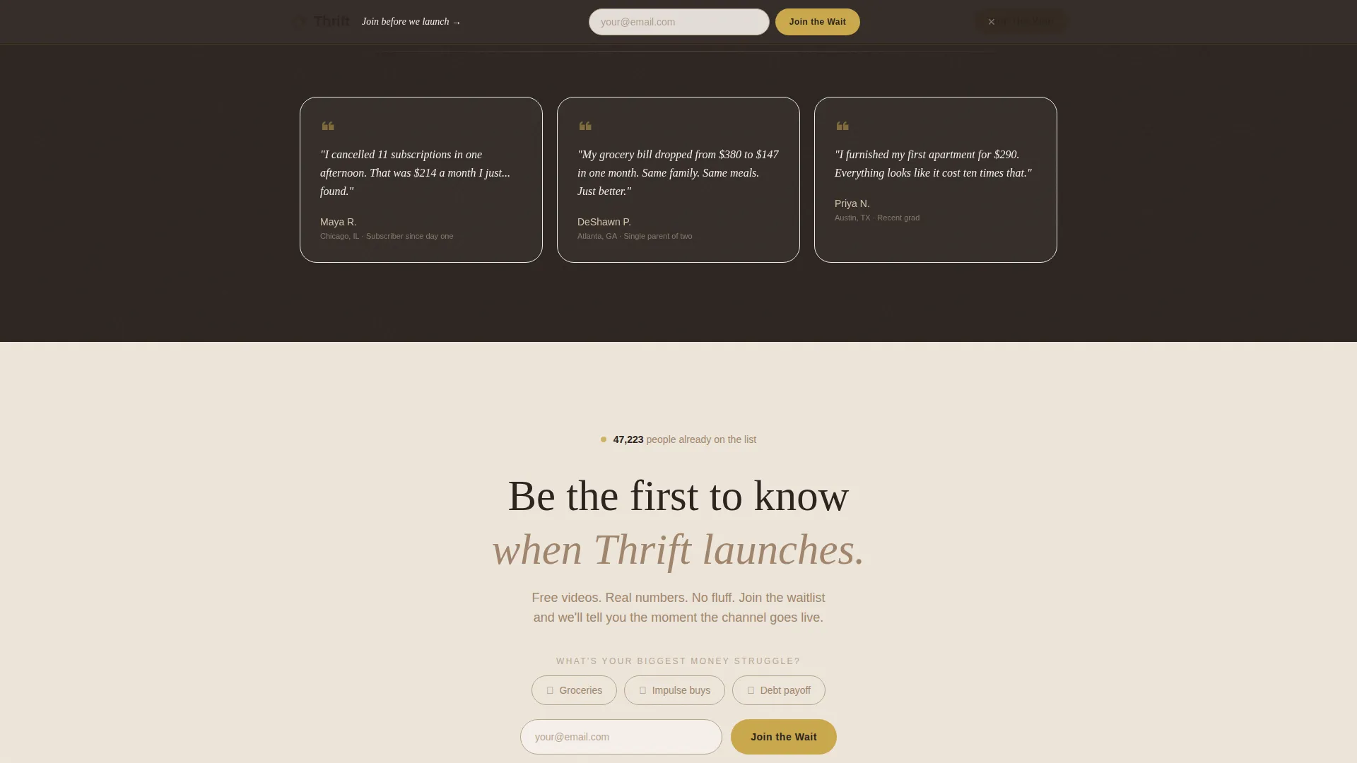
The waitlist form includes three tap-to-select options: groceries, impulse buys, and debt payoff. This one interaction lets the creator understand audience intent without adding friction to the sign-up flow.
Live Join Counter
A live counter displays how many people have already joined the waitlist. It reinforces social proof passively, requiring no manual update from the creator.
Full-Width Waitlist Section
A dedicated bottom section pairs the email field with the toggle selector and the live counter. It gives visitors a final, unhurried moment to commit before the footer.
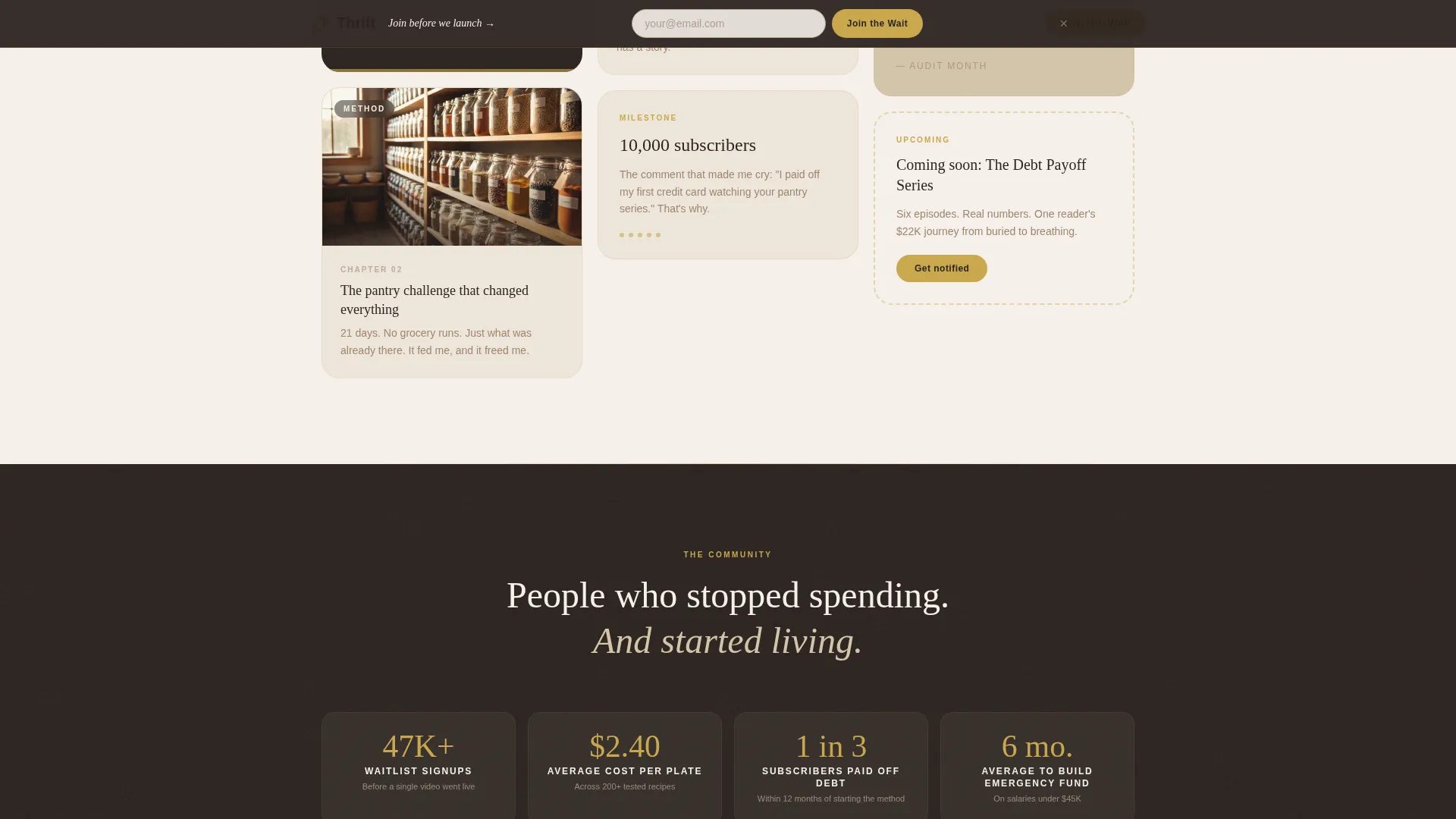
Community Burst Section
A distinct section surfaces subscriber milestone callouts, community screenshots, and collaboration announcements. It shows momentum and makes new visitors feel they are joining something already in motion.
Page sections overview
| Section | Purpose |
|---|---|
| Hero with headline | Sets visual tone and opens the origin story |
| Masonry timeline cards | Tells the channel story chapter by chapter |
| Sticky waitlist bar | Captures emails without interrupting the scroll |
| Community burst section | Displays social proof and channel momentum |
| Full-width waitlist call to action | Converts visitors with form, toggle, and counter |
| Ultra-minimal footer | Closes the page cleanly without distraction |
Design & branding system
The visual identity follows a Luxe Minimal direction. The palette is drawn from a ceramicist's studio in afternoon light: warm, tactile, and deliberate. Nothing feels cheap, and nothing feels over-designed.
- Plaster white (#F5F0EB) dominates backgrounds; sandstone (#D4C5A9) carries card surfaces and section dividers; clay (#A0856C) anchors all body text
- Tarnished brass (#C9A84C) appears only on buttons and hover states, pulling the eye exactly where action is needed
- Fraunces serif handles headlines for warmth and weight; DM Sans handles body text for clean readability
Mobile & speed optimization
The template is built mobile-first because the target audience scrolls primarily on their phones. The masonry layout adapts gracefully from desktop columns down to a single stacked feed.
- Lazy loading is prioritized across the image-heavy masonry grid to keep the page feeling responsive
- Staggered card reveal animations are scroll-linked and medium in intensity, avoiding jank on smaller devices
- The sticky waitlist bar is designed to sit comfortably within mobile viewport constraints without blocking content
How this template helps you convert
Every design and layout decision points toward one outcome: getting the visitor to join the waitlist before they leave.
- The origin story timeline builds genuine trust by showing real milestones and confessional moments before asking for anything in return.
- The sticky bar keeps the sign-up option visible throughout the scroll, so the visitor never has to hunt for the form.
- The live join counter and community section create soft urgency by showing that others have already committed.
Other information about this template
This template is a strong fit for creators building a brand around intentional living, mindful spending, or any content niche where the personal story is the product.
- The template uses Fraunces and DM Sans as its type pairing, which are available as free web fonts
- Animation intensity is set to medium, with scroll-linked card reveals and a slide-in sticky bar that can be adjusted during customization
- The footer follows an ultra-minimal horizontal layout, keeping the close of the page as clean as the opening
- The glassmorphic intro card in the hero section adds a subtle depth layer without competing with the full-bleed photograph
- The page is scoped as a single waitlist landing page and does not include blog archive pages, video index pages, or multi-page navigation
Theme
Luxe Minimal
Creative direction
Origin Story
Color system
Warm Stone
Style
Masonry/Pinterest
Direction
Waitlist/Coming Soon
Page Sections
Masonry Origin Story Timeline
Sticky Waitlist Bar
Money Struggle Toggle Selector
Live Join Counter
Community Burst Section
Full-width Waitlist Call to Action
Related questions
Can I use this template before my YouTube channel is live?
How does the money struggle toggle work?
Is the live join counter connected to a real database?
Can I replace the hero photograph with my own image?
Does this template include more than one place to collect emails?



