Stock Market & Trading Newsletter Advanced Blog Website Template
Ticker is a hub and spoke landing page template built for a weekly stock market and trading interview newsletter. It showcases editorial depth through on-page interview content, a warm artisan visual identity, and a deliberate portrait-quote-story rhythm. The primary call to action is a free email subscription, earned by giving readers one full interview before asking them to commit.
by Rocket studio
Quick summary
Ticker is a single-page newsletter landing page template designed for a weekly trading interview and profile publication. It blends editorial depth with a warm, print-inspired visual identity to attract self-directed investors, aspiring fund managers, and finance professionals. The page earns the subscribe by putting real content front and center before any commitment is asked.
Who this template is for
This template is built for independent newsletter publishers and editorial teams who cover the stock market and trading world through interviews and in-depth profiles. It suits creators who want their landing page to feel like a publication, not a pitch deck.
- Stock market and trading newsletter founders looking to convert first-time visitors into subscribers
- Independent finance writers and portfolio professionals building a paid or free weekly publication
- Market-focused content creators who need a credibility-first landing page with a clear subscribe path
What problem this template solves
Most newsletter landing pages lead with a sign-up form and hope the headline alone is enough. For an interview-driven finance publication, that approach leaves trust on the table. Visitors with high standards, such as active traders and fund professionals, need proof of editorial quality before they hand over their inbox.
- Generic newsletter templates strip out the editorial atmosphere that makes a finance publication feel authoritative
- A flat subscribe wall gives nothing away, so skeptical readers leave before they feel the value
- No clear content hierarchy means visitors cannot browse, sample, or assess editorial depth on their own terms
What you get with this template
This template delivers a fully structured, section-led landing page that reads like a quarterly journal and converts like a curated subscription offer. Every section is purpose-built around the editorial rhythm of a trading interview newsletter.
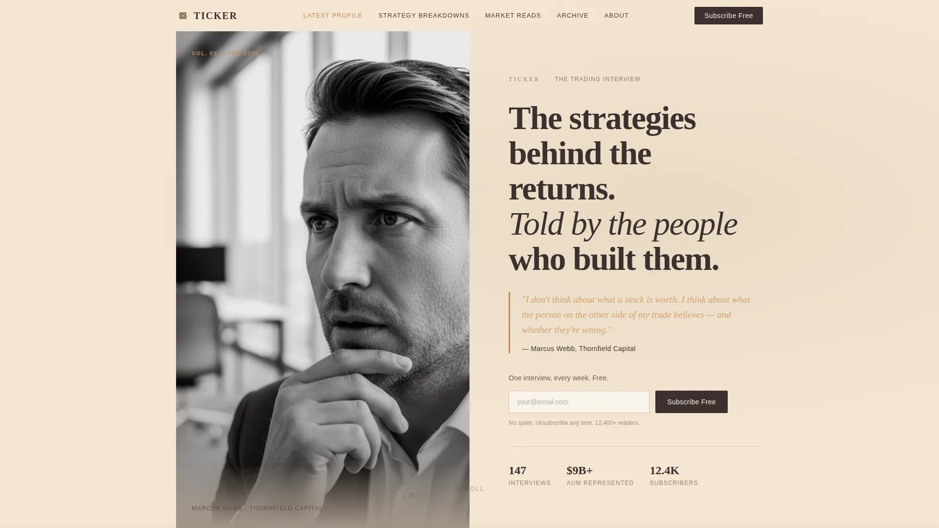
- A half-page hero with a black-and-white portrait, large serif headline, and an anchor navigation bar styled like a magazine table of contents
- A portrait-quote-story scroll rhythm across multiple profile sections, with inline subscribe cards surfacing after every second profile
- Strategy breakdown and recommended reading interstitial sections that add editorial texture between profiles
Feature list
This template includes purpose-built components drawn directly from the Ticker brief. Each feature serves the dual goal of editorial immersion and subscriber conversion.
Half-Page Hero with Anchor Navigation
The hero splits the viewport between an editorially lit black-and-white portrait on the left and a large serif headline on the right. A single amber italic teaser line from the latest interview sits beneath the headline. An anchor navigation bar with five or six spoke labels sits directly below, styled as understated text links for smooth-scroll section jumping.
Portrait-Quote-Story Profile Rhythm
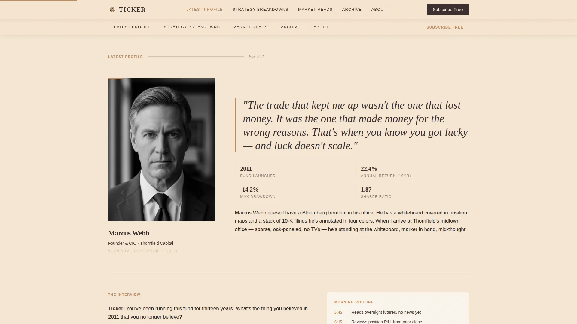
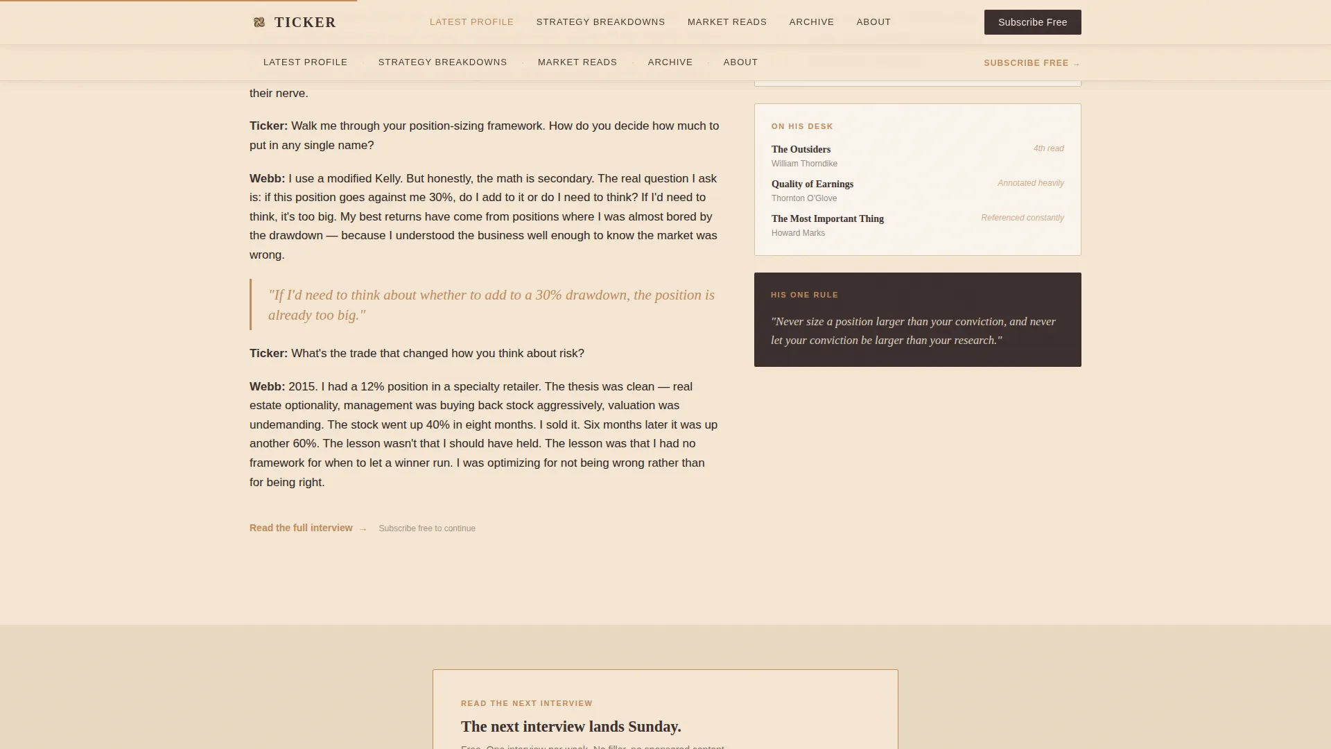
Each profile section opens with a new portrait and a large serif pull-quote before revealing the full interview excerpt. This deliberate portrait, quote, story sequence creates a reading experience closer to a quarterly print journal than a scrolling feed. By the fourth profile, the cumulative effect builds trust in the newsletter's access and editorial taste.
Inline Magazine-Style Subscribe Cards
The primary call to action is "Read the Next Interview" with a single email field and a submit button labeled "Subscribe Free." This subscribe card appears first beneath the hero portrait and resurfaces as an inline prompt after every second profile. It is styled like a physical magazine subscription card using a warm stone background and amber border, with no pop-up interruptions.
Strategy Breakdowns Bento Grid
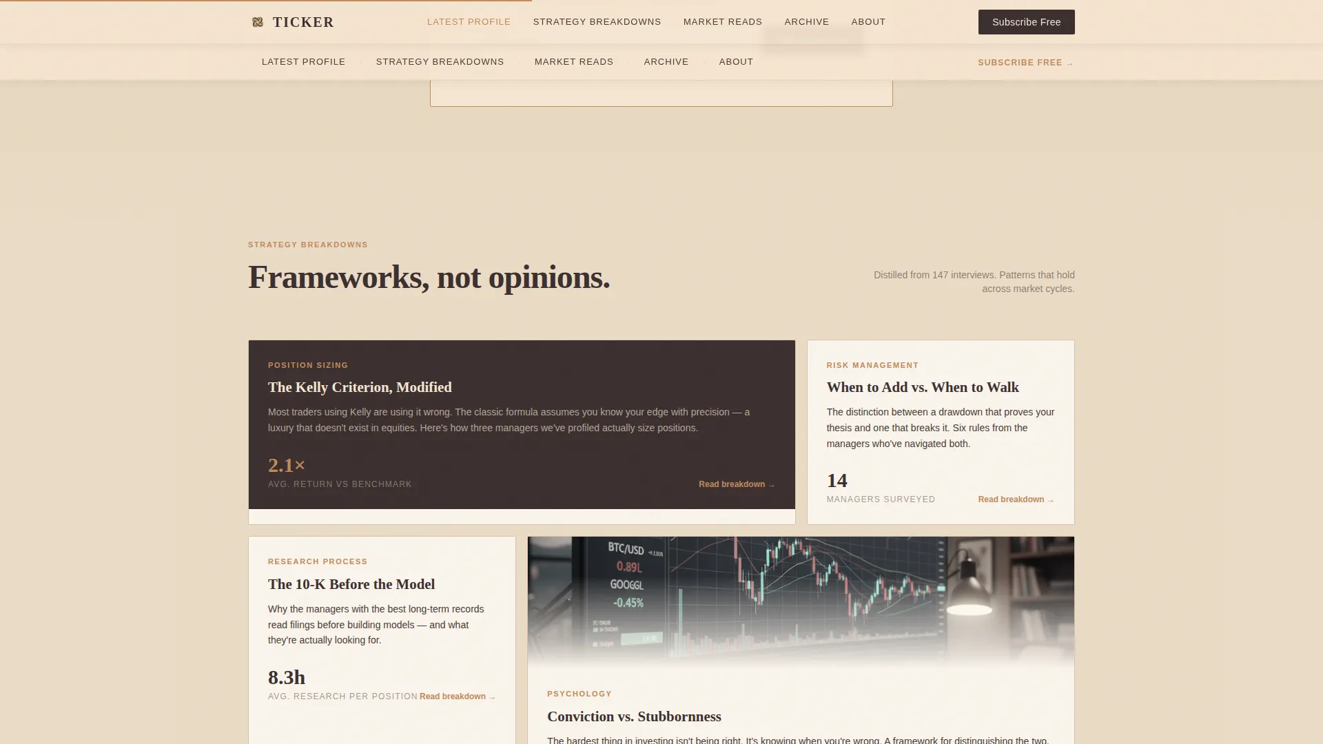
Between profile sections, an editorial bento grid with asymmetric cards surfaces strategy breakdowns. This section adds depth and variety to the scroll, signaling that the newsletter covers frameworks and process, not just personalities.
Market Reads Interstitial Section
A dedicated recommended reading section sits between profiles as a palate-cleanser. It reinforces editorial curation and gives visitors another reason to trust the newsletter's point of view before they subscribe.
Archive Call-to-Action Section
A secondary path invites visitors to browse the full archive. This gives proof-seekers a way to assess depth and history without committing to a subscription, reducing friction for the most skeptical visitors.
Page sections overview
| Section | Purpose |
|---|---|
| Hero portrait area | Introduce editorial identity and anchor navigation |
| Latest profile excerpt | Deliver full interview to demonstrate voice and depth |
| Inline subscribe card one | Convert readers warmed by the first profile |
| Strategy breakdowns grid | Show process and framework coverage between profiles |
| Second profile excerpt | Continue portrait-quote-story rhythm and build trust |
| Market reads interstitial | Surface curated reading to reinforce editorial curation |
| Inline subscribe card two | Resurface subscribe prompt for still-undecided visitors |
| Archive call to action | Offer a secondary path for depth-seekers |
| Footer | Provide navigation flow and publication details |
Design & branding system
The visual identity follows a Warm Artisan editorial theme. The palette and typography are chosen to feel like a well-read finance book left open on a mahogany desk, unhurried and substantive.
- Color system uses deep espresso (#3B2F2F), sandstone cream (#F5E6D3), aged parchment (#D4C4A8), and a quiet amber accent (#C08B5C) reserved for links, hover states, and pull-quote borders. Body text sits in a warm near-black (#2C2420). Backgrounds alternate between sandstone cream and espresso dark sections.
- Typography pairs Fraunces serif for headlines and pull-quotes with DM Sans for body text and interface elements, balancing editorial weight with clean readability
- Grain textures and mahogany-toned surfaces give the page a tactile, print-informed quality that sets it apart from flat digital newsletter templates
Mobile & speed optimization
The template is built desktop-first to serve the financial professional audience who most often engage with long-form trading content on larger screens. It is also structured to respond cleanly to mobile viewports.
- Scroll reveals, staggered text animations, and parallax portrait effects are handled with medium animation weight to keep the page feeling alive without sacrificing load clarity
- Server Components power the static editorial content while Client Components handle scroll animations and interactive states, keeping the rendering approach efficient
- The anchor navigation, subscribe form, and hover states are all interactive components designed to work across device sizes without layout breakage
How this template helps you convert
The conversion strategy is built on editorial generosity rather than urgency tactics. Visitors earn the subscribe decision through content, not pressure.
- One full interview is published on-page so first-time visitors can experience the editorial voice and realize they want the next one before any email is requested
- Inline subscribe cards resurface naturally after every second profile section, meeting readers at the moment their appetite for more is highest
- The archive call-to-action section provides a low-commitment secondary path for skeptical visitors who want to assess depth before subscribing
Other information about this template
This template is part of a broader hub and spoke landing page category designed for content-first publications. A few additional details worth knowing before you build with it.
- The template style is Hub and Spoke with Anchor Navigation, meaning each spoke section is accessible from the top nav and the page functions as a self-contained content destination
- The footer follows a Vercel Horizontal Flow pattern, keeping the closing section clean and structurally consistent with the editorial tone above it
- The landing page direction is Content and Resource, which means the page is optimized to deliver editorial value before conversion rather than leading with a hard sell
- Social proof comes from pull-quotes attributed to traders and fund names embedded throughout the profile sections, building credibility through specificity rather than generic testimonials
- The template is localized for English-language audiences using United States dollar references and United States date formatting
Theme
Warm Artisan
Creative direction
Creator Spotlight
Color system
Warm Stone
Style
Hub & Spoke (Anchor Nav)
Direction
Content/Resource
Page Sections
Half-page Hero with Anchor Navigation
Portrait-quote-story Profile Rhythm
Inline Magazine-style Subscribe Cards
Strategy Breakdowns Bento Grid
Market Reads Interstitial Section
Archive Call-to-action Section
Related questions
Can I publish a real interview directly on this landing page?
How many profile sections does this template include?
Is this template suitable for a paid newsletter or only a free one?
Can visitors browse the publication without subscribing?
Does the anchor navigation support smooth scrolling between sections?



