Private Equity Newsletter Landing Page Template
Ticker is a horizontal-scroll landing page template built for a private equity intelligence newsletter. It combines editorial authority, redacted sample content panels, and a persistent email capture rail to convert PE professionals into subscribers. The design uses a Luxe Minimal aesthetic in Parchment and Rust tones, with a desktop-first layout built around a Vision and Mission narrative flow.
by Rocket studio
Quick summary
Ticker is a single-page, horizontal-scroll landing page template for a private equity data and trends newsletter. It guides fund managers, institutional allocators, and investor relations professionals through a problem-mission-proof narrative, then closes with a persistent email capture rail. Every panel is designed to earn trust before asking for the subscription.
Who this template is for
This template is built for publishers and operators launching a premium private equity newsletter. It speaks directly to financially sophisticated readers who scan quickly and trust specificity over hype.
- Fund managers and institutional allocators who need a weekly edge on sector rotations and deal flow
- Investor relations professionals who must sound authoritative in limited partner meetings
- Newsletter operators and B2B financial media teams building a high-trust subscriber base
What problem this template solves
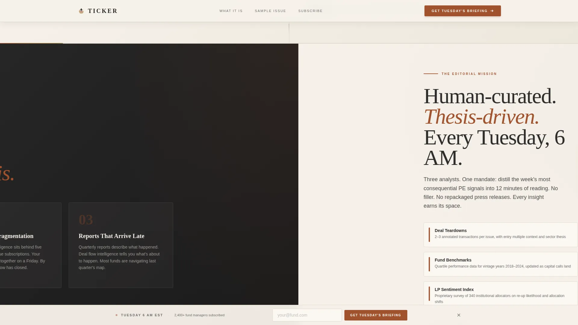
PE professionals are buried in data overload. Reports arrive late, relevant intelligence sits behind fragmented paywalls, and most newsletters describe trends rather than distilling them. This template addresses that gap head-on in the first two panels of the scroll.
- Signals the newsletter's value before the reader reaches the call to action
- Frames the problem of fragmented, delayed market intelligence directly in the layout
- Builds credibility through real sample content, not just copy claims
What you get with this template
You get a complete horizontal-scroll landing page built around editorial authority and lead generation. The structure moves from hero to problem to mission to sample proof, then anchors the ask at the end of the journey.
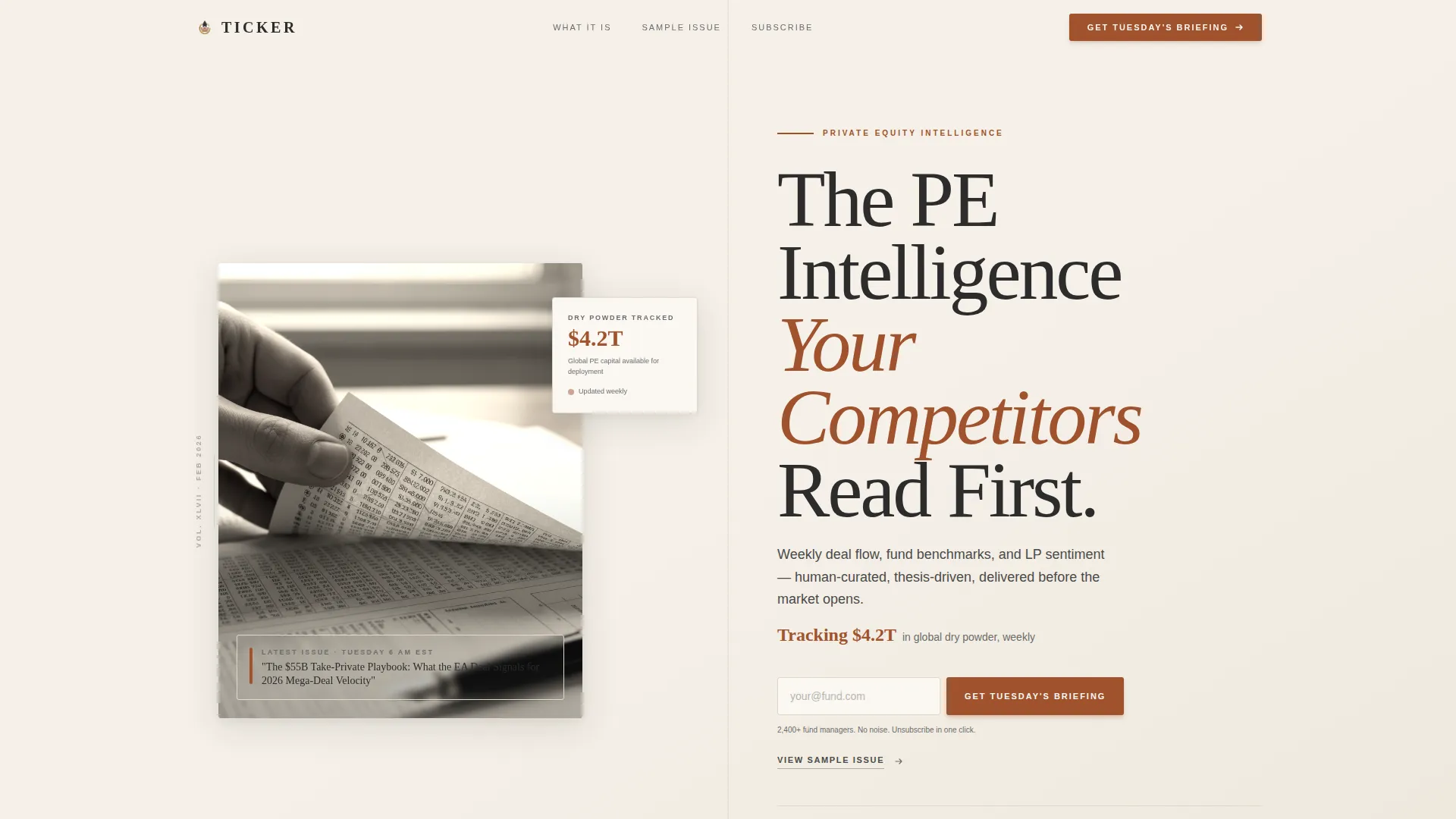
- A half-page editorial hero with a serif headline, a rust-accented stat, and an inline email input
- Horizontal scroll panels covering the problem, mission statement, and redacted sample content previews
- A sticky bottom email capture rail that persists throughout the entire scroll experience
Feature list
This template ships with a focused set of purpose-built components. Each one serves the conversion flow without adding noise.
Editorial Hero with Inline Email Capture
The hero splits into two halves. The left side holds a desaturated editorial photograph of a financial report with natural window light. The right side presents a large serif headline and a rust-colored stat line. An email input field sits directly in the hero for immediate capture.
Horizontal Scroll Panel Sequence
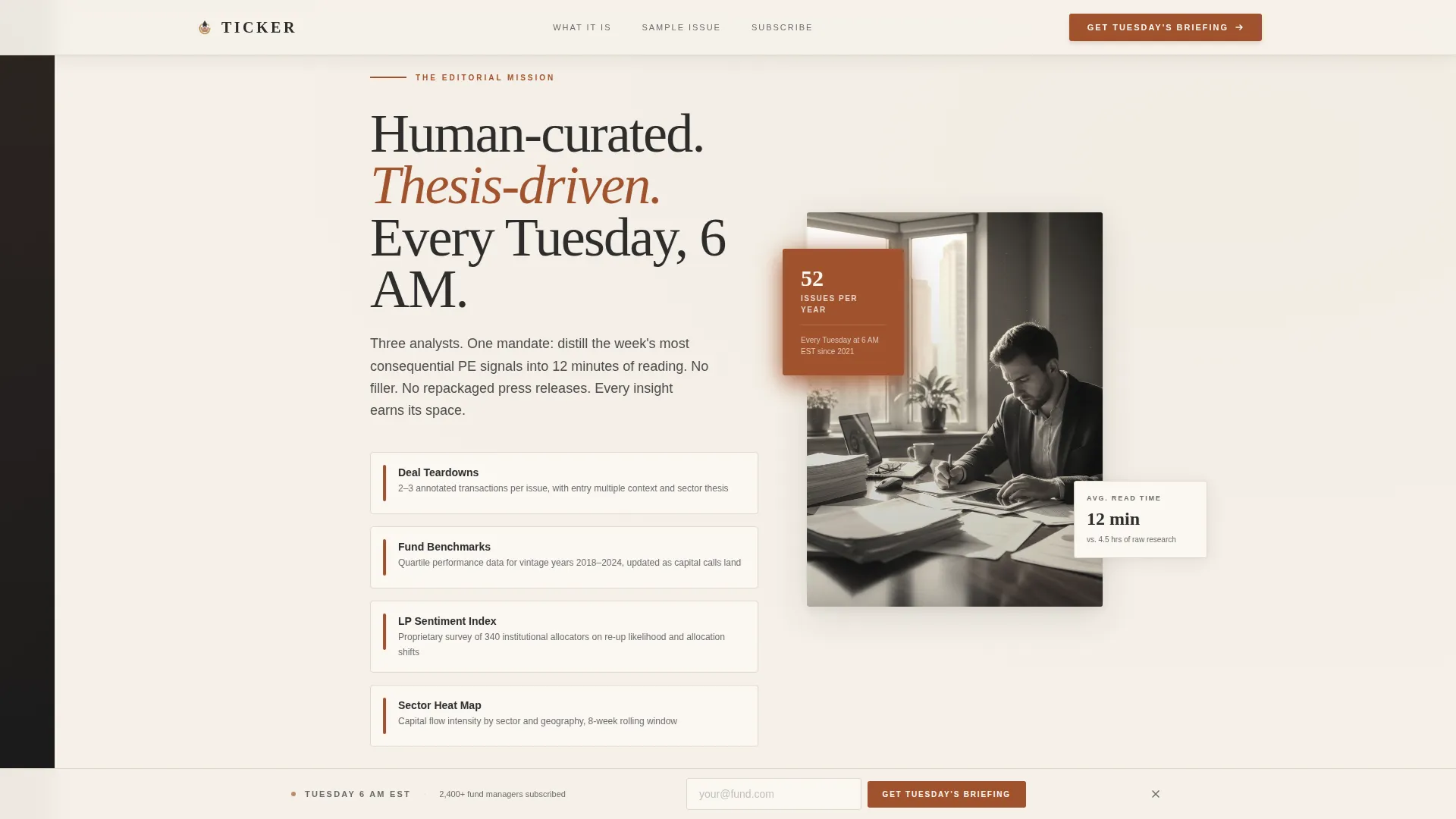
Each lateral panel advances the Vision and Mission narrative in a deliberate order: problem, editorial mission, then sample proof. Scroll-linked transitions and stagger reveal animations connect each panel with a sense of forward momentum.
Redacted Sample Content Panels
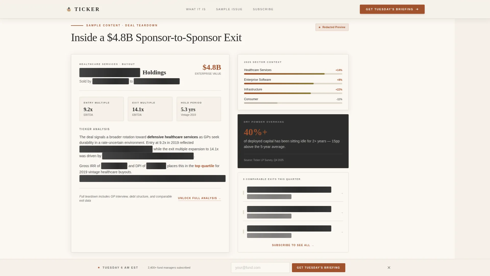
Two sample panels show real newsletter content at partial visibility. One features a redacted deal teardown card alongside a sector heat map. The second shows a GP sentiment chart with subscriber social proof. The redaction creates the ache of wanting the full version.
Sticky Bottom Email Rail
A persistent email capture bar locks to the bottom of the viewport during the horizontal scroll. It keeps the call to action visible without interrupting the editorial reading experience.
Gated Sample Issue Path
A secondary call to action reads "View Sample Issue" and links to a gated PDF download. The download gate captures the email address before granting access, creating a second conversion path alongside the main subscribe flow.
Hover States and Interactive Data Cards
Data card components respond to hover with tarnished brass color transitions. A floating badge uses a pulse animation. Redacted text panels carry a shimmer effect on hover, reinforcing the sense that more intelligence is just one step away.
Page sections overview
| Section | Purpose |
|---|---|
| Editorial Hero Panel | Headline, stat, and first email input |
| Problem Statement Panel | Frames data overload and fragmentation |
| Editorial Mission Panel | Tuesday cadence and human-curated positioning |
| Sample Panel A | Redacted deal teardown and sector heat map |
| Sample Panel B | GP sentiment chart and subscriber social proof |
| Minimal Footer | Horizontal flow footer with closing context |
Design & branding system
The visual identity follows a Luxe Minimal theme rooted in warmth and editorial authority. Every color choice references the weight of a first-edition financial tome rather than a modern SaaS dashboard.
- Aged parchment (#F5F0E8) as the dominant background, deep editorial charcoal (#2C2C2C) for body text, and oxidized rust (#A0522D) for accent lines and data highlights
- Tarnished brass (#8B7D3C) on hover states and interactive markers, reinforcing the tactile quality of the design system
- Fraunces display serif for headlines and Decimate Sans for body and user interface text, pairing editorial gravity with clean readability
Mobile & speed optimization
The template is desktop-first by design, reflecting the reality that fund managers typically review intelligence on large monitors. A responsive mobile fallback ensures the layout remains functional and readable on smaller screens.
- Server Components handle static content sections, keeping JavaScript footprint minimal for the scroll behavior
- Scroll-linked horizontal panel transitions and stagger reveals are implemented with medium animation weight to balance visual richness against load performance
- The sticky email rail adapts to mobile viewport constraints without breaking the capture flow
How this template helps you convert
Every structural decision in this template serves the lead generation goal. The layout earns the subscription by showing real content before asking for an email address.
- The hero presents the value proposition and a stat proving scale ("Tracking $4.2T in global dry powder, weekly") before the reader scrolls a single panel, reducing drop-off at the first impression.
- Redacted sample panels in the middle of the scroll use partial content visibility and shimmer effects to create deliberate curiosity, motivating the reader to subscribe for the full briefing.
- The sticky bottom email rail and the gated PDF path maintain two live capture points at all times, so the call to action is never more than one glance away regardless of scroll position.
Other information about this template
This template is part of a curated set of editorial and B2B media landing page designs. It is built for operators who need to project institutional credibility from the first pixel.
- The social proof layer includes named fund manager quotes and quantified claims such as "2,400+ allocators" to reinforce trust with a financially skeptical audience
- The localization defaults are English, US dollar formatting, and US date format (Tuesday, 6 AM EST delivery cadence as shown in the mission panel)
- The template style is classified as Horizontal Scroll with a Luxe Minimal theme, making it distinct from vertical-flow newsletter landing pages in the same category
Theme
Luxe Minimal
Creative direction
Vision & Mission
Color system
Parchment & Rust
Style
Horizontal Scroll
Direction
Lead Generation
Page Sections
Editorial Hero with Email Capture
Horizontal Scroll Panel Sequence
Redacted Sample Content Panels
Sticky Bottom Email Rail
Gated Sample Issue Path
Hover States and Animated Data Cards
Related questions
Who is the target reader for this newsletter landing page?
What is the call to action on this landing page?
How does the horizontal scroll layout work?
Can the redacted sample panels be updated with real newsletter content?
Is this template suitable for a newsletter with a paid subscription tier?



