Business & Finance Blog Blog Website Template
Ticker is a single-column editorial landing page template built for premium stock market analysis platforms. Styled after a broadsheet newspaper, it combines serif typography, an Ink & Paper color palette, and editorial section layouts to earn reader trust before asking for a free trial signup. Every element of the landing page is designed to convert serious investors into subscribers.
by Rocket studio
Quick summary
Ticker is an editorial landing page template designed for investing and stock market analysis platforms. It unfolds like a curated broadsheet, guiding visitors through flagship analysis, sector spotlights, an earnings calendar, and contributor profiles before landing on a focused free trial call to action. The page is typographically disciplined and visually confident, built to earn the click through editorial quality alone.
Who this template is for
This template is purpose-built for finance publishers and editorial platforms that serve serious individual investors. It suits teams who want a high converting landing page that leads with content quality rather than promotional noise. The layout and tone are tuned for audiences who read before they sign up.
- Self-directed investors managing six-figure portfolios who want rigorous, data-rich analysis
- Junior analysts and finance students who are building structured research habits and morning briefing routines
- Retired professionals and experienced market participants who still track futures and earnings before the trading day opens
- Finance media companies and editorial teams launching or repositioning a premium stock market subscription platform
What problem this template solves
Most stock market editorial platforms struggle with one specific problem: their landing pages look like every other finance website. Generic dashboards, hollow testimonials, and aggressive pricing pop-ups fail to demonstrate editorial value before asking for a commitment. Visitors bounce before they understand what they are actually getting. The Ticker template solves this by letting the editorial product speak first.
- Generic finance landing pages fail to communicate the depth and rigor of premium editorial services
- Readers cannot evaluate content quality before signing up, creating hesitation that kills conversion
- Most templates in the finance category force a decision before building genuine trust with the visitor
What you get with this template
When you download the Ticker template, you receive a complete, single-column flow landing page structured around six editorial sections. Each section is independently crafted but editorially sequenced so that stakes compound as visitors scroll. The form at the close of the landing page asks only for an email address, keeping friction low and conversion potential high.
- A full-bleed photo hero section with a serif headline and a glass call to action card
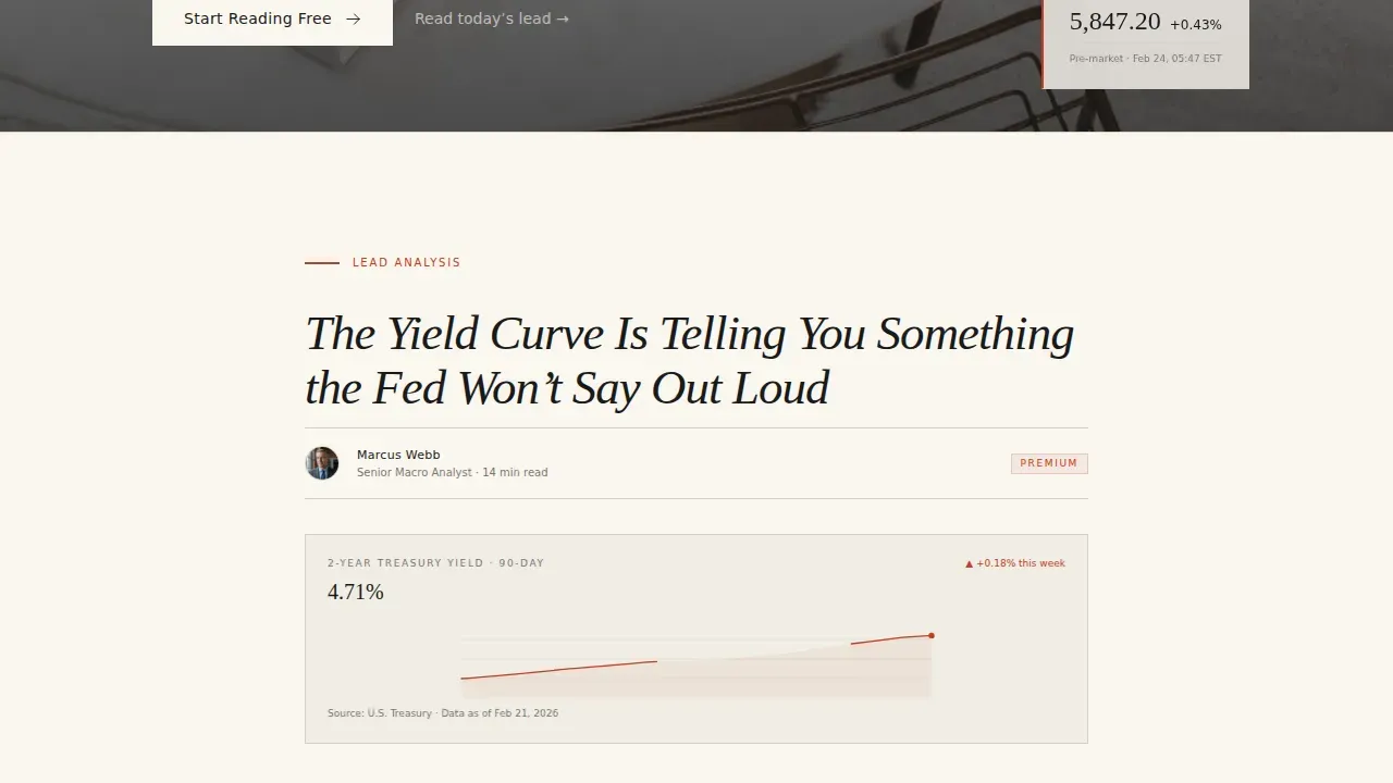
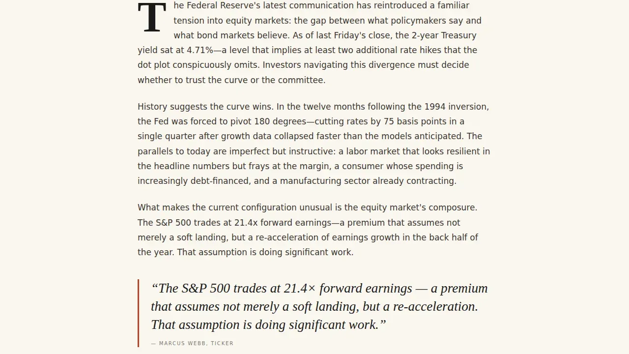
- A flagship analysis section with a large drop cap, pull quote, and featured data visualization
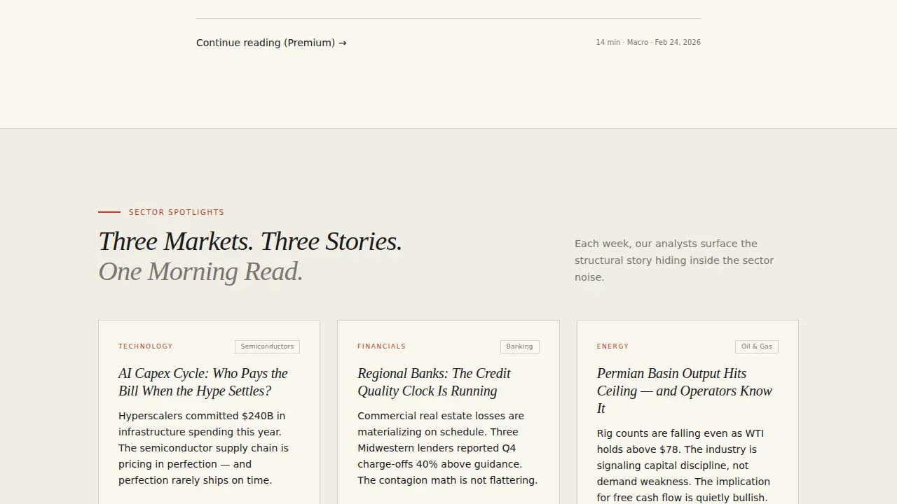
- A trio of sector spotlight column cards, an annotated earnings calendar table, contributor bylines with headshots, and an email signup lockup
- Fraunces serif display typography paired with DM Sans body text, set in the complete Ink & Paper color system
Feature list
This template is built around a focused set of features that link editorial design directly to free trial conversion. Each feature earns its place the way a headline earns above-the-fold real estate.
Full-Bleed Editorial Hero
The hero section uses an overhead photo of a marble desk scattered with market research artifacts: a creased newspaper, a glowing laptop edge showing a candlestick chart, a yellow legal pad covered in handwritten ticker symbols. A serif headline fades in over the image. A refined text link to "Start Reading Free" sits beneath the headline, making the value proposition visible before any scroll. Clear value propositions placed above the fold ensure visitors immediately understand the offer, which is a critical principle for any high converting landing page.
Drop Cap Flagship Analysis Section
The flagship analysis section opens with a large drop cap, a formatting choice borrowed from broadsheet editorial tradition. This section includes a pull quote and a featured chart or data visualization. Short paragraphs and expert-driven analysis improve readability and user experience on financial pages, which is exactly the reading experience this section is designed to replicate. Visitors who read this section are not evaluating a product; they are already experiencing it.
Sector Spotlight Column Cards
Three editorial column cards display sector-level analysis in a format that mirrors a magazine's table of contents. Each card has its own typographic hierarchy and a mini data visualization. These cards give visitors a fast, scannable view of the platform's analytical scope. Users can jump between topics quickly without losing the editorial thread of the page.
Annotated Earnings Calendar
The earnings calendar section renders financial data in a table with annotation styling drawn from the margin-note red of the Ink & Paper palette. This is a data-rich section designed to show rather than tell. Incorporating charts and graphs to visualize data can replace complex text and enhance understanding, and this section follows that principle directly. It demonstrates that the platform delivers structured, actionable stock market coverage.
Contributor Bylines and Email Signup
The closing section pairs named contributor profiles, styled as editorial bylines with headshots, with an email signup lockup. Social proof through named contributors with credentials builds trust that anonymous platforms cannot match. Including author credentials and testimonials showcases expertise and builds credibility. The form asks for only one field: an email address. Using fewer than 100 words in forms can reduce friction and increase conversion rates significantly.
Ink and Paper Color System
The complete color system is built into the template. Broadsheet cream (#FAF7F0) covers background surfaces. Typeset black (#1A1A1A) anchors all body text and headlines. Financial column rule gray (#D4D0C8) defines section separators. Margin-note red (#C23B22) is reserved for alerts, annotations, and hover states. Every color decision is deliberate, and the palette is editable so teams can adapt the system to fit their own brand identity.
Page sections overview
| Section | Purpose |
|---|---|
| Full-Bleed Hero | Anchor the landing page with an immersive photo, serif headline, and first call to action link |
| Flagship Analysis | Demonstrate editorial depth with a drop cap piece, pull quote, and data visual |
| Sector Spotlight Cards | Show analytical breadth across three market categories using column card layouts |
| Earnings Calendar | Display structured, annotated financial data in a scannable table format |
| Contributor Bylines | Build trust with named editorial voices and headshot profiles |
| Email Signup Lockup | Close the landing page with a single-field form and final call to action |
Design & branding system
The visual identity of this template follows an Editorial Magazine theme that treats every design decision as a typographic choice. The page feels like unfolding a freshly printed broadsheet on a mahogany desk at dawn: ink-heavy, paper-warm, and deeply intentional. The visuals are not decorative. They are functional. They direct focus, create hierarchy, and build the kind of visual appeal that makes a reader slow down instead of bouncing.
- Typography: Fraunces is used for all display headlines and drop caps; DM Sans handles body text, labels, and user interface elements throughout the landing page
- Color system: broadsheet cream, typeset black, rule gray, and margin-note red form the complete palette; each color has a specific role and is not used interchangeably
- Illustrations and layout details: scroll-triggered opacity animations, line-reveal effects using GSAP, hover spring physics on cards, and a scroll-linked header complete the interaction layer of the landing page
Mobile & speed optimization
This template is built desktop-first to match the reading habits of its primary audience, who typically access the platform on a laptop during early morning hours. A solid mobile fallback is included so the landing page remains readable and functional for visitors arriving from any traffic source. Ensuring the landing page loads in under 3 seconds is essential to avoid high bounce rates, and the template's architecture supports fast rendering through a Server Components approach for static editorial sections.
- Desktop-first layout prioritizes the reading experience for finance professionals on larger screens, while maintaining a thumb-friendly fallback for mobile sessions
- Over 50% of web traffic is mobile, and the landing page responds cleanly across screen sizes without breaking the editorial hierarchy
- Speed and layout integrity are maintained by separating static editorial components from client-side animation code, keeping the page fast and the visuals sharp
How this template helps you convert
A high converting landing page in the finance category earns trust before asking for anything. Successful financial landing pages in 2026 typically achieve conversion rates of 2.35% to 4.14%, with top-tier pages exceeding 11.45%. This template is structured to pursue the higher end of that range by removing hesitation at every scroll depth. The key is that every part of the landing page is focused on one specific action: starting a free trial.
- The call to action appears three times across the landing page: first as a refined text link beneath the hero headline, then as a full-width button after the sector spotlight cards, and finally as a typographic lockup paired with a single email field at the close of the page. Prominent, repeated calls to action that are bold, easy to find, and accessible throughout the landing page significantly improve engagement.
- The editorial content itself is the conversion mechanism. Visitors do not read about the platform's value; they experience it through the flagship analysis section, the annotated earnings calendar, and the contributor bylines. Social proof through named contributors, reader community size, and publication counts reduces hesitation. Using social proof such as testimonials and recognizable contributor profiles can boost credibility across the full landing page.
- The email form uses a single field and no credit card requirement. This removes the most common friction points that cause visitors to abandon finance landing pages before they submit.
Other information about this template
The Ticker template sits in the Blog and Editorial category with a Business and Finance Blog subcategory, focused entirely on the Investing and Stock Market niche. This positioning means the template is designed for a specific type of platform, not a general-purpose finance website. Teams evaluating it should compare its editorial depth and conversion structure against more generic finance templates before they decide.
- The template is relevant for teams who want to store a high-quality landing page design in their asset library for future campaign use, or use it directly as the primary conversion page for a stock market editorial platform launch
- Creators can download the template and modify the color system, typography, and section content to fit their specific company identity without touching layout code
- The Ink and Paper color system is a complete design language, not a loose set of illustrations or swatches; it governs background, text, borders, and interactive states so the landing page stays coherent across all screen sizes
- Teams building their first finance editorial platform can use this template to save significant production time; using templates speeds up the process of creating landing pages without requiring deep coding knowledge
- Non-technical users can fill in section content, swap headshots, and update data visuals without breaking the editorial structure, because the template is designed with content flexibility in mind
- This is one of the best landing page examples in the editorial finance category for teams who want a swipe file reference or a production-ready starting point for a stock market analysis platform
- A/B testing is an essential tool for optimizing any landing page; teams can use this template as a baseline and run tests on headline copy, call to action placement, and form field count to discover what resonates best with their audience
- Adobe Express and similar tools offer customizable landing page templates, but few are purpose-built for the editorial finance category with this level of typographic discipline and stock market data integration
- The creative direction is Curated Collection, meaning the scroll experience mirrors flipping through a magazine's table of contents; each section acts as a distinct editorial piece with its own hierarchy, making this template a strong inspiration reference for finance editorial design teams
- The landing page direction is Click-Through, optimized to drive free trial signups through editorial quality demonstration rather than persuasive copy alone; the template earns the conversion by making visitors feel like they are already reading the product before they submit their email
- Vibe coding principles are embedded in the design: emotional triggers like the pre-dawn desk photo, the smell of fresh newsprint conveyed through warm cream tones, and the gravity of margin-note red annotations all draw the reader into the world of the platform before a single word of copy asks for a click
- The logo and header scroll behavior are linked, meaning the masthead adapts as visitors move down the page; this keeps the brand identity visible without taking up fixed screen real estate
- Feedback from the target audience shaped the decision to lead with a flagship analysis piece rather than a pricing table; real readers want to evaluate the editorial quality before they see a course of action or a commitment screen

Theme
Editorial Magazine
Creative direction
Curated Collection
Color system
Ink & Paper
Style
Single Column Flow
Direction
Click-Through
Page Sections
Full-bleed Photo Hero with Serif Headline
Drop Cap Flagship Analysis Section
Sector Spotlight Column Cards with Data Visuals
Annotated Earnings Calendar Table
Contributor Bylines with Social Proof
Single-field Email Signup Lockup
Related questions
What type of finance platform is this landing page template designed for?
Can I modify the colors and typography without coding experience?
How does the landing page demonstrate product value before asking visitors to sign up?
Is this template optimized for mobile visitors?
How many times does the call to action appear on the landing page?



