Ocean Conservation Blog Landing Page Template
Tidepool is a hub-and-spoke anchor-nav landing page template built for ocean conservation editorial blogs. It uses a gallery-walk layout with five thematic spokes, a full-viewport reef hero, sticky navigation, and a persistent bottom bar. The warm stone color palette and editorial serif typography create a coastal research-station atmosphere that earns reader trust before every click.
by Rocket studio
Quick summary
Tidepool is an ocean conservation blog landing page template with a gallery-walk structure. Five thematic spokes, Coral, Ice, Plastic, Sound, and Depth, each feel like a separate exhibition room. A full-bleed aerial reef hero anchors the experience, while sticky anchor navigation and a persistent bottom bar route readers into thematic blog archives without friction.
Who this template is for
This template suits editorial teams and independent creators who need a visually serious home for ocean science storytelling. It works equally well for a solo researcher building a digital field journal and a small editorial team publishing long-form investigations.
- Marine biology students and coastal educators who need a credible, research-grade content hub
- Weekend divers and ocean-curious general readers drawn in by emotional visual storytelling
- Environmental journalists and science communicators publishing thematic, archive-driven content
What problem this template solves
Most blog landing pages present a flat chronological feed. For niche science topics like ocean conservation, that structure buries editorial depth and loses readers before they find the content most relevant to them. Tidepool solves the discovery problem by organizing content into five clear thematic rooms, so every visitor finds their entry point quickly.
- Readers with different expertise levels (students, educators, casual divers) all need a different door into the same archive
- A generic grid layout fails to communicate editorial authority or visual seriousness
- Click-through rates suffer when a page gives no reason to go deeper before asking for the click
What you get with this template
You get a single, fully structured ocean conservation landing page with a hub-and-spoke anchor navigation system. Every section is designed to feel self-contained but emotionally cumulative, building the reader's desire to explore the full archive.
- A full-viewport Type Over Image hero with an editorial headline and sticky anchor nav
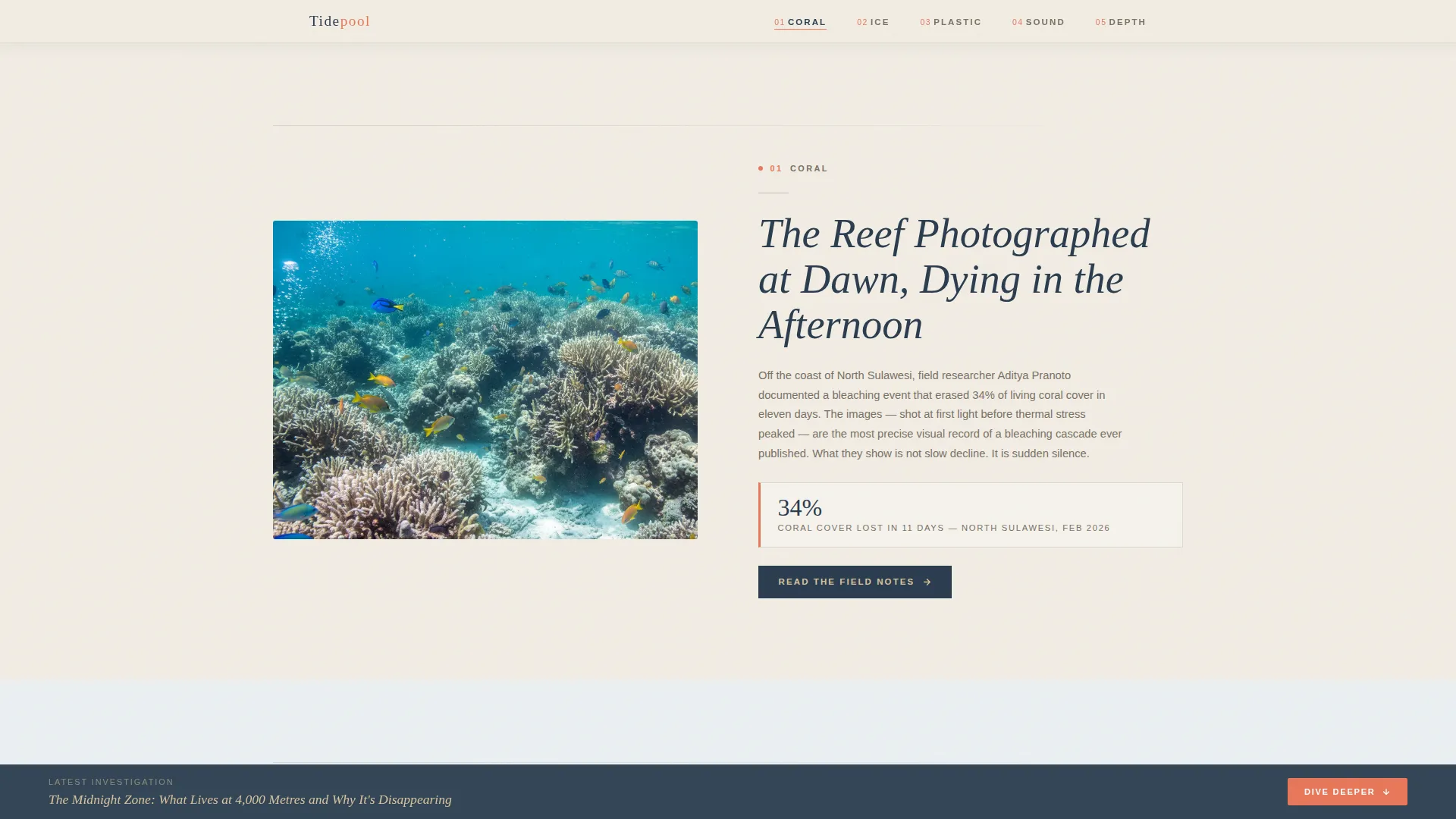
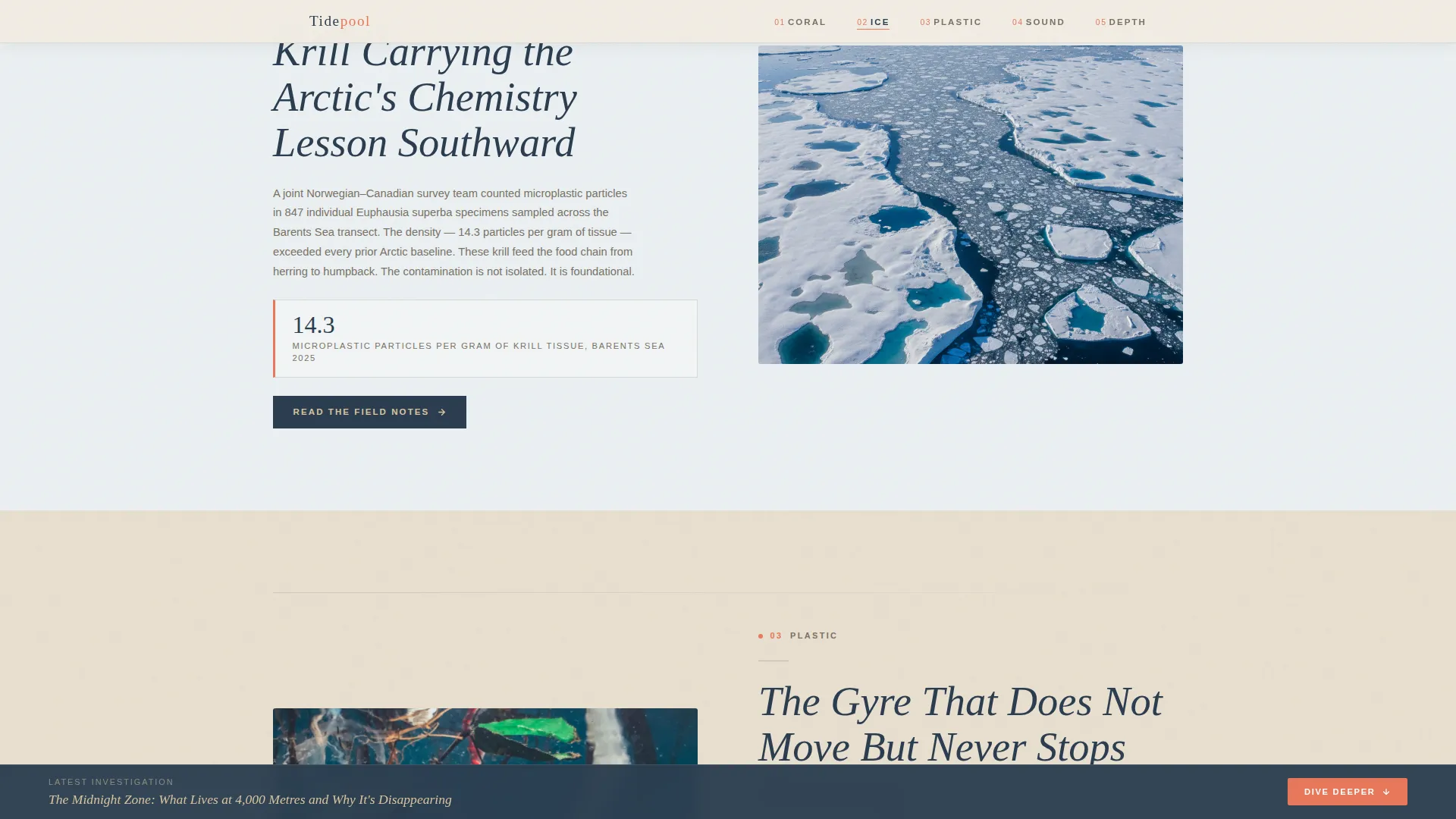
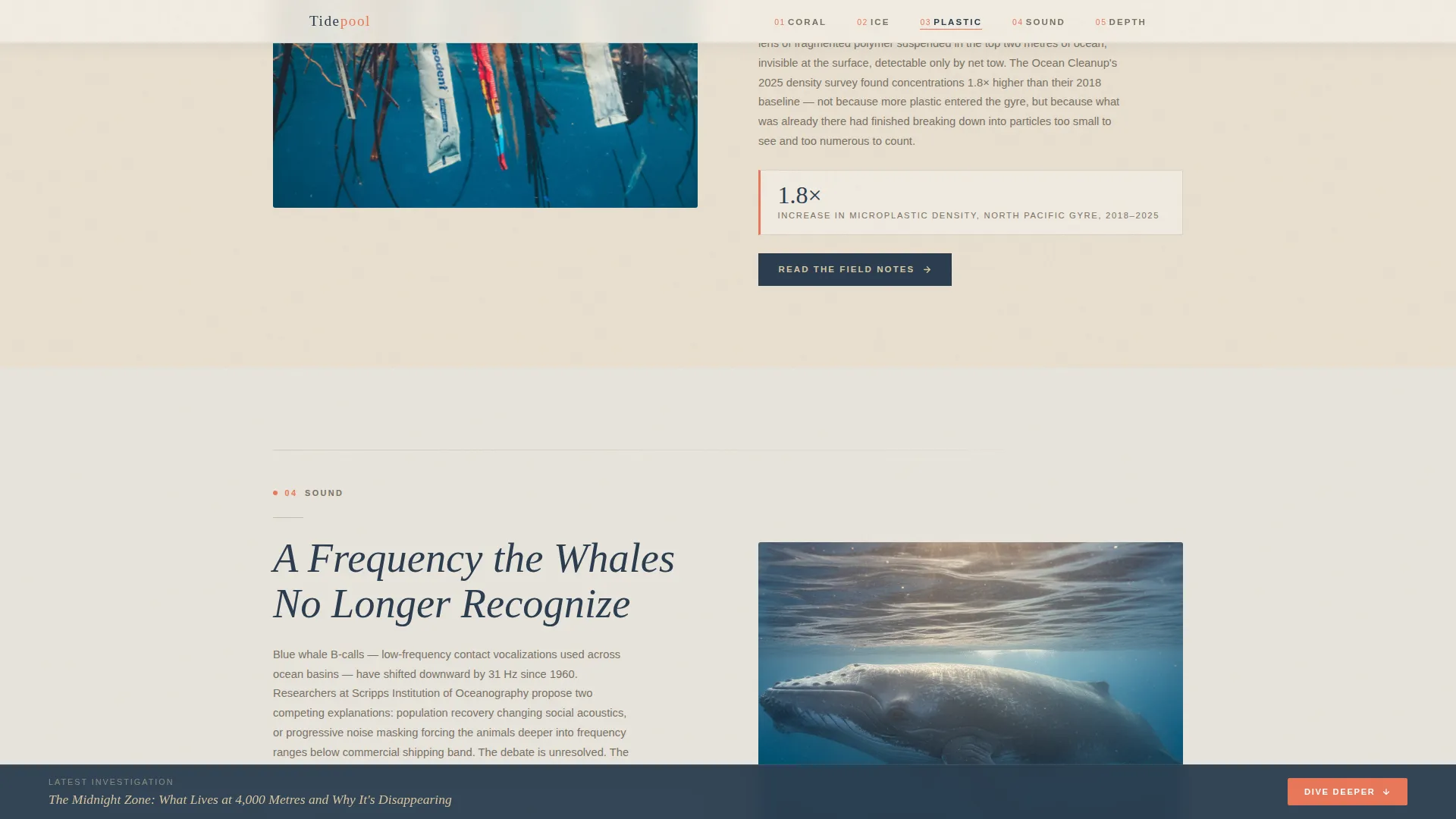
- Five distinct gallery spoke sections, each with a dominant image, editorial wall-placard text, and a "Read the Field Notes" call to action
- A persistent bottom bar carrying a secondary "Dive Deeper" call to action linking to the latest long-form investigation
Feature list
This template packs a focused set of editorial and navigational features, each grounded in the gallery-walk creative direction and click-through landing page strategy.
Full-Viewport Reef Hero Section
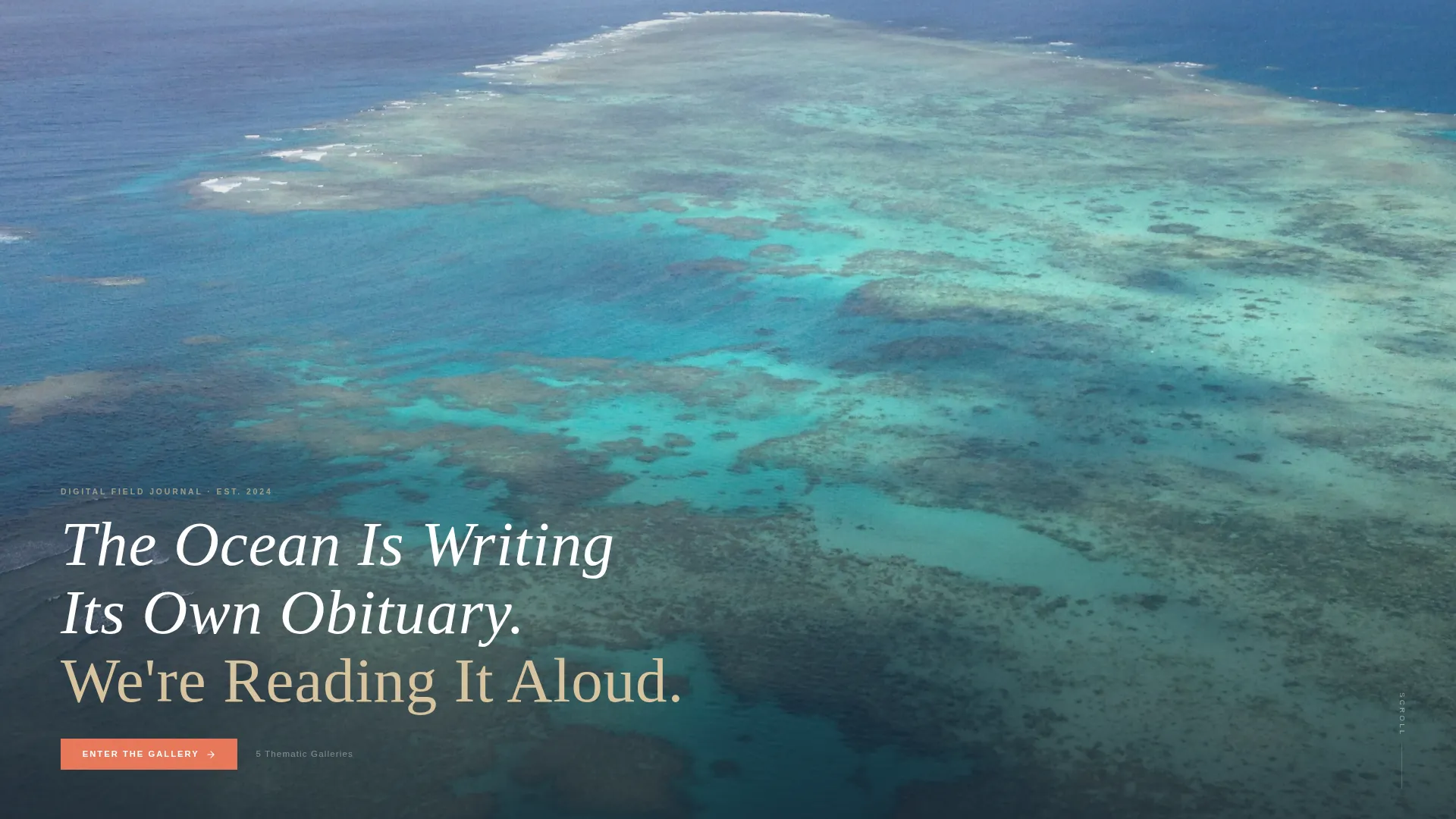
A full-bleed aerial reef photograph fills the entire viewport. The editorial headline sits low in the frame, white type against the dark water channels between coral formations. A sticky anchor navigation bar pins to the top as the reader scrolls.
Sticky Anchor Navigation
The anchor nav behaves like exhibition room numbers in a curated show. It pins to the top of the viewport and highlights the active spoke as the reader scrolls. Living coral accent color marks navigation states and hover interactions.
Five Thematic Gallery Spokes
Each spoke, Coral, Ice, Plastic, Sound, and Depth, functions as a self-contained editorial gallery room. Background tones shift subtly within the warm stone palette as the reader moves between spokes, signaling a new thematic space without breaking visual continuity.
Per-Spoke Click-Through Call to Action
Each spoke closes with a "Read the Field Notes" button that routes the reader into the full blog archive filtered by that theme. The placement earns the click by delivering enough editorial substance within the spoke itself to create curiosity.
Persistent Bottom Bar
A fixed bottom bar remains visible throughout the scroll. It carries the secondary "Dive Deeper" call to action, linking directly to the latest long-form investigation. There is no form and no friction, just a single clear next step.
GSAP ScrollTrigger Animation System
Image reveals, parallax scrolling, and sticky navigation transitions are all powered by GSAP ScrollTrigger. Animations are high-fidelity and timed to the gallery-walk pacing, making each new spoke feel like stepping through a doorway.
Page sections overview
| Section | Purpose |
|---|---|
| Hero Full Viewport | Establishes editorial tone with aerial reef photograph and headline |
| Sticky Anchor Nav | Pins exhibition-style room numbers for spoke navigation |
| Coral Gallery Spoke | Documents bleaching crisis with Sulawesi field photography |
| Ice Gallery Spoke | Covers cryosphere collapse and Arctic krill microplastic data |
| Plastic Gallery Spoke | Presents microplastic ingestion chains and Pacific gyre documentation |
| Sound Gallery Spoke | Explores ocean acoustics and noise pollution impact on cetaceans |
| Depth Gallery Spoke | Showcases deep-sea discoveries and pressure-zone biology |
| Persistent Bottom Bar | Carries secondary "Dive Deeper" call to action to latest long-form piece |
| Minimal Footer | Closes page with a clean horizontal flow layout |
Design & branding system
The visual identity follows an Atelier Studio theme built on a warm stone color palette. Every color choice references a physical material you might find along a coastline, keeping the atmosphere grounded and quietly ancient rather than cold or clinical.
- Warm stone palette: sun-bleached sandstone (#D9C5A0), driftwood gray (#7A7265), deep tide-pool shadow (#2C3E50), and living coral accent (#E8785A) reserved for navigation markers and hover states
- Typography pairing: Fraunces editorial serif for headlines, set thin and wide-tracked; DM Sans for body text and interface elements
- Gallery-walk aesthetic: background tones shift subtly between spokes, dominant images anchor each room, and editorial text reads like museum wall placards
Mobile & speed optimization
The template is designed desktop-first to serve researchers and educators working on larger screens. Full mobile support is included so the gallery-walk experience translates cleanly across device sizes.
- Server Components handle static content delivery, and AppImage handles image optimization to keep load times practical
- Responsive layout adapts the sticky anchor nav, full-bleed hero, and spoke galleries for smaller viewports
- GSAP animations are scoped to preserve smooth performance across both desktop and mobile environments
How this template helps you convert
Tidepool earns the click before asking for it. The gallery-walk structure delivers genuine editorial substance inside each spoke, so the call to action at the close of every section feels like a natural next step rather than a prompt.
- Each spoke functions as a complete editorial teaser. Readers consume enough of the story inside the gallery to feel the pull toward the full archive, making the "Read the Field Notes" click feel earned rather than forced.
- The persistent bottom bar keeps a frictionless secondary conversion path visible at all times. No form, no signup gate, just one clear link to the latest long-form investigation for readers ready to go deeper immediately.
Other information about this template
This template is part of a broader editorial template family built on the Atelier Studio theme. The Atelier Studio approach prioritizes craft, restraint, and visual seriousness over decoration, making it a strong fit for science journalism and environmental storytelling.
- Template style: Hub and Spoke with Anchor Navigation, a structure well-suited to content blogs with multiple distinct topic areas
- Creative direction: Gallery Walk, where each scroll section behaves like a curated exhibition room with its own visual and tonal identity
- Header concept: Type Over Image, a full-viewport photograph with an editorial headline placed low in the frame for maximum breathing room
- Landing page direction: Click-Through, optimized to move readers into the blog archive without any form or signup barrier
- Footer pattern: Vercel Horizontal Flow, minimal layout that closes the page cleanly without distraction
Theme
Atelier Studio
Creative direction
Gallery Walk
Color system
Warm Stone
Style
Hub & Spoke (Anchor Nav)
Direction
Click-Through
Page Sections
Full-viewport Type Over Image Hero
Sticky Anchor Navigation System
Five Thematic Gallery Spokes
Per-spoke Click-through Call to Action
Persistent Frictionless Bottom Bar
GSAP Scrolltrigger Animation System
Related questions
Can I change the five spoke topics to match my own content categories?
Does this template include a blog archive or individual post pages?
Is this template suitable for a non-ocean environmental topic?
What level of coding skill do I need to customize this template?
How does the persistent bottom bar work?



