History & Culture Blog Portfolio Website Template
Chronicle is a single-page world history landing page built for editorial publishers who take the long view. It pairs architectural serif typography with a nineteenth-century folio color palette to create a reading destination that feels authoritative from the first scroll. The template ships with an era showcase, inline article excerpts, and two clear conversion paths, all in an asymmetric 60/40 grid layout.
by Rocket studio
Quick summary
Chronicle is a heritage editorial landing page designed for world history blogs and long-form content destinations. It uses an asymmetric 60/40 grid, a warm ink-and-vellum color system, and a section-led flow that moves readers from a bold typographic hero through era showcases and article excerpts to two focused conversion calls to action.
Who this template is for
This template suits publishers who prioritize depth, credibility, and reader trust over flashy visuals. It works equally well for solo writers and small editorial teams running a scholarly content destination.
- AP history teachers and academics looking to anchor a content hub with genuine scholarly weight
- Graduate students or independent researchers who want a landing page that signals bibliographic seriousness
- Autodidacts and history enthusiasts building a long-form blog that readers will return to weekly
What problem this template solves
Most blog templates flatten editorial content into a generic feed. Chronicle solves the specific challenge of presenting dense, long-form historical writing in a way that feels inviting rather than intimidating.
- Visitors bounce before reading because the page gives no sense of the content's depth or range
- A history blog covering 26 centuries of recorded history needs a visual hierarchy that guides readers, not overwhelms them
- Newsletter signups stall when readers cannot sample the prose quality before committing
What you get with this template
Chronicle delivers a complete single-page layout with every section mapped to a specific reader journey stage. Every element serves the goal of earning trust through visible depth.
- A full asymmetric 60/40 grid landing page with seven distinct content sections from hero to footer
- Three inline article excerpt blocks so readers taste the writing quality before they subscribe
- Two conversion paths: a primary archive call to action and a secondary newsletter signup with a single email field
Feature list
Chronicle's built-in features come directly from its editorial brief and layout architecture. Each one addresses a real need in the world history content niche.
Architectural Hero Typography
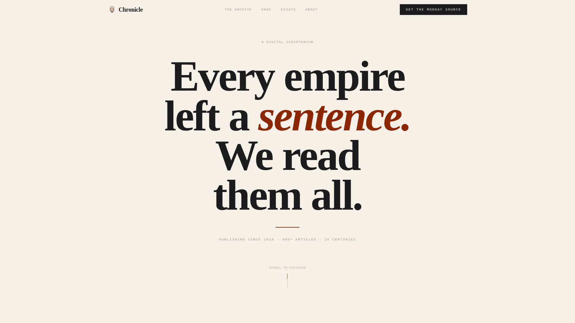
The hero section fills the entire viewport with a single giant centered serif headline set in Fraunces display type. A thin rubric-red rule sits beneath it, and a dateline fades in slowly to establish credibility with a single glance.
Asymmetric 60/40 Grid Layout
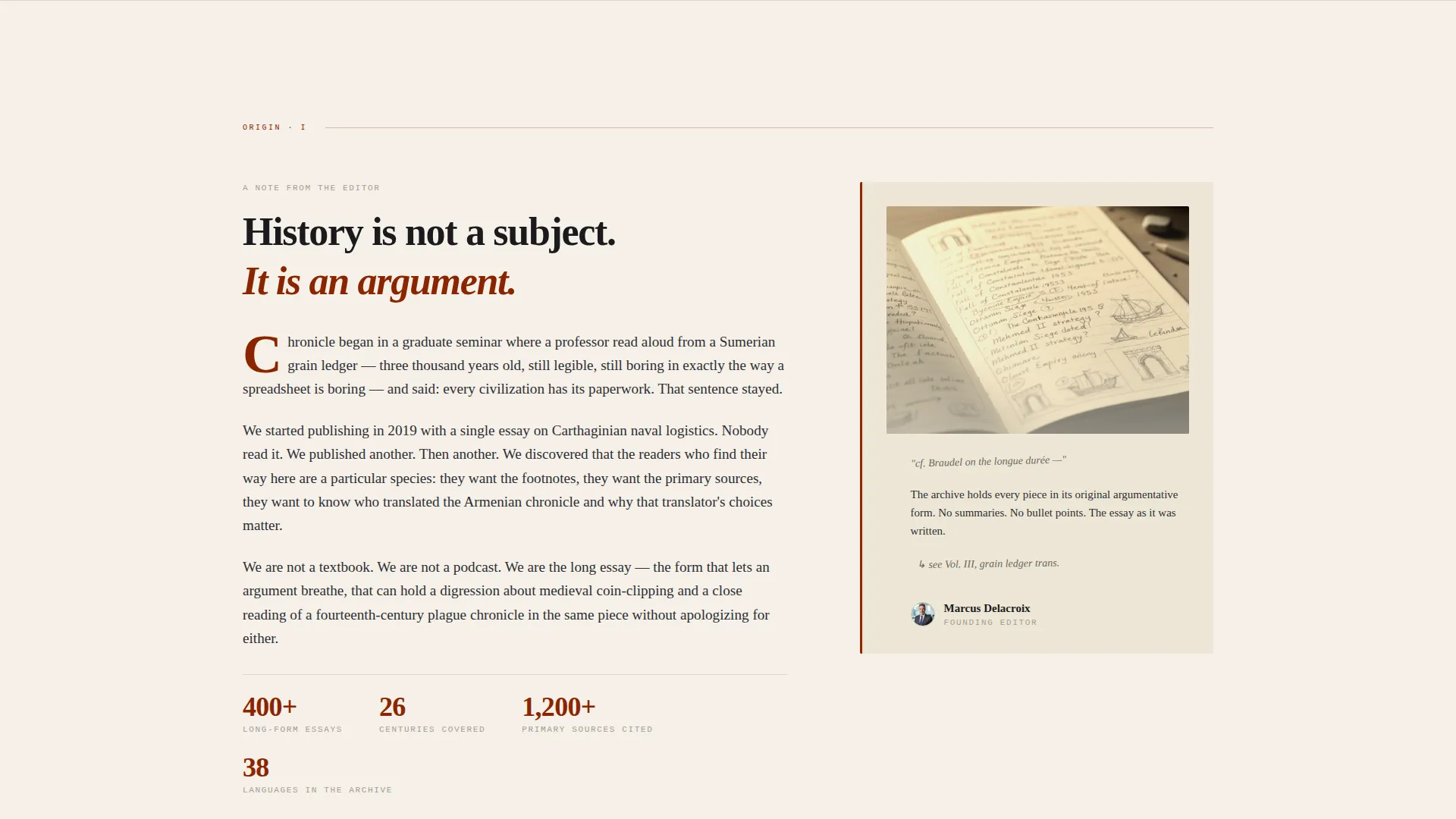
Every section uses a deliberate 60/40 column split that shifts weight as the page scrolls. The wider column carries the primary narrative while the narrower column holds supporting artifacts, notebook margins, and newsletter capture.
Era Showcase with Artifact Cards
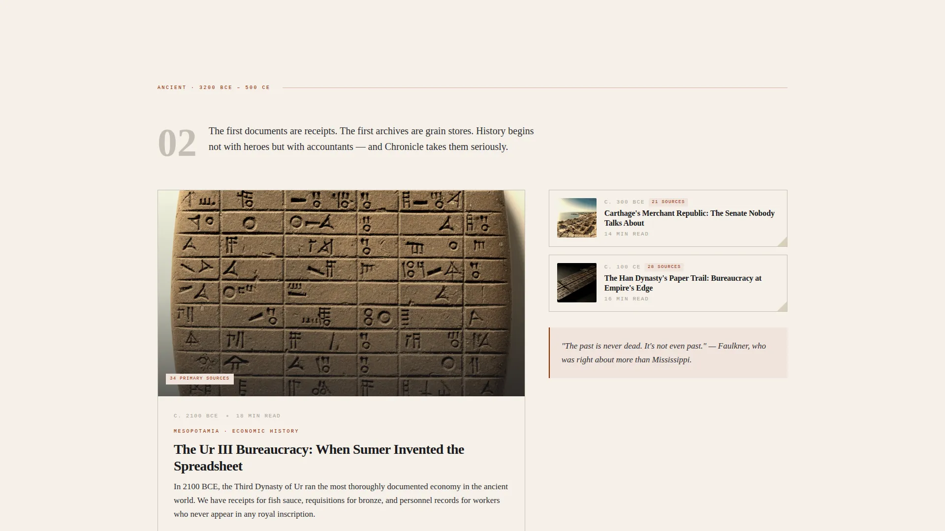
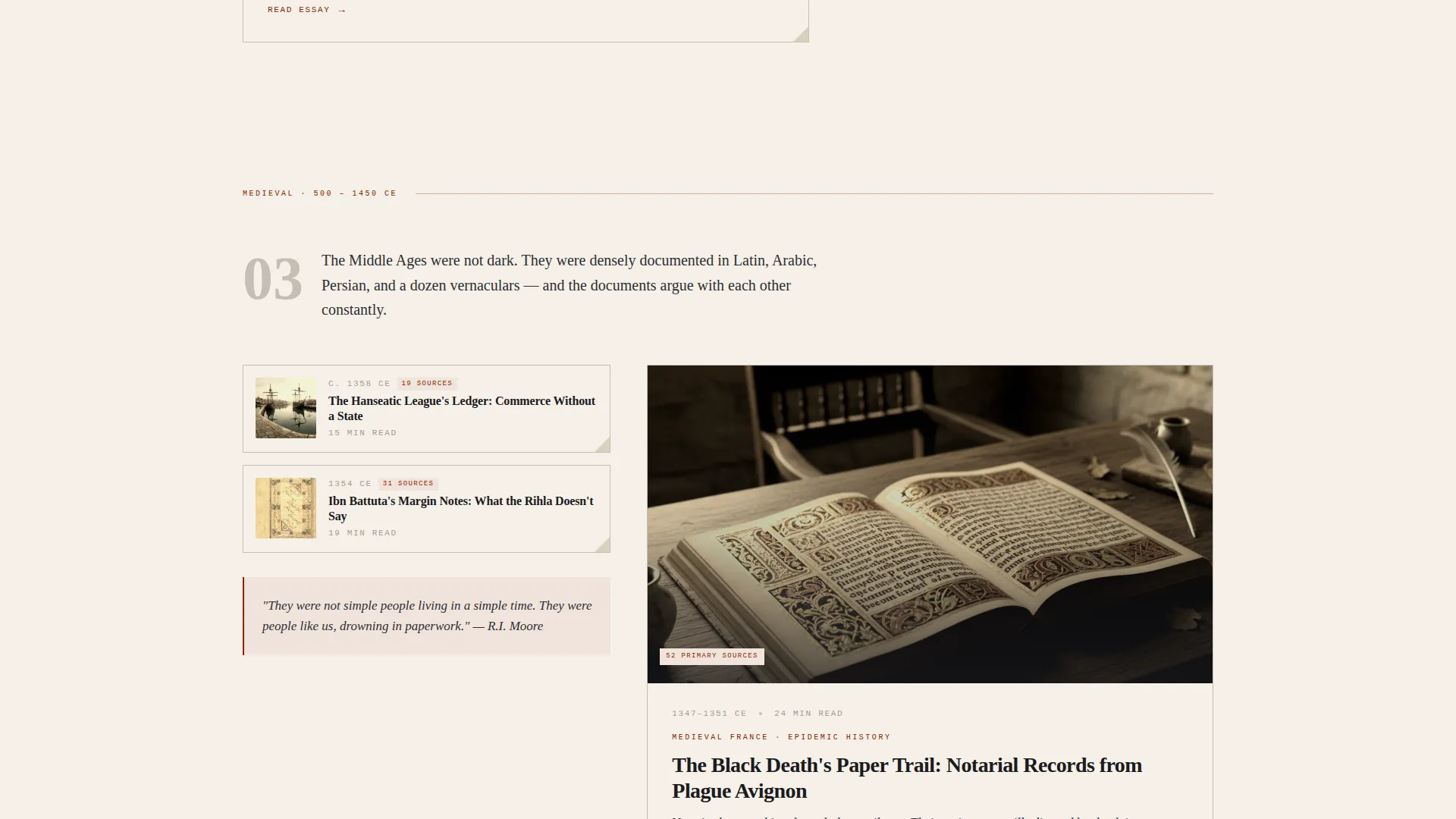
Four content eras, Ancient, Medieval, Early Modern, and Modern, each surface featured articles as artifact cards. Cards display date stamps and source counts, and they animate in with staggered entrances on scroll reveal.
Inline Article Excerpt Blocks
Three full prose samples load directly on the page using accordion-style interactive blocks. Readers can expand each excerpt without leaving the page, letting them judge writing quality before clicking through to the full archive.
Dual Conversion Path Design
The primary call to action, labeled "Enter the Archive," appears after the era showcase when reader curiosity peaks. A secondary "Get the Monday Source" newsletter path sits in the 40-column alongside a preview of the latest weekly dispatch.
Heritage Typographic System
Body text uses Crimson Text for warmth and readability across long paragraphs. Datelines and labels use JetBrains Mono for a sharp, archival contrast. Together they reinforce the nineteenth-century folio aesthetic throughout every section.
Page sections overview
| Section | Purpose |
|---|---|
| Hero Headline | Establish authority with architectural serif typography and a slow-fade dateline |
| Origin Story | Founder's note in 60-column beside a scanned notebook margin in 40-column |
| Era Showcase | Artifact card grid spanning Ancient, Medieval, Early Modern, and Modern eras |
| Inline Excerpts | Three accordion prose samples with date stamps and source counts |
| Archive Call to Action | Primary "Enter the Archive" button placed at peak curiosity |
| Newsletter Signup | Secondary email capture with "Get the Monday Source" and dispatch preview |
| Minimal Footer | Horizontal flow footer with essential links |
Design & branding system
Chronicle's visual identity is built around the Heritage and Story theme using a four-color Ink and Paper system. Every color decision references a specific material from the history of manuscript production.
- Aged vellum (#F5F0E8) warms all backgrounds; iron-gall ink (#1B1B1E) anchors all body text for sharp legibility
- Marginal rubric red (#8B2500) marks every hyperlink, interactive accent, and section drop cap, exactly as a medieval scribe would mark a feast day
- Faded pencil-annotation gray (#A39E93) handles section dividers and secondary labels, keeping the hierarchy clear without adding visual noise
Mobile & speed optimization
The template is designed desktop-first to serve its core audience of long-form readers, but it includes full mobile support so no visitor is turned away.
- Server Components handle all static sections, keeping initial load lean for content-heavy pages
- Scroll animations and accordion interactivity run as Client Components, isolating motion to only the elements that need it
- The asymmetric grid reflows cleanly on smaller screens, preserving the 60/40 rhythm without sacrificing readability
How this template helps you convert
Chronicle earns conversions by building visible credibility before asking for anything. The page architecture guides readers through a deliberate trust sequence.
- The hero dateline ("Publishing since 2019 · 400+ articles · 26 centuries") establishes social proof in the first three seconds, before a reader has read a single article.
- Three inline article excerpts let readers experience the writing quality firsthand, removing the biggest hesitation before a newsletter signup.
- The primary call to action appears after the era showcase, precisely when curiosity about the archive is highest, rather than forcing the ask too early.
Other information about this template
Chronicle is built for the world history blog niche but its layout and conversion logic translate to any long-form editorial or content destination that relies on depth over volume to grow an audience.
- The template is categorized under Blog and Editorial, History and Culture Blog, and the World History Blog niche
- The creative direction follows an Origin Story structure, treating the blog itself as an artifact to be excavated section by section
- The footer uses a Vercel Horizontal Flow pattern (Pattern 3) for a clean, minimal close that does not compete with the archive call to action above it
Theme
Heritage & Story
Creative direction
Origin Story
Color system
Ink & Paper
Style
Asymmetric Grid (60/40)
Direction
Content/Resource
Page Sections
Architectural Hero with Fade-in Dateline
Asymmetric 60/40 Scrolling Grid
Era Showcase Artifact Cards
Accordion Inline Article Excerpts
Dual Conversion Path Layout
Heritage Typographic Trio
Related questions
Can I adapt this template for a history blog covering a single era rather than all of world history?
Does the template include actual article content or just the layout structure?
How does the newsletter signup section work?
Is this template suitable for a desktop-first audience?
Can I use this template if I have not yet published 400 articles?



