Certified Hobby & Passion Content Professional Website Template
Tourney is a medieval combat landing page built for the SCA heavy fighting community. It uses an asymmetric 60/40 grid to pair long-form feature excerpts with data-rich sidebars. Parchment fog backgrounds, woad blue ink lines, and tarnished gold accents give every section the weight of a manuscript page. Fighters, heralds, and chirurgeons all find a reason to keep reading.
by Rocket studio
Quick summary
Tourney is a single-page editorial landing page for an SCA medieval combat blog and community archive. The layout pairs deep narrative features with community data snapshots. Every design choice, from the full-bleed hero to the gold pull-quote breaks, serves readers who earned their stories on the field.
Who this template is for
This template suits community builders and editorial voices rooted in living history and middle ages warfare culture.
- SCA heavy fighters, both veterans and newcomers still on loaner gear
- Heralds, chirurgeons, and living history researchers seeking peer-written content
- Community organizers running a medieval combat blog or archive
What problem this template solves
Generic blog layouts flatten the distinction between a recipe post and a fighter's road to Crown. This landing page restores that weight.
- Long-form excerpts lose readers without a strong visual rhythm to hold attention
- Community data such as war numbers and poll results has nowhere compelling to live
- Click-through rates suffer when the narrative cuts too early or too late
What you get with this template
The template delivers a fully structured editorial landing page shaped around the knighthood homepage layout principle: hierarchy earns the scroll.
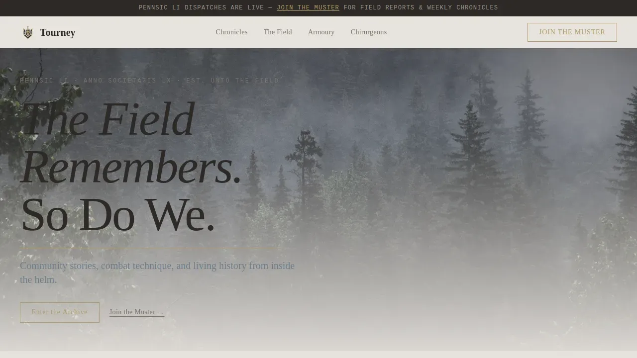
- A full-bleed photo hero with serif headline, gold rule, and woad blue subhead
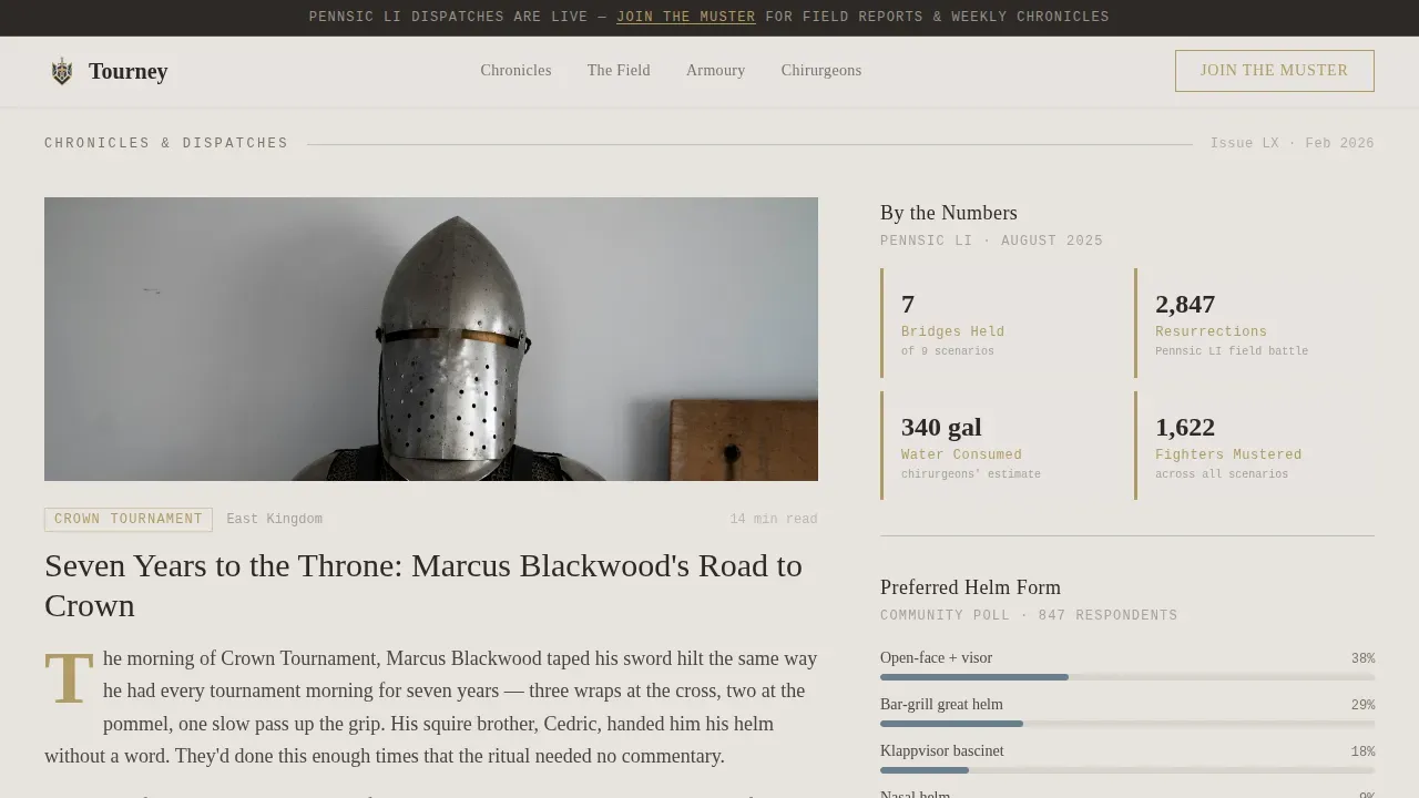
- An asymmetric 60/40 feature well pairing long-form excerpts with a sticky data sidebar
- Pull quote breaks, a tactical deep-dive section, and a community voices block
Feature list
Each section of this landing page vector template is built to carry real editorial weight.
Full-Bleed Photo Hero
A wide, desaturated battlefield image leads the page. The headline fades in over the lower third in Fraunces serif. A thin gold rule draws beneath it, followed by a single woad blue subhead line.
Asymmetric 60/40 Feature Well
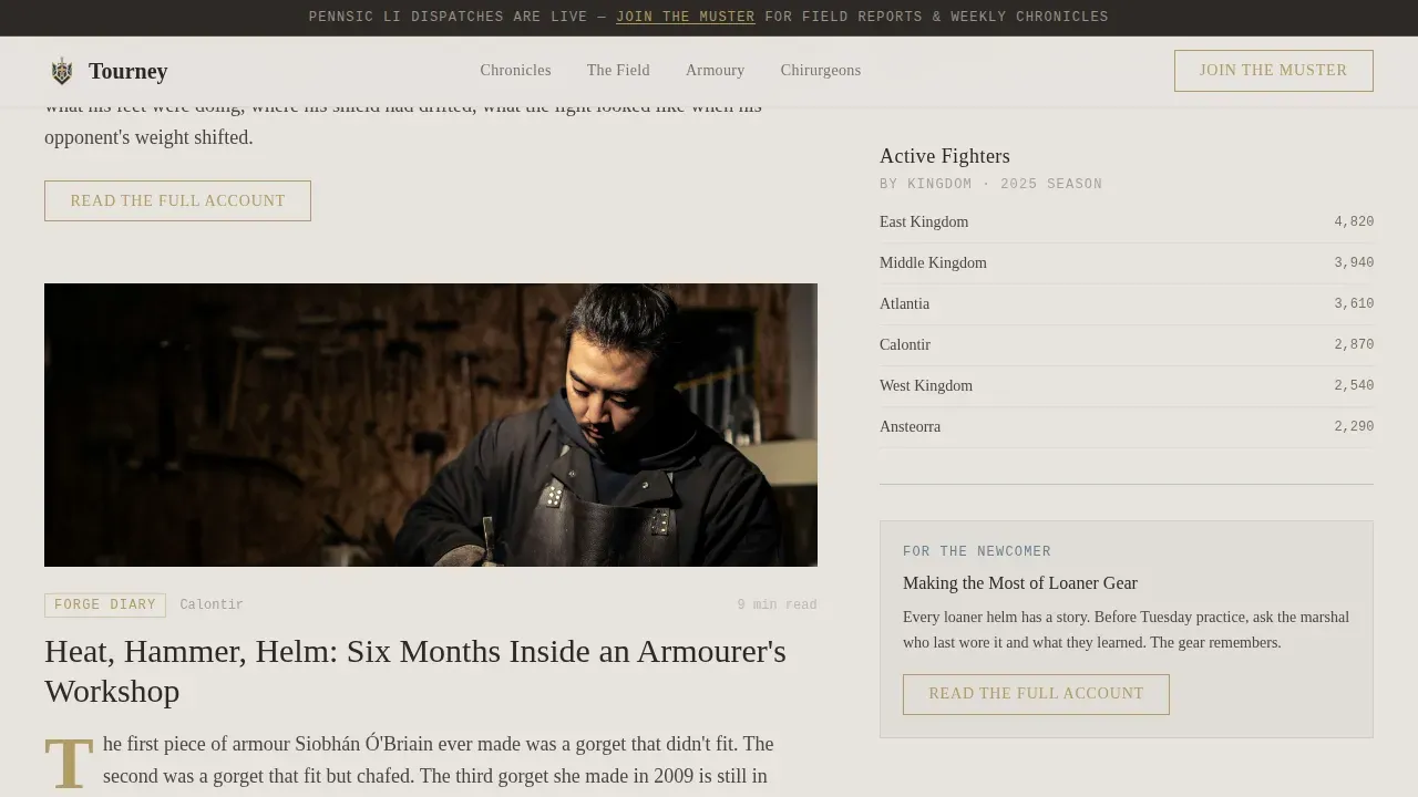
The 60-column carries long-form feature excerpts. The 40-column sidebar holds sticky data cards: kingdom participation numbers, helm-type poll results, and war statistics rendered in JetBrains Mono.
Tarnished Gold Pull Quote Breaks
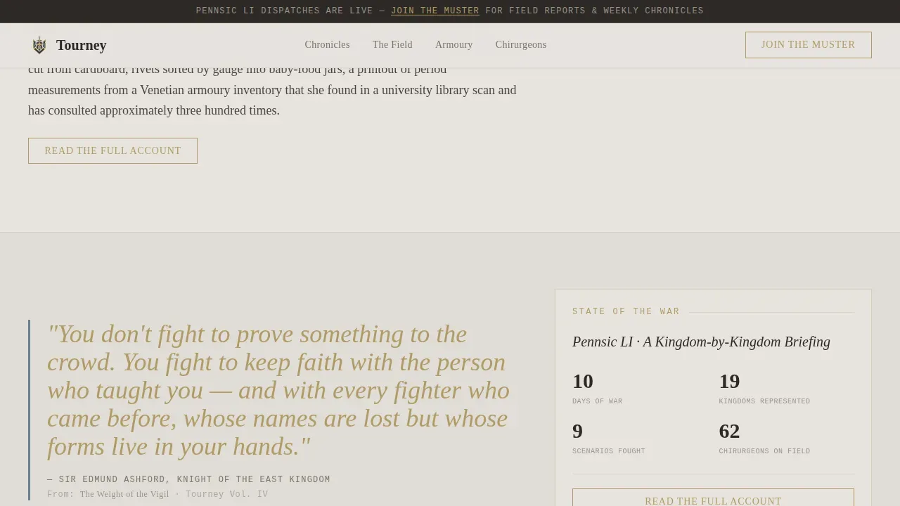
Pull quotes interrupt the scroll like marginalia in an old chronicle. Each one is bordered in woad blue and accented in tarnished gold, giving the page a manuscript rhythm between sections.
Tactical Deep-Dive Section
A dedicated block for technique breakdowns or forge diary excerpts. It escalates the narrative from personal story to analytical depth, giving data-hungry readers a reason to stay.
Community Voices Block
Fighter and chirurgeon testimonials act as trust indicators. Testimonials and expert endorsements enhance the authenticity of any editorial landing page, and this section delivers both.
Theme-Matched Call-to-Action Buttons
Every feature excerpt ends with a gold "Read the Full Account" button. A persistent top bar links to "Join the Muster" for community signup, keeping the conversion path clear without interrupting the read.
Page sections overview
| Section | Purpose |
|---|---|
| Hero Banner | Establish atmosphere and headline |
| Feature Well | Long-form excerpts plus data sidebar |
| Pull Quote Break | Rhythm reset, war numbers card |
| Tactical Deep-Dive | Technique and forge diary content |
| Community Voices | Fighter and chirurgeon testimonials |
| Footer | Minimal parchment-toned navigation |
Design & branding system
The visual identity follows a Heritage and Story theme using the Soft Mist color system. Textured parchment fog backgrounds and historical-script-style typography create an authentic manuscript atmosphere throughout.
- Colors: parchment fog (#E8E4DF), hearthstone gray (#7A7267), faded woad blue (#6B7F8E), tarnished gold (#B09A64), deep charcoal (#2C2926)
- Typography: Fraunces for display headlines, Crimson Text for body, JetBrains Mono for data and numbers
- Woad blue ink lines mark section dividers and pull-quote borders
Mobile & speed optimization
The template is designed desktop-first for long-form readers, with a mobile-responsive fallback. Scroll-reveal animations and parallax effects use CSS scroll-behavior with no heavy JavaScript libraries.
- Staggered card reveals and a gold rule draw animation add motion without heavy scripts
- Sticky sidebar data cards collapse gracefully on narrower screens
- Server Components handle static sections to keep the page lean
How this template helps you convert
High-quality visuals and editorial structure bridge the gap between heritage culture and modern digital engagement, turning passive readers into active community members.
- Each feature excerpt delivers roughly 60% of the story, then cuts at peak tension so the "Read the Full Account" button feels like turning a page, not clicking an ad.
- The persistent "Join the Muster" top bar offers a free signup path without competing with the main reading flow.
Other information about this template
This template is built for users who want a no-code-friendly editorial foundation with strong visual identity. It uses vectors and flat illustrations to represent middle ages combat themes throughout.
- The knighthood homepage layout draws on web banner webpage cartoon concepts and banner webpage cartoon concept styling found in medieval times landing design libraries
- Interface idea with flat illustrations and idea with flat illustrations inform the sidebar data cards and section dividers, giving the page a consistent webpage cartoon concept feel
- The landing page vector template and vector template structure supports easy customization; users can download, select, and swap content blocks in order to match their community's voice
- A website interface idea rooted in horse troops web banner aesthetics makes the hero section immediately recognizable to the SCA audience
- In 2026, visitors value how heritage sites support local conservation and historical preservation, making trust signals like fighter testimonials especially important here
Theme
Heritage & Story
Creative direction
Industry Report
Color system
Soft Mist
Style
Asymmetric Grid (60/40)
Direction
Click-Through
Page Sections
Full-bleed Photo Hero with Animated Gold Rule
Asymmetric 60/40 Editorial Grid
Tarnished Gold Pull Quote Sections
Tactical Deep-dive Content Block
Community Voices Testimonials
Theme-matched Conversion Buttons
Related questions
Is this template suitable for a non-SCA medieval history blog?
Can I search for and replace the placeholder content easily?
Does the template support flat illustrations and vector assets?
How does the 60/40 grid behave on mobile devices?
What makes this different from a standard blog layout?



