Marketplace Growth Stage Landing Page Template
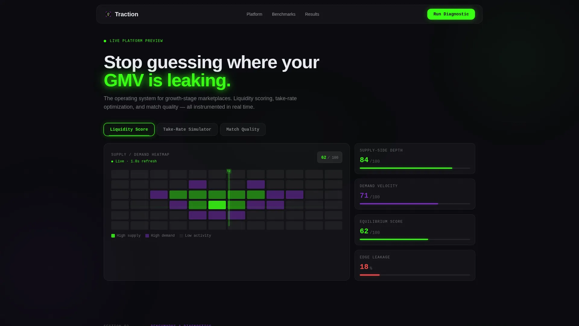
Traction is a bento grid landing page template built for growth-stage marketplace startups. It leads with interactive tools, a tab-switching hero, a take-rate simulator, and a liquidity diagnostic, so founders experience the product before signing up. The design runs on a Tech Glass aesthetic: void black, phosphor green, and UV purple on frosted glass panels.
by Rocket studio
Quick summary
Traction is a single-page, bento grid landing page template for growth-stage marketplace platforms. It puts three live diagnostic tools front and center: a Liquidity Score heatmap, a Take-Rate Simulator, and a Match Quality feed. Visitors interact with real levers before hitting any signup form, making the conversion feel earned rather than forced.
Who this template is for
This template is designed for founders and operators who already understand marketplace mechanics and need a landing page that speaks their language from the first pixel.
- Series A marketplace founders tracking gross merchandise volume (GMV) lift and cohort health
- Growth product managers whose search-rank and matching logic is leaving transactions unconverted
- Operations leads managing manual supplier onboarding and liquidity diagnostics at scale
What problem this template solves
Two-sided marketplace platforms lose value quietly. Matching inefficiencies, miscalibrated take rates, and supply-demand imbalances are hard to visualize on a standard marketing page. Prospects scroll past claims they cannot verify.
- Founders cannot see their own problem reflected in generic SaaS landing pages
- Standard lead capture forms ask for commitment before delivering any value
- Ops and growth teams need proof of platform intelligence before they trust a new tool
What you get with this template
You get a fully structured bento grid landing page with high interactivity baked in at the hero level. Every section builds on the last, layering proof until the call to action feels like a logical next step rather than a request.
- A tab-switching hero bento with three independently reconfiguring diagnostic panels
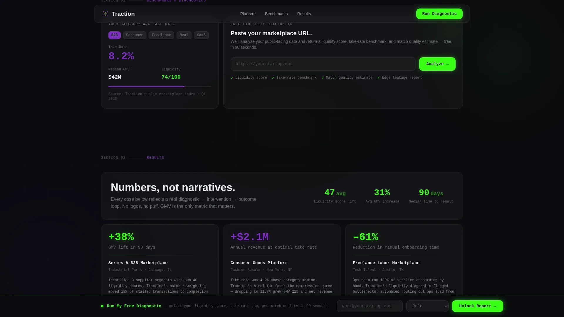
- A benchmarks row with a category take-rate card and a URL-paste liquidity diagnostic
- A glass-tile case study stack, a pinned freemium call-to-action bar, and a linear single-row footer
Feature list
This template ships with six purpose-built components. Each one is grounded in how Series A marketplace operators actually evaluate a platform.
Tab-Switching Hero Bento
Three glass tabs at the top of the hero, Liquidity Score, Take-Rate Simulator, and Match Quality, each reconfigure the bento grid below when clicked. The active tab glows phosphor green at its edge. No static imagery is used; every visible element is a working interface panel.
Live Liquidity Score Heatmap
The Liquidity Score tab surfaces a real-time supply and demand heatmap with a pulsing equilibrium line. Founders can immediately see how balanced their category looks, making the diagnostic feel personal and immediate rather than illustrative.
Draggable Take-Rate Simulator
The Take-Rate Simulator tab exposes a draggable slider. As the visitor moves it, projected GMV and projected platform revenue recalculate live. This single interaction communicates the platform's core value proposition faster than any paragraph of copy.
Match Quality Confidence Feed
The Match Quality tab displays a ranked feed of buyer-seller pairs with confidence percentages that tick upward in real time. The animated counters reinforce that the matching engine is already running, not a concept waiting to be built.
URL Diagnostic and Benchmark Cards
Below the hero, a wide bento card lets visitors paste their own marketplace URL to receive a free liquidity diagnostic. A smaller companion card shows the average take rate for their category, pulled from public marketplace benchmark data. Together they personalize the page without requiring login.
Pinned Freemium Conversion Bar
After the first scroll, a phosphor green "Run My Free Diagnostic" call-to-action bar pins itself to the bottom of the viewport. The form only asks for a work email and role, founder, growth, or ops, because the URL was already captured in the hero tool. A secondary path, "See Full Benchmarks," gates a downloadable category report behind a separate email capture.
Page sections overview
| Section | Purpose |
|---|---|
| Hero Tab Switcher | Opens with three interactive diagnostic tabs that reconfigure the bento grid live |
| Liquidity Score Panel | Shows a pulsing supply/demand heatmap tied to the first hero tab |
| Take-Rate Simulator Panel | Surfaces a draggable GMV and revenue slider in the second hero tab |
| Match Quality Feed | Displays a ranked buyer-seller confidence feed in the third hero tab |
| Benchmarks Row | Combines a category take-rate card with a URL-paste liquidity diagnostic tool |
| Case Study Stack | Stacks three glass-tile mini case studies showing GMV lift percentages |
| Pinned call to action Bar | Pins "Run My Free Diagnostic" to the viewport bottom after first scroll |
| Benchmarks Gate | Captures email for a downloadable marketplace category benchmark report |
| Linear Footer | Single-row footer following the Pattern 1 linear layout |
Design & branding system
The visual identity follows a Tech Glass direction powered by an Acid Digital color system. The palette is built to feel electric and clinical at the same time, like a terminal window reflecting off a glass desk late at night.
- Core colors: void black (#0B0B0F) for backgrounds, phosphor green (#39FF14) for live data and primary calls to action, UV purple (#7B2FBE) for secondary actions and graph accents, and frosted glass white (#E8EAF0) for card surfaces at 12% opacity blur
- Typography: JetBrains Mono for all data and numerical displays, Manrope for all interface copy and body text
- Card borders carry subtle luminance so panels appear to float over the void black background rather than sit on it
Mobile & speed optimization
This template is built desktop-first, reflecting how Series A founders and growth operators typically work: on laptops, late at night, with multiple data tabs open. The technical build targets smooth, GPU-accelerated performance to keep interactions feeling instant.
- Animations use GPU-accelerated transforms and minimal repaints to keep tab switching and counter updates smooth on modern laptops
- Pulsing data indicators, glowing borders, and counter animations are handled without layout-blocking operations
- The bento grid layout is structured to remain navigable at common laptop screen widths without sacrificing the density of information on display
How this template helps you convert
This template is built around a single conversion principle: give real value before asking for anything. By the time a visitor reaches the call-to-action bar, they have already used the product.
- The hero diagnostic tools let visitors interact with their own marketplace scenario in the first seconds on page, making the "Run My Free Diagnostic" call to action feel like a continuation rather than a cold ask.
- The URL capture in the hero tool pre-fills the conversion funnel, so the final signup form only requires a work email and role, reducing friction at the moment of highest intent.
- The secondary "See Full Benchmarks" path offers a downloadable category report behind email capture, providing a lower-commitment entry point for visitors who are not yet ready for the full diagnostic.
Other information about this template
This template suits founders and operators who want a landing page that does analytical work before the sales conversation begins. A few additional details worth knowing before you build.
- The bento grid layout is structured in escalating rows: each section adds a new layer of proof, so scrolling feels like configuring a dashboard rather than reading a brochure
- Social proof is expressed through GMV lift percentages and cohort improvement stats in the glass-tile case study stack, not logos or company names
- Localization defaults are set for English copy, USD currency formatting, and US date format
- The footer follows the Pattern 1 linear single-row layout, keeping the bottom of the page clean and uncluttered
- This template works best when paired with a backend that can handle real URL ingestion and diagnostic report generation, as those interactive components are designed as live-capture flows


Theme
Tech Glass
Creative direction
Calculator/Tool First
Color system
Acid Digital
Style
Bento Grid
Direction
Freemium/Trial
Page Sections
Tab-switching Hero Bento Grid
Draggable Take-rate Simulator
Live Liquidity Score Heatmap
Match Quality Confidence Feed
URL Diagnostic and Benchmark Cards
Pinned Freemium Call to Action Bar
Related questions
Who is this landing page template designed for?
Can I customize the take-rate slider values and benchmark data?
Does the template include the actual diagnostic logic for the URL tool?
What makes this different from a standard SaaS landing page template?
Is this template suitable for early-stage marketplaces that have not yet reached Series A?



