Refined Insurance Insights Landing Page Template
The Underwrite template is a horizontal scroll insurance podcast landing page built for audio journalism brands in the insurance industry. It pairs a Japanese Zen color system with cinematic typography to create an editorial media destination. Visitors explore episode clips, a portrait gallery of guests, and a thematic episode library before signing up for a weekly brief.
by Rocket studio
Quick summary
Underwrite is a luxe minimal insurance podcast landing page template built for media brands that serve insurance professionals. The horizontal scroll layout moves visitors through a manifesto hero, inline episode clips, a portrait gallery, a thematic archive, and a frictionless email capture form. Every section is designed to build trust and convert listeners into loyal subscribers.
Who this template is for
This template is purpose-built for insurance podcast creators and editorial media brands targeting serious industry professionals. It suits hosts who produce long-form conversations with underwriters, actuaries, and agency owners. The layout communicates authority without clutter, making it the right fit for a sophisticated target audience.
- Independent insurance agents and carrier executives seeking market intelligence
- InsurTech founders and industry-curious professionals exploring the legacy insurance world
- Podcast producers who want a premium media brand presence rather than a generic show page
What problem this template solves
Most podcast landing pages treat all visitors the same. They stack episode thumbnails in a vertical feed, load the page with competing calls-to-action, and leave visitors guessing about the show's purpose. An insurance podcast landing page for a niche professional audience needs more intentional structure. Without it, even great content fails to convert.
- Generic podcast pages overwhelm visitors with too many choices and no clear hierarchy
- Insurance professionals distrust pages that look amateurish or fail to signal editorial credibility
- Standard templates cannot express the depth and prestige that long-form insurance journalism demands
What you get with this template
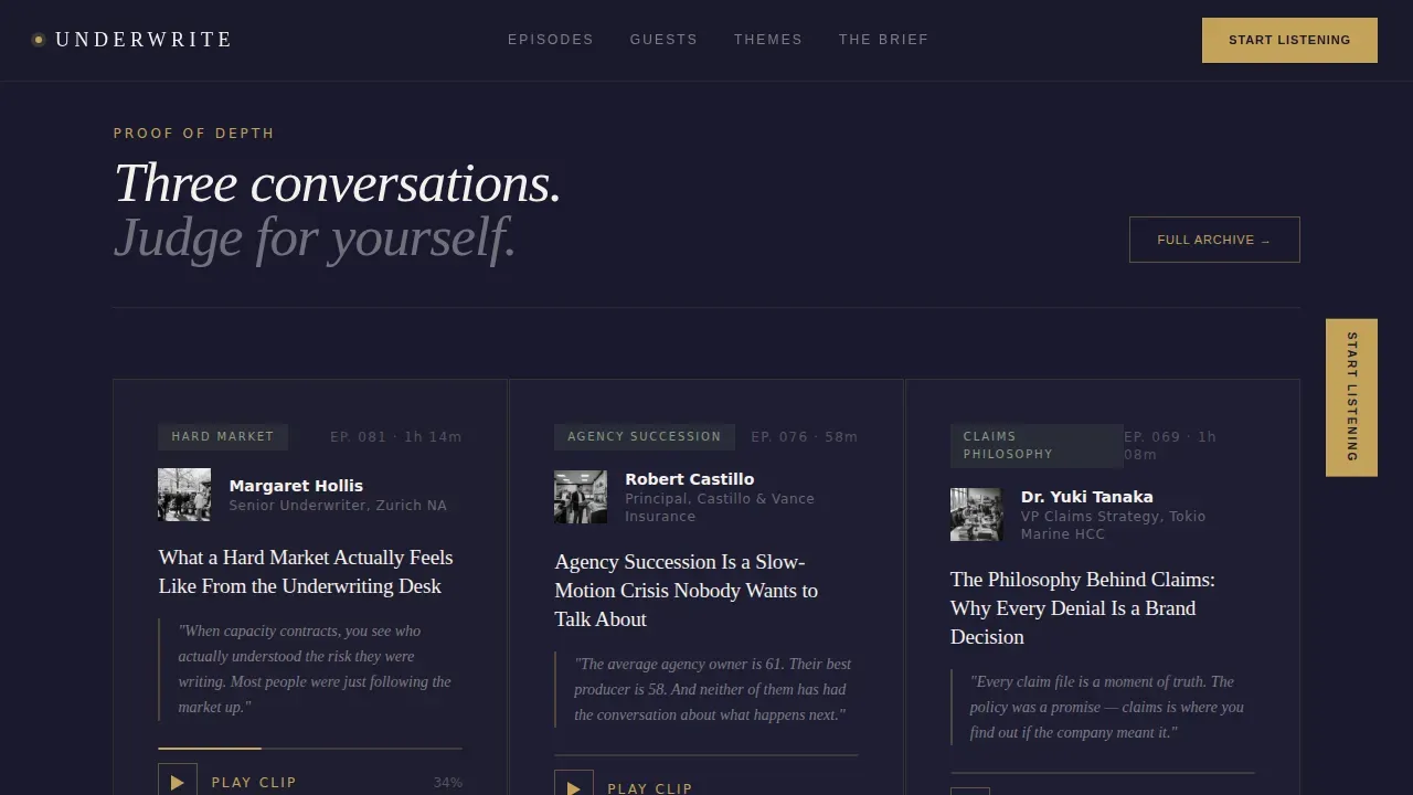
This template delivers a fully structured, horizontally scrolling podcast landing page designed around the Underwrite brand brief. Every section earns its place. The page proves depth before it asks for anything, surfacing three inline episode clips so visitors can sample content before they fill out any form.
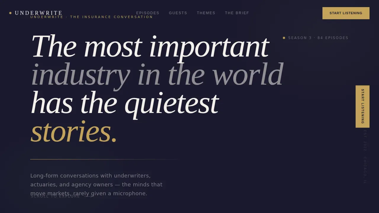
- A full-viewport manifesto hero with cinematic serif headlines and a tatami-gold pulse rule
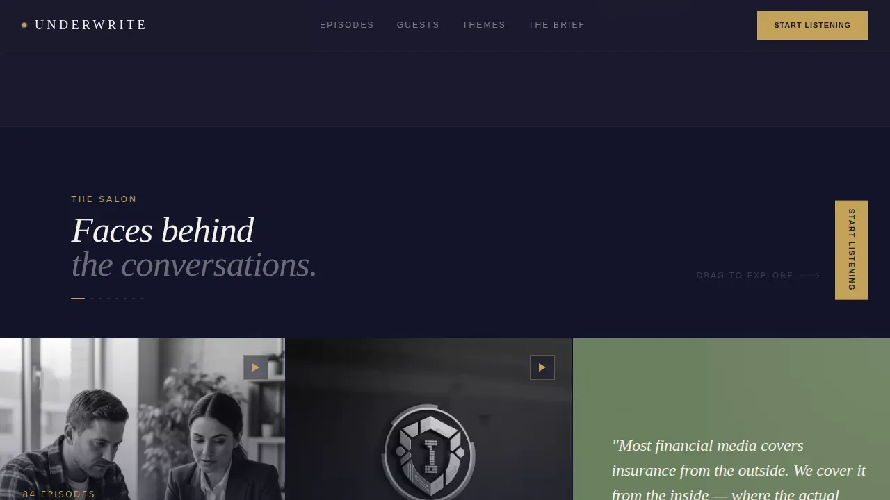
- A horizontal Creator Spotlight gallery with black-and-white portrait panels and guest philosophy quotes
- A thematic episode library organized as a curriculum, plus a "Get the Brief" email capture form with a role selector
Feature list
This insurance podcast landing page template ships with six core features that work together to convert visitors into listeners and subscribers.
Full-Viewport Manifesto Hero
The hero section fills the entire screen with a sumi-ink background and a single refined serif headline. No hero image competes with the message. A thin tatami-gold rule pulses beneath the text, inviting the first lateral scroll. The result is an immediate, cinematic value proposition that visitors feel within seconds.
Horizontal Scroll Gallery Walk
The page moves laterally rather than vertically. Each scroll panel carries a single idea: a portrait, a quote card, or an episode cluster. This layout keeps users engaged and builds narrative momentum as they move through the page. The drag scroll interaction is smooth and intentional, never mechanical.
Inline Episode Clip Player
Three full episode clips are embedded directly on the page before any subscription ask. Visitors can access audio without leaving the landing page. This embedded audio player approach lets the content do the convincing. Proof of depth comes first; the form comes after.
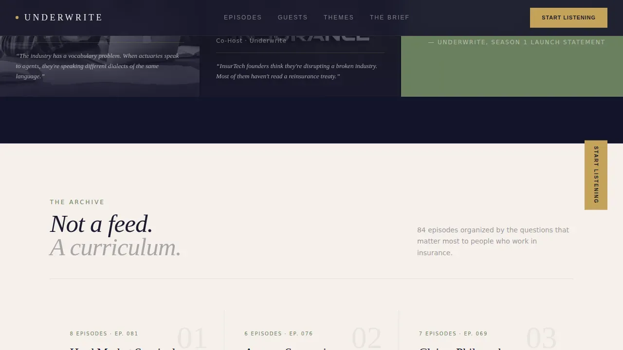
Thematic Episode Library
Episodes are organized by theme rather than by date. Categories such as "Hard Market Survival," "Agency Succession," and "Claims Philosophy" make the archive feel like a curriculum. This structure helps guide visitors toward the content most relevant to their role, improving dwell time and conversion rate.
Creator Spotlight Portrait Panels
Each panel in the gallery walk features a single host or recurring guest in dramatic black-and-white portraiture, paired with a one-sentence philosophy pulled from their episode. Quote cards in moss stone typography break the rhythm between portraits. This section functions as social proof, establishing the media brand's editorial credibility through the faces and ideas of its contributors.
"Get the Brief" Email Form
The subscription form asks only for an email address and a role selector: agent, carrier, vendor, or curious outsider. The form is intentionally minimal and easy to fill out. A frictionless form like this reduces bounce rates and keeps the conversion path clear. The "Start Listening" call-to-action anchors every scroll panel, while "Get the Brief" closes the page with a low-commitment secondary ask.
Page sections overview
| Section | Purpose |
|---|---|
| Manifesto Hero | Opens with cinematic conviction and invites lateral scroll |
| Episode Proof Clips | Three inline clips prove content depth before any ask |
| Creator Portrait Gallery | Horizontal salon of hosts and guests with philosophy quotes |
| Quote Break Cards | Full-bleed moss stone cards let key insights breathe |
| Thematic Episode Library | Curriculum-style archive organized by professional theme |
| Get the Brief Form | Email capture with role selector for weekly executive summary |
| Ultra-Minimal Footer | Clean horizontal footer pattern with essential links only |
Design & branding system
The visual identity follows a Japanese Zen color system built around four tones that never compete. Professional typography pairs Fraunces, an elegant serif, for display headlines with DM Sans, a clean sans-serif, for body and interface text. This two-font system keeps branding consistent across every scroll panel. The result is a page that feels like a handmade washi paper journal resting on black lacquer.
- Sumi ink (#1A1A2E) as the primary background, tatami gold (#C4A35A) for rules and accents, shoji white (#F5F0EB) for body text, and moss stone (#6B7F5E) reserved for active states and progress indicators
- Dramatic black-and-white portrait photography in the gallery panels, with no color photography competing against the palette
- Ample white space and large negative space in every panel, creating a minimal layout where each element earns its presence through restraint
Mobile & speed optimization
The template is built desktop-first to serve carrier executives on a commute and agents between appointments. However, mobile parity is maintained so the horizontal scroll and embedded players work correctly on touch devices. Most people today access content on phones, and a mobile-friendly insurance landing page must load fast and keep everything easy to read and tap.
- Touch-friendly horizontal drag scroll that responds naturally on mobile screens
- Server-rendered static sections for fast initial load, with client-side interactions reserved for scroll and player components
- Optimized layout that scales from wide desktop panels to a single-column mobile stack without losing visual hierarchy
How this template helps you convert
Every design decision in this template serves a single goal: move visitors from curiosity to action without friction. The page earns trust before it asks for anything, which is the hallmark of amazing landing pages in any niche. Limiting the page to one primary call-to-action per panel helps guide visitors toward conversion without clutter.
- The manifesto hero creates immediate emotional investment, so visitors scroll forward with intent rather than bouncing within seconds of loading the page.
- Three inline episode clips function as trust signals and social proof, letting the content itself build credibility before the subscription form appears.
- The minimal "Get the Brief" form asks for only two inputs, keeping the conversion rate high by reducing the commitment required to sign up.
Other information about this template
This template is a great example of how a podcast landing page can serve a niche professional audience without overwhelming visitors with dense content or competing visual elements. The design approach aligns with best practices for high-converting insurance landing pages across a range of insurance products and coverage areas. Whether a company focuses on auto insurance, travel insurance, health insurance landing page content, or broader health insurance landing topics, the editorial structure adapts to any insurance business that wants to communicate authority through audio journalism.
Companies using dedicated landing pages generate significantly more leads than those that rely on general website pages alone. The messaging on this insurance landing page communicates values around security, convenience, and trust, which are the same values that most people look for when evaluating any insurance company or insurance options in the market. The page is built to support an insurance company that wants to protect its brand reputation while also building an engaged listener community.
The template is fully customizable. You can publish it quickly without writing code from scratch. The layout, headlines, video clips, testimonials, and form fields can all be updated to match your brand. Background colors, typography, and section order can be adjusted to support different insurance products and coverage stories.
- The underwrite luxe minimal insurance podcast landing page template is the source design for this listing
- Trust signals such as industry awards, guest credentials, and listener role diversity are built into the gallery and episode sections
- The page is a relevant reference for any editorial media brand in the insurance business looking to build trust with a professional audience
- Tools like this template save significant time compared to building a custom insurance landing page from scratch
- The store of episode content grows over time, and the thematic library structure lets you add new curriculum categories without redesigning the page
- Dynamic content areas allow you to post updated episode clips and quote cards as the show evolves
Theme
Luxe Minimal
Creative direction
Creator Spotlight
Color system
Japanese Zen
Style
Horizontal Scroll
Direction
Content/Resource
Page Sections
Full-viewport Manifesto Hero
Horizontal Scroll Gallery Walk
Inline Episode Clip Player
Thematic Episode Library
Creator Spotlight Portrait Panels
Frictionless Get the Brief Form
Related questions
Who is this landing page template designed for?
Can I customize the episode categories and guest portraits?
Does the template include an embedded audio player?
How does the Get the Brief form work?
Can this template work for a health insurance landing page or other insurance niches?



