Insurance Blog Coming Soon Landing Page Template
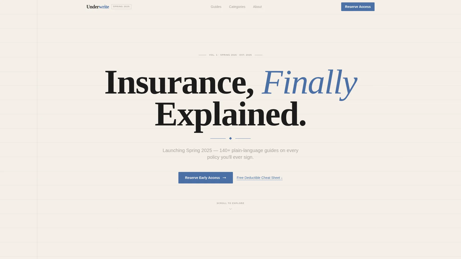
Underwrite is a coming-soon landing page for an insurance how-to blog. It pairs a bold editorial aesthetic with practical conversion tools: a masonry grid of article preview cards, full-width pull-quote banners, and a focused email waitlist form. The design feels like a trusted field guide, built to earn reader confidence before a single guide goes live.
by Rocket studio
Quick summary
Underwrite is a single-page waitlist landing page designed for an insurance education blog. It uses an editorial field-guide aesthetic to preview 140+ plain-language guides across five policy categories. Two email capture points, a masonry article grid, and typeset pull-quote banners work together to convert curious visitors into early-access subscribers.
Who this template is for
This template suits publishers and content creators launching an insurance-focused blog or editorial resource. It works best when you want to build an audience before your full content archive goes live.
- First-time bloggers and independent publishers entering the insurance education space
- Content teams previewing a large guide library ahead of a formal launch
- Freelance writers or consultants building an email list around policy how-to content
What problem this template solves
Insurance topics are dense, jargon-heavy, and rarely explained in plain language. Most coming-soon pages feel thin and unconvincing. This template solves the credibility gap by showing depth before launch day arrives.
- Visitors can see the full scope of the planned content archive before signing up
- The editorial design signals expertise and authority without requiring live articles
- Two distinct email capture flows serve readers who want early access and those who want something useful right now
What you get with this template
You get a fully structured, single-page waitlist landing page that functions as both an audience-building tool and a content preview. Every section is built around the insurance how-to blog use case.
- A hero section with a large centered serif headline and subline on a clean parchment field
- A masonry grid of styled article preview cards organized by category and edition notation
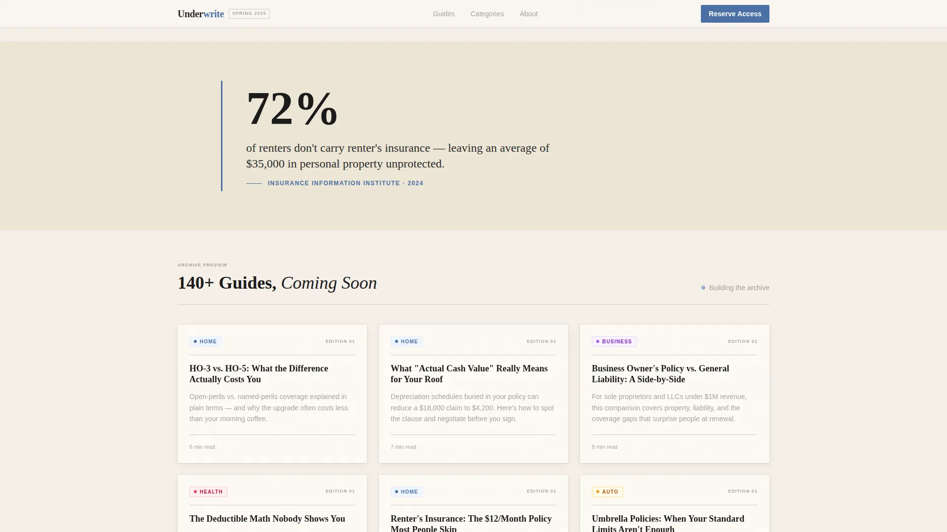
- Two full-width pull-quote banners displaying typeset statistics between card clusters
- A sticky mobile call-to-action bar and an anchored desktop sidebar form for email capture
- A secondary call-to-action offering a free downloadable deductible cheat sheet
Feature list
This template includes purpose-built features aligned with the coming-soon blog launch use case.
Masonry Article Preview Grid
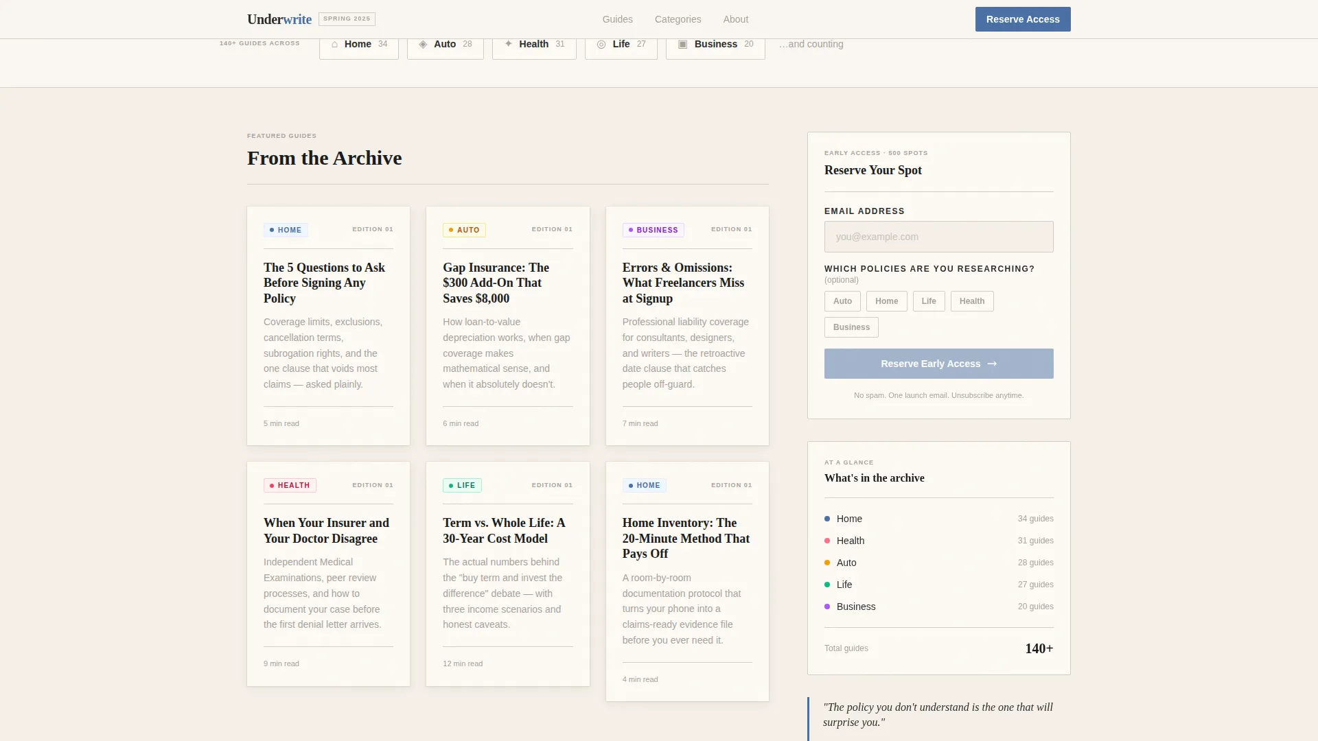
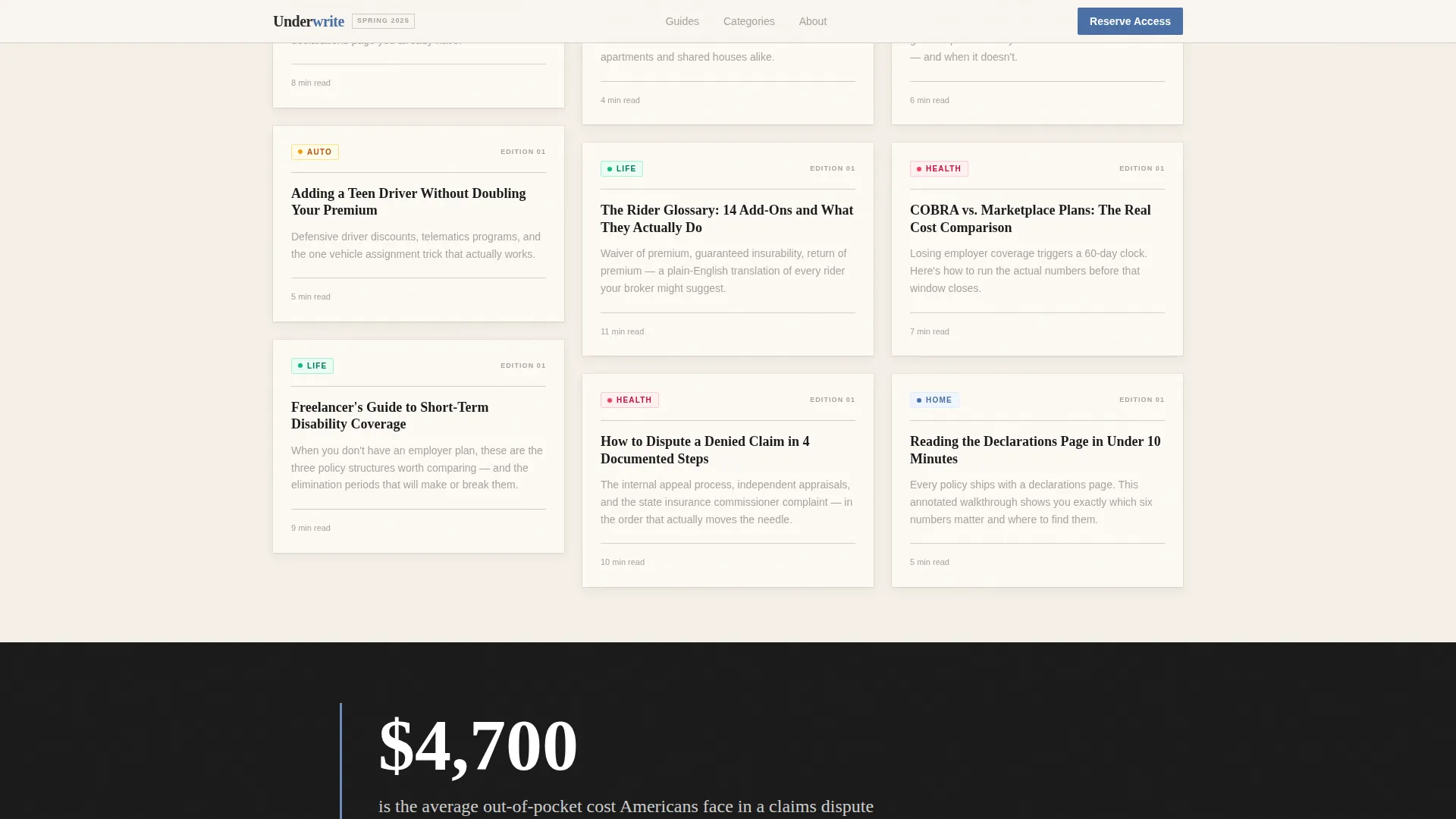
Cards are styled as excerpted report pages, each showing an article title, a two-line abstract, a category tag, and an edition notation. The grid loads progressively and varies card heights to suggest a deep, already-assembled archive.
Pull-Quote Statistic Banners
Full-width banners surface bold typeset statistics between card clusters. They are styled like data callouts from a printed annual report, reinforcing subject-matter credibility through scroll.
Dual Email Capture System
A primary form asks only for an email address plus an optional checkbox grid for policy interest areas: Auto, Home, Life, Health, and Business. A secondary call-to-action below the grid captures emails through a free cheat sheet offer for readers who want immediate value.
Sticky and Sidebar Call-to-Action Layout
On mobile, the primary call-to-action appears as a sticky bottom bar that stays visible during scroll. On desktop, the same form anchors as a sidebar field, keeping the conversion prompt in view without interrupting the reading flow.
Editorial Typography System
Headlines use a serif typeface for printed authority. Body copy and interface elements use a clean sans-serif for readability. The contrast between the two creates the field-guide tension the design relies on.
Scroll-Linked Animation and Card Stagger
Cards reveal with a stagger animation as the visitor scrolls. Pull-quote banners use scroll-linked parallax. The progressive loading effect reinforces the sense of a vast archive unfolding with each scroll step.
Page sections overview
| Section | Purpose |
|---|---|
| Hero Headline | Anchors trust with a bold serif headline and subline on a parchment field |
| Masonry Grid (First) | Previews article cards styled as report excerpts across five categories |
| Pull-Quote Banner 1 | Displays a typeset insurance statistic as a full-width editorial callout |
| Masonry Grid (Continued) | Extends the archive preview with additional staggered cards |
| Pull-Quote Banner 2 + call to action | Pairs a second statistic callout with the cheat-sheet secondary offer |
| Footer | Closes the page with a horizontal flow layout |
Design & branding system
The visual identity follows an Ink and Paper theme built around the Cloud Canvas color system. Every design decision references the feeling of a well-loved reference book sitting open on a wooden desk.
- Four-color palette: soft parchment white (#F5F0E8) for backgrounds, graphite ink (#2C2C2C) for type, margin-note gray (#A8A29E) for secondary text, and editorial blue (#4A6FA5) used sparingly for links, buttons, and pull-quote rules
- Cards float on subtle shadows that evoke clipped articles pinned to a corkboard, reinforcing the archival aesthetic
- Typography pairs a serif headline face for editorial authority with a sans-serif body face for clean interface legibility
Mobile & speed optimization
The template is built mobile-first, with distinct interaction patterns for small and large screens. Static and interactive components are structured to keep the page responsive under real browsing conditions.
- The sticky bottom call-to-action bar on mobile keeps the email form accessible without interrupting card browsing
- Server components handle the static masonry grid while client components manage form interactions and checkbox toggles
- Card stagger reveals and scroll-linked parallax are implemented at medium intensity to balance visual impact with smooth scrolling
How this template helps you convert
The conversion strategy is built around showing depth first and asking for commitment second. Every structural decision reduces the friction between arriving on the page and submitting an email address.
- The masonry grid previews enough article titles, abstracts, and categories to make the archive feel real and substantial before any guide exists publicly, earning trust through implied scope.
- The dual call-to-action system offers two entry points: a waitlist promise for readers who are convinced by the depth, and a free cheat sheet for readers who want immediate value before committing to early access.
Other information about this template
This template is designed specifically for the insurance blog and editorial publishing niche. It is a strong fit for anyone building a content-first audience before a full site launch.
- The five category tags built into the preview cards are Auto, Home, Life, Health, and Business, matching the most common personal and small-business insurance research areas
- The optional checkbox grid doubles as a lightweight audience segmentation tool, letting you see which policy categories attract the most interest at signup
- The template follows a Waitlist and Coming Soon landing page direction, making it reusable for any future educational blog launch beyond the insurance niche
- Footer layout follows a horizontal flow pattern suited to minimal brand information and social links
Theme
Ink & Paper
Creative direction
Industry Report
Color system
Cloud Canvas
Style
Masonry/Pinterest
Direction
Waitlist/Coming Soon
Page Sections
Masonry Article Preview Grid
Pull-quote Statistic Banners
Dual Email Capture System
Sticky and Sidebar Call-to-action Layout
Scroll-linked Animations and Card Stagger
Editorial Ink and Paper Typography
Related questions
Can I use this template if my blog is not about insurance?
Does the template include actual written guides or article content?
How does the dual email capture system work?
What does the optional checkbox grid do?
Can I change the color palette or typefaces?



