Insurance Community Forum Landing Page Template
The Underwrite landing page template is a premium editorial insurance landing page built for professional communities navigating a hardening market. It presents as a typeset industry journal, with chapter-led scroll sections, pull quotes, editorial infographics, and a dual-path membership form. Designed for independent agents, underwriters, and claims adjusters who demand peer-level insight fast.
by Rocket studio
Quick summary
Underwrite is a single-page editorial template designed to serve as an insurance community forum landing page. It opens like a beautifully typeset journal, moves through chapter-led content sections covering property catastrophe, cyber liability, and professional indemnity, and closes with a dual conversion path: a membership application form and a gated quarterly brief download. Every design choice reinforces intellectual authority and professional trust.
Who this template is for
This template is built for operators who want to launch or grow a premium professional insurance community. It speaks directly to practitioners, not generalists.
- Independent agents and excess and surplus (E&S) market specialists who need peer insight before their next renewal
- Claims adjusters and underwriters at regional carriers looking for practitioner-level analysis of complex coverage disputes
- Community builders and insurance business operators who want to position their forum as the authoritative destination for hardening-market intelligence
What problem this template solves
Most professional communities use generic membership landing pages that fail to reflect the depth and sophistication of the audience they serve. For insurance professionals, that disconnect erodes trust immediately. This template solves that by making the page itself feel like proof of the community's intellectual standards.
- A generic landing page cannot carry the weight of complex coverage conversations or signal authority to experienced practitioners
- Independent agents and insured professionals need to feel that the forum understands their specific challenges before they commit
- Community operators need a landing page structure that captures leads through both membership applications and content downloads, without overwhelming visitors with unnecessary choices
What you get with this template
You get a fully designed, section-complete editorial landing page ready to publish. Every section serves a specific purpose in the reader's journey, from orientation to conversion.
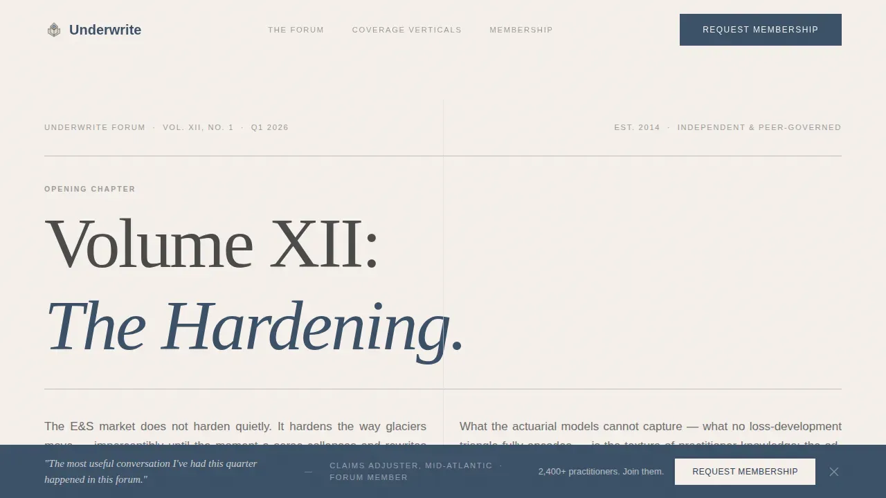
- A chapter-based hero section with a "Volume XII: The Hardening" header, a justified two-column prose opening, and no reliance on a hero image
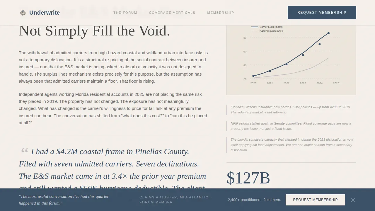
- Three scroll-through content chapters covering property catastrophe, cyber liability, and professional indemnity, each with pull quotes, editorial infographic placeholders, and margin annotation styling
- A dual conversion section with a membership application form featuring a professional role selector, and a secondary gated PDF download path for the quarterly brief
Feature list
This template includes a focused set of purpose-built features. Each one is drawn directly from the editorial and conversion brief.
Chapter-Based Hero Typography
The page opens as a book spread. A large serif chapter heading reads "Volume XII: The Hardening," set against a warm parchment background. A thin typographic rule sits beneath it, followed by a dateline styled like a journal issue. There is no hero image. Typography is the visual anchor, and it immediately signals that ideas are taken seriously here. This approach keeps users engaged from the first scroll.
Chapter-Scroll Content Architecture
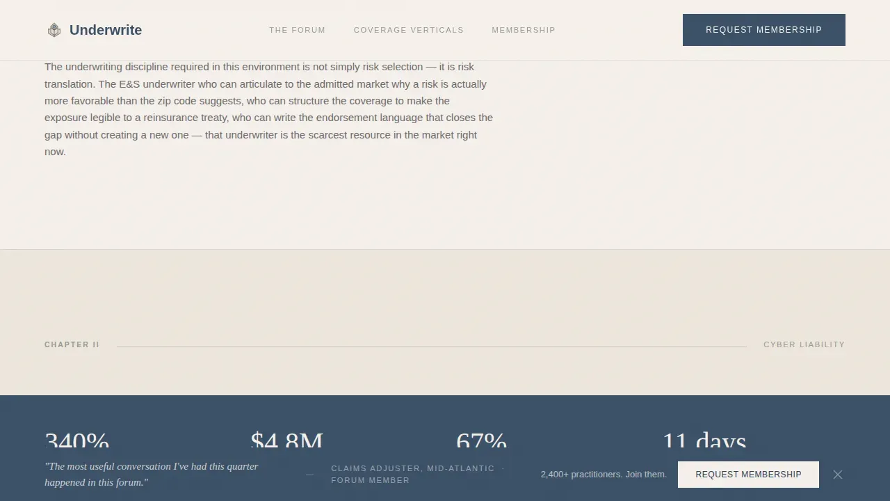
Each of the three main content sections is structured as a named chapter. Chapter I covers property catastrophe with pull quotes and editorial infographics. Chapter II addresses cyber liability and includes an inline membership call to action. Chapter III focuses on professional indemnity with full-bleed stat callouts alternating with dense analytical prose. The rhythm mirrors turning printed pages, which keeps the reading experience focused and immersive.
Dual Conversion Form System
The membership form asks for professional role, lines of business, and years in the industry. It is framed as a seating request rather than a qualification gate, reducing friction and keeping the tone collegial. A separate secondary form captures email and company name in exchange for a free quarterly brief download. This two-path system captures leads from both committed prospects and early-stage visitors.
Fixed Bottom Call-to-Action Bar
After the fourth content section, a fixed bottom bar appears with a persistent membership invitation. This sticky element keeps the primary action visible as visitors scroll through dense editorial content. It functions as a reliable trust signal that the community is open and ready to receive new members, without interrupting the reading flow.
Pull Quotes and Margin Annotations
Each chapter section includes styled pull quotes drawn from forum thread discussions, with practitioner attribution. Margin annotation elements, styled to look like a colleague's penciled notes, appear alongside analytical passages. These details create social proof within the editorial layout itself. They also reflect the kind of peer-level insight that sets this community apart from standard insurance blog content.
Editorial Infographic Placeholders
Each chapter includes data visualization areas styled as hand-drawn editorial infographics. These placeholders support content that explains market shifts, such as the move from soft to hard insurance markets, premium increase trends, and coverage restriction patterns. The styling is consistent with the journal aesthetic, using graphite lines and lavender-gray borders rather than dashboard-style charts.
Page sections overview
| Section | Purpose |
|---|---|
| Book Spread Hero | Open with editorial authority and chapter framing |
| Chapter I: Property Cat | Present property catastrophe analysis and pull quotes |
| Chapter II: Cyber Liability | Deliver cyber coverage analysis with inline membership call to action |
| Chapter III: Professional Indemnity | Alternate stat callouts with analytical prose |
| Membership Form | Capture applications via role-specific framed form |
| Quarterly Brief Download | Gate a PDF to collect email and company leads |
| Footer | Minimal copyright, essential links, clean close |
Design & branding system
The visual identity uses the Soft Mist color system, developed under an Atelier Studio editorial theme. The palette is quiet and deliberate, designed to let content carry the weight.
- Colors: warm parchment (#F5F0EB) for backgrounds, muted graphite (#4A4A4A) for body text, quiet lavender-gray (#C4BFC6) for borders and dividers, and aged ink blue (#3B5068) reserved for links, pull quotes, and interactive moments
- Typography: Fraunces serif is used for all display headings and chapter titles; DM Sans handles body text and form labels, creating a clear editorial hierarchy
- White space is used generously throughout, so the page breathes between dense analytical passages and open stat callouts, keeping the reading experience unhurried and considered
Mobile & speed optimization
This landing page template is designed desktop-first, prioritizing the experience of insurance professionals reading at their desks. However, the layout is responsive and adapts for tablet viewing.
- The two-column prose sections, editorial infographic areas, and chapter layouts reflow cleanly for tablet-width viewports
- The fixed bottom call-to-action bar and membership form remain functional and legible across screen sizes, ensuring mobile visitors can still complete the process
- Scroll-reveal animations and parallax rule line effects are handled via client-side components, keeping editorial content server-rendered for faster initial load
How this template helps you convert
This landing page is built around a single business objective: turn qualified insurance professionals into forum members and brief subscribers. Every structural decision supports that goal.
- The chapter-scroll format keeps users engaged through educational content before presenting the membership form, so visitors arrive at the conversion point already convinced of the community's value
- A frictionless, two-path conversion system lets visitors choose their own commitment level: apply for full membership or download a free brief, which improves conversion rates across both high-intent and early-stage prospects
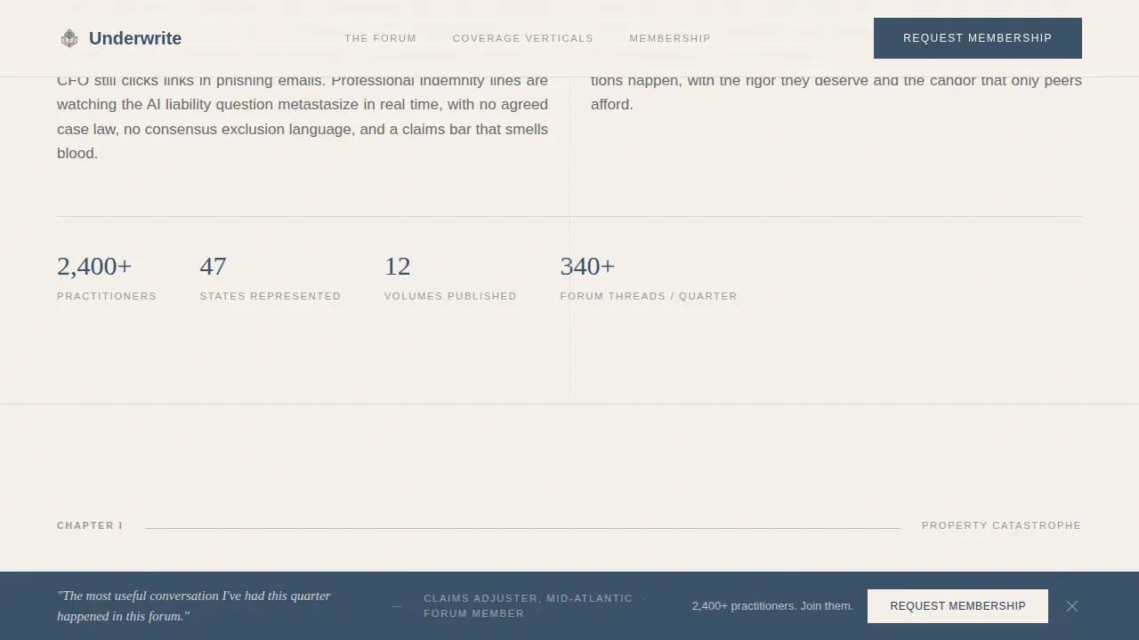
- Trust signals embedded throughout the page, including practitioner pull quotes, peer attribution, and a membership count stat, build trust organically within the editorial experience rather than through separate testimonials sections
Other information about this template
This template is built to serve a specific and underserved intersection: the insurance landing page for a professional peer community during a period of market hardening. It does not try to serve every insurance use case. That focus is intentional and is part of what makes it effective.
- The Underwrite the Hardening Insurance Community Forum Landing Page Template is the formal product reference for this design, combining editorial magazine style with a professional insurance landing page conversion structure
- No coding skills are required to publish this template. The layout and section structure are pre-built, so you can fill in your own chapter content, pull quotes, and form labels without touching code
- This template can also serve as a useful reference or great example for adjacent use cases where editorial depth matters, such as a health insurance landing page for a broker network, a health insurance landing community blog, or an insurance company thought-leadership site
- For broader insurance landing contexts, the chapter-format approach can be adapted for travel insurance community resources, auto insurance professional forums, or any insurance business that wants to position itself as a serious peer-intelligence platform
- Displaying logos of affiliated professional bodies or industry awards near the membership form can enhance credibility further and reinforce trust signals already present in the editorial layout
- Case studies and hard-market response checklists can be added as supplementary downloadable resources, giving the secondary lead capture path more variety
- The template reflects best-practice landing page guidance: short forms, clear coverage of what members receive, focused conversion paths, and removal of standard site navigation to keep visitors focused on joining
- Companies are advised to plan renewal messaging and market-hardening content well in advance; this template gives insurance business operators the structure to publish that content immediately and position themselves ahead of competitors
Theme
Atelier Studio
Creative direction
Industry Report
Color system
Soft Mist
Direction
Lead Generation
Page Sections
Chapter-based Hero Typography
Chapter-scroll Content Architecture
Dual Conversion Form System
Fixed Bottom Call-to-action Bar
Pull Quotes and Margin Annotations
Editorial Infographic Placeholders
Related questions
Do I need coding skills to use this template?
Can I adapt this template for a different insurance niche?
What conversion paths does this template include?
How does the template handle trust signals?
Is this template suitable for desktop and tablet users?



