InsurTech Comparison Table Landing Page Template
Underwrite is a single-page, comparison-table landing page built for the InsurTech space. It pairs a Dynamic Motion visual identity with an Industry Report creative direction to help Series A founders, insurance executives, and analysts evaluate competing platforms side by side. Dark glass panels, scroll-triggered animations, and two structured conversion paths make the case before a visitor ever hits the call to action.
by Rocket studio
Quick summary
Underwrite is a focused InsurTech landing page template designed around one goal: helping sophisticated buyers compare embedded insurance architectures quickly and confidently. It combines a void-black Electric Indigo color system with scroll-triggered data animations, a full-width comparison table, and dual conversion paths that guide visitors from raw intelligence to a gated benchmark report.
Who this template is for
This template is built for teams that need to communicate competitive depth to a technically literate audience. It works best when the product story lives in data, not in marketing language.
- Series A founders positioning an embedded insurance or predictive underwriting platform against established competitors
- VP-level insurance executives evaluating API-first alternatives and needing a structured capability breakdown
- Analysts and investors building market maps who require side-by-side clarity on pricing architecture and integration depth
What problem this template solves
Explaining a complex InsurTech platform in a single page is genuinely hard. Most landing pages flatten the story into bullet points and lose the buyer before the call to action. Underwrite solves that by structuring the page like an analyst report, not a brochure.
- Visitors comparing multiple platforms need instant visual clarity on capability dimensions, not paragraph walls
- Founders pitching at the Series A stage need a page that signals intelligence and earns trust before asking for contact details
- Static PDFs and slide decks cannot replicate the live, scroll-driven data experience that makes a comparison feel current and credible
What you get with this template
You get a fully structured, single-page layout with every section, animation behavior, and conversion element defined in the design brief. Nothing needs to be invented from scratch.
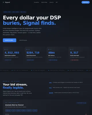
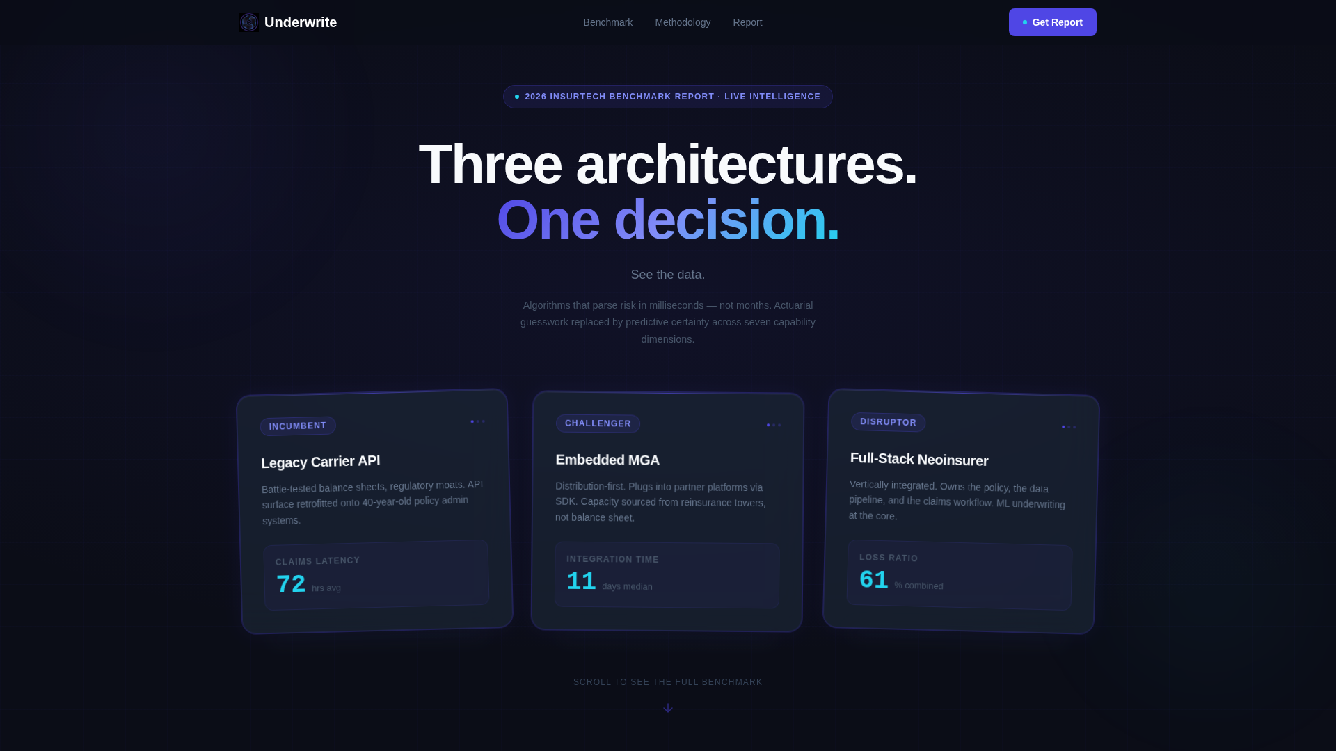
- A header section with three dark glass panel cards, each representing a competing InsurTech archetype with a glowing cyan knockout metric
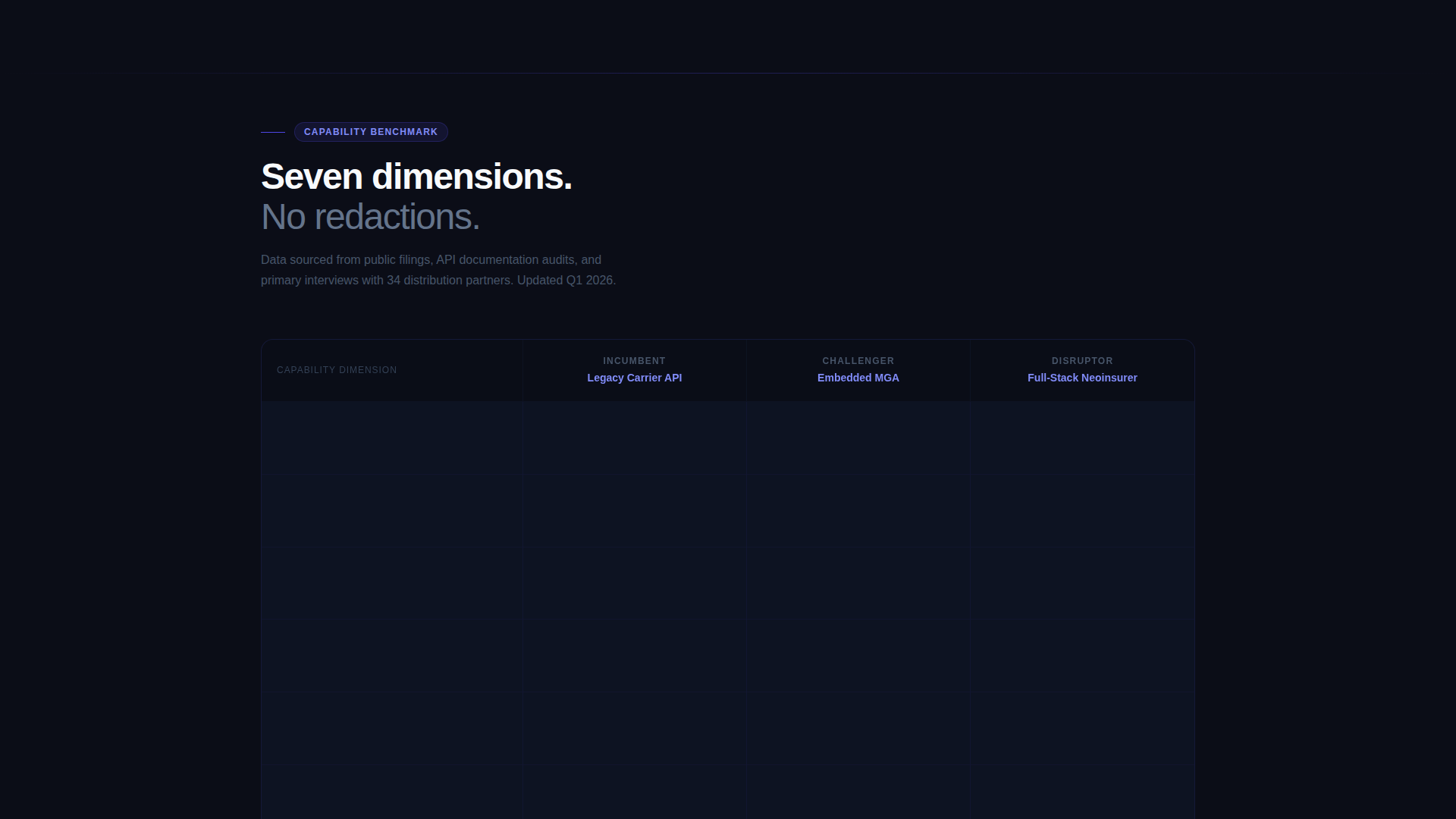
- A full-width comparison table covering five to seven capability dimensions, with sticky column headers and scroll-triggered row animations
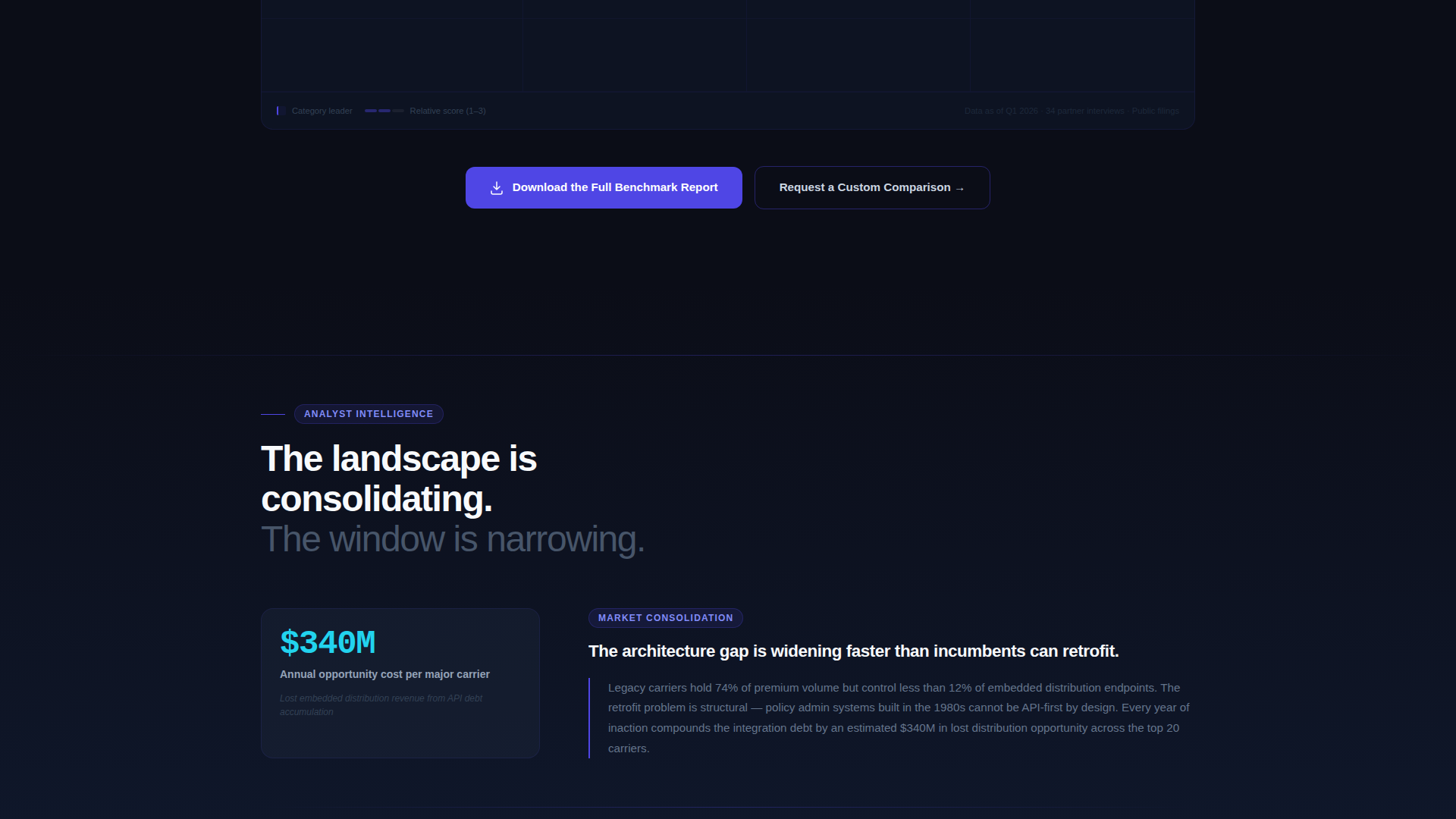
- Two conversion paths: a primary "Download the Full Benchmark Report" call to action and a secondary "Request a Custom Comparison" form with a platform name field and integration requirements textarea
Feature list
This template is engineered around the specific visual and functional demands of an InsurTech comparison page. Every feature below is defined in the source brief.
Dark Glass Panel Header
Three translucent, frosted-glass cards float against void black, each representing a platform archetype. Faint indigo edge lighting and soft card reflections create the feel of classified intelligence. Subtle parallax drift on scroll keeps the header alive as the visitor moves down the page.
Scroll-Triggered Comparison Table
The full-width table covers five to seven capability dimensions including underwriting speed, API endpoints, regulatory coverage, embedded distribution, claims automation, reinsurance access, and pricing model. Sticky column headers track the visitor through the data. Each row animates in with a left-to-right wipe as it enters the viewport, and numerical values count up to their final figures on entry.
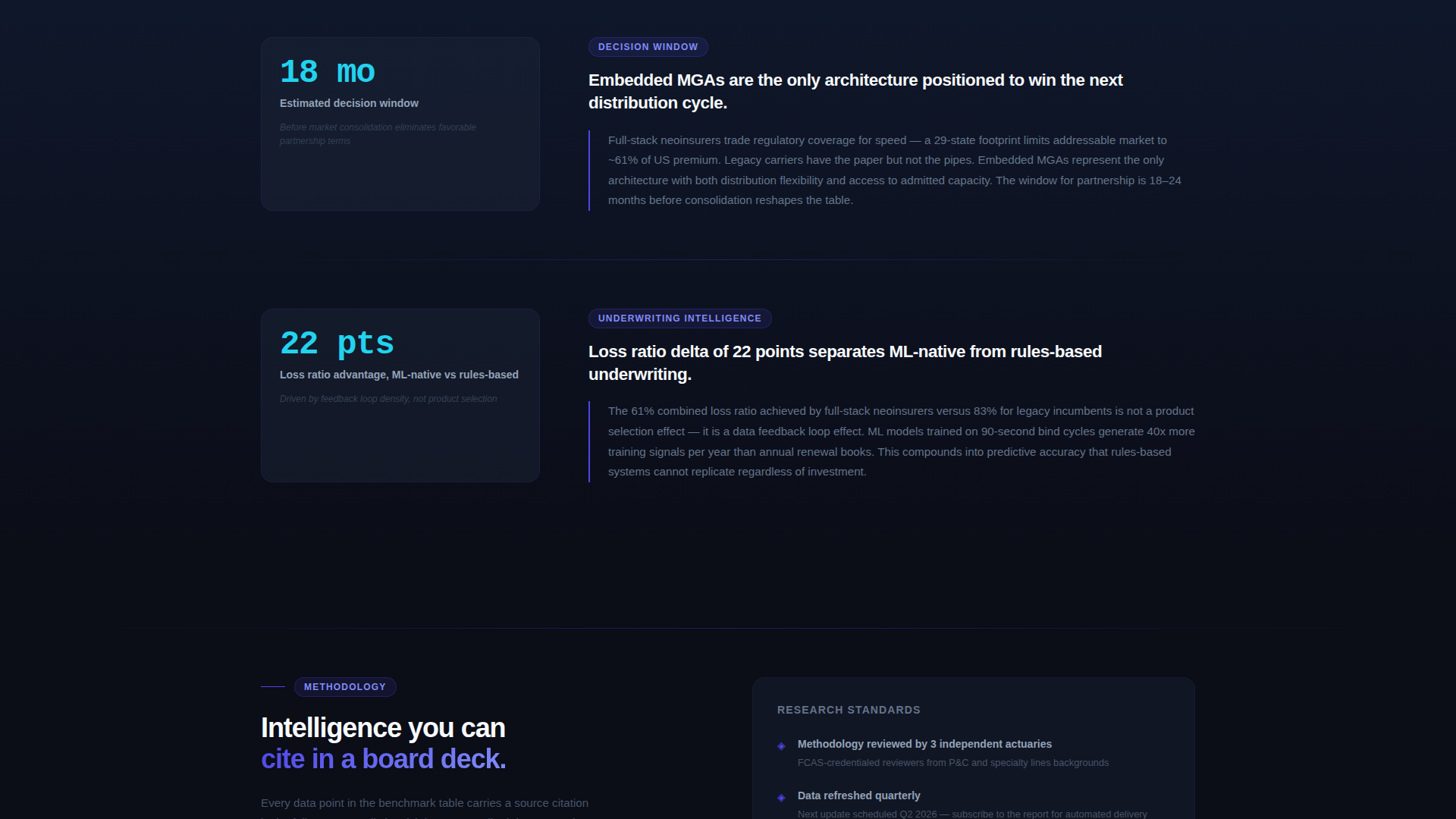
Analyst-Style Narrative Blocks
Below the table, short commentary sections present pull-quote statistics and a consolidating market argument. Each block builds the case that the decision window is narrowing, matching the tone of an industry intelligence report rather than a sales page.
Dual Conversion Path Design
The primary call to action, "Download the Full Benchmark Report," appears directly beneath the comparison table and again as a persistent bottom bar that slides up after 40 percent scroll depth. The secondary path, "Request a Custom Comparison," triggers a longer form with a platform name field and integration requirements textarea for visitors who want their own stack evaluated.
Dynamic Motion Interaction System
Cards tilt on hover, data points pulse, and scroll-triggered counters reinforce that the page presents live intelligence. Reactive cyan fires exclusively on hover states and live data pulses, functioning as a reward for engagement rather than ambient decoration.
Page sections overview
| Section | Purpose |
|---|---|
| Dark Glass Header | Introduces three platform archetypes with knockout metrics and a parallax drift effect |
| Comparison Table | Delivers side-by-side capability data across five to seven dimensions with sticky headers and row animations |
| Narrative Commentary | Presents analyst-style pull-quote blocks that build the consolidation argument |
| Primary call to action Block | Places the benchmark report download form directly after the table |
| Persistent Bottom Bar | Slides up at 40 percent scroll depth to keep the primary conversion path visible |
| Custom Comparison Form | Secondary conversion path with platform name field and integration requirements textarea |
Design & branding system
The Electric Indigo color system is built for information density. Every color has a defined role, and nothing is decorative without purpose.
- Deep void black (#0B0D17) forms all backgrounds, cool slate (#1E293B) surfaces panel interiors, and electric indigo (#4F46E5) carries all primary actions and column headers
- Reactive cyan (#22D3EE) is reserved exclusively for hover states and live data pulses, firing only on interaction as a deliberate reward signal
- The Dynamic Motion theme governs all movement: parallax on scroll, left-to-right row wipes, card tilt on hover, and counting number animations all follow a disciplined motion system where nothing moves without informational intent
Mobile & speed optimization
The template is designed so that the motion and density of the desktop experience translates clearly to smaller screens without losing structural integrity.
- Scroll-triggered animations and sticky table headers are scoped to the layout so the comparison table remains navigable on mobile viewports
- The persistent bottom bar conversion path is particularly effective on mobile, where it stays visible without interrupting the reading flow
How this template helps you convert
The conversion strategy is built into the content architecture. Visitors receive the majority of the insight before any form appears, which removes resistance and makes the gated step feel logical.
- The comparison table gives away roughly 70 percent of the benchmark data openly, making the full report feel like an obvious extension rather than a paywall
- The persistent bottom bar ensures the primary call to action remains visible throughout the scroll journey without interrupting the analytical reading experience
- The secondary "Request a Custom Comparison" path captures higher-intent visitors, such as founders and operators, who want their own platform stack evaluated against the table dimensions
Other information about this template
This template sits within the Startup and Launch category, specifically targeting the InsurTech startup subcategory and the InsurTech pitch deck page niche. It is designed as a Comparison and Versus landing page direction, making it a strong fit for any team using competitive positioning as its primary growth narrative.
- The template style is a Comparison Table layout, which means the core content block is the structured capability grid rather than a narrative hero or feature showcase
- The Industry Report creative direction means copy tone should match analyst language: precise, data-forward, and free of generic marketing enthusiasm
- The Intersection Match Score of 13 reflects a tightly aligned combination of theme, creative direction, color system, template style, landing page direction, and header concept, all drawn from the matched intersection row
Theme
Dynamic Motion
Creative direction
Industry Report
Color system
Electric Indigo
Style
Comparison Table
Direction
Comparison/Versus
Page Sections
Dark Glass Panel Header with Parallax
Animated Full-width Comparison Table
Analyst-style Narrative Commentary
Dual Conversion Path Architecture
Dynamic Motion Interaction System
Related questions
Who is this landing page template designed for?
Can I customize the comparison table dimensions?
How do the two conversion paths work?
Does the template use a gated or open content approach?
Is this template suited for an InsurTech pitch deck context?