Insurance Review Blog Landing Page Template
Underwrite is an editorial insurance review landing page built on an asymmetric 60/40 grid. It pairs a cinematic photo-and-text hero with alternating review spotlight cards, coverage comparison callouts, and a persistent top bar driving readers to explore. The warm, tactile Atelier Studio design gives every policy breakdown the feel of a well-lit editorial desk rather than a corporate brochure.
by Rocket studio
Quick summary
Underwrite is a single-page editorial landing page for an insurance review blog. It uses a 60/40 asymmetric grid, a Creator Spotlight creative direction, and a Warm Stone color palette to present policy reviews in a personal, readable way. The design earns reader trust and moves them toward the full review articles through well-placed, consistent calls to action.
Who this template is for
This template is built for independent insurance bloggers, editorial content creators, and personal finance writers who want a professional publishing home for policy reviews. It suits anyone who translates complex coverage language into clear, human-centered content.
- Insurance review bloggers covering home, life, and disability policies
- Freelance financial writers building a personal editorial brand
- Content-led publishers targeting first-time buyers, freelancers, and growing families
What problem this template solves
Most insurance content online feels either corporate and cold or cluttered and hard to trust. Readers comparing home coverage options or shopping for short-term disability plans need a source that feels credible and warm at the same time. This template solves the gap between authoritative and approachable.
- Policy language feels inaccessible, and standard blog layouts do not help readers feel guided
- Generic templates lack the editorial structure needed to present letter-grade verdicts and personal review voices
- A single click-through goal gets diluted when the layout tries to do too many things at once
What you get with this template
You get a fully structured, single-page editorial layout designed specifically for insurance review publishing. Every section works together to build reader trust and move visitors toward the full review articles.
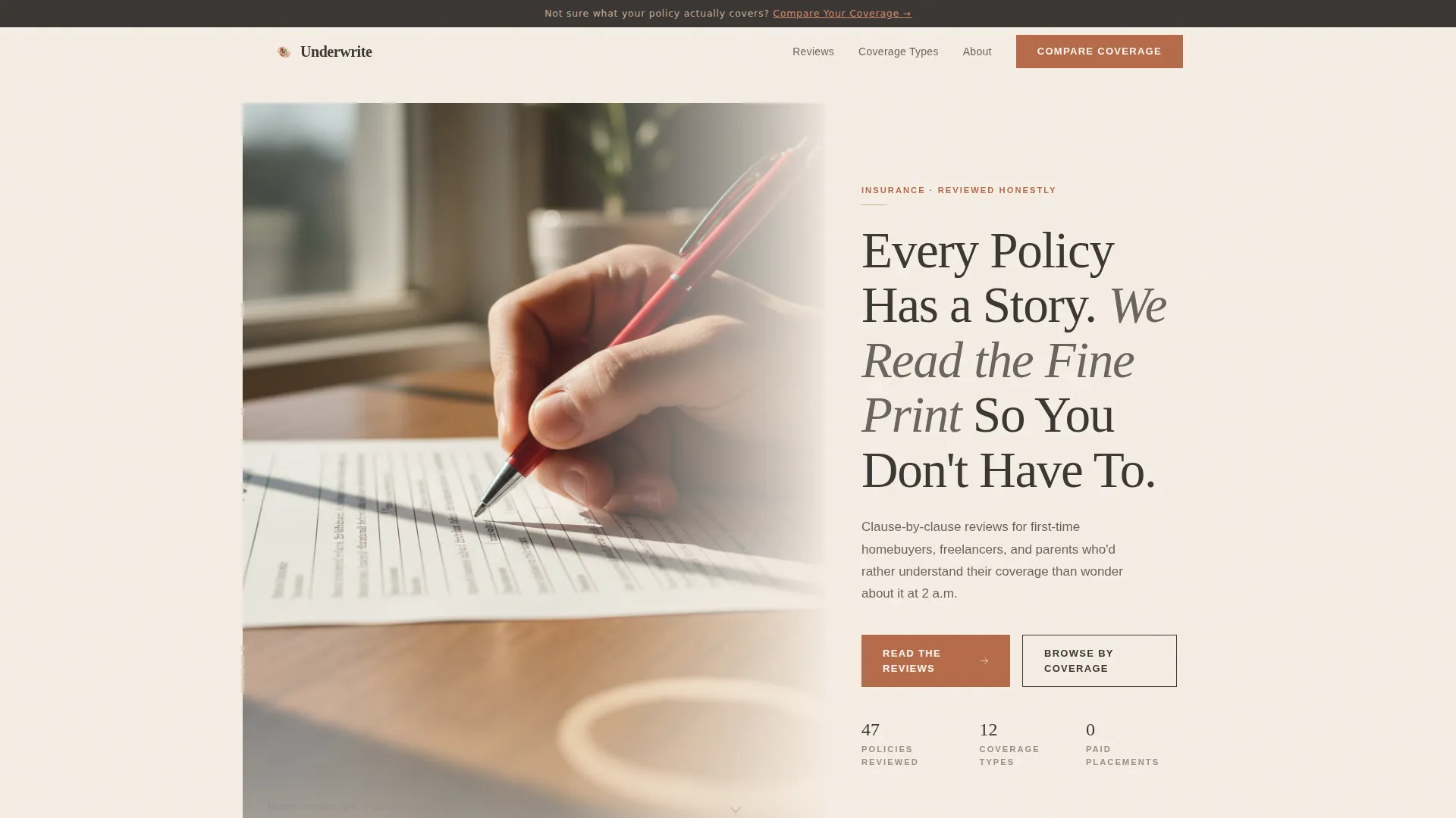
- A cinematic 60/40 hero section with a photo-and-text split and a terracotta call-to-action button
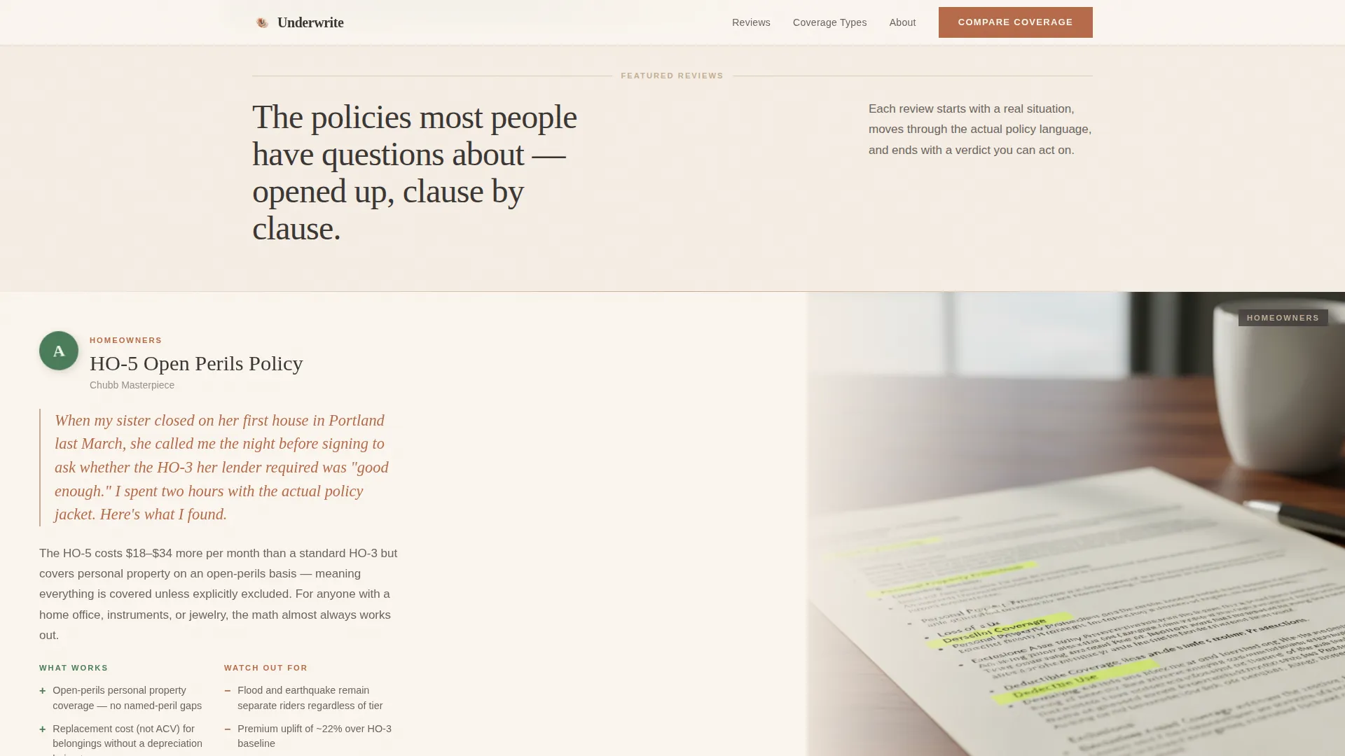
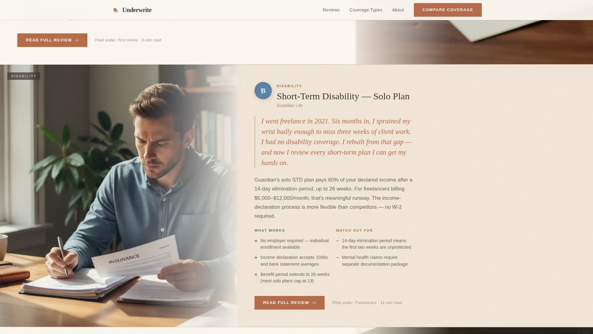
- Alternating asymmetric review spotlight cards with letter-grade badges, pros and cons, and "Read Full Review" links
- A persistent top bar carrying a secondary "Compare Your Coverage" call to action throughout the scroll
Feature list
This template delivers a focused set of editorial design features grounded in the source brief. Each one supports the core goal: turn a curious reader into an engaged one.
Asymmetric 60/40 Editorial Grid
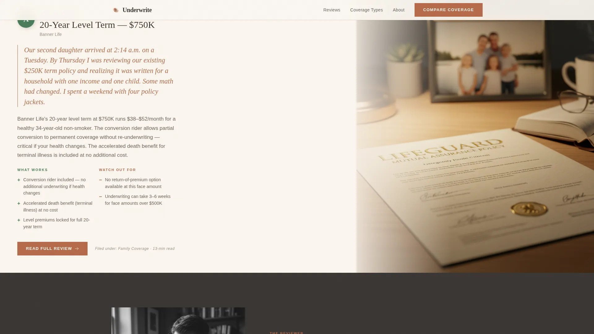
The page layout divides every section into a 60-column editorial lane and a 40-column sidebar lane. Review content, photography, and callout cards swap sides as the reader scrolls, giving the page a curated journal rhythm rather than a static feed.
Creator Spotlight Review Cards
Each featured review is presented through a typographic card that includes the reviewer's personal anecdote, a letter-grade badge, a key pros-and-cons breakdown, and a "Read Full Review" link in terracotta. The card gives just enough verdict to create a natural information gap.
Cinematic Half-Page Hero
The header pairs a shallow-depth-of-field photograph of a hand holding a red pen over a printed document with a warm serif headline on the 40-side. A single descriptor line and a terracotta primary call-to-action button complete the composition.
Persistent Top Bar Call to Action
A low-profile top bar stays visible throughout the scroll and carries the secondary "Compare Your Coverage" link to an interactive quiz. It is unobtrusive by design, reinforcing the click-through goal without interrupting the reading experience.
Coverage Comparison Bento Cards
The template includes mini comparison card components in the sidebar lane. These bento-style callouts let readers see policy category highlights side by side without leaving the page.
Alternating Photography Rhythm
Photography shifts from desk scenes in the hero to close-up images of highlighted policy language as the reader moves through the review sections. This visual rhythm supports the editorial tone and keeps the scroll feeling alive.
Page sections overview
| Section | Purpose |
|---|---|
| Persistent Top Bar | Secondary "Compare Your Coverage" call to action |
| Hero Photo + Text | Cinematic entry point with primary call to action |
| Featured Review Cards | Alternating spotlight cards with letter-grade verdicts |
| Creator Spotlight | Editorial voice introduction with personal anecdote |
| Coverage Comparison Cards | Mini bento cards for side-by-side policy highlights |
| Recent Reviews Grid | Asymmetric masonry layout of recent review posts |
| Footer | Horizontal flow pattern for navigation and links |
Design & branding system
The visual identity follows an Atelier Studio theme built around a Warm Stone color system. The palette references letterpress printing, with kiln-fired cream backgrounds, worn wooden type trays, and heavy cotton stock textures. Every color choice is intentional and functional.
- Colors: kiln-fired cream (#F5EDE3) and sandstone wash (#C4AD94) for backgrounds, charcoal graphite (#3B3735) for body text, and terracotta ink (#B56B4A) reserved for links, pull-quotes, hover states, and call-to-action buttons
- Typography: Fraunces serif for display headings and editorial weight, paired with DM Sans for body copy and navigation
- Animation and interaction: fade-in-up scroll reveals, staggered card animations, hover states that lift grayscale images to full color, and smooth hover responses on review cards
Mobile & speed optimization
The template is designed desktop-first to support the editorial reading experience, with a solid responsive foundation for mobile visitors. The static-first build approach keeps the image-heavy layout performing well without sacrificing visual quality.
- Desktop-first layout preserves the asymmetric 60/40 grid and full editorial rhythm on larger screens
- Mobile layout adapts the alternating review cards and comparison callouts to a readable single-column flow
- Static-first architecture supports image-heavy editorial publishing without requiring server-side rendering
How this template helps you convert
The entire landing page is oriented around a single conversion goal: get the reader to click through to a full review article. Every structural and design decision supports that outcome.
- The letter-grade badge and pros-and-cons summary on each review card create a deliberate information gap, making the "Read Full Review" click feel like turning the next page rather than leaving the site.
- The persistent top bar keeps the "Compare Your Coverage" secondary call to action visible at every scroll depth, so readers who are not yet ready for a full review still have a next step.
- The no-form design philosophy removes friction entirely. There is nothing to fill out, only editorial content worth reading and a clear link to more of it.
Other information about this template
This template is designed for US insurance market publishing in English, with content framed around USD-denominated policies. The editorial voice targets practical, life-stage decisions: buying a first home, working as a freelancer, or re-evaluating coverage after a growing family.
- Fraunces and DM Sans are Google Fonts and can be updated to match a personal or publication brand
- The footer follows a horizontal flow pattern suited to editorial navigation and category links
- The template supports policy categories including homeowners coverage comparisons, short-term disability reviews, and term life insurance breakdowns
- No form or lead capture component is included; the page is built purely for click-through editorial engagement
- The asymmetric masonry recent reviews grid at the bottom of the page reinforces the depth of the publication and encourages deeper exploration
Theme
Atelier Studio
Creative direction
Creator Spotlight
Color system
Warm Stone
Style
Asymmetric Grid (60/40)
Direction
Click-Through
Page Sections
Asymmetric 60/40 Editorial Grid
Creator Spotlight Review Cards
Cinematic Half-page Hero
Persistent Top Bar
Coverage Comparison Bento Cards
Alternating Photography and Layout Rhythm
Related questions
Does this template include a contact form or email sign-up?
Can I add more review spotlight cards to the page?
What types of insurance reviews does this layout support?
Is this template suitable for a solo blogger or a team publication?
Do I need coding experience to customize this template?



