Insurance Blog & Media Professional Website Template
Underwrite is a horizontal scroll landing page template built for insurance thought leadership publishers. It replicates the visual authority of a broadsheet newspaper, complete with a masthead hero, halftone contributor panels, and a sticky subscription strip. The design speaks directly to VP-level carrier executives, independent agents, and InsurTech founders who expect substance before they subscribe.
by Rocket studio
Quick summary
Underwrite delivers a digital broadsheet experience for insurance professionals who publish original risk analysis. The template uses a horizontal scroll layout, a newspaper front-page hero, and a creator spotlight section to position contributors as credible voices. The primary conversion goal is the "Get the Morning Brief" email subscription strip anchored to the bottom of the page.
Who this template is for
This template is built for publishers, editorial teams, and content leads operating inside the insurance industry. It suits anyone who needs their publication to feel authoritative from the first glance, not just functional.
- Insurance thought leadership blogs run by carriers, trade associations, or independent editorial teams
- InsurTech founders and independent agents who publish original analysis to build audience and credibility
- VP-level communications teams at carrier organizations producing regulatory intelligence for a professional readership
What problem this template solves
Most blog templates look like blogs. They borrow the same card-grid layouts used for recipe sites and lifestyle content. For an insurance publication targeting executives, that visual register destroys credibility before the first paragraph loads.
- Generic blog layouts fail to signal the editorial seriousness that VP-level readers expect
- Contributor-led publications lose trust when writers are buried in sidebars rather than given byline prominence
- Lead generation forms on standard templates feel transactional, not earned, so conversion rates reflect that mismatch
What you get with this template
You get a fully designed, single-page horizontal scroll landing page built around a print broadsheet metaphor. Every section is purposefully sequenced to build authority and guide visitors toward subscribing.
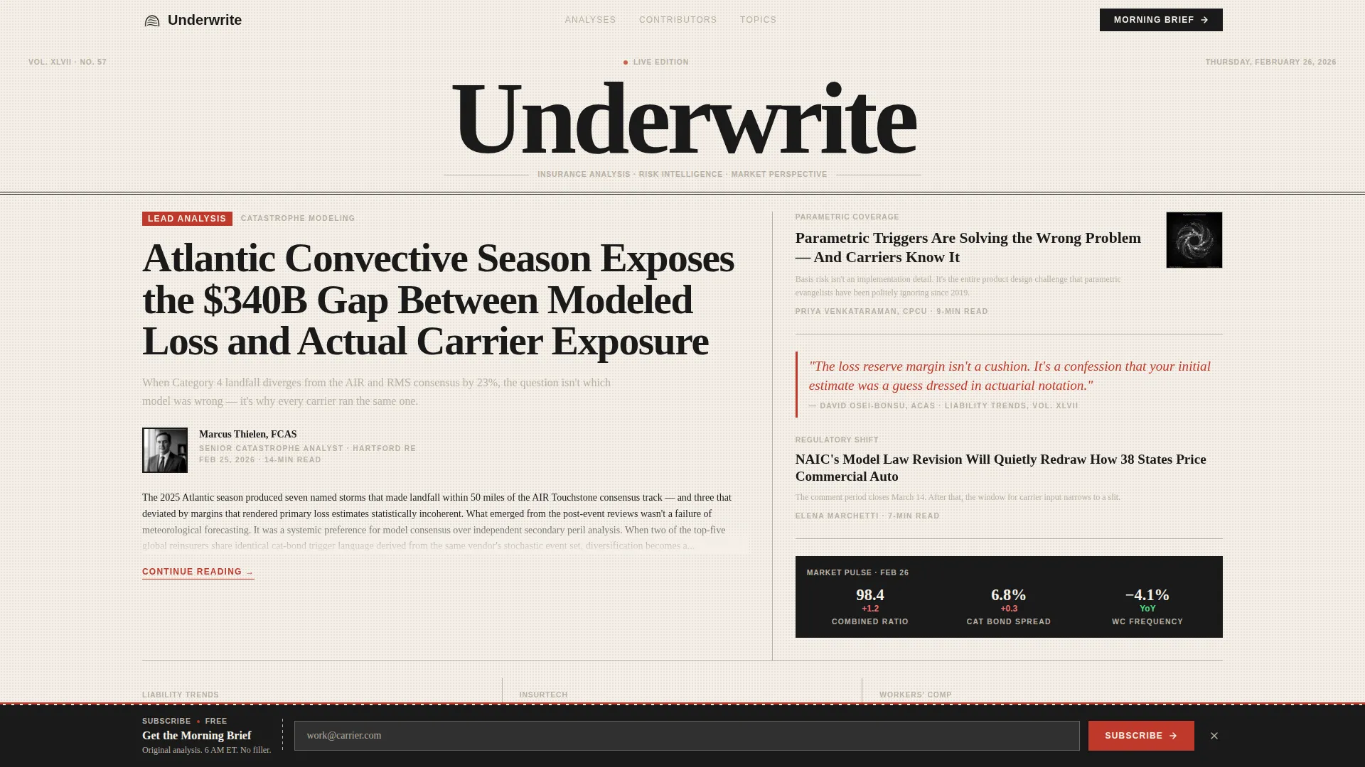
- A newspaper front-page hero with a masthead, lead headline spanning four columns, contributor portrait inset, and a floating "Breaking" card
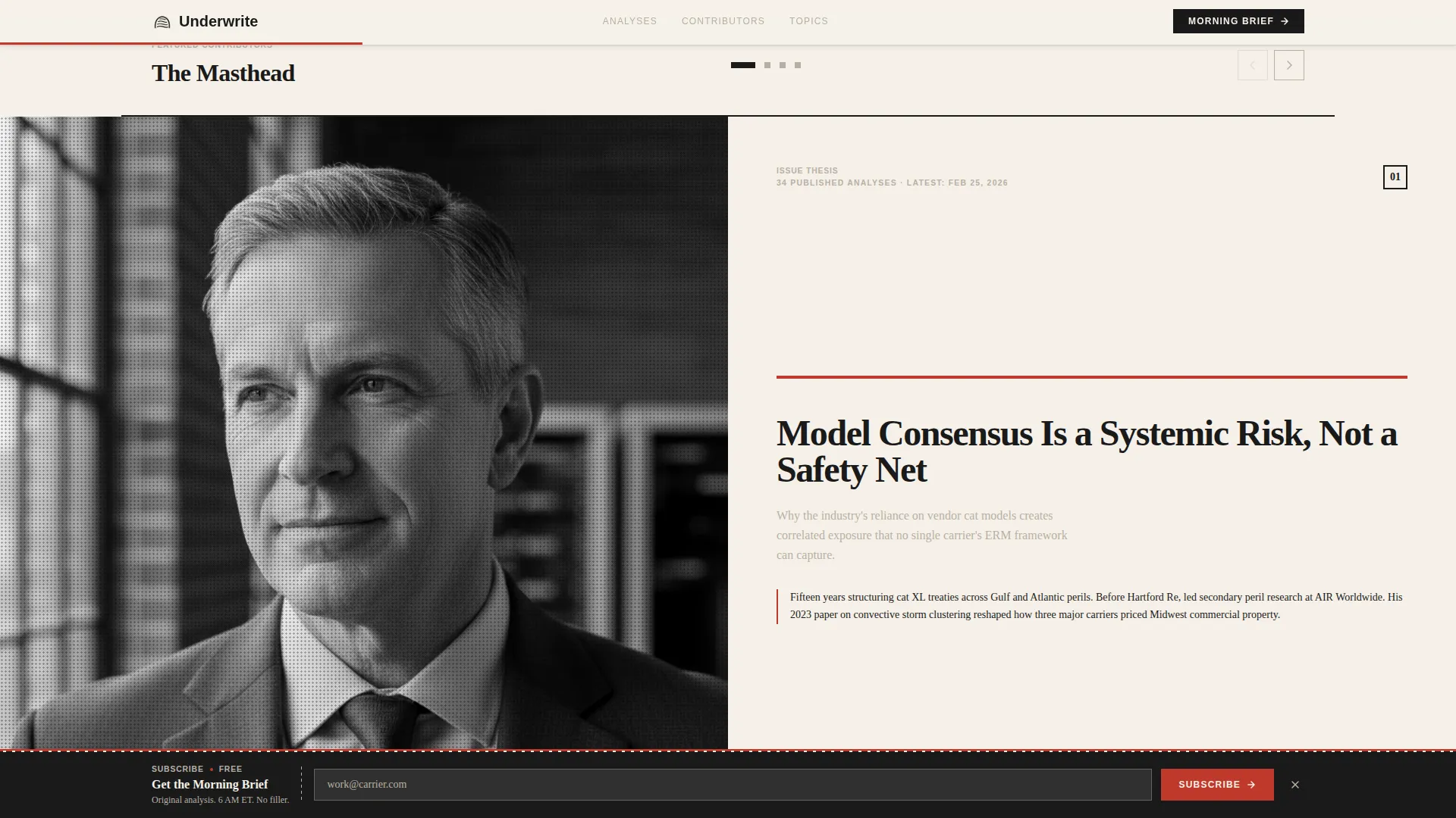
- A horizontal swipe creator spotlight section where each full-screen panel features a halftone portrait and a typographic thesis poster
- A sticky subscription strip along the bottom edge styled as a newspaper tear-strip, with an inline role dropdown and work email field
Feature list
A paragraph introducing the feature set: Each feature in this template was designed around a single editorial truth, that insurance professionals will not trust a publication that looks like it was built for a consumer audience. Every component earns its place.
Newspaper Front-Page Hero
The hero section replicates a broadsheet above-the-fold layout. A high-contrast serif masthead sits at the top, today's date appears in small caps, and the lead article headline spans a five-to-seven asymmetric column grid. A contributor portrait is inset like a traditional byline photo, flanked by secondary headlines and pull-quote teasers.
Horizontal Scroll Creator Spotlight
The creator spotlight drives the core horizontal scroll interaction. Each panel is a full-screen editorial spread: a halftone-grain portrait on the left, the writer's latest thesis rendered as a typographic poster on the right, and a three-line bio styled like a dust-jacket blurb. Swiping through panels feels like turning broadsheet pages.
Morning Brief Preview Section
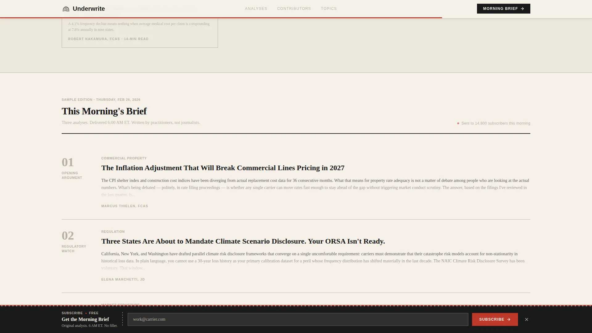
A sample issue reveal shows visitors real opening paragraphs from published analyses. Content is deliberately truncated at the moment the argument becomes most compelling, giving readers enough substance to judge quality before subscribing.
Sticky Subscription Strip
The primary call to action lives in a ribbon anchored to the bottom edge of the page. It is styled as a newspaper subscription tear-strip. The form collects a work email first, then captures company name and role through a single inline dropdown with options for Carrier, Agent/Broker, InsurTech, Consultant, and Other.
Follow This Writer Modal
Each contributor panel includes a secondary conversion path. Visitors can tap "Follow This Writer" to register topic-preference data. This segments leads by specialty, catastrophe modeling, parametric coverage, liability trend forecasting, before any nurture sequence begins.
Contributor Roster Section
A masthead-style byline grid displays the full editorial team. Byline credentials, publication counts, and reader role badges serve as social proof. The layout communicates editorial depth at a glance, reinforcing the impression of a staffed publication rather than a solo blog.
Page sections overview
| Section | Purpose |
|---|---|
| Masthead Hero | Establish publication authority with a newspaper front-page layout |
| Creator Spotlight | Showcase contributors via horizontal swipe editorial panels |
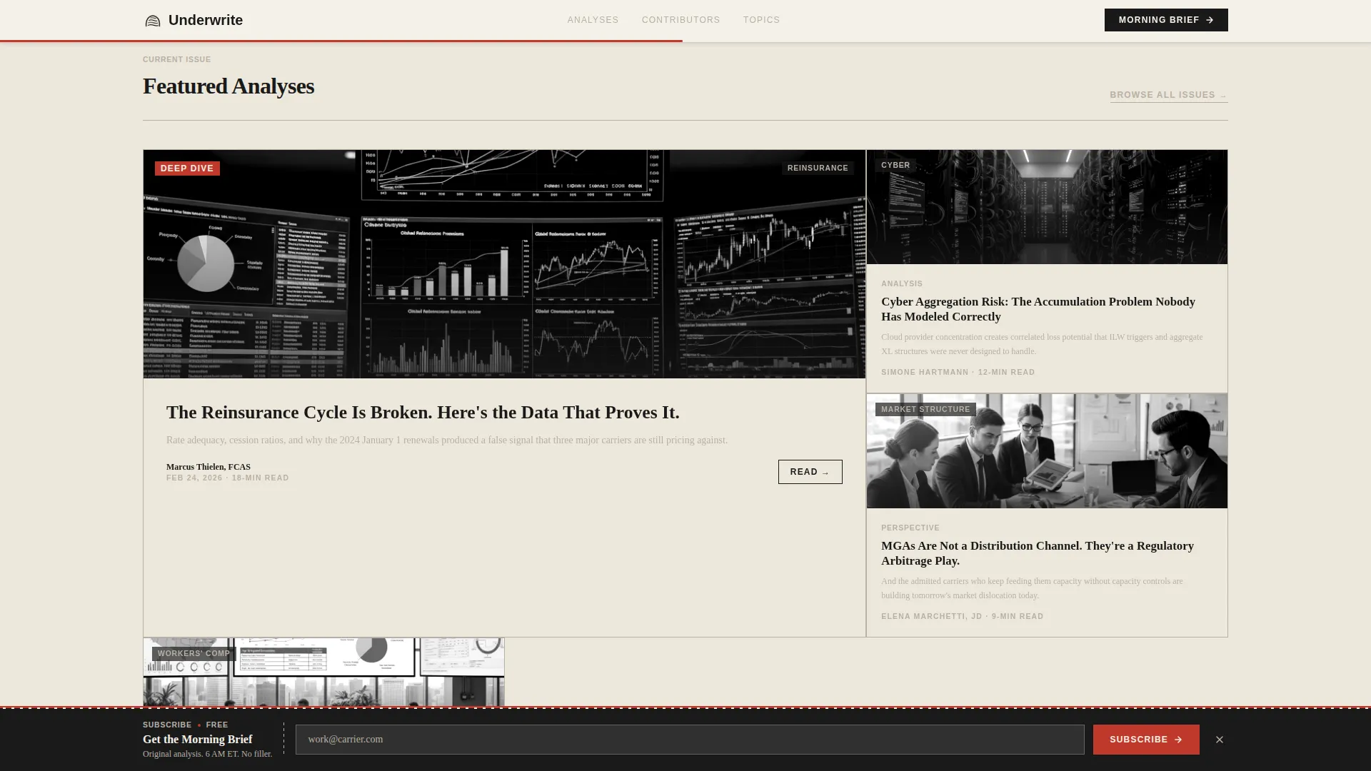
| Featured Analyses Grid | Present article categories in an asymmetric bento layout |
| Morning Brief Preview | Reveal truncated sample content to earn the subscription click |
| Contributor Roster | Display the full masthead byline grid as editorial social proof |
| Footer | Provide a single-row linear footer for navigation and legal links |
Design & branding system
The visual identity follows an Ink & Paper theme built entirely around the tactile memory of a printed broadsheet. Cream dominates the canvas, black owns the typography, gray draws structural lines between columns, and red appears sparingly as an editor's annotation would.
- Color palette: editorial black (#1A1A1A), broadsheet cream (#F5F0E8), column-rule gray (#B8B0A4), and red-pencil accent (#C0392B) used only for pull quotes, contributor highlights, and interactive hover states
- Typography: Fraunces serif for all headlines, giving headlines the weight and optical authority of a printed masthead; DM Sans for body copy and interface elements, keeping reading comfortable at smaller sizes
- Halftone CSS filter applied to contributor portraits to simulate the grain of newsprint photography
Mobile & speed optimization
The template is designed desktop-first, reflecting the morning reading habits of VP-level executives at their workstations. Responsive behavior is included so the layout adapts cleanly for mobile readers.
- Horizontal scroll snap and reveal-on-scroll animations are handled through client-side interactions, while static content sections use server components to keep initial load lean
- Staggered animation timing and medium-weight motion design keep the broadsheet feel intact without overloading the interaction layer on slower connections
How this template helps you convert
The conversion architecture is layered. Every section earns a little more trust before asking for anything in return.
- The hero section establishes publication credibility immediately, so visitors arrive at the subscription strip already primed rather than skeptical
- The morning brief preview shows real editorial thinking, cut at the moment of peak interest, making the subscription feel like gaining access rather than giving up an email address
- The "Follow This Writer" path on each contributor panel captures topic-preference data passively, creating a segmented lead list without requiring a separate form or interruption
Other information about this template
This template is part of a broader set of editorial and thought leadership landing page designs built for professional industries. A few additional details worth noting:
- The page is built for the Blog & Editorial category, specifically the Insurance Thought Leadership Blog niche within the Insurance Blog & Media subcategory
- The intersection match score for this template's niche, creative direction, and layout style is 13, indicating a tight alignment between the horizontal scroll format, creator spotlight direction, and lead generation objective
- The Ink & Paper color system, Newspaper/Publication header concept, and Creator Spotlight creative direction are all formally defined intersection attributes baked into this template
- The template targets a US-centric regulatory and market context, with English-language copy and USD-denominated audience assumptions throughout
Theme
Ink & Paper
Creative direction
Creator Spotlight
Color system
Ink & Paper
Style
Horizontal Scroll
Direction
Lead Generation
Page Sections
Newspaper Front-page Hero Section
Horizontal Scroll Creator Spotlight
Morning Brief Preview with Content Truncation
Sticky Subscription Tear-strip
Follow This Writer Modal
Masthead Contributor Roster
Related questions
Who is the intended reader for a publication built on this template?
Does the horizontal scroll work on mobile devices?
What information does the subscription form collect from visitors?
Can the creator spotlight section feature contributors with different specialties?
What makes this template different from a standard blog layout?



