Internet Service Provider Pre-Launch Website Template
Uplink is a modular card grid landing page template built for community broadband networks. It leads with a live-style product screenshot and an interactive savings estimator, then guides visitors through coverage, funding transparency, and construction milestones. The freemium conversion flow ends with a personalized address check and a refundable deposit or referral-powered waitlist path.
by Rocket studio
Quick summary
Uplink is a single-page community broadband landing page template built on a modular card grid. It opens with a real product screenshot showing live coverage data, hands visitors an interactive savings calculator immediately, and converts them through a two-path freemium flow: a direct connection reservation or a referral-powered waitlist pledge.
Who this template is for
This template is built for the people who are actually doing the work of bringing fiber internet to underserved communities. It speaks directly to decision-makers who have the mandate but need a compelling public-facing page to drive sign-ups and build momentum.
- Rural township boards and municipal broadband committees launching a fiber-to-the-premises network
- HOA presidents and neighborhood organizers collecting commitments from residents
- Community broadband advocates who need a page that converts curious visitors into paying pledges
What problem this template solves
Most internet service provider pages either mimic the bland designs of monopoly incumbents or bury the value under walls of technical copy. Community broadband projects have a harder job: they must explain a new model, prove it is real, and get neighbors to commit before construction even starts.
- Visitors arrive skeptical and need proof before they will act, not just promises
- Organizers lack a page that collects address-level interest and builds referral momentum
- There is no clear path from "I'm curious" to "I've reserved my connection" on generic templates
What you get with this template
You get a fully structured, single-page layout designed specifically for community broadband sign-up campaigns. Every card section is purpose-built and sequenced to earn trust before asking for a commitment.
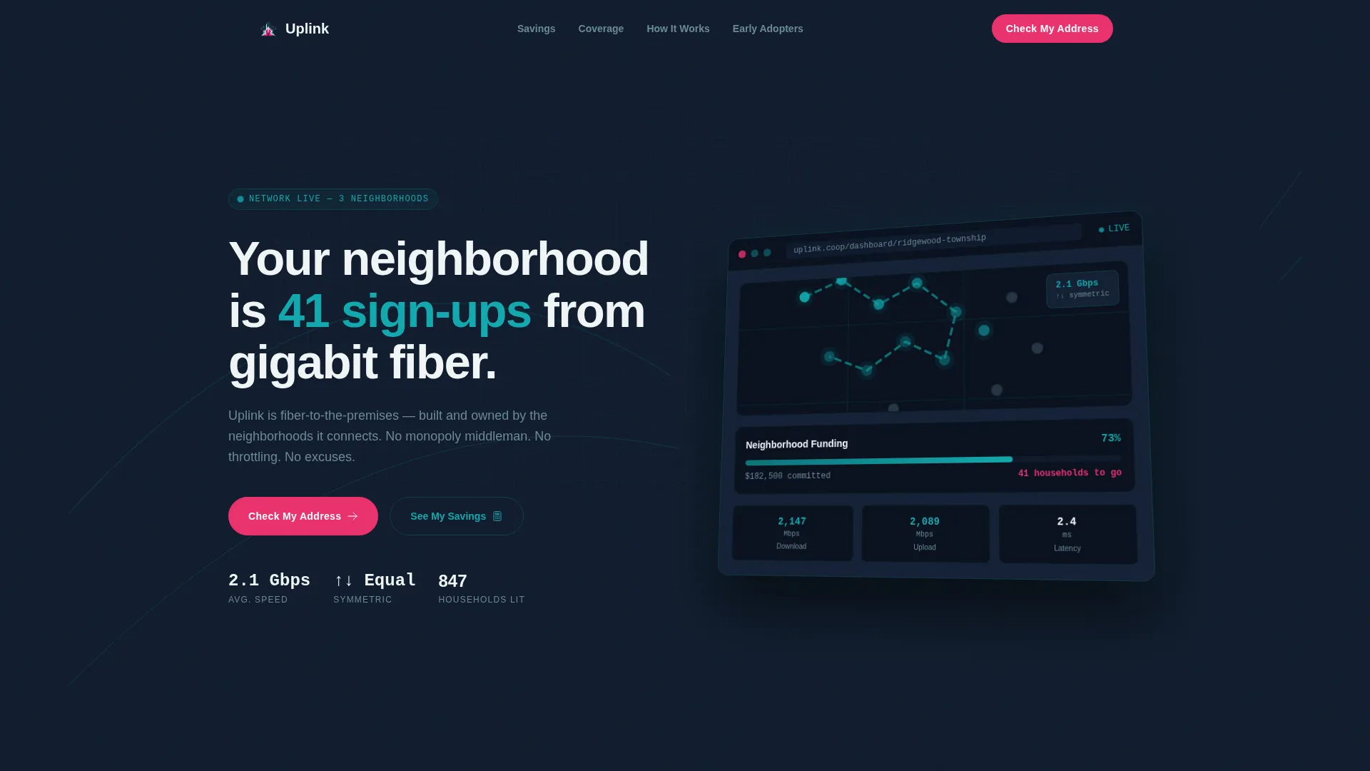
- A product screenshot header displaying a neighborhood coverage map, a funding progress bar, and a live speed result
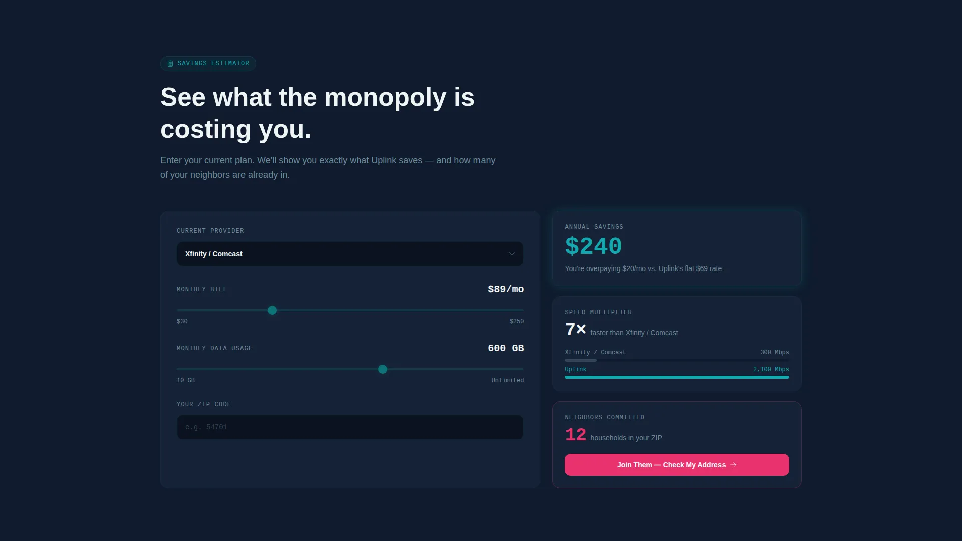
- An interactive savings estimator card with a provider dropdown, bill input, and usage slider
- A two-outcome address check flow that routes visitors to either a reservation card or a referral-powered waitlist card
Feature list
This template is built around modular card sections that each carry one clear message. The sections are sequenced to build confidence progressively, from proof to participation.
Interactive Savings Estimator Card
Visitors select their current provider, enter their monthly bill, and adjust a usage slider. The card instantly returns an annual savings figure, a speed multiplier comparison, and the number of neighbors already committed in their area. This tool earns the conversion click before the page ever asks for personal information.
Address Check Conversion Flow
The primary call to action is a single street address input with autocomplete. Submitting it returns one of two personalized outcome cards: a green-lit confirmation with a "Reserve My Connection" button and a refundable deposit field, or a waitlist card showing the exact neighbor count needed to trigger construction along with a "Pledge and Notify My Street" path that captures an email and generates a unique referral link.
Product Screenshot Header
The header uses a crisp, isometric product screenshot rather than stock photography. It shows a neighborhood map with lit addresses, a progress bar reading "73% funded, 41 households to go," and a live speed test result of 2.1 Gbps symmetric. The screenshot is the proof statement, not decoration.
Funding Transparency Card
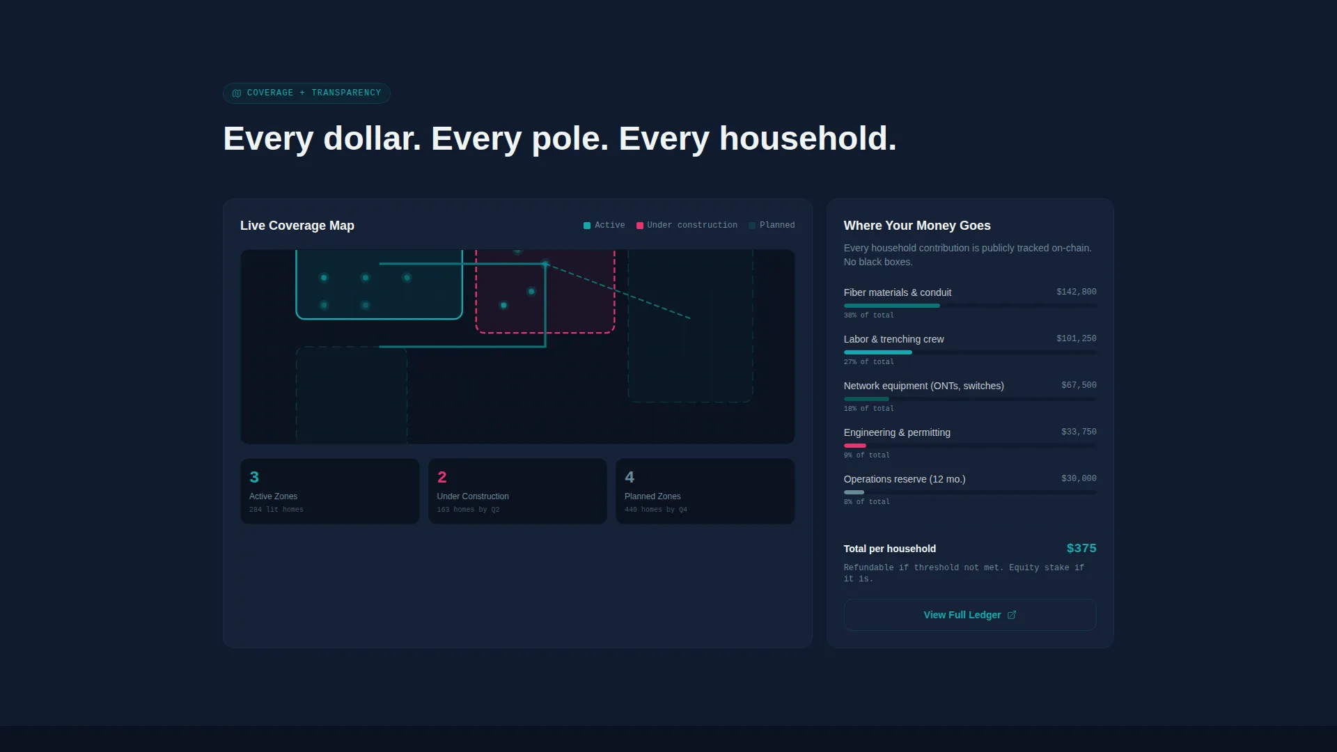
A dedicated card shows where every dollar in the project budget is routed. This section answers the accountability questions that township boards and committee members will ask before they endorse a sign-up campaign publicly.
Construction Timeline Card
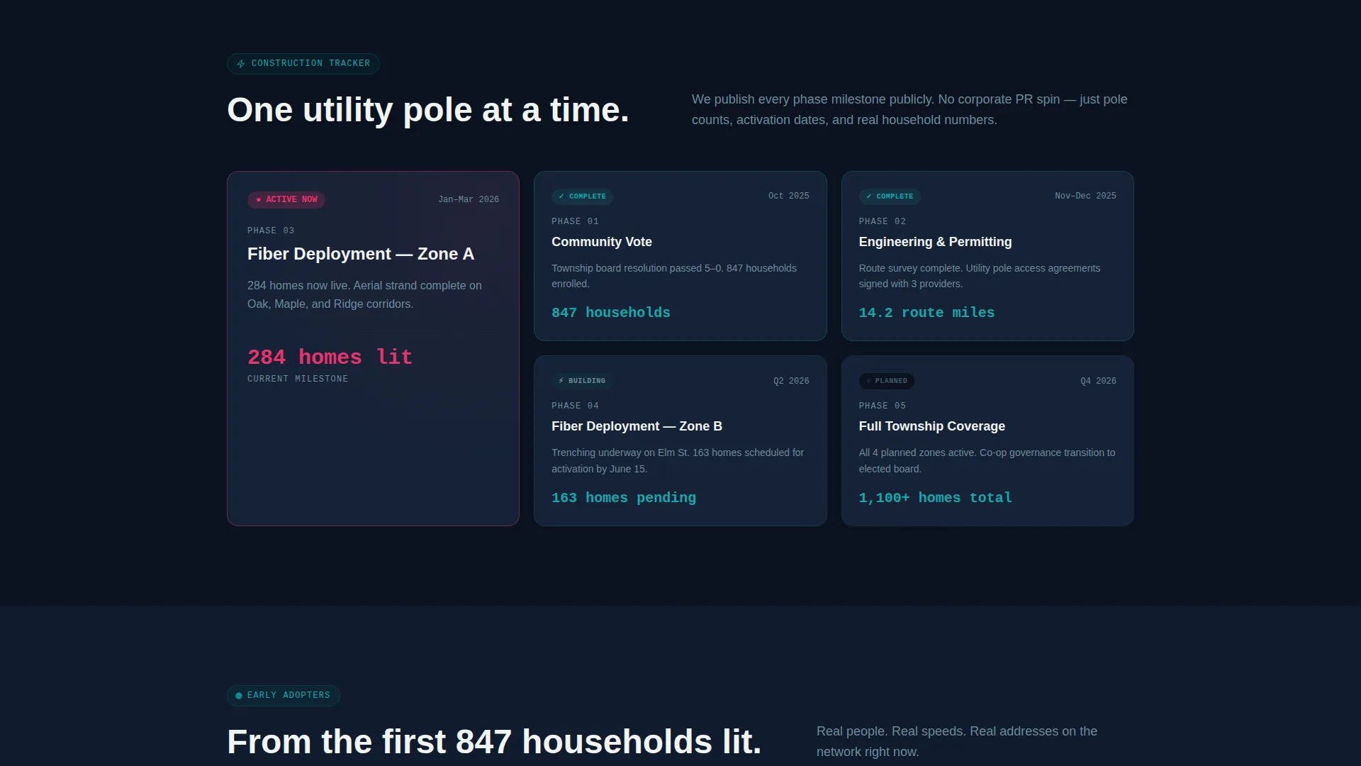
A milestone-tracking card displays the current stage of the project build. Visitors can see exactly where the network stands, from feasibility to construction to activation, so the project feels real and progressing rather than hypothetical.
Testimonial Card Grid
A grid of testimonials from early-lit households anchors the social proof section. Each card shows a resident streaming, gaming, or running a business on the network, giving prospective customers a concrete picture of what connection actually looks like day-to-day.
Page sections overview
| Section | Purpose |
|---|---|
| Product Screenshot Header | Establish instant credibility with live coverage data and a real speed result |
| Savings Estimator Card | Give visitors a personalized cost and speed comparison before any commitment |
| Coverage Map Card | Show interactive neighborhood coverage and lit address status |
| Funding Transparency Card | Explain where project dollars go to satisfy accountability concerns |
| Construction Timeline Card | Track build milestones so the project feels active and real |
| Testimonial Card Grid | Provide social proof from households already connected and using the network |
| Address Check Flow | Route visitors to a reservation or a referral waitlist based on coverage status |
Design & branding system
The visual identity follows a Startup Velocity theme using the Teal Catalyst color system. The palette is deliberately high-contrast and purposeful. Color is not decorative here; it is functional, signaling state and urgency the way a live indicator light does on network hardware.
- Deep network teal (#0D7377) is the primary action color for interactive elements and confirmed states
- Midnight infrastructure (#0F1B2D) fills backgrounds and section dividers, grounding every card in depth
- Signal white (#F0F4F5) surfaces each card cleanly against the dark background
- Hot catalyst magenta (#E9326D) is reserved exclusively for call-to-action buttons and live data callouts, creating an unmistakable visual pulse
Mobile & speed optimization
The card grid layout is inherently responsive. Each modular card is a self-contained unit that reflows cleanly from a multi-column desktop layout to a single-column mobile stack without losing section hierarchy or conversion logic.
- The address check input and savings estimator are designed for touch interaction, with large tap targets and a minimal input footprint
- The isometric product screenshot header scales and crops intentionally on smaller screens so the key data points remain visible
- Card sections load in a sequenced rhythm that mimics network momentum, with each section appearing slightly faster than the last
How this template helps you convert
The entire page is sequenced around the principle that proof must come before the ask. The savings estimator does the persuasion work early so that the address check feels like a natural next step, not a cold request.
- The interactive estimator delivers a personalized financial case before the visitor reaches any form field, making the value tangible and specific to their situation.
- The address check splits visitors into two conversion paths: immediate reservation with a low-friction refundable deposit, or a waitlist pledge that activates a referral link and grows the committed neighbor count organically.
Other information about this template
This template is designed for the community broadband niche specifically. It is not a generic internet service provider template with renamed labels. The structure, language, and conversion logic are built around the real dynamics of a neighborhood-owned fiber network campaign.
- The template style is Card Grid (Modular), making individual sections easy to reorder or expand as a project evolves from pre-launch to active construction
- The creative direction is Calculator/Tool First, meaning the savings estimator appears immediately below the header before any narrative copy
- The header concept is Product Screenshot, using real dashboard data rather than abstract visuals or stock imagery
- The landing page direction follows a Freemium/Trial model, with the refundable deposit and referral waitlist acting as low-barrier first steps toward full connection
Theme
Startup Velocity
Creative direction
Calculator/Tool First
Color system
Teal Catalyst
Style
Card Grid (Modular)
Direction
Freemium/Trial
Page Sections
Interactive Savings Estimator
Two-path Address Check Flow
Product Screenshot Header
Funding Transparency Card
Construction Timeline Tracker
Testimonial Card Grid
Related questions
Can I customize the coverage map and funding progress data in the template?
Does the address check flow handle both covered and uncovered addresses?
Is this template suitable for a project still in the feasibility stage?
Who is this template designed for?
Can I configure the savings estimator with local provider options?