Cleantech HVAC Energy Landing Page Template
Upvote is a cleantech landing page template built for industrial HVAC energy optimization products. It combines a dark Data Command visual identity with a Problem-to-Solution narrative arc, a twelve-row comparison table, a two-step lead capture form, and a case-study carousel, giving cleantech founders a credible, conversion-focused launch page out of the box.
by Rocket studio
Quick summary
Upvote is a single-page cleantech launch template designed around one goal: turning skeptical facilities managers and sustainability officers into qualified leads. It opens with a stat-forward header, walks visitors through a before-and-after energy dashboard, lands a detailed comparison table, and closes with a progressive lead capture form, all wrapped in a high-contrast dark visual identity.
Who this template is for
This template is built for teams launching a hardware-software energy product to a technical, ROI-focused buyer. It suits anyone who needs proof before trust.
- Facilities managers evaluating HVAC retrofit and building management system alternatives
- Sustainability officers building the case for Scope 2 carbon reduction in quarterly ESG reporting
- Startup founders or CTOs launching a cleantech product and needing rapid lead generation without a custom build
What problem this template solves
Industrial energy products are hard to sell without data. Buyers are skeptical, procurement cycles are long, and a generic landing page rarely survives a serious facilities manager's scrutiny.
- Visitors leave when they cannot quickly compare the product against existing manual tuning or legacy retrofit options
- Lead forms placed too early or asking too much kill conversions before any trust is built
- A product that delivers real kilowatt-hour savings needs a page that proves it, not just describes it
What you get with this template
You get a fully structured, single-page layout that moves a technical buyer from pain recognition to form submission in one scroll. Every section serves a specific role in that journey.
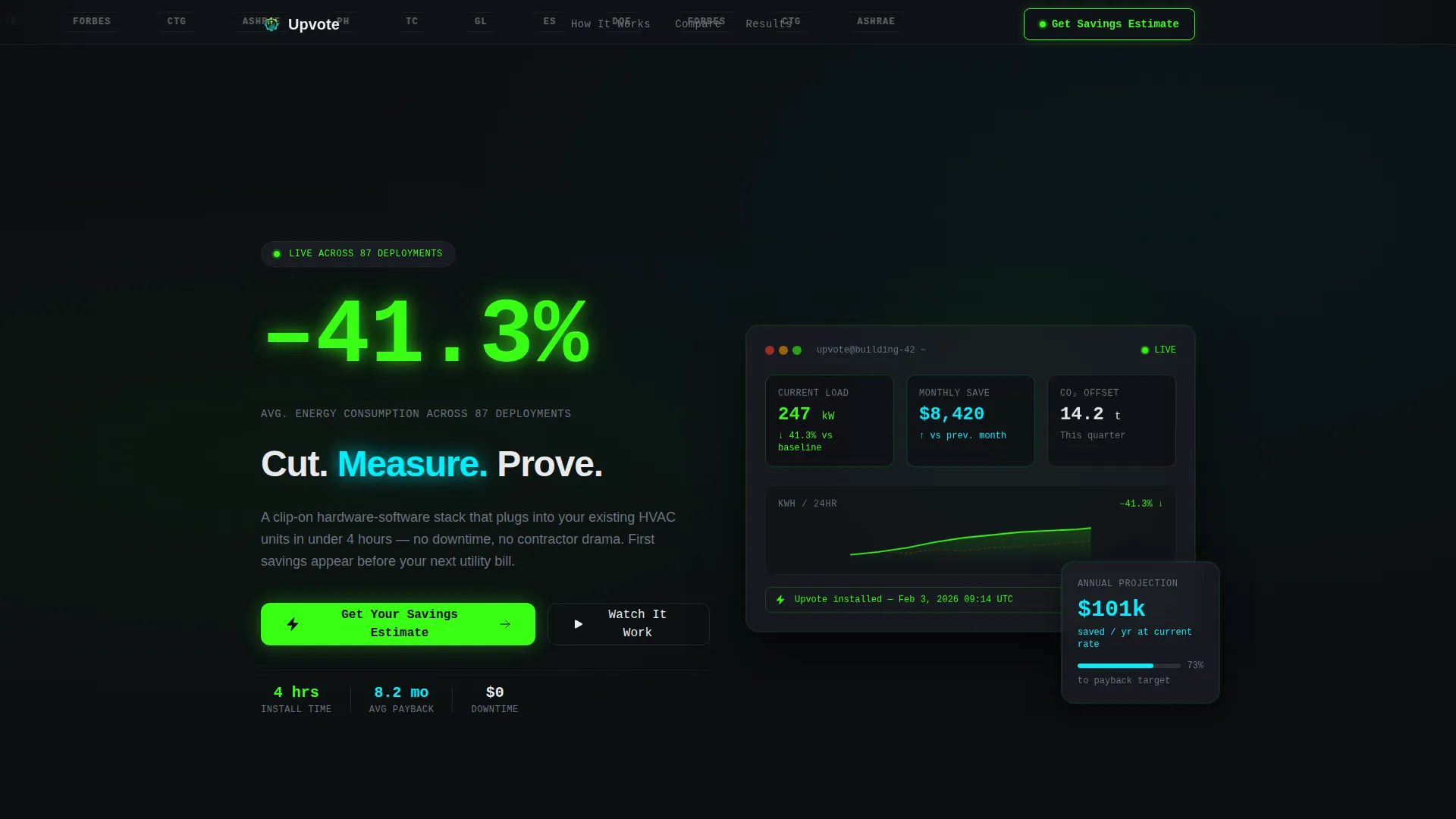
- A stat-led header with a logo credibility ribbon, a 120-pixel phosphor green headline figure, and a three-word value statement
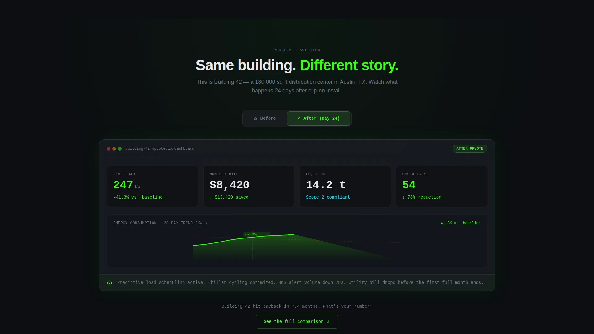
- A before-and-after energy dashboard visual showing red climbing graphs flipping to green descending curves post-installation
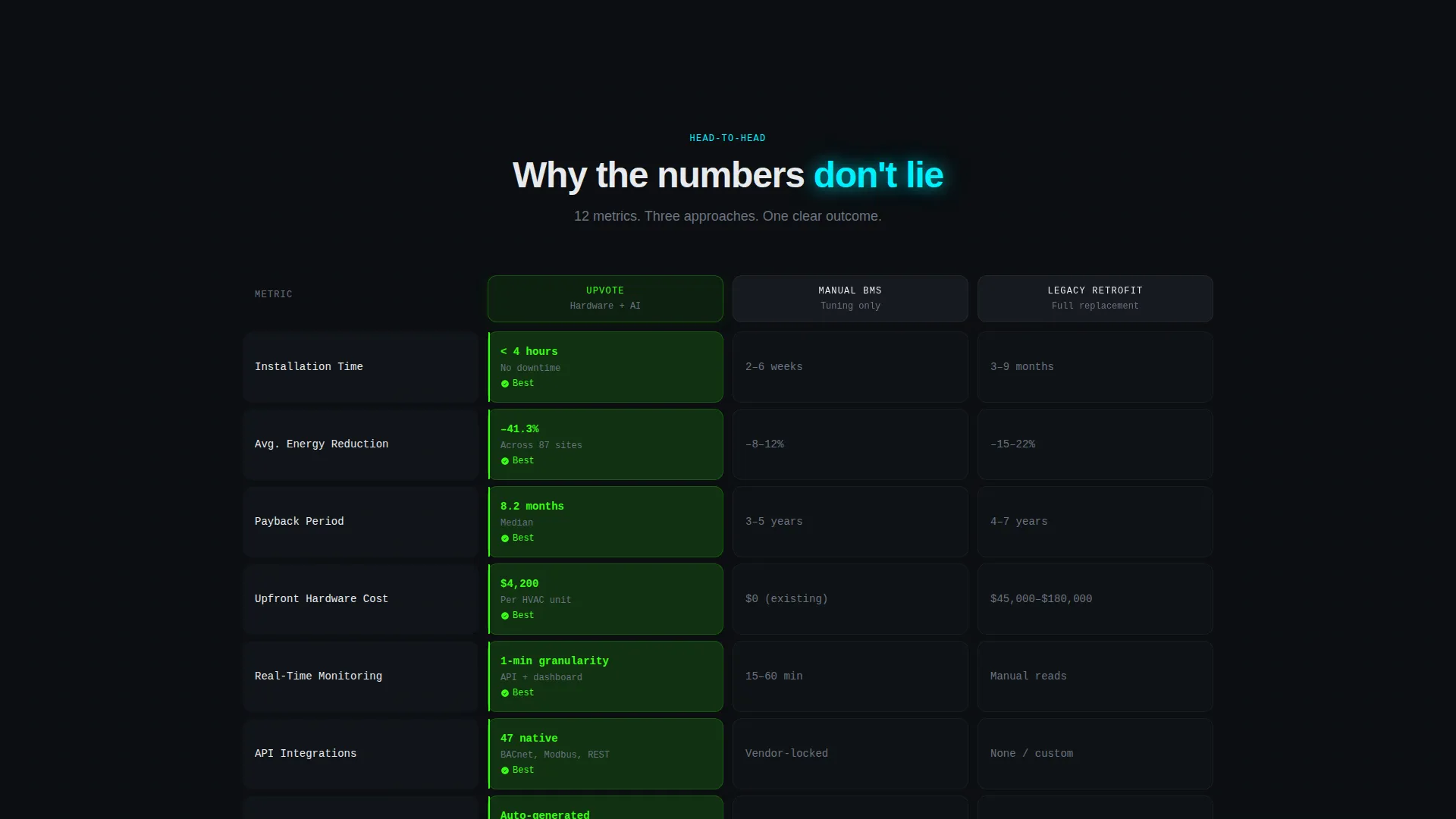
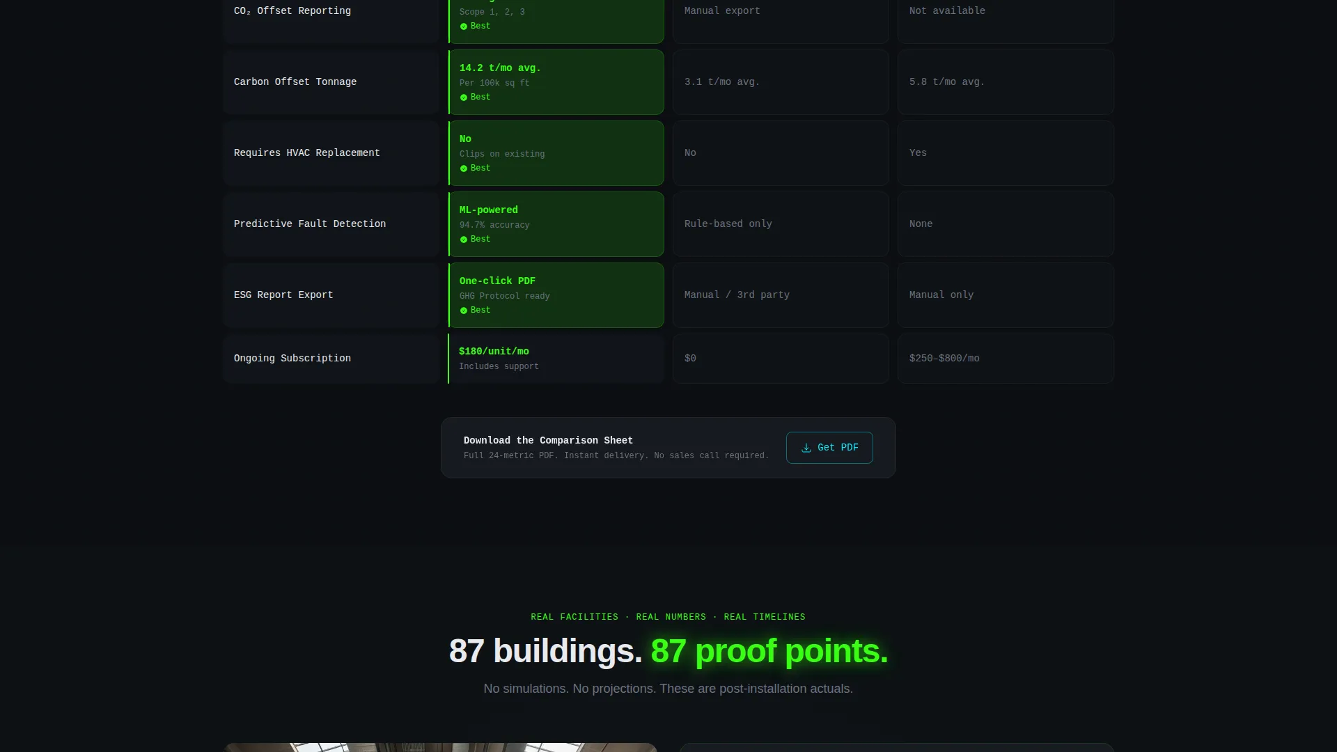
- A twelve-row, three-column comparison table pitting the product against manual BMS tuning and legacy retrofit solutions, with phosphor green pulse highlights on winning cells
- A two-step progressive lead form, a secondary gated PDF download path, and a sticky mobile call-to-action bar
Feature list
This template is built from a defined set of purposeful components. Each one is grounded in what a cleantech product launch actually needs to earn buyer trust.
Stat-Forward Header with Logo Bar
The header opens with a scrolling horizontal ribbon of partner and media logos. Below it sits a single deployment statistic rendered in 120-pixel phosphor green type. A three-word headline follows in crisp white, letting the number carry the argument.
Before-and-After Dashboard Section
The first scroll reveals a live-styled mock dashboard showing a building in its pre-installation state: red numbers, climbing energy graphs, and a circled utility bill total. The next section shows the same dashboard post-installation with green numbers and descending savings curves. The visual contrast makes the product's impact immediate and tangible.
Twelve-Row Comparison Table
Three columns compare the product directly against manual building management system tuning and legacy retrofit solutions. Twelve rows cover installation time, payback period, API integrations, carbon offset tonnage, and monitoring granularity, among others. Cells where the product leads pulse faintly in phosphor green, drawing the eye without noise.
Two-Step Progressive Lead Form
Step one asks for building square footage, HVAC system age, and monthly energy spend. Step two, revealed on submit, captures name, company, and email with a promise of a custom return-on-investment projection PDF within 24 hours. The split reduces form friction and increases completion rates.
Case Study Carousel
A carousel section presents real facility names, real percentage energy drops, and real deployment timelines. It gives the comparison table's claims a human anchor and keeps the narrative moving toward the call-to-action.
Secondary Gated PDF Download
A "Download the Comparison Sheet" option gives visitors who are not ready to submit the form a lower-commitment entry point. It requires only an email address and is designed to feed a follow-up nurture sequence.
Page sections overview
| Section | Purpose |
|---|---|
| Logo credibility bar | Establish trust with media and partner recognition |
| Stat headline block | Lead with a single deployment figure in phosphor green |
| Pre-installation dashboard | Show the energy waste problem with live-styled red metrics |
| Post-installation dashboard | Flip the frame to green savings curves after product install |
| Comparison table | Benchmark product against BMS tuning and legacy retrofits |
| Case study carousel | Ground savings claims in real facility names and timelines |
| Primary lead form | Capture building details and deliver custom ROI projection |
| Secondary PDF gate | Offer comparison sheet download for lower-intent visitors |
| Sticky mobile call to action bar | Keep the primary call-to-action visible on mobile scroll |
Design & branding system
The visual identity follows a Data Command theme built on the Acid Digital color system. Every color choice is functional, not decorative. Bright elements carry information; dark elements provide structure.
- Void black (#0B0E11) as the base canvas, with muted graphite (#1C1F26) for card and panel surfaces to create depth without softness
- Phosphor green (#39FF14) reserved for live data points, savings figures, pulsing comparison wins, and primary call-to-action elements
- Reactor cyan (#00F0FF) used to highlight differentiator cells inside the comparison grid, with crisp white (#E8EAED) body text ensuring legibility throughout
Mobile & speed optimization
The template is structured to maintain its dashboard-style clarity on smaller screens. The comparison table's density is handled gracefully, and the lead form path stays accessible throughout the mobile experience.
- The sticky bottom bar repeats the primary call-to-action on mobile, keeping "Get Your Building's Savings Estimate" visible without interrupting the scroll narrative
- The two-step form is sequenced to minimize visible field count at any one moment, reducing perceived friction on a phone screen
How this template helps you convert
The entire page is built as a single persuasion arc. Nothing is decorative; every section moves a skeptical technical buyer one step closer to submitting their building details.
- The header stat and logo bar handle credibility in the first three seconds, before a visitor has read a single word of copy, proof arrives before the pitch does.
- The before-and-after dashboard sequence makes the product's value visceral and visual, so the comparison table lands on a buyer who already believes the problem is real.
- The split lead form and secondary PDF download give visitors two commitment levels to choose from, capturing both high-intent leads and early-stage prospects into a single funnel.
Other information about this template
This template is part of the Startup and Launch category, specifically built for the CleanTech Product Hunt Launch niche. It is designed to support a product that ships fast and needs to generate leads before the next board meeting.
- The template style is a Comparison Table layout, making it well suited for products competing against established but inefficient legacy approaches
- The creative direction follows a Problem-to-Solution Arc, a narrative structure that works particularly well when the buyer's pain is immediate and measurable
- The header concept is a Logo Bar, which provides the kind of third-party signal that early-stage cleantech products often need before a buyer will engage with a form
- The lead generation direction is specifically designed around a progressive two-step form, reducing early abandonment while still collecting the data needed to deliver a personalized ROI output
Theme
Data Command
Creative direction
Problem→Solution Arc
Color system
Acid Digital
Style
Comparison Table
Direction
Lead Generation
Page Sections
Stat-forward Header with Logo Bar
Before-and-after Energy Dashboard
Twelve-row Comparison Table
Two-step Progressive Lead Form
Case Study Carousel
Secondary Gated PDF Download
Related questions
Can I customize the comparison table rows for my specific product?
What does the two-step lead form actually collect?
Does the template include real dashboard data or only the visual layout?
Who is the secondary PDF download path designed for?
Is this template suitable for a Product Hunt launch day?



