Photography Blog Specialist Blog Website Template
Urbex is a magazine-style landing page for an abandoned places photography YouTube channel. Built on an Ink and Paper editorial design, it pairs enormous serif headlines with a Warm Stone color palette to tell a creator's origin story. The page pulls history enthusiasts and brand partners into an email expedition list through two conversion paths and a fixed bottom call-to-action bar.
by Rocket studio
Quick summary
Urbex is a single-page editorial template for an abandoned places photography YouTube channel. It scrolls like a printed magazine feature, opening with a full-bleed typographic hero and unspooling a creator origin story through chapter-style sections. Two lead generation paths collect emails: a "Join the Expedition List" form and a gated free PDF download.
Who this template is for
This template suits creators who document forgotten places and need a page that matches the weight of their work. It speaks directly to both community builders and brand prospects.
- Urban exploration photographers or videographers running a YouTube channel
- History-focused content creators looking to grow a direct subscriber list
- Brand partnership seekers targeting outdoor gear or camera companies
What problem this template solves
Most creator link-in-bio pages and generic channel pages feel thin. They list videos but tell no story. They collect no leads and give brands nothing to act on.
- The template replaces a forgettable channel page with a compelling, story-driven magazine feature
- It turns passive viewers into active expedition list subscribers through a dual-path email capture design
- It gives brand managers a polished editorial block that communicates the creator's value proposition clearly
What you get with this template
You get a fully structured, single-page editorial layout built specifically for this niche. Every section is pre-planned with a defined purpose and design direction.
- A typographic hero, a narrative origin chapter, a milestone section, a photo grid, a lead generation section, and a brand partnership block
- Two distinct conversion paths: an expedition list form with a coordinates field and a gated PDF offer
- A fixed bottom call-to-action bar that stays visible on scroll throughout the page
Feature list
This section details the core built-in components that ship with the template.
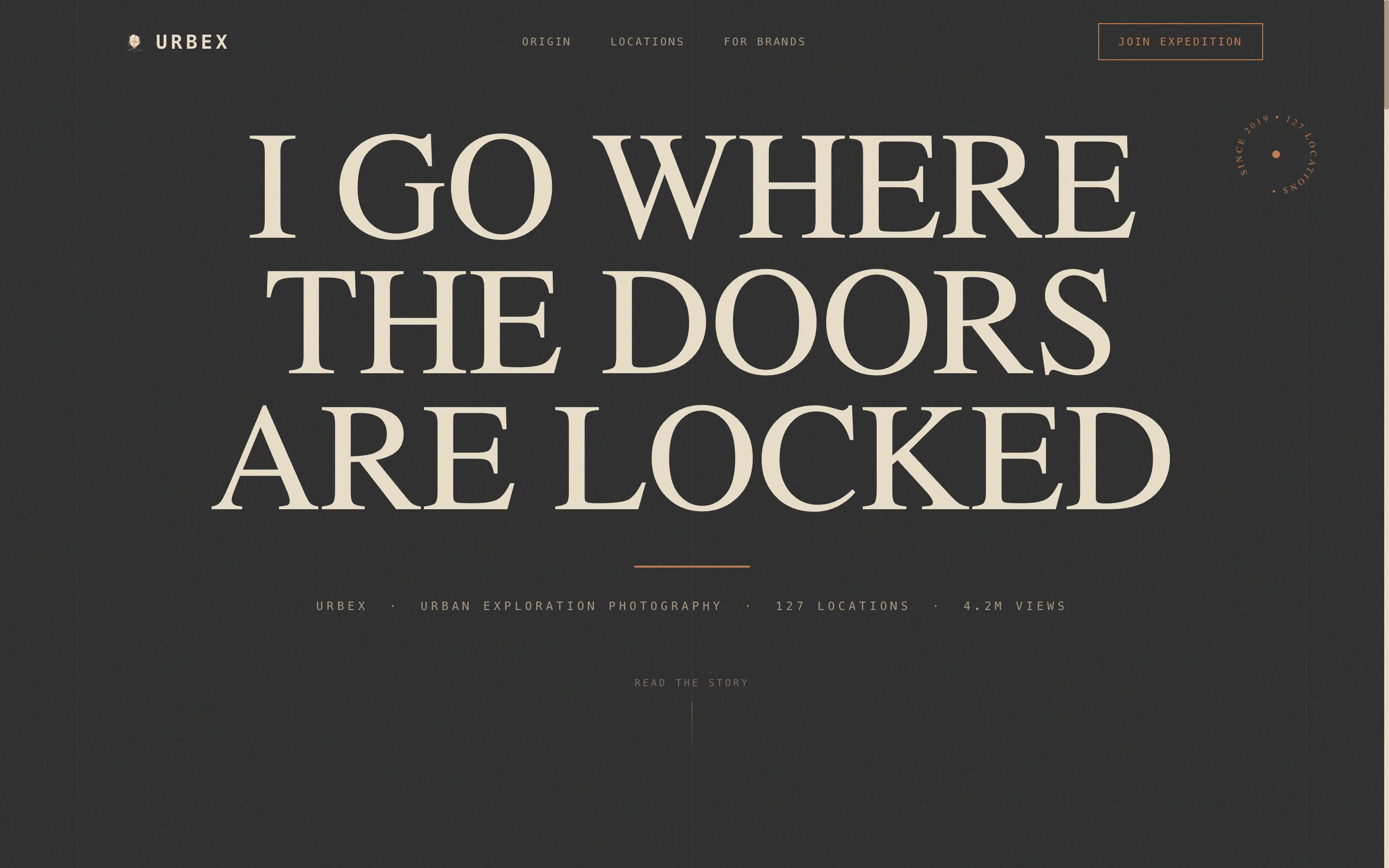
Giant Typographic Hero Section
The hero opens with an enormous centered serif headline set against a full-bleed charcoal background. A thin copper rule sits beneath the headline. A small-caps dateline follows, displaying the creator's name, channel identity, and location count. No image competes with the type; the words carry the full visual load.
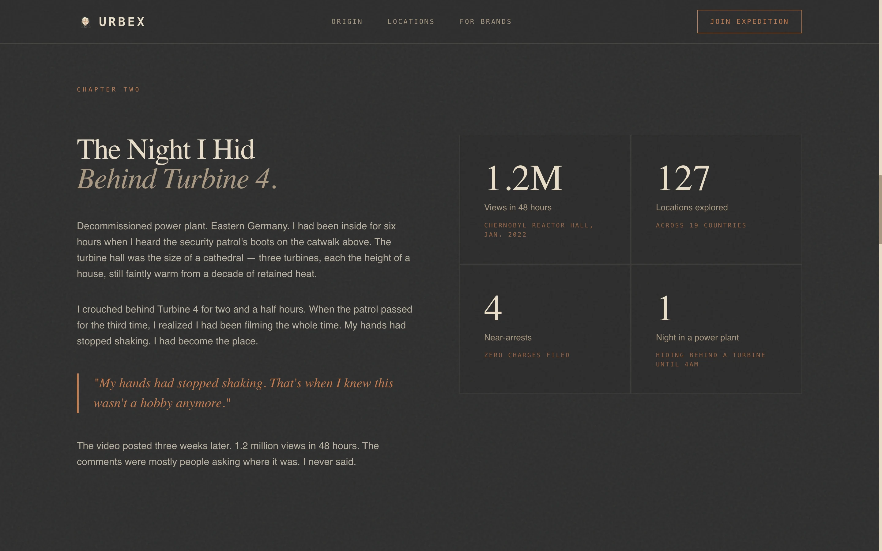
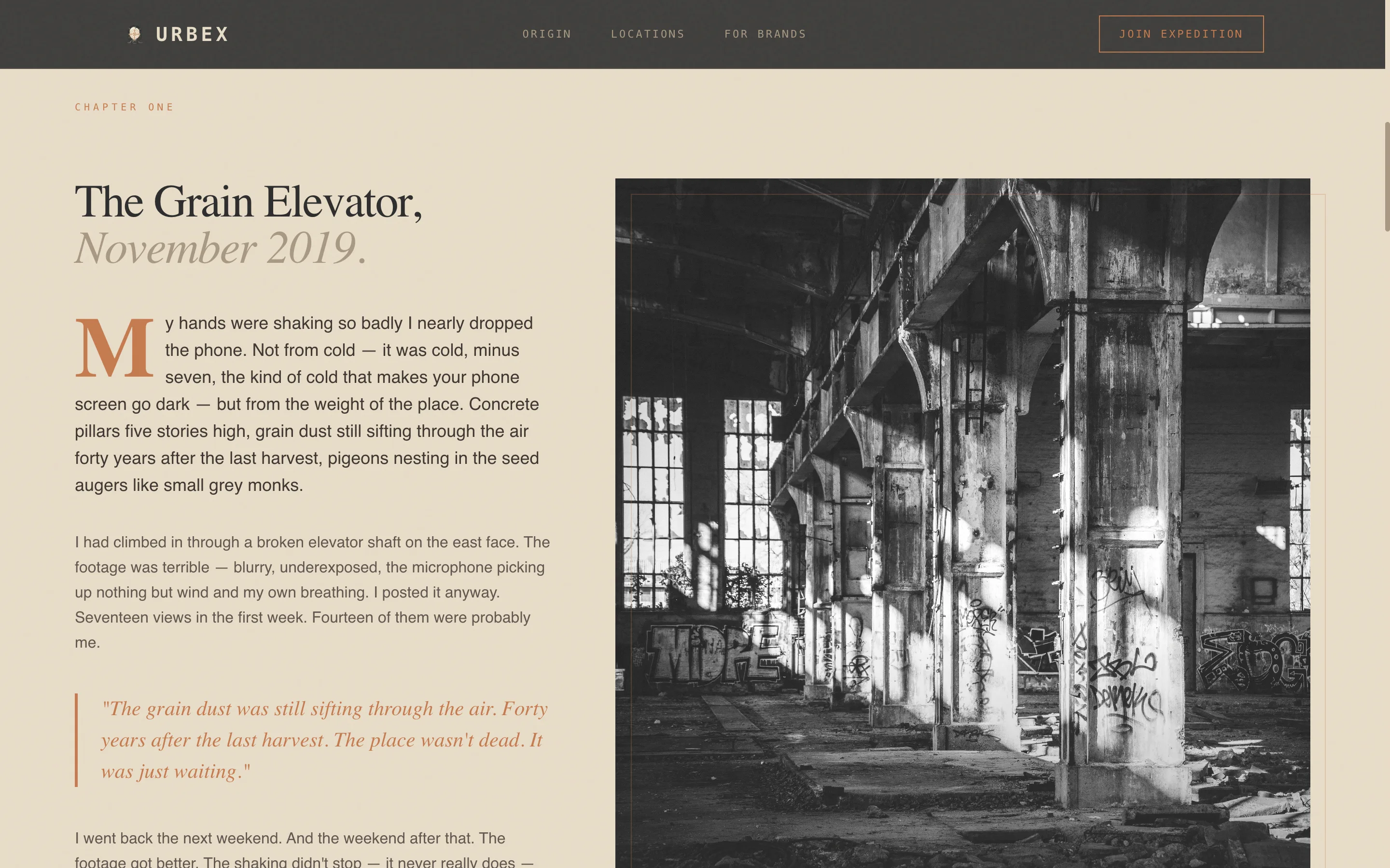
Origin Story Chapter Layout
The editorial body scrolls like a magazine article. Each chapter opens with a large drop-cap letter. Full-bleed photography bleeds to the page edges. Pull quotes appear in copper italic type, framing the most charged moments of the creator's journey from a first phone-shot exploration to a channel milestone.
Asymmetric Exploration Photo Grid
A locations section displays selected explorations in an asymmetric photo grid. Each entry carries a danger rating, giving visitors a tangible sense of the creator's access and risk level. The grid communicates the range and depth of the back catalog visually rather than through lists.
Dual-Path Lead Generation Form
The expedition list section holds an email capture form with two fields: a required email address and an optional coordinates or pin drop for viewers who know an abandoned place. A secondary conversion path offers a free downloadable PDF gated behind the same email entry.
Fixed Bottom Call-to-Action Bar
A persistent call-to-action bar anchors to the bottom of the viewport on scroll. It keeps the primary conversion action visible at all times without interrupting the editorial reading experience above it.
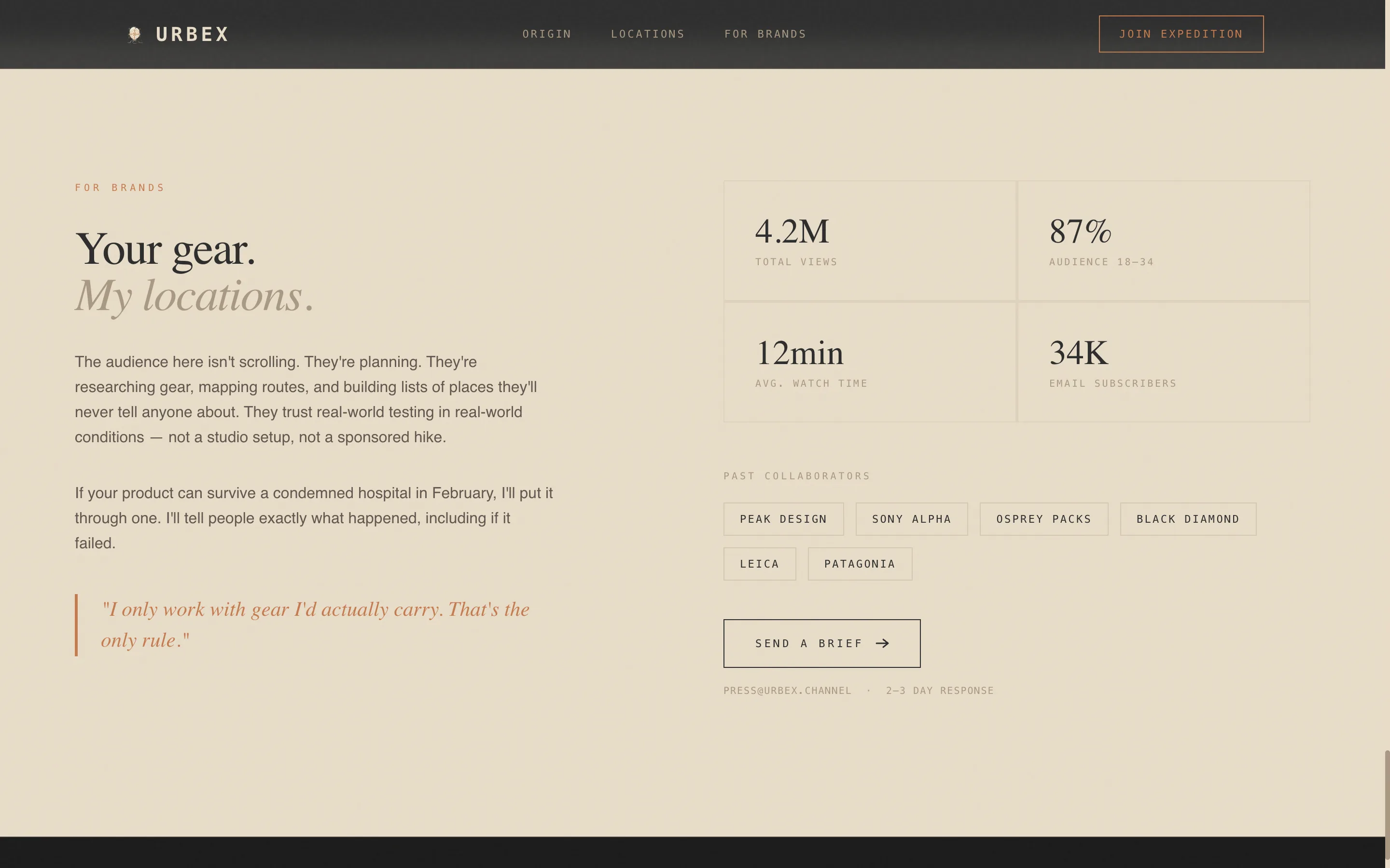
Brand Partnership Editorial Block
A dedicated section addresses brand managers directly in the same editorial voice used throughout the page. It presents the creator's reach, access, and unique value to outdoor gear and camera brands considering a content partnership.
Page sections overview
| Section | Purpose |
|---|---|
| Hero headline | Opens with giant centered serif type and copper rule dateline |
| Origin story chapter | Drop-cap editorial prose recounting the first exploration |
| Turning points chapter | Documents the million-view milestone and power plant night |
| Locations photo grid | Asymmetric grid of explorations with danger ratings |
| Expedition list form | Dual-path email capture with coordinates field and PDF offer |
| Brand partnership block | Secondary editorial block aimed at gear and camera brands |
| Footer | Linear single-row footer with channel and contact essentials |
Design & branding system
The visual identity follows an Ink and Paper editorial theme anchored by a Warm Stone color palette. Every color carries a specific role and is not used interchangeably.
- Aged parchment (#E8DCC8) for backgrounds and light-section body contrast, charcoal graphite (#2C2C2C) for dark backgrounds and dominant text blocks, and crumbling mortar (#A89882) for body text on light sections
- Oxidized copper (#C47A4E) appears only on links, subscribe buttons, pull-quote borders, and the thin rule beneath the hero headline
- Typography uses Fraunces for serif display headlines, DM Sans for readable body text, and IBM Plex Mono for datelines and labels
Mobile & speed optimization
The template is designed desktop-first to serve the late-night binge-reading audience. It includes a strong mobile fallback so the editorial experience holds on smaller screens.
- Staggered reveal animations, a marquee ticker, parallax scroll effects, and reveal-text transitions are handled through client-side components
- Mousemove parallax on photography and the fixed bottom call-to-action bar are built as interactive client components
- Editorial content sections are structured as server components, separating static content delivery from animation logic
How this template helps you convert
Every structural decision in this template is designed to move a reader toward one action: joining the expedition list.
- The origin story arc builds emotional investment before any call to action appears, so visitors arrive at the form already engaged rather than cold
- The dual conversion path (expedition list form plus free PDF offer) gives both passive readers and active tip-submitters a clear next step that matches their intent
- The fixed bottom call-to-action bar ensures the primary action is never more than a glance away, regardless of how deep into the story the visitor has scrolled
Other information about this template
This template is part of the Blog and Editorial category, sitting within the Abandoned Places Photography Content subcategory. It is built for the Urban Exploration YouTube Channel niche with a high intersection match for that use case.
- The creative direction follows an Origin Story scroll structure, and the header concept is a Giant Headline Centered layout
- The lead generation direction means the page is conversion-focused from the first scroll, not just a portfolio or bio page
- The template style is Editorial and Magazine, making it a strong fit for any creator whose work has a strong narrative identity beyond standard channel pages
Theme
Ink & Paper
Creative direction
Origin Story
Color system
Warm Stone
Style
Editorial/Magazine
Direction
Lead Generation
Page Sections
Giant Typographic Hero Section
Origin Story Chapter Layout
Asymmetric Exploration Photo Grid
Dual-path Lead Generation Form
Fixed Bottom Call-to-action Bar
Brand Partnership Editorial Block
Related questions
Can I use this template if I am not a YouTube creator?
Do I need to know how to code to customize this template?
What does the free PDF offer require to set up?
Is the fixed bottom call-to-action bar visible on mobile devices?
Can brand managers tell this page is designed for partnership outreach?