Art & Design Blog Booking Website Template
A premium editorial landing page built for a user experience and user interface design blog. It pairs a typographic Chapter/Book hero with a masonry article grid organized as a chronological philosophical arc. The Luxe Minimal design uses parchment, graphite, and restrained muted gold to create a reading experience that feels like a design monograph rather than a content feed.
by Rocket studio
Quick summary
This template is a single-page editorial landing page for a user experience and user interface design blog. It opens with an oversized typographic hero styled as a book chapter spread, then flows into a masonry article grid structured as a designer's evolving philosophy. Every detail, from the warm parchment background to the muted gold hover states, signals depth, restraint, and craft.
Who this template is for
This template was built for designers who take their writing as seriously as their work. It suits anyone publishing considered opinions about interface decisions rather than quick tutorial roundups.
- Mid-career product designers who need a publication-quality home for design criticism and rationale
- Junior designers building out their first case studies and wanting a professional editorial presence
- Design leads and writers who publish long-form pieces and want readers to feel the narrative arc
What problem this template solves
Most design blogs look like content feeds: endless cards with no sense of progression or authorial intent. Readers arrive, skim one post, and leave. This template addresses that by giving every scroll a sense of direction.
- The chapter-by-chapter masonry structure replaces a random feed with a philosophical timeline
- The restrained visual system stops decoration from competing with ideas, letting the writing carry full authority
- The floating "Start Reading" call to action keeps momentum without interrupting the browsing experience with gates or pop-ups
What you get with this template
You get a fully designed, single-page landing page that functions as both a publication front cover and a browsable article index. The layout is built around editorial pacing rather than conversion pressure.
- A full-viewport typographic hero with chapter label, essay title, italic subtitle, horizontal rule, and dateline
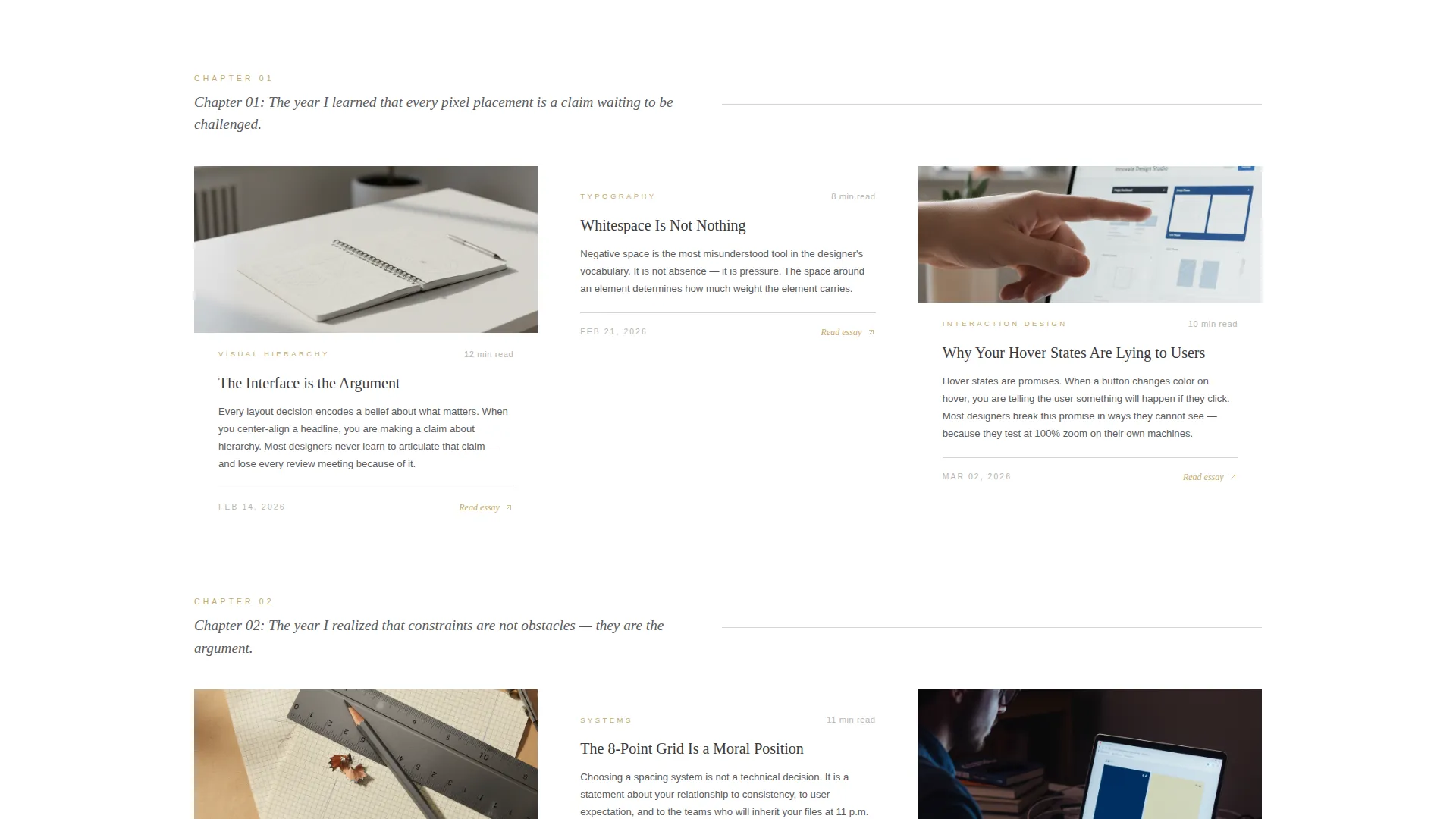
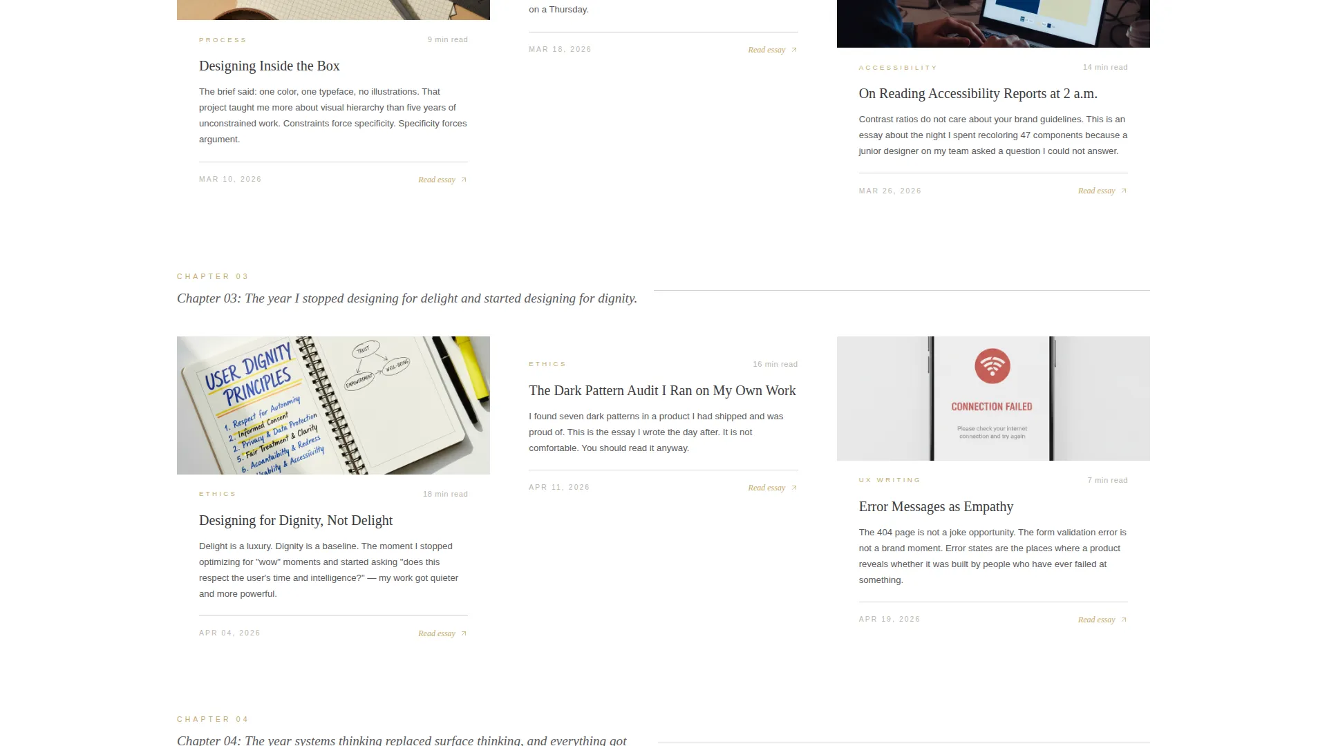
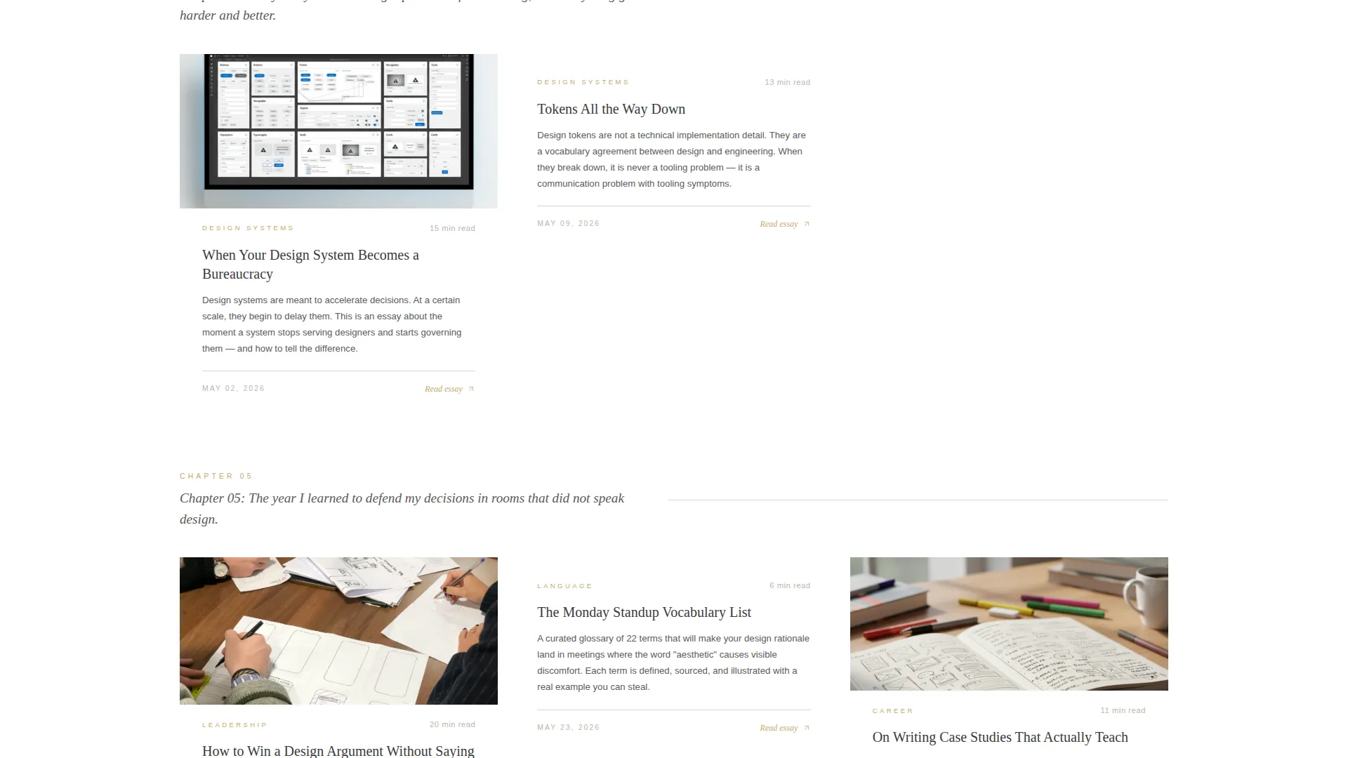
- A masonry article grid with chapter-number row headers, article cards featuring serif titles, gold category tags, and reading-time stamps
- A featured essay banner with dark editorial pull-quote treatment, a philosophy strip with founding statement, and a clean linear single-row footer
Feature list
This section walks through the template's core functional and visual features as delivered in the brief.
Typographic Chapter Hero
The hero occupies the full viewport as a typographic spread. The left side displays "Chapter 01" in thin tracked-out uppercase mist gray. The right side carries the founding essay title in a large editorial serif, black on parchment, with a two-line italic subtitle and a dateline below a horizontal rule. No images compete with the words.
Chapter-Structured Masonry Grid
The article grid is organized chronologically across chapters, each introduced by a chapter number and a one-sentence thesis statement. Article cards use generous padding, graphite serif titles, muted gold category tags, and reading-time stamps styled like page counts. As the visitor scrolls deeper, the chapters progress, building a sense of evolving authorial philosophy.
Floating Click-Through Call to Action
A "Start Reading" button in muted gold on graphite appears below the hero essay excerpt and floats at the bottom of the viewport as visitors scroll the masonry grid. It stays visible without interrupting reading, maintaining consistent click-through momentum throughout the page.
Gold Hover Animation on Cards
Each article card carries a subtle gold underline animation on hover. This signals interactivity without visual noise, keeping the editorial atmosphere intact while making every card a clear click-through surface.
Featured Essay Pull-Quote Banner
A dedicated full-width banner section presents a featured essay in a dark editorial treatment with a highlighted pull quote. It breaks the parchment rhythm and adds tonal contrast, drawing attention to a signature piece of content.
Philosophy Strip and Footer
A philosophy strip beneath the masonry grid carries the founding design statement alongside a link to the about section. The footer follows Pattern 1 Linear Single-Row layout, keeping the closing of the page as clean and deliberate as the opening.
Page sections overview
| Section | Purpose |
|---|---|
| Chapter Hero Spread | Opens the page as a full-viewport typographic statement with essay title, subtitle, and dateline |
| Masonry Article Grid | Displays article cards in a chapter-structured chronological arc with row-level thesis headers |
| Featured Essay Banner | Highlights a signature essay with a dark pull-quote editorial treatment |
| Philosophy Strip | Presents the founding design statement and a link to the about section |
| Single-Row Footer | Closes the page with a minimal linear footer using Pattern 1 layout |
Design & branding system
The visual identity follows a Luxe Minimal theme inspired by Japanese stationery and printed design monographs. Every color decision earns its place; nothing decorates without reason.
- The Cloud Canvas color system uses warm parchment white (#F7F5F0), soft graphite (#3A3A3C), mist gray (#D6D4CF), and muted gold (#C4A96A) reserved for hover states, pull quotes, and chapter markers
- Typography pairs Fraunces as the editorial serif for titles and chapter headings with DM Sans for body text and user interface labels
- Backgrounds alternate between parchment and pure white, keeping the reading surface tactile and calm across every section
Mobile & speed optimization
The template is built desktop-first, reflecting the reality that its primary audience works on large screens. Mobile adaptation is included and handled gracefully.
- GSAP scroll reveals and staggered card entrance animations provide medium-level interactivity without overloading the experience
- Static-first architecture with server components for all content keeps the page lean and fast to load
- The floating call to action and hover states adapt cleanly to touch and smaller viewports without losing the editorial character
How this template helps you convert
This landing page converts through narrative curiosity rather than pressure tactics. The chapter structure does the persuasion work quietly and steadily.
- The chapter-numbered masonry arc creates a sense of story progression, so visitors keep scrolling to find out where the philosophy leads rather than bouncing after one card
- The floating "Start Reading" call to action stays consistently visible throughout the masonry scroll, offering a clear next step at the exact moment curiosity peaks
Other information about this template
This template was designed specifically for the user experience and user interface design blog niche within the broader Art and Design Blog and Blog and Editorial categories. It sits at the intersection of premium editorial design and practical publishing needs for design professionals.
- The template style is Masonry and Pinterest grid layout, suited to content-heavy publications with a strong visual and typographic identity
- The creative direction follows an Origin Story arc, meaning the page is structured as a personal design timeline rather than a neutral content index
- The header concept is Chapter and Book, treating the first viewport as the opening spread of a printed monograph
- The landing page direction is Click-Through, with no email gates or sign-up walls interrupting the reader's path to the first essay

Theme
Luxe Minimal
Creative direction
Origin Story
Color system
Cloud Canvas
Style
Masonry/Pinterest
Direction
Click-Through
Page Sections
Typographic Chapter Hero Spread
Chapter-structured Masonry Grid
Floating Click-through Call to Action
Gold Hover Animation on Cards
Featured Essay Pull-quote Banner
Philosophy Strip and Linear Footer
Related questions
Who is this landing page template designed for?
Does this template include an email sign-up gate or pop-up?
Can I customize the chapter titles and article card content?
What animation and interaction features are included?
Is this template suitable for a desktop-first audience?



