Paranormal Online Course Landing Page Template
Veil is a single-column landing page template built for paranormal and unexplained online courses. It uses a gallery-walk layout to present course modules like museum exhibits, building credibility through accumulated depth. The design follows a Luxe Minimal Japanese Zen aesthetic with a candlelit reading room atmosphere, guiding visitors toward a dedicated enrollment page via a shrine vermillion call to action.
by Rocket studio
Quick summary
Veil is a single-column, click-through landing page template designed for a paranormal and unexplained online course. Six course modules unfold like gallery exhibits as visitors scroll, building trust through depth rather than urgency. The restrained Japanese Zen color system and editorial typography create a serious, immersive atmosphere that converts curious readers into enrolled students.
Who this template is for
This template is designed for educators, researchers, and course creators in the paranormal, consciousness studies, and unexplained phenomena space. It speaks to audiences who want rigor alongside wonder, and it positions instructors as archival scholars rather than entertainment personalities.
- Creators launching a paranormal or unexplained online course who need credibility without compromise
- Digital academies presenting multi-module curricula to adult learners, retired professionals, and practicing therapists
- Researchers and educators whose audience values documented evidence and serious inquiry over sensationalism
What problem this template solves
Most course landing pages use urgency, countdown timers, and aggressive sales copy. That approach alienates the thoughtful, skeptical adult who needs to trust the source before committing. Veil solves the credibility gap by letting the curriculum speak for itself through a paced gallery experience.
- Visitors leave generic course pages unconvinced because the content feels shallow or promotional
- Paranormal and consciousness-focused educators struggle to signal scholarly depth in a visual format
- A single-column gallery walk replaces hard-sell tactics with accumulated evidence, so trust is earned before the call to action appears
What you get with this template
Veil delivers a complete, fully structured single-column landing page ready for customization. Every section is designed and sequenced to move a curious visitor from first impression to enrollment click.
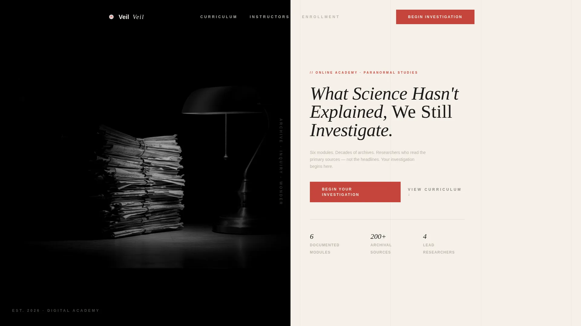
- A hero section with a half-page split layout featuring a high-contrast archival photograph and a tracked serif headline
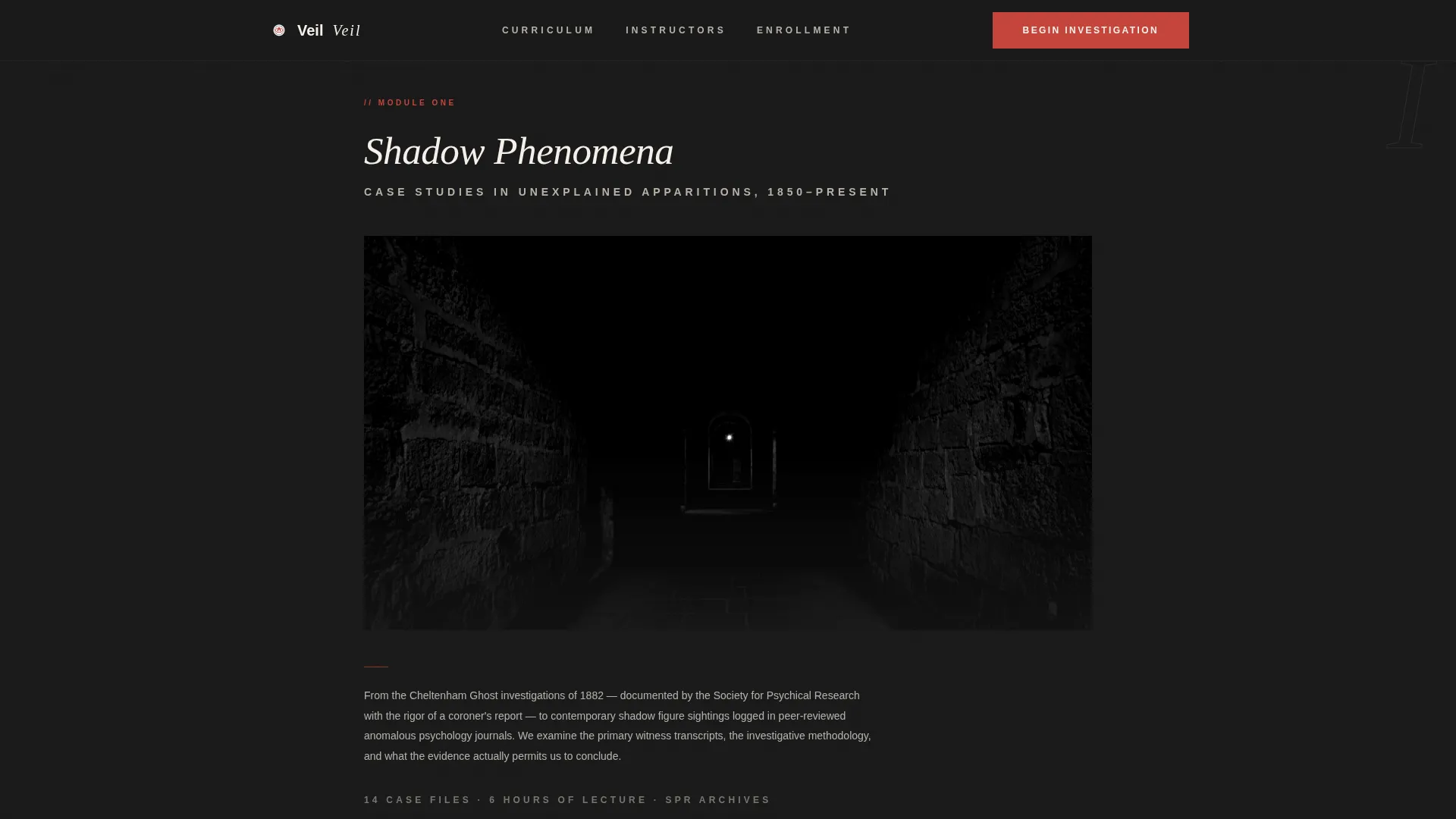
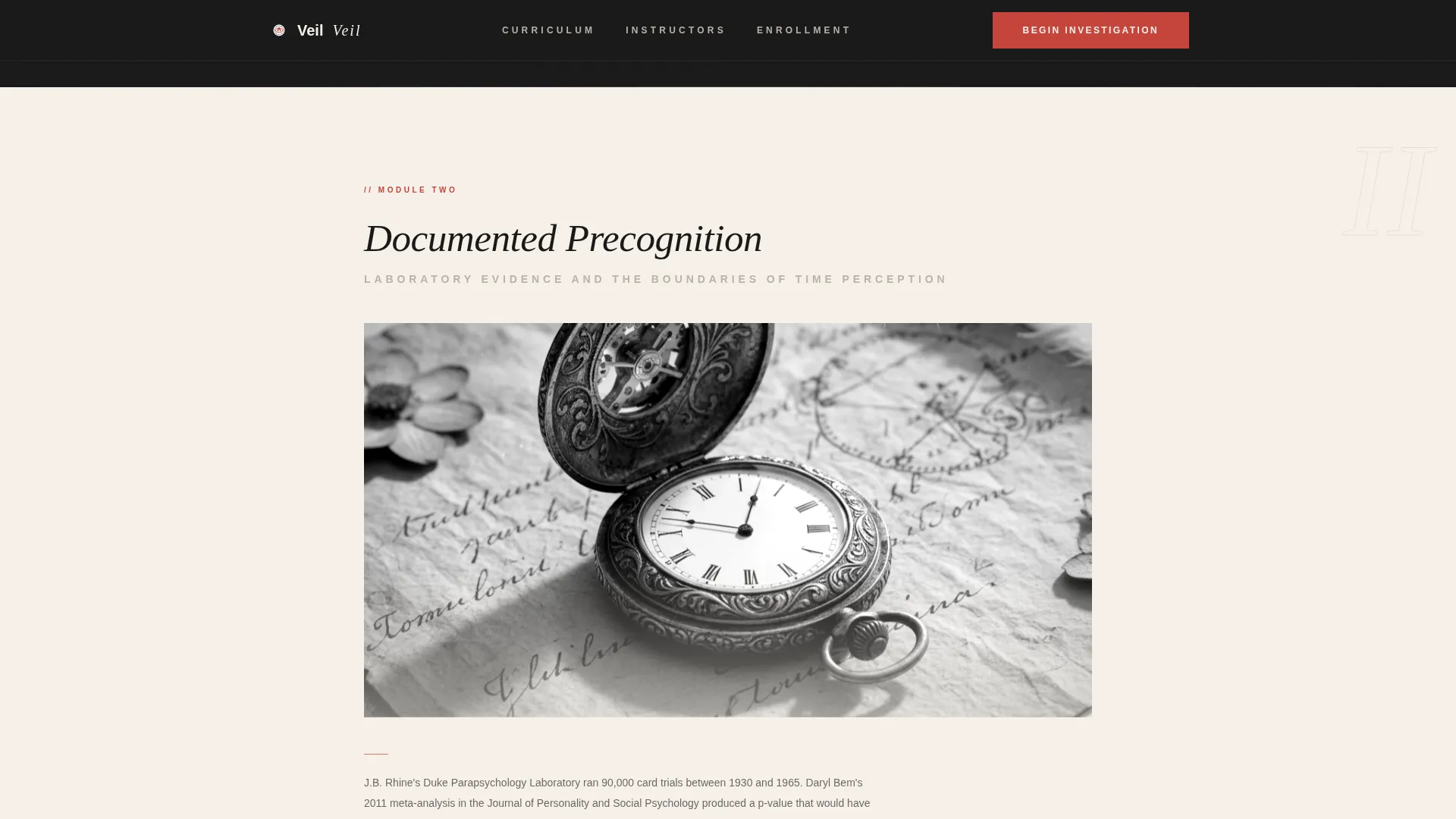
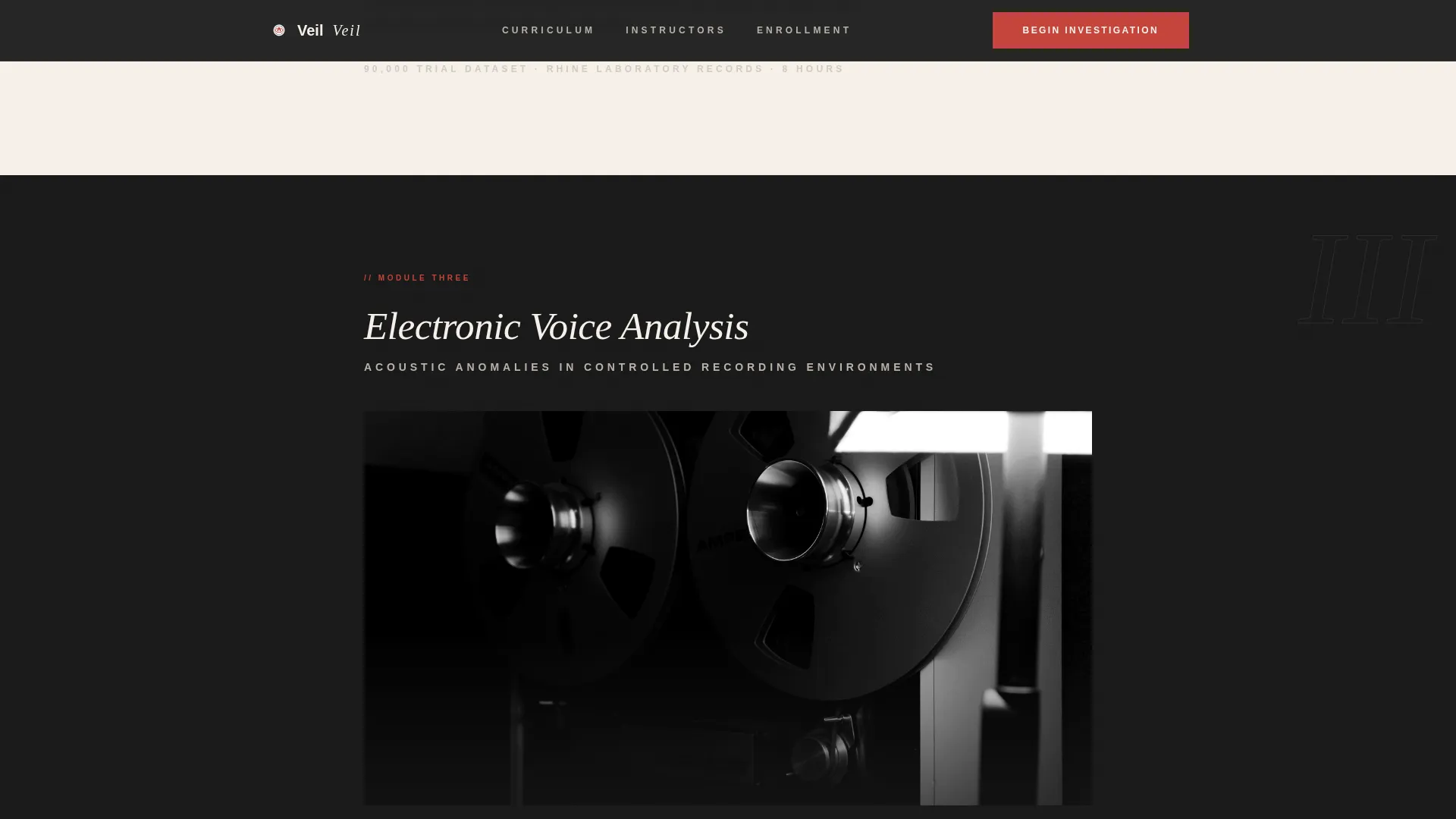
- Six course module exhibit blocks that alternate between ink-stone and shoji cream backgrounds, each with a full-width archival image and a curator's note
- Instructor credibility section, editorial testimonial section, and a final call to action with a minimal footer pattern
Feature list
Half-Page Hero Split Layout
The hero divides the screen into two equal halves. The left side holds a grain-textured black-and-white archival photograph lit by a single desk lamp. The right side carries the headline in thin, tracked-out DM Serif Display type against shoji cream, with a subtext line in temple fog gray and the vermillion primary call to action below it.
Gallery Walk Module Exhibits
Six course module blocks are presented as gallery exhibits in a single-column scroll. Each exhibit includes a full-column-width archival image or illustration followed by a brief curator's note describing the module topic. Backgrounds alternate between deep ink-stone and warm shoji cream so each exhibit feels distinct and deliberate.
Recurring Shrine Vermillion Call to Action
The primary call to action, labeled "Begin Your Investigation," appears first beneath the hero and resurfaces after every third module. It is always rendered in shrine vermillion against whichever background is active, making it visually consistent and unmissable without feeling aggressive.
GSAP ScrollTrigger Module Reveals
Module blocks animate into view using GSAP ScrollTrigger. Each reveal uses a staggered fade-up sequence so modules appear one at a time as the visitor scrolls. A grain texture overlay and scroll-linked opacity shifts reinforce the atmospheric reading room feel throughout the page.
Instructor Credibility Section
Two researcher profiles are presented in an archival aesthetic, establishing the academic and investigative authority behind the course. This section is positioned after the module gallery to reinforce trust at the moment a visitor is most engaged with the curriculum depth.
Editorial Testimonial Section
Three testimonial quotes are displayed in a typographic, editorial style that matches the overall reading room atmosphere. The quotes are positioned to provide social proof before the final call to action, giving hesitant visitors one last point of confidence before clicking through to enrollment.
Page sections overview
| Section | Purpose |
|---|---|
| Hero split layout | Introduce course tone and primary call to action |
| Module exhibit one | Present Shadow Phenomena course module |
| Module exhibit two | Present Documented Precognition module |
| Module exhibit three | Present Electronic Voice Analysis module |
| Mid-page call to action | Resurface enrollment prompt after module three |
| Module exhibit four | Present Government Psi Programs module |
| Module exhibit five | Present fifth course module exhibit |
| Module exhibit six | Complete gallery and close curriculum breadth argument |
| Instructor credibility | Establish researcher authority and archival depth |
| Testimonials section | Deliver editorial-style social proof |
| Final call to action | Drive enrollment click before footer |
| Page footer | Minimal pattern one closure |
Design & branding system
The visual identity follows a Luxe Minimal theme interpreted through a Japanese Zen color system. Every design decision is intentional and restrained, with generous negative space doing the work that decoration usually attempts. Typography pairs DM Serif Display in italic for headings with Plus Jakarta Sans for body text, creating a scholarly editorial contrast.
- Four-color palette: ink-stone black (#1A1A1A), shoji screen cream (#F5F0E8), temple fog gray (#B8B2A8), and shrine vermillion (#C4453C) reserved exclusively for interactive elements and calls to action
- Alternating section backgrounds between deep ink-stone and warm shoji cream keep each exhibit visually separated without using borders or dividers
- Grain texture overlay and high-contrast black-and-white archival photography reinforce the candlelit reading room atmosphere across every section
Mobile & speed optimization
Veil is designed desktop-first to honor the reading room aesthetic, where wide negative space and large archival images create the intended atmospheric effect. On smaller screens, the layout collapses gracefully so the gallery experience remains intact and readable.
- The half-page hero split transitions to a stacked single-column layout on mobile, preserving the archival photograph and headline without cropping key elements
- GSAP animations are handled through Client Components while static sections use Server Components, separating interactive and non-interactive rendering appropriately
- Hover states on module blocks and the magnetic call to action button are touch-adapted on mobile so interactive moments remain functional across device types
How this template helps you convert
Veil is a click-through landing page, meaning its single goal is to move a visitor from curiosity to enrollment-page click. It achieves this through deliberate pacing and accumulated trust rather than pressure tactics.
- The gallery walk structure builds credibility exhibit by exhibit, so by the sixth module the sheer breadth of the curriculum becomes its own argument for enrollment
- The shrine vermillion call to action resurfaces at predictable scroll intervals, keeping the enrollment prompt visible without interrupting the reading experience
- The instructor credibility and testimonial sections resolve final hesitations before the last call to action, ensuring visitors arrive at the enrollment page already convinced of the course's depth
Other information about this template
Veil is built for a very specific content niche: the paranormal and unexplained online course market where adult learners demand scholarly credibility. The template's structure and tone are calibrated for that audience and would suit similar digital academies in adjacent fields such as consciousness studies, historical anomaly research, or parapsychology education.
- The enrollment page, including pricing tiers and cohort dates, is handled separately; this landing page carries no form or pricing display
- The template is categorized under Blog and Editorial with a Paranormal and Unexplained Content subcategory, making it a strong fit for content-forward educational brands in that niche
- Animation intensity is set to medium, using GSAP ScrollTrigger for module reveals, staggered fade-ups, and scroll-linked opacity, all of which can be adjusted to match a creator's preferred pacing
Theme
Luxe Minimal
Creative direction
Gallery Walk
Color system
Japanese Zen
Style
Single Column Flow
Direction
Click-Through
Page Sections
Half-page Hero Split Layout
Gallery Walk Module Exhibits
Recurring Vermillion Call to Action
GSAP Scrolltrigger Animations
Instructor Credibility Section
Editorial Testimonial Section
Related questions
Does this template include the enrollment or pricing page?
How many course modules does the gallery section support?
Can the color palette be adjusted for a different brand?
Does the page include social proof elements?
Is this template suitable for topics outside the paranormal niche?



