Live Metrics & Open Startup Transparency Landing Page
Velocity is a modular card-grid landing page built for open startup transparency. It leads with a live metrics wall showing Monthly Recurring Revenue, burn rate, runway, and customer count in real time. An interactive benchmarking tool lets visitors plot their own numbers against published data, and a freemium signup converts interest into action with a single email and read-only API key.
by Rocket studio
Quick summary
Velocity is a single-page, card-grid template designed for founders who publish their real numbers publicly. The header is a live metrics wall. Below it, an interactive benchmarking tool pulls visitors in immediately. Every card module reveals a different layer of financial and operational transparency, and two well-placed calls to action convert the curious into users.
Who this template is for
This template is built for founders, builders, and analysts who believe raw numbers speak louder than polished pitch decks. It fits anyone running a real startup and willing to show it.
- Indie hackers and bootstrapped founders who want to publish live Monthly Recurring Revenue, burn, and runway data publicly
- Startup operators comparing their early-stage metrics against an open dataset of real published figures
- Developer-minded visitors who want API access to pull transparency data directly into their own tools
What problem this template solves
Most startup pages hide the hard numbers behind marketing language. Founders who want to build trust through radical transparency have no clean, purpose-built format to do it well. Velocity solves that gap.
- Vanity metrics and polished summaries obscure what is actually happening inside a business, frustrating informed readers who want signal
- Founders building in public have no structured page layout that treats live financial data as the primary visual experience
- Potential collaborators, analysts, and fellow builders cannot benchmark themselves without a shared, interactive reference point
What you get with this template
You get a fully structured, modular card-grid landing page where live data does all the storytelling. Every section is purpose-built around financial transparency and interactive benchmarking.
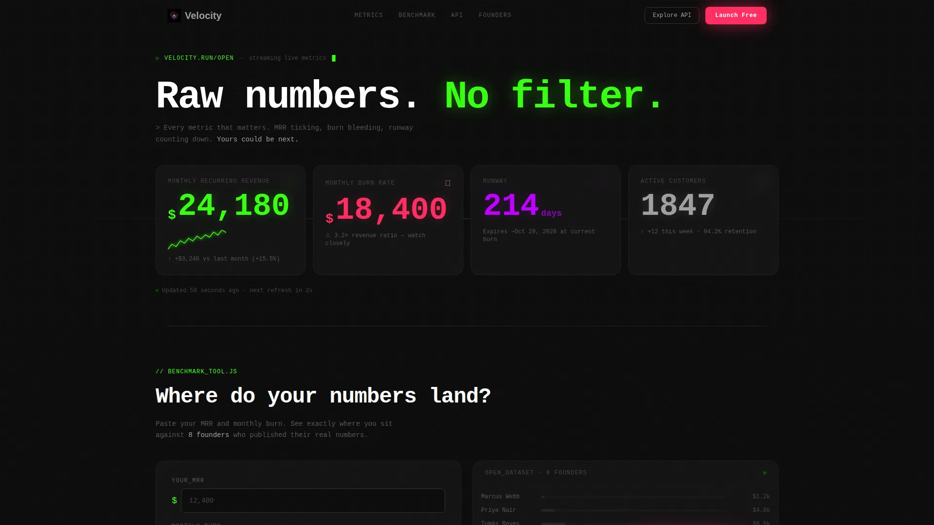
- An animated metrics wall header with oversized cards for Monthly Recurring Revenue, burn rate, runway countdown, and live customer count
- An interactive benchmarking tool where visitors enter their own figures and instantly see results plotted against the open dataset
- Modular revenue, traffic, churn, and salary transparency cards organized by category tabs, plus two conversion touchpoints using the freemium signup flow
Feature list
This section describes the core functional and visual capabilities built into the Velocity template.
Live Metrics Wall Header
The header renders as a grid of oversized metric cards that animate immediately on page load. Monthly Recurring Revenue displays with a climbing sparkline. Burn rate appears in red with a flame icon. Runway shows as a live day countdown. Customer count increments in real time as the visitor watches. Numbers render in tabular monospace at 72 pixels. A single gray timestamp line reads "Updated 47 seconds ago" below the grid.
Interactive Benchmarking Tool
Directly below the header, visitors can paste their own Monthly Recurring Revenue and enter their burn rate. The tool instantly plots their startup position against the published open dataset. Results render in real time without a page reload, making the experience feel native and immediate. The primary call to action appears inside the tool once results are visible.
Modular Transparency Card Grid
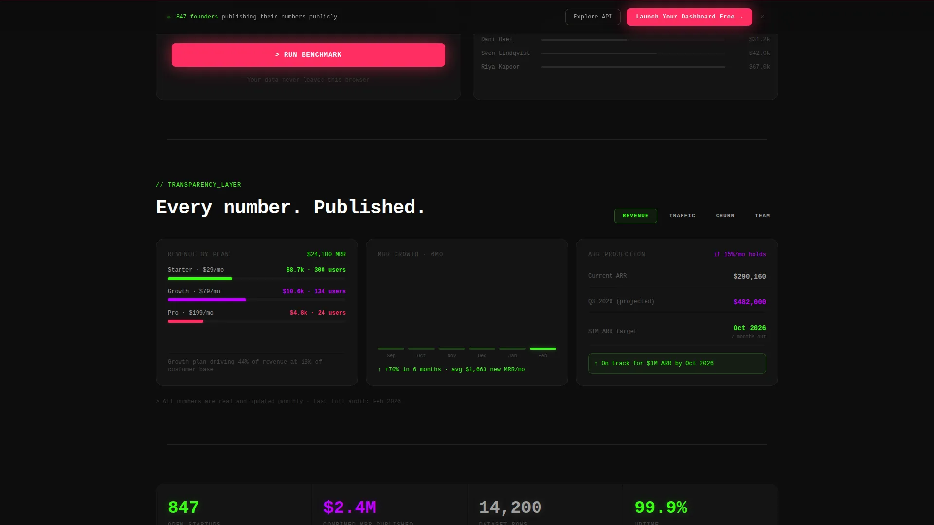
Below the benchmarking tool, the page unfolds as a scrollable grid of card modules. Each card exposes a different transparency layer: revenue breakdown by plan tier, traffic sources with actual session counts, feature-level churn analysis, and even the founder's salary. Cards are organized by category tabs, allowing visitors to shuffle and rearrange what they see by topic.
Dual Conversion Touchpoints
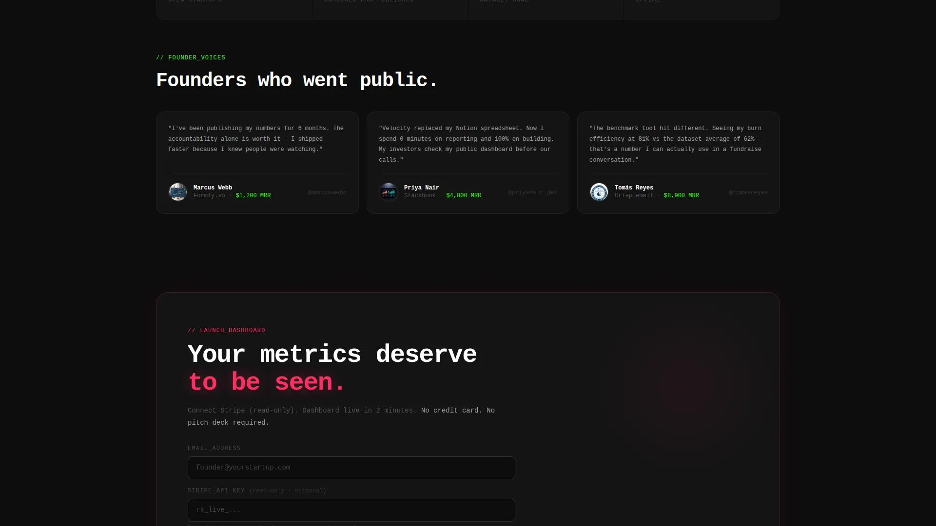
The primary call to action button labeled "Launch Your Dashboard Free" appears first inside the benchmarking tool after results render. It reappears as a sticky bottom bar after the visitor scrolls past three card rows. The signup flow asks only for an email address and a read-only Stripe API key, with a toggle to make metrics public.
Secondary Developer Path
A secondary call to action labeled "Explore the API" targets developers who want to pull the open dataset programmatically. This path sits alongside the primary freemium flow without competing for visual priority, giving technically-minded visitors a clear next step.
Page sections overview
| Section | Purpose |
|---|---|
| Live Metrics Header | Displays animated MRR, burn, runway, and customer count cards on load |
| Benchmarking Tool | Lets visitors enter their own figures and compare against the open dataset |
| Revenue Breakdown Cards | Shows income split by plan tier inside modular transparency cards |
| Traffic Source Cards | Reveals actual session counts per traffic channel |
| Churn Analysis Cards | Breaks down churn by feature usage and plan segment |
| Founder Salary Card | Publishes founder compensation as part of full financial transparency |
| Sticky call to action Bar | Reappears after three card rows to prompt freemium signup |
| API Explorer call to action | Provides a secondary path for developers to access the open dataset |
Design & branding system
The visual identity is built on an Acid Digital color system that feels synthetic, restless, and direct. Black dominates every surface. Green pulses through live data. Violet and pink fire only where interaction demands attention.
- Core palette: void black (#0D0D0D) as the base, terminal phosphor green (#39FF14) for live data and chart lines, electric violet (#BF00FF) for interactive card borders on hover, and hot signal pink (#FF2E63) reserved strictly for alert states and call to action buttons
- Typography uses tabular monospace throughout, with metric figures rendered at 72 pixels and supporting text in cool gray (#A0A0A0) for readability against the dark background
- No hero images or illustrations are used; the data itself is the visual, and every decorative function is served by color, motion, and live number output
Mobile & speed optimization
The card-grid layout is built to reflow cleanly across screen sizes. Modular cards stack vertically on smaller viewports so the metrics wall and benchmarking tool remain the dominant experience on any device.
- Oversized metric cards resize proportionally so tabular figures stay legible without horizontal scrolling on mobile screens
- The sticky call to action bar is designed to remain visible and functional at the bottom of the viewport on both mobile and desktop layouts
- Card tab navigation for category filtering adapts to a compact horizontal scroll on narrow screens, keeping all category options accessible without layout breakage
How this template helps you convert
Velocity earns the conversion before it asks for it. By the time a visitor reaches the signup prompt, they have already used the tool and seen their own data in context.
- The live metrics wall creates immediate credibility. Real numbers animating in real time signal that this is not a static marketing page, which builds trust with skeptical, data-literate visitors before a single word of copy is read.
- The benchmarking tool delivers personal value before asking for anything. When visitors see their own Monthly Recurring Revenue and burn rate plotted against real published data, the dashboard already feels like theirs. The call to action at that moment is a natural next step, not a cold ask.
- The sticky bottom bar captures visitors who scroll deep into the card grid. Placing the "Launch Your Dashboard Free" prompt after three rows of transparency data means the second conversion touchpoint arrives at peak engagement, not at the start of the page when trust is lowest.
Other information about this template
Velocity fits naturally into the open startup movement, where founders publish real financial and operational data to build community trust and attract aligned users. The template sits within the Startup and Launch category, specifically designed for the open startup and transparency page niche.
- Template style is Card Grid (Modular), meaning individual metric and transparency cards can be read independently or as a complete scrolling story
- The creative direction is Calculator and Tool First, prioritizing interactive utility over passive reading to move visitors from observer to participant
- The landing page direction follows a Freemium and Trial model, with a low-friction signup requiring only an email and a read-only Stripe API key
- The header concept is Stats and Metrics, replacing the conventional hero image with a live data wall as the first and dominant visual impression
- This template is suited for builders who want a Baremetrics-style public metrics page or a transparency dashboard similar to open startup showcases, without building from scratch

Theme
Startup Velocity
Creative direction
Calculator/Tool First
Color system
Acid Digital
Style
Card Grid (Modular)
Direction
Freemium/Trial
Page Sections
Animated Live Metrics Wall
Interactive Benchmarking Tool
Modular Transparency Card Grid
Dual-placement Freemium Call to Action
Developer API Access Path
Related questions
Does this template require a developer to set up?
Can I choose which metrics to make public?
What does the benchmarking tool actually do?
Is there a path for developers who want raw data access?
What makes this different from a standard startup metrics page?



