HRTech Startup Careers Website Template
Velocity is a card grid landing page template built for HRTech growth-stage startups. It leads with a live cost-of-vacancy calculator that turns slow hiring into a dollar figure before the visitor scrolls. The dark mission-control design, count-up metric cards, and sticky app-download call to action work together to move HR directors from awareness to action fast.
by Rocket studio
Quick summary
Velocity is a single-page landing page template designed for Series B HRTech startups. It opens with an interactive cost-of-vacancy calculator, moves through cascading benchmark stat cards, and closes with an app-download module. Every section is built to make the financial impact of slow hiring feel personal, immediate, and impossible to ignore before the primary call to action appears.
Who this template is for
This template is built for growth-stage talent acquisition teams that need to communicate hiring cost urgency fast. If your company reports hiring velocity to a board that only reads burn rate, this page was designed for you. It suits product-led HRTech platforms targeting HR directors, VP People Ops, and overwhelmed recruiters who manage candidate pipelines across multiple tabs.
- HR directors and VP People Ops at Series B startups scaling from 50 to 500 employees
- HRTech SaaS founders who need a high-converting landing page that earns the app download before asking for it
- Talent acquisition teams and recruitment technology vendors who want to show cost-per-hire impact without a sales call
What problem this template solves
Slow hiring is a silent killer for growth-stage companies, but most teams cannot see the damage until it shows up on a quarterly review. The cost of a vacancy is spread across lost productivity, delayed revenue, and overloaded internal team members who absorb unplanned work. A hiring manager waiting on feedback, a recruiter juggling job boards and job postings across six tabs, a new employee onboarding into a team that is already behind: these indirect costs rarely appear in a single number until someone builds one.
This template solves the communication gap between what a bad hire actually costs and what leadership is willing to fund to prevent it.
- It replaces abstract hiring strategy slides with a live, specific dollar figure the visitor calculates themselves
- It surfaces both direct costs and indirect costs that most recruiting dashboards ignore
- It gives talent teams a page that earns trust before it asks for a download, reducing drop offs and follow ups that never convert
What you get with this template
You get a complete, modular card grid landing page ready to represent a real-time hire calculator platform. The layout is structured in five clear content zones, each doing a distinct job in the conversion flow. No filler sections, no generic hero copy: every module connects the visitor's attention to a measurable cost outcome.
- An interactive hero calculator that outputs a weekly cost-of-vacancy figure in electric cyan before the visitor scrolls past the fold
- Three rows of animated stat cards covering benchmark metrics, applicant tracking system integration speed, and customer proof with number-as-headline testimonials
- A final app-download module with a three-field form, app store badges, and a sticky mobile call to action bar pinned at the bottom of the screen
Feature list
This section covers the key features built into the Velocity template and what each one does for your hiring strategy presentation and conversion flow.
Live Cost-of-Vacancy Calculator
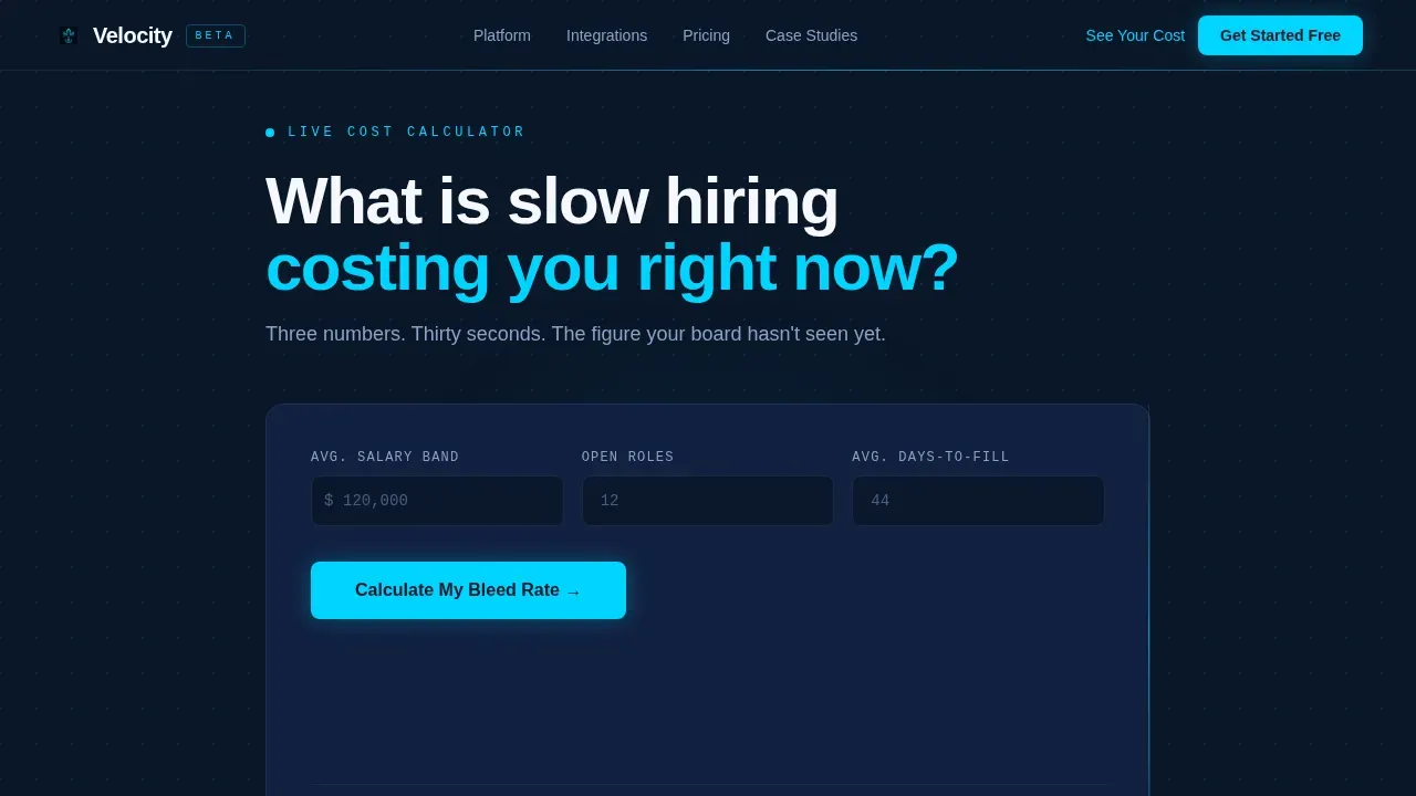
The hero section is a fully interactive cost calculator. Visitors enter their average salary band, number of open roles, and average time to hire. The tool outputs a weekly cost-of-vacancy figure displayed in electric cyan with a single pulse animation. The number is uncomfortably specific. A single line of copy beneath it reads: "That's what slow hiring costs you before coffee on Monday." This interactive element captures the visitor's attention immediately and frames the rest of the page as evidence, not pitch. The calculator allows businesses to transition from reactive hiring to proactive, data-driven talent acquisition by making the financial impact of recruitment speed visible from the first second.
Count-Up Benchmark Stat Cards
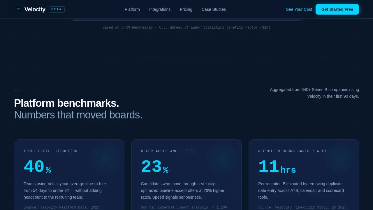
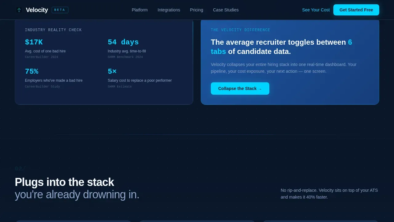
The first scroll row contains three oversized metric cards showing platform-level benchmarks: time to hire reduction, offer acceptance lift, and recruiter time saved. Each card animates in with its figure counting upward, creating a cascade of mathematical evidence that builds as the visitor descends. These are not decorative numbers. They reflect the actual costs of hiring inefficiency and give a hiring manager or VP People Ops the language to justify recruitment technology spend to a board.
Applicant Tracking System Integration Cards
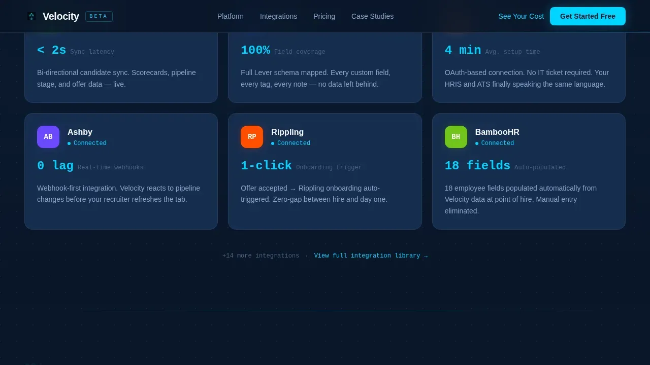
The second card row displays integration cards for the applicant tracking system tools visitors already use. Each card leads with a one-line stat on sync speed. This section speaks directly to the recruiter toggling between tabs: it demonstrates that the platform connects to existing recruitment efforts without adding friction. Showing compatibility with tools already in use is a critical role this section plays in building trust before the download ask.
Customer Proof Cards with Number Headlines
The third row uses testimonial cards where the metric is the headline and the quote is the caption. This layout makes candidate quality outcomes and cost-per-hire improvements impossible to skip. Named testimonials with company context reinforce employer brand credibility. Using social proof this way is all the difference between a page that feels like a product brochure and one that feels like peer validation.
App Download Module with Magic Link Form
The final card module combines a three-field form (work email, company size dropdown, and primary applicant tracking system), app store badges, and a sticky mobile bar. Submitting the form triggers a magic link that skips onboarding screens. This module converts lead generation intent into an immediate, low-friction action. The secondary call to action, "See Your ROI First," scrolls back to the calculator for visitors who missed it, reducing drop offs and keeping potential customers in the flow.
Sticky Mobile Call to Action Bar
On mobile devices, the primary "Download and Start Hiring Faster" button is pinned as a bottom bar throughout the scroll. This ensures user actions remain accessible without interrupting the reading experience. The sticky bar removes the need for visitors to scroll back to convert, which is especially important for a mobile friendly layout targeting users on the go.
Page sections overview
| Section | Purpose |
|---|---|
| Hero Calculator | Interactive cost-of-vacancy tool; outputs weekly cost figure in electric cyan before first scroll |
| Benchmark Stat Cards | Three count-up metric cards showing time-to-hire, offer acceptance, and recruiter time saved |
| ATS Integration Cards | Displays applicant tracking system compatibility with sync speed stats per integration |
| Customer Proof Cards | Testimonial cards with metric as headline and quote as caption for social proof |
| App Download Module | Three-field form, app store badges, magic link trigger, and sticky mobile call to action |
| Footer | Single-row linear footer with essential navigation and brand links |
Design & branding system
The visual identity follows a Startup Velocity theme rooted in a Midnight Blue color system. The aesthetic is a mission-control terminal dashboard: dark enough to focus, bright enough to signal what matters. Every accent color earns its pixel by directing the eye toward data that costs money to ignore. The visual appeal is deliberate, precise, and built for an audience that reads dashboards for a living.
- Primary background is deep terminal navy (#0A1628), card surfaces use strategic cobalt (#1E56A0), electric cyan (#00D4FF) marks live data points and interactive accents, and clean system white (#F6F8FC) handles typography and negative space
- DM Sans is used for headings and body copy; JetBrains Mono handles all data and number displays to reinforce the terminal dashboard aesthetic
- Animation includes count-up numbers, beam borders, card cascade reveals on scroll, and a single pulse on the calculator output to draw the eye without distracting from the message
Mobile & speed optimization
The template is designed desktop-first for HR directors and VP People Ops who review dashboards on large screens. At the same time, the mobile experience is fully considered, with a sticky bottom call to action bar and smooth transitions between sections that keep the conversion path intact on any device. A mobile friendly layout means recruiters reviewing the page between candidate calls can still act without friction.
- The sticky mobile call to action bar pins "Download and Start Hiring Faster" to the bottom of the screen throughout the scroll, removing barriers to conversion on smaller screens
- Scroll-linked card reveals and smooth transitions are structured to maintain visual clarity as the visitor moves down the page, whether on desktop or mobile
- Server components handle static content sections while client components manage the live calculator and animation logic, keeping the interactive features performant without overloading the render path
How this template helps you convert
The Velocity landing page earns the download before it asks for it. The conversion architecture is sequential: the calculator builds personal urgency, the stat cards build mathematical confidence, and the proof cards build social trust. By the time the visitor reaches the app download module, the cost of inaction already feels specific and personal.
- The interactive hero calculator makes the total cost of slow hiring personal in under 30 seconds, giving the visitor a number they did not have before they arrived and framing the platform as a solution to a cost they can now calculate
- The cascading benchmark and proof card rows deliver industry benchmarks and real-world financial impact in a format that mirrors how HR directors already read data, making informed decisions feel natural rather than forced
- The magic link form reduces onboarding friction to three fields, and the secondary "See Your ROI First" button keeps visitors who skipped the calculator in the flow rather than letting them leave
Other information about this template
This template is designed for a very specific intersection: a HRTech SaaS company at the growth stage that needs a new landing page capable of communicating cost-per-hire impact at the speed of a board meeting. It is not a nice to have for teams that have already outgrown generic SaaS page builders. It is built for the moment when abstract hiring strategy has to become a dollar figure before the next quarterly review.
- The cost of a landing page built from scratch, including custom graphic elements and interactive features, typically ranges from $1,000 to $5,000 for a basic build. This template provides the same structural depth at a fraction of that website cost, making cost effectiveness a practical reason to start here rather than with custom code
- The formula at the heart of the hire calculator follows the standard cost-per-hire equation: Cost Per Hire (CPH) equals Total Cost of Hire divided by Number of Hires. The template surfaces this logic visually, so every hiring manager and board member can follow the simple math without a spreadsheet
- Many factors contribute to cost per hire beyond the obvious: job boards fees, job postings spend, recruiter time, onboarding overhead for each new employee, and the opportunity cost of a critical role sitting empty. This template is designed to surface all of those layers, including indirect costs that live outside the standard recruitment process accounting
- The US median time to hire is 35 days, which is 8% faster than the global average. Yet many average time to hire calculators simply measure the days between a job posting going live and an offer being extended, ignoring actual screening and admin time. This template's calculator accounts for those hidden layers to produce a more honest cost figure
- Workforce planning decisions depend on accurate cost data. This template supports scenario planning conversations by giving talent teams and leadership a shared visual reference for what different time to hire outcomes mean in dollar terms
- Building a passive talent pipeline before you need it can reduce sourcing time and cost per hire. This template can support that message by positioning the platform as a tool for proactive, not reactive, talent acquisition strategy
- Google Sheets and similar tools are often the default for tracking recruitment efforts, but they do not surface the financial impact of hiring delays in real time. This template positions the platform as the recruitment technology upgrade that replaces those manual approaches
- For teams looking to justify more resources, the page's proof cards and benchmark stats give an internal team the data they need to present to leadership. More resources follow evidence. This template makes the evidence visible
- Search engines index landing pages based on content relevance and structure. A well-built landing page with clear hierarchy, descriptive headings, and optimized copy improves increasing visibility in search results and drives more qualified potential customers to the download funnel
- User engagement on this template is driven by interactive elements that respond to visitor input: the live calculator, count-up animations, and scroll-linked card reveals all respond to user behavior and user actions in ways that keep the visitor moving forward rather than bouncing
- Employer brand signals appear throughout: named testimonials with company context, benchmark stats from real recruitment processes, and a design language that communicates precision and credibility to job seekers and hiring decision-makers alike
Theme
Startup Velocity
Creative direction
Stats-First Impact
Color system
Midnight Blue
Style
Card Grid (Modular)
Direction
App Download
Page Sections
Live Cost-of-vacancy Hero Calculator
Count-up Benchmark Stat Card Grid
Applicant Tracking System Integration Cards
Customer Proof Cards with Metric Headlines
App Download Module with Magic Link Form
Sticky Mobile Call to Action Bar
Related questions
What is the Velocity template and who is it for?
How does the interactive calculator work in this template?
Does this template include social proof and benchmark data sections?
Can I use this template without starting from scratch on design?
What does the app download module include?



