HealthTech Startup Pre-Launch Website Template
Pulse is a dynamic, glassmorphic healthtech landing page built to capture waitlist signups for a patient-data aggregation platform. It features a full-width product screenshot hero, a modular spec-card grid with viewport-triggered micro-animations, and two conversion paths: a sticky pulsing call-to-action button and a social-proof waitlist counter at the foot of the page.
by Rocket studio
Quick summary
Pulse is a single-page, click-through landing page template built for a healthtech waitlist platform. The design leads with a pixel-perfect product screenshot at hero scale, then walks visitors through capability spec cards with purposeful motion. The goal is simple: move curious visitors to the waitlist signup page before they bounce.
Who this template is for
This template is built for early-stage healthtech founders and product teams who need a high-conviction waitlist page fast. It speaks directly to three distinct audiences the product serves.
- Chronic-condition patients who manage multiple specialist portals and fragmented health records
- Primary care physicians who need consolidated patient data before appointments
- Employer wellness directors who need to demonstrate measurable return on benefits investment
What problem this template solves
Health data is scattered across portals, PDFs, and wearable apps. Patients, clinicians, and employers all feel that fragmentation differently. A generic landing page template cannot communicate the urgency of that problem or the clarity of the solution.
- Visitors arrive skeptical; they need to see the product working, not read about it
- The waitlist model requires social proof and a frictionless path to signup
- Multiple buyer personas need different signals, delivered in a single scroll
What you get with this template
You get a fully structured, single-page layout ready to present your healthtech platform with confidence. Every section is purposeful and every component earns its place.
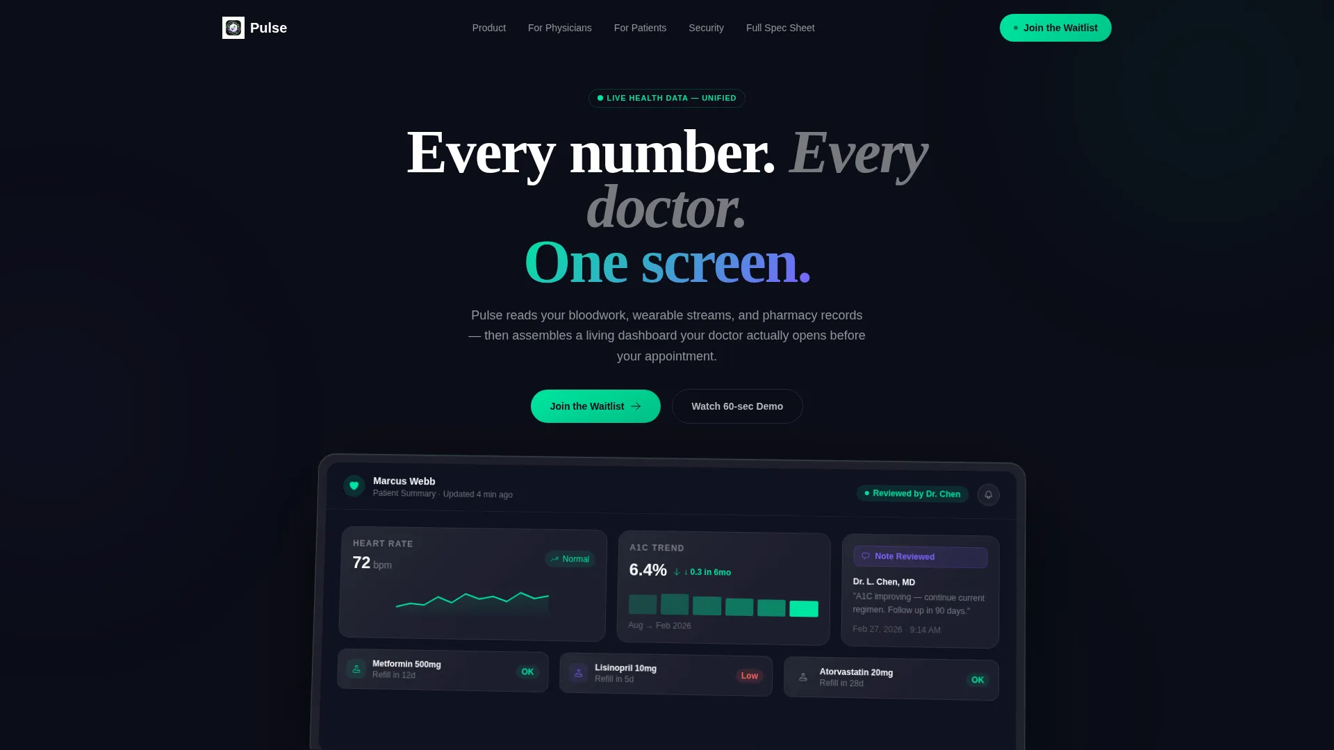
- A hero section built around a full-width product screenshot on a frosted, tilted card with a soft green ambient glow
- A modular spec-card grid where each card isolates one platform capability with a viewport-triggered micro-animation
- Two conversion touchpoints: a sticky pulsing nav pill and a full-width bottom card showing a live waitlist count
Feature list
This section breaks down the distinct capabilities built into the Pulse template.
Hero-Scale Product Screenshot
The header renders the Pulse dashboard at full width, showing a realistic patient summary. Visible elements include a heart-rate sparkline, a declining A1C trend arrow, medication refill countdown cards, and a doctor-note badge. The screenshot sits on a frosted card tilted two degrees on the Z-axis with a green ambient glow underneath, making the screen appear to emit light.
Modular Spec-Card Grid
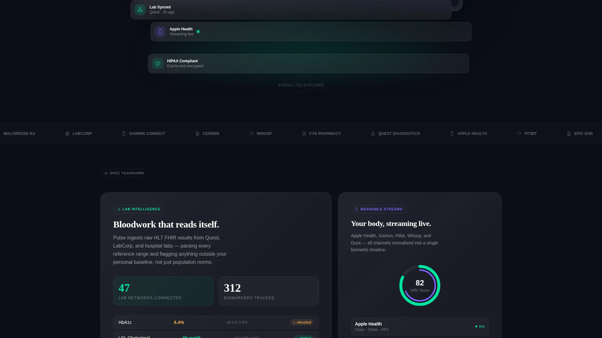
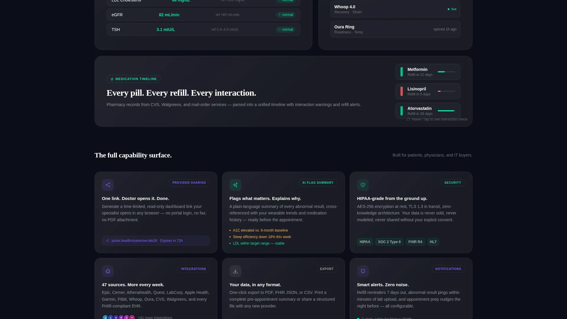
Below the fold, each card isolates a single platform capability: lab sync, wearable data ingestion, medication timeline, provider sharing, and AI-generated flag summaries. Cards are sized intentionally. Early cards are large and explanatory; later cards compress into a dense grid to communicate product breadth quickly.
Viewport-Triggered Micro-Animations
Every spec card activates on scroll entry. Numbers count up, progress rings complete, and cards flip to reveal a detail layer. Motion is always purposeful: each animation demonstrates the feature it describes rather than decorating the layout.
Sticky Pulsing Call-to-Action
The primary "Join the Waitlist" button lives in the top navigation as a pill button. After three seconds of scroll, it begins a subtle pulse using the electric health-green accent. This keeps the conversion path visible without interrupting the reading flow.
Social-Proof Waitlist Counter
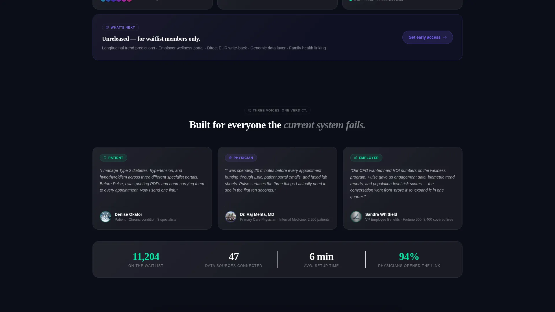
The page closes with a full-width card showing the current waitlist count, for example "11,204 people ahead of you." This pairs social proof with a light scarcity signal. The click carries the visitor forward to a dedicated signup flow; no form fields appear on this page.
Slide-Over Spec Drawer
A secondary call-to-action, "See the Full Spec Sheet," opens a slide-over drawer with deeper technical detail. This serves the physician or IT-buyer persona who needs more evidence before committing to a click.
Page sections overview
| Section | Purpose |
|---|---|
| Sticky Navigation Bar | Anchors the pulsing waitlist call to action at all scroll depths |
| Hero Screenshot Card | Leads with the product dashboard as the primary visual argument |
| Primary Headline Block | Delivers the core message: "Every number. Every doctor. One screen." |
| Lab Sync Card | Demonstrates bloodwork aggregation as a standalone capability |
| Wearable Ingestion Card | Shows real-time wearable stream integration visually |
| Medication Timeline Card | Highlights refill tracking and pharmacy record reading |
| Provider Sharing Card | Communicates the doctor-facing sharing workflow |
| AI Flag Summary Card | Presents intelligent alert summaries for clinical review |
| Dense Capability Grid | Compresses remaining features into a fast-scan breadth view |
| Roadmap Teaser Card | Hints at unreleased features to reward full-page scrollers |
| Waitlist Counter call to action | Closes the page with social proof and the primary conversion action |
| Spec Sheet Drawer | Provides deeper detail for high-intent physician and IT buyers |
Design & branding system
The visual identity uses a Dynamic Motion theme over a Glassmorphic color system. The palette feels like holding smoked glass up to a city at night: the background breathes with defocused light while the information layer floats above it, crisp and luminous.
- Core colors: deep void black (#0B0D17) for backgrounds, frosted translucent panel white (rgba 255, 255, 255, 0.08) for cards, electric health-green (#00E5A0) for live-data accents, and signal violet (#7B61FF) for hover states and notification pings
- Typography: pure white at headline weight, 60% white for body text; green appears only where data is alive, on ticking numbers, pulsing status dots, and filling progress rings
- Card surfaces use frosted glass with a 1-pixel border opacity and backdrop blur; backgrounds carry subtle gradient noise to add depth without illustration
Mobile & speed optimization
The card grid layout is modular by design, which makes it naturally adaptable across screen sizes. Spec cards reflow cleanly as the viewport narrows, preserving the visual hierarchy and conversion path on smaller devices.
- Micro-animations trigger on viewport entry, so they activate correctly whether a visitor is scrolling on desktop or swiping on mobile
- The click-through model keeps this page lightweight: no embedded forms, no complex input handling, and no data processing on the page itself
How this template helps you convert
The Pulse template is engineered as a click-through page. Every design decision points toward a single outcome: moving the visitor to the waitlist signup flow.
- The product screenshot hero does the selling before a single word of copy is read, letting curious visitors understand the platform immediately and viscerally
- The spec-card grid builds cumulative conviction as the visitor scrolls, so that by the time they reach the bottom call to action they have already "used" the product with their eyes
- The waitlist counter injects social proof and a sense of scarcity at the exact moment the visitor is deciding whether to act, without adding friction or form fields to this page
Other information about this template
This template is categorized under Startup and Launch, with a specific focus on the HealthTech Startup subcategory and the HealthTech Waitlist Landing Page niche. It is well-suited for early-stage teams preparing a pre-launch campaign or a product announcement.
- The template style is Card Grid (Modular), making individual sections easy to reorder, remove, or extend as the product roadmap evolves
- The Intersection Match Score for this template's configuration is 13, reflecting a tight alignment between theme, creative direction, color system, template style, landing-page direction, and header concept
- The roadmap teaser card at the bottom of the grid is designed to reward visitors who scroll the full depth, hinting at unreleased features to maintain anticipation beyond the waitlist signup
Theme
Dynamic Motion
Creative direction
Spec Sheet
Color system
Glassmorphic
Style
Card Grid (Modular)
Direction
Click-Through
Page Sections
Hero-scale Product Screenshot Header
Modular Spec-card Grid Layout
Viewport-triggered Micro-animations
Sticky Pulsing Waitlist Button
Social-proof Waitlist Counter
Slide-over Spec Sheet Drawer
Related questions
Does this template include the waitlist signup form itself?
Can I update the waitlist count shown on the bottom call to action card?
Who is the 'See the Full Spec Sheet' secondary path designed for?
Can I reorder or remove individual spec cards?
Is this template only suitable for health data platforms?