Sports Blog Reviews & Social Proof Website Template
Volley is a single-column editorial landing page built for serious tennis writers and newsletter creators. It combines a commanding typographic hero, a creator spotlight section, featured article previews, social proof, and two email capture forms into one flowing layout. The design feels like a premium print magazine brought to the browser, built to turn passionate tennis readers into loyal subscribers.
by Rocket studio
Quick summary
Volley is a tennis blog landing page template built for long-form editorial content and newsletter lead generation. It leads with a giant centered serif headline, introduces the creator with a candid photo and first-person bio, and moves visitors through featured articles, social proof, and a sample newsletter preview before offering a free downloadable resource gated behind an email capture.
Who this template is for
This template is designed for independent tennis writers, newsletter operators, and coaching content creators who want to build a real subscriber base around serious, analytical tennis content.
- Club-level players and Grand Slam followers who want a home for deep-dive match analysis
- Tennis coaches publishing technique breakdowns and lesson-planning resources
- Fantasy tennis enthusiasts and ATP Race trackers building a personal editorial brand
What problem this template solves
Most blog landing pages treat every visitor the same. Volley is built around a specific reader: someone who already knows the scores and wants the story behind them. Generic templates cannot carry the editorial weight that niche sports writing demands.
- No clear way to introduce the creator voice before asking for an email address
- No structure that balances editorial credibility with a direct subscription call to action
- No built-in flow from article previews to a gated lead magnet in a single-page layout
What you get with this template
You get a complete single-column landing page that handles the full reader journey, from first impression to email capture, without requiring multiple pages or complex navigation.
- A typographic hero section, creator bio, three-article grid, social proof strip, sample newsletter preview, and a gated PDF section
- Two email capture form placements: one beneath the creator bio and one as a sticky bottom bar that appears after 60 percent scroll depth
- A layout paced like a magazine feature, alternating between generous whitespace and dense editorial content blocks
Feature list
A brief paragraph overview: every feature in this template is grounded in the source brief and serves either the editorial reading experience or the subscriber conversion goal. Nothing is decorative for its own sake.
Giant Centered Typographic Hero
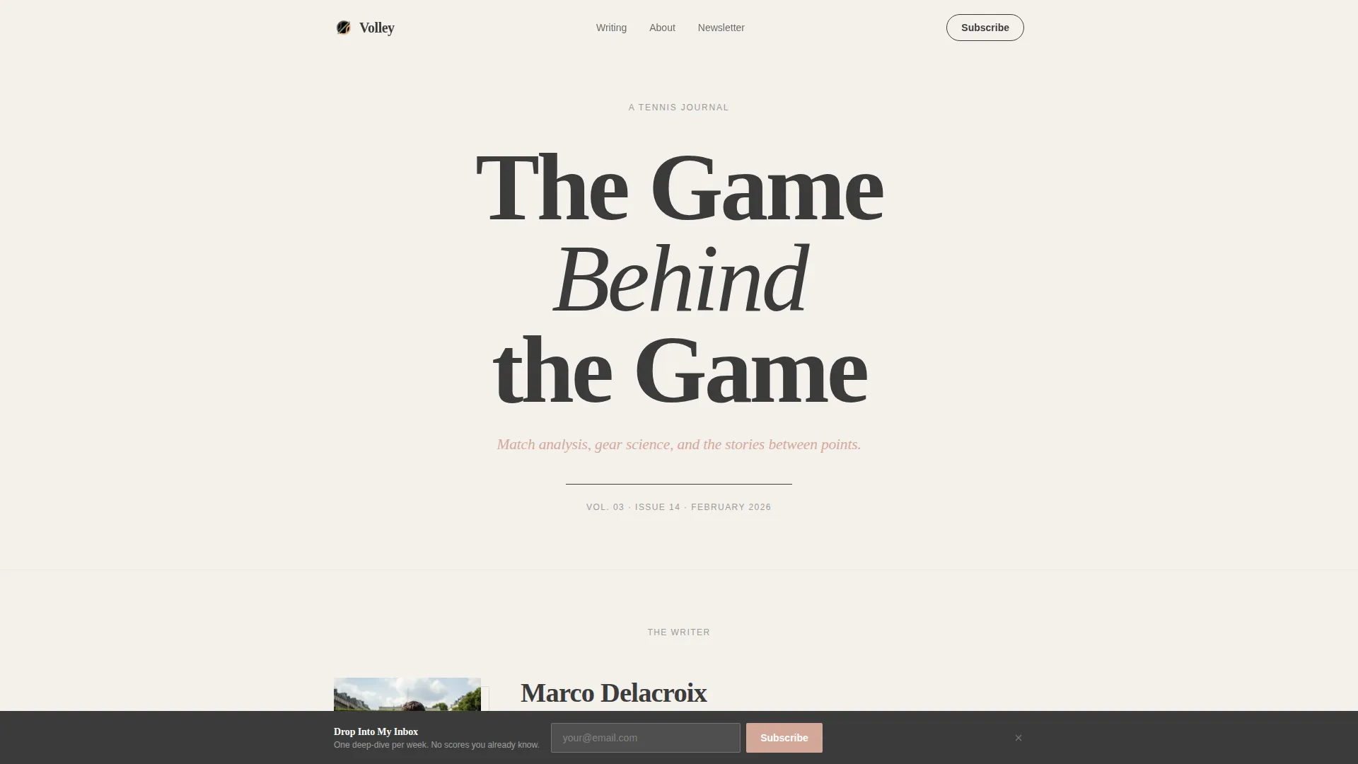
The header fills the viewport with a large serif headline set in pencil graphite on a warm fog white background. A single italic subhead sits beneath it in clay court blush. A thin graphite rule and a masthead-style issue date complete the section, with no imagery needed.
Creator Spotlight Section
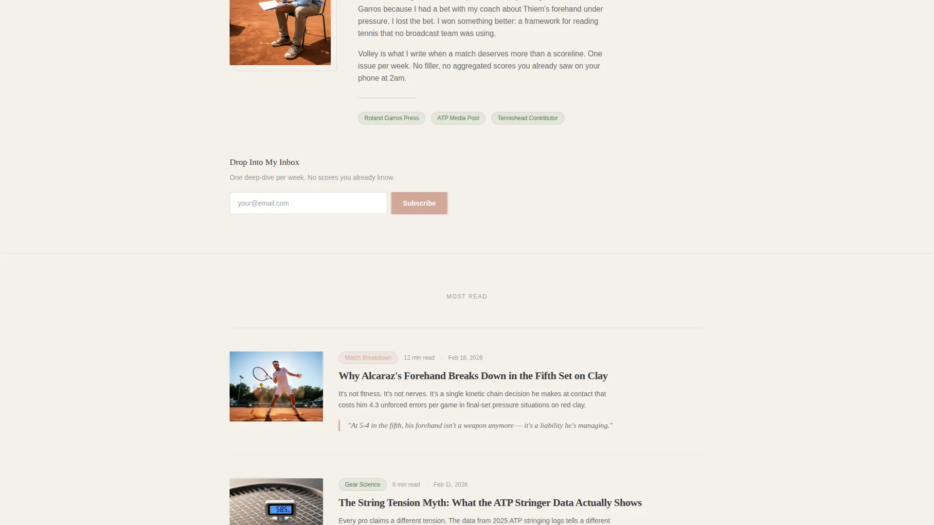
A candid photo, a two-sentence first-person bio, and the primary email call to action appear together early in the scroll. This section establishes the writer as the product before any article content is shown, building personal trust at the right moment.
Three-Article Editorial Grid
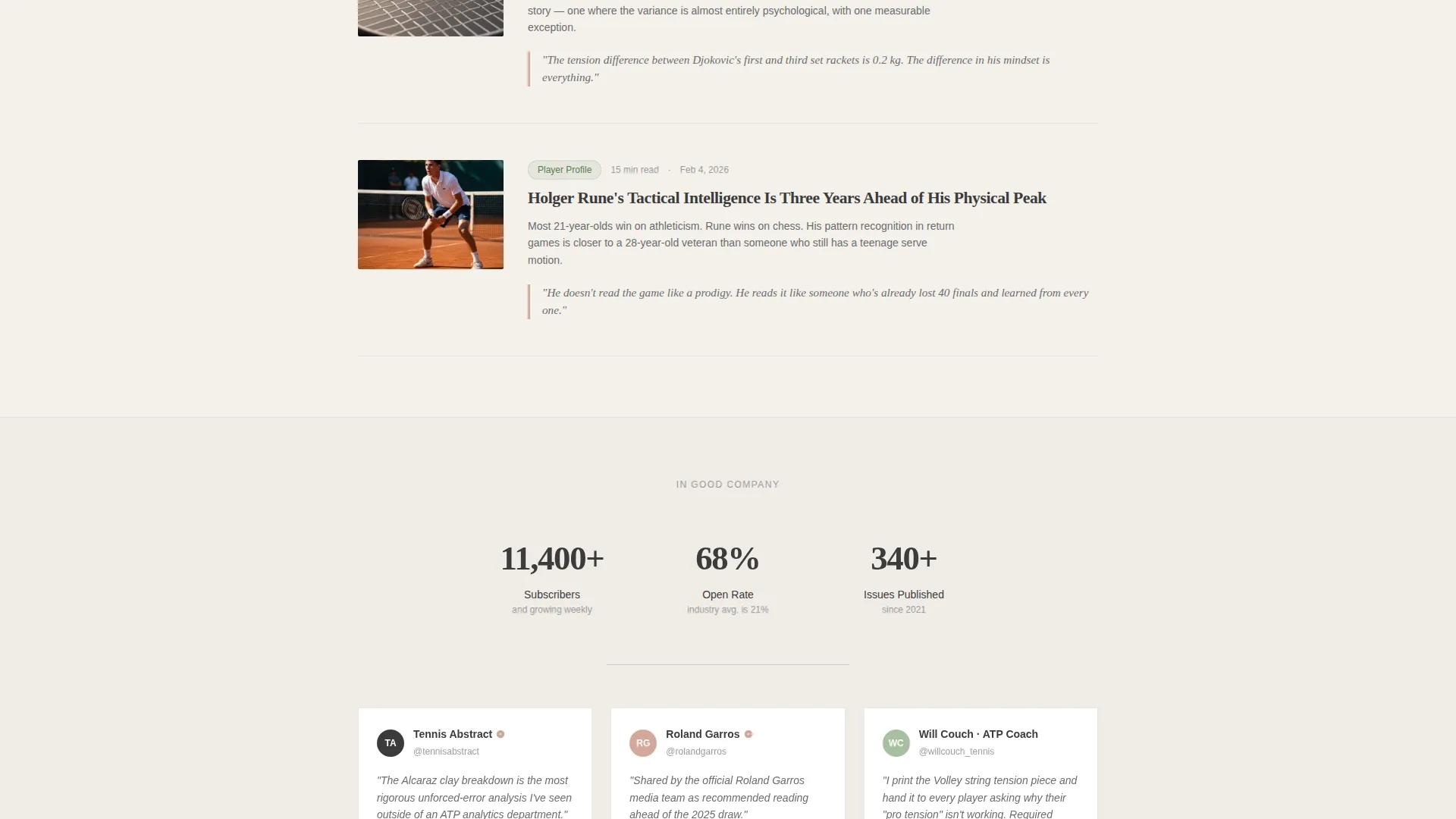
Three featured pieces display as a staggered card grid with oversized italic pull quote fragments and read-time badges. The cards reveal on scroll using IntersectionObserver-based animation, giving the section a paced, editorial rhythm.
Social Proof Strip
A dedicated strip surfaces a subscriber count milestone and verified reshares from notable tennis accounts. It provides credible third-party context right after the article content, when reader trust is building.
Sample Newsletter with PDF Lead Magnet
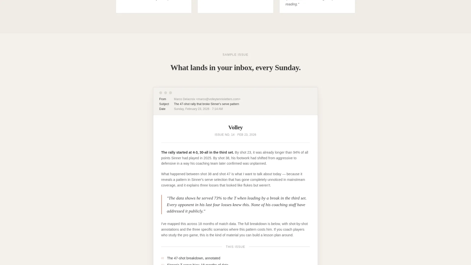
A styled email preview lets visitors read an actual newsletter sample before committing. Directly below it, a second email capture gates the free downloadable PDF titled "The 30 Patterns That Decide Every Match," turning curiosity into a conversion moment.
Sticky Subscription Bar
After a visitor scrolls past 60 percent of the page, a sticky bottom bar with an email field and submit button appears. This keeps the primary call to action visible without interrupting the reading flow.
Page sections overview
| Section | Purpose |
|---|---|
| Typographic Hero | Commands attention with a full-viewport serif headline and masthead date |
| Creator Bio Spotlight | Introduces the writer with a photo, first-person bio, and first email form |
| Featured Articles Grid | Displays three articles with pull quotes and read-time badges |
| Social Proof Strip | Shows subscriber count and verified tennis account reshares |
| Sample Newsletter Preview | Lets visitors read a real newsletter sample before subscribing |
| PDF Lead Magnet Gate | Offers a free downloadable guide gated behind the email capture form |
| Sticky Bottom Bar | Reappears as a persistent call to action after 60 percent scroll |
| Single-Row Footer | Closes the page with a clean linear footer layout |
Design & branding system
The visual identity follows an editorial magazine theme. Every color and type choice reinforces the feeling of a freshly printed publication: unhurried, precise, and confident in its content.
- Color palette: warm fog white (#F4F1EC) as the dominant background, pencil graphite (#3B3B3B) for body text, clay court blush (#D4A89A) for accents and hover states, and washed-out grass green (#A8BFA0) for secondary category tags
- Typography: Fraunces as the display serif for headlines and pull quotes, DM Sans as the body typeface for readable long-form text
- Visual rhythm: generous whitespace sections alternate with dense editorial blocks to mimic the pacing of a printed magazine feature
Mobile & speed optimization
The template is desktop-first by design, reflecting the magazine reading metaphor that works best on larger screens. On smaller devices, each section stacks cleanly into a single readable column.
- Editorial content blocks and the three-article grid stack vertically on mobile without losing visual hierarchy
- Scroll-triggered animations use IntersectionObserver with minimal JavaScript, keeping motion behavior lightweight
- Server Components handle all static sections, so only the interactive elements like the sticky bar and email forms load client-side behavior
How this template helps you convert
The conversion architecture is layered deliberately. Visitors are not asked to subscribe immediately. Trust is built section by section before any form is presented a second time.
- The creator bio section places the first email capture form early, directly after establishing the writer's voice and credibility with a photo and first-person introduction.
- The sample newsletter preview and gated PDF create a second, high-intent conversion moment: visitors have already read real content and are offered something specific and useful in exchange for their email address.
- The sticky bottom bar ensures the call to action remains accessible throughout the entire scroll without interrupting the editorial reading experience.
Other information about this template
This template was designed specifically for the intersection of editorial blogging and niche sports content. It suits creators who prefer a voice-first, creator-led media approach over a traditional blog archive layout.
- The primary call to action label reads "Drop Into My Inbox" with a clay court blush submit button and a one-line promise beneath the field: "One deep-dive per week. No scores you already know."
- The free lead magnet is pre-titled "The 30 Patterns That Decide Every Match," making it easy to launch immediately with a relevant, audience-specific offer
- The footer uses a linear single-row pattern, keeping the page close cleanly without cluttering the editorial experience
- The template style is a single-column flow, meaning all content moves in one vertical reading path without sidebars or multi-column page navigation
Theme
Editorial Magazine
Creative direction
Creator Spotlight
Color system
Soft Mist
Style
Single Column Flow
Direction
Lead Generation
Page Sections
Giant Centered Typographic Hero
Creator Spotlight with Bio and Form
Three-article Editorial Grid
Social Proof Strip
Sample Newsletter and Gated PDF Section
Sticky Scroll-triggered Bottom Bar
Related questions
How many email capture forms does this template include?
Can I use this template without a lead magnet ready?
Is this template suited for a coach or a writer?
Does the sticky bar appear immediately when the page loads?
What kind of content fits the featured articles grid?



