Luxe Editorial Energy Drink Review Landing Page
Volt is a luxe minimal editorial landing page built for an energy drink review blog. It combines a full-bleed studio hero, themed curated shelves, and single-can hero breakouts to pull readers deeper into long-form reviews. The warm stone color system and serif typography give every sip score the weight of a gallery print.
by Rocket studio
Quick summary
Volt is a magazine-style editorial landing page designed for an energy drink review blog. It surfaces curated can reviews through themed shelves, hover tasting-note reveals, and a persistent email signup bar. The warm stone palette and Fraunces serif headlines give the page a gallery-quality feel that earns the reader's trust before they ever click through.
Who this template is for
This template is built for editorial creators who take energy drink criticism seriously and want a publication-grade presence online. It suits bloggers and independent media makers who need their content to look as considered as the reviews themselves.
- Energy drink review bloggers who publish long-form tasting notes and scored write-ups
- Independent food and beverage media creators who want an editorial identity, not a generic blog layout
- Content-led publishers targeting night-shift workers, competitive gamers, and curious newcomers looking for honest, aesthetic-forward reviews
What problem this template solves
Most blog templates flatten every post into a list of identical tiles. For a review publication with real editorial depth, that approach kills credibility. Volt solves the problem of looking and feeling like a real magazine rather than a content dump.
- Readers scanning a shelf of sixty glowing cans need visual hierarchy and themed groupings to find what is relevant to them
- A standard blog grid hides editorial voice; Volt surfaces tasting-note snippets, gold pip ratings, and one-line verdicts at a glance
- Without a persistent call to action, casual visitors leave without subscribing; the fixed bottom bar keeps the weekly newsletter offer visible at all times
What you get with this template
Volt delivers a fully composed single-page layout with five distinct content zones and a footer. Every section is built to serve a specific editorial function, from atmospheric first impression to repeat-visit newsletter hook.
- A full-bleed studio hero with a serif headline fade-in animation that sets the publication's tone immediately
- Themed curated shelf grids with hover-reveal tasting-note cards, five-point brushed gold pip ratings, and per-card "Read the Full Review" calls to action
- A persistent bottom bar email signup capturing the "Get the Weekly Drop" newsletter offer without interrupting the reading flow
Feature list
This template is built around a small set of deliberate, high-impact features. Each one serves the editorial mission of giving readers just enough to want more.
Full-Bleed Studio Hero with Fade-In Headline
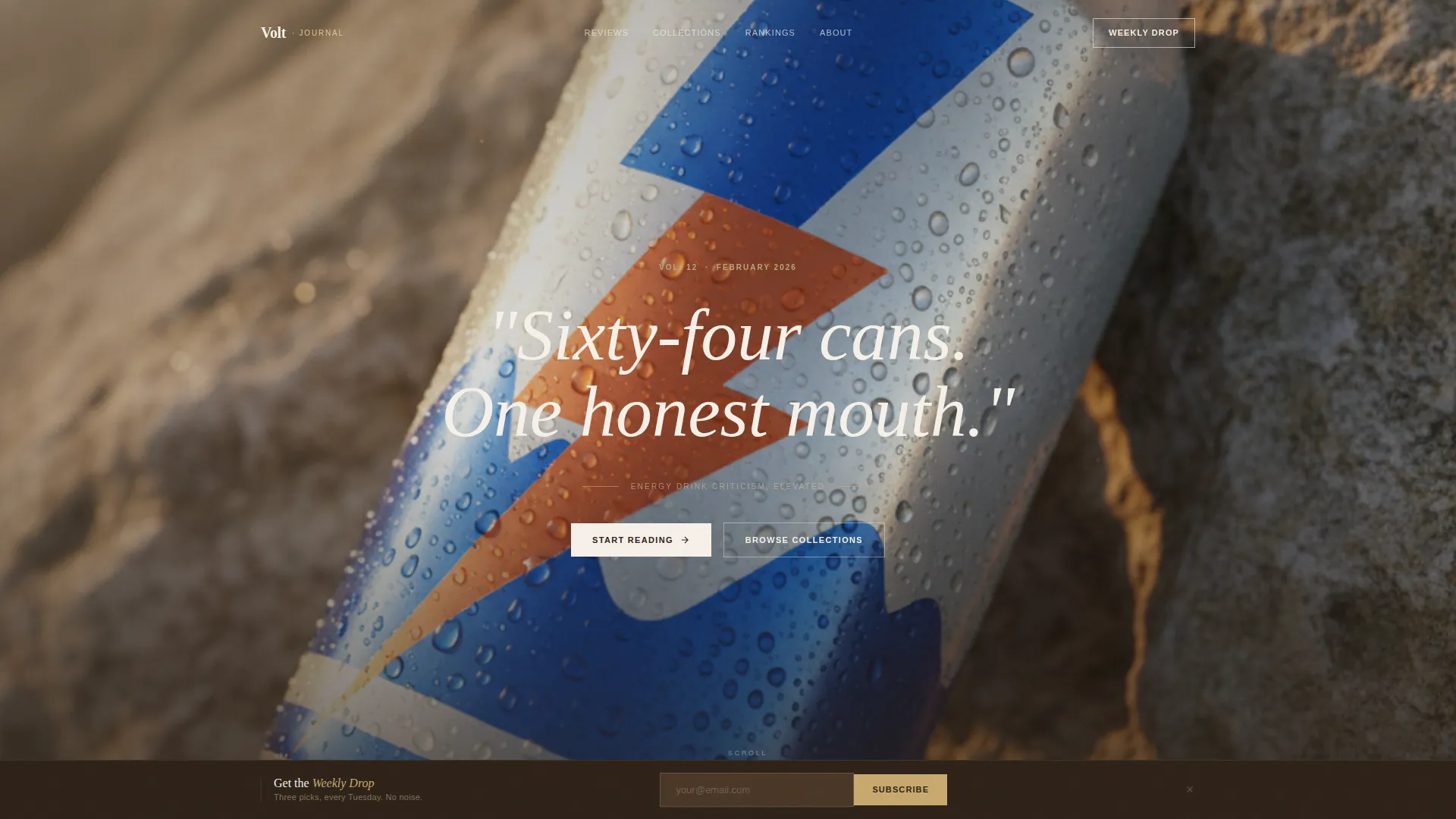
The hero opens with a top-down studio photograph of a single can on raw limestone. A serif headline fades in after a brief beat, creating atmospheric depth without relying on motion-heavy animations or cluttered overlays.
Themed Curated Shelf Grids
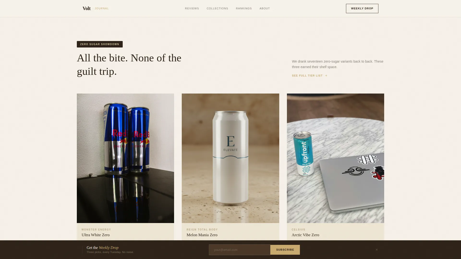
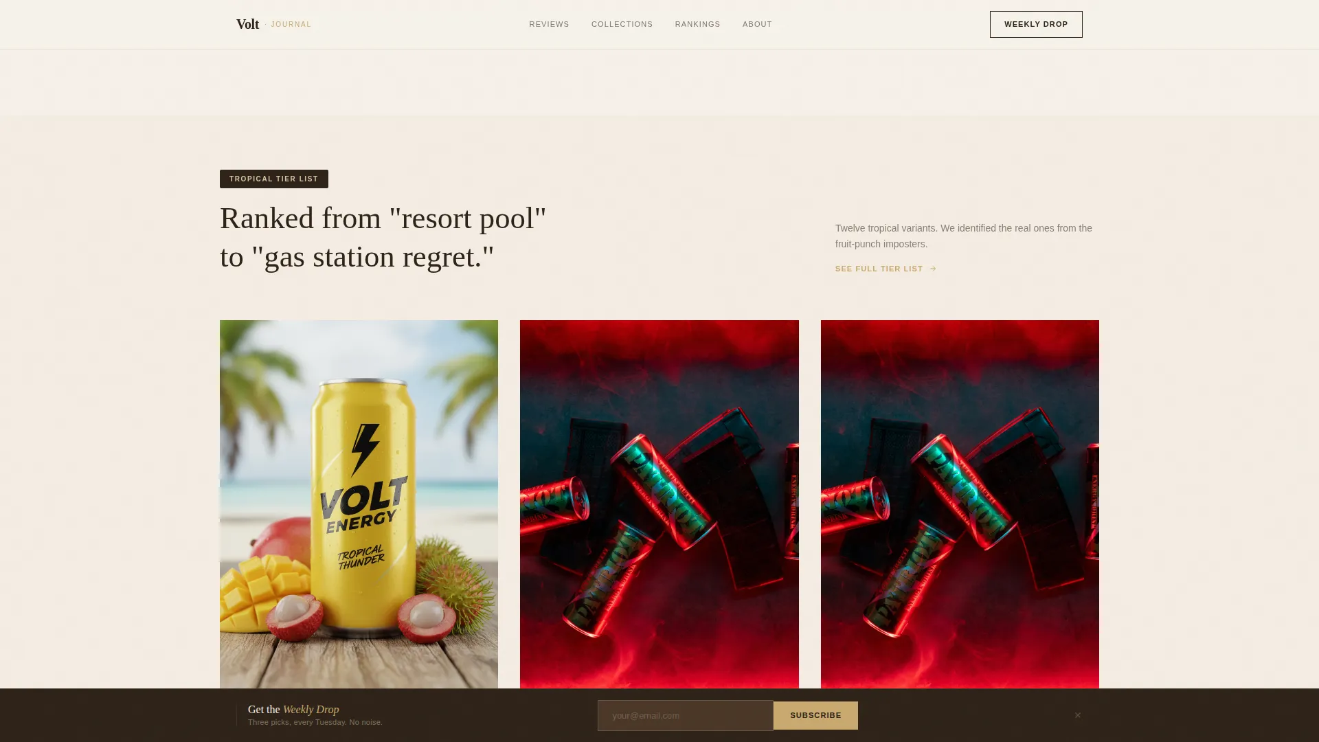
Three to four review cards per shelf are grouped by editorial theme, such as a zero sugar comparison or a budget tier list. The alternating rhythm between tight grids and single-can hero breakouts mirrors the pacing of a well-edited print magazine.
Hover Tasting-Note Card Reveals
Each review card reveals a tasting-note snippet and a five-point gold pip rating on hover. This interaction gives readers a preview of the full review without leaving the page, creating a natural pull toward the click-through.
Single-Can Hero Breakouts
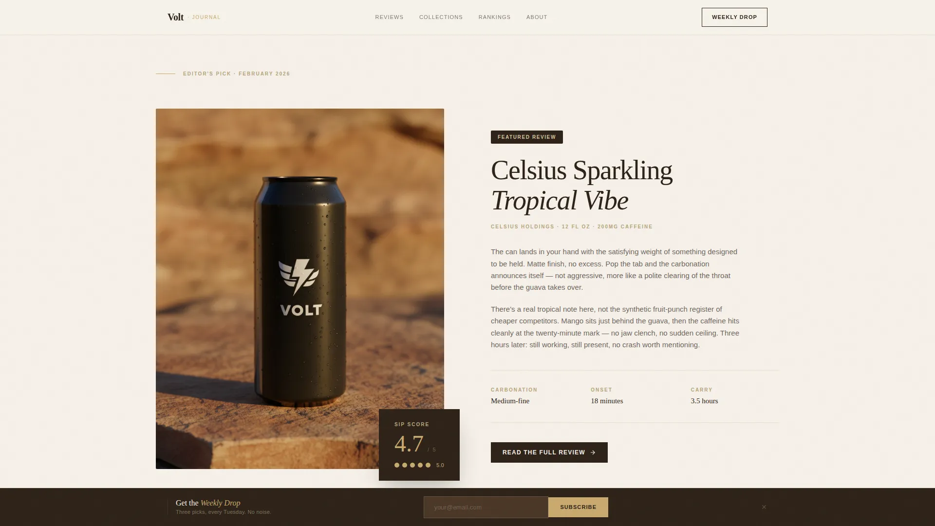
Full-width featured review sections give one can the spotlight with a beauty shot, a complete paragraph review, and a prominent rating. These breakouts slow the scroll and signal editorial authority.
Persistent Bottom Bar Email Signup
A fixed bar sits at the bottom of the viewport throughout the entire scroll. It holds a single email field and the "Get the Weekly Drop" promise of a Tuesday inbox delivery, converting passive readers into repeat subscribers.
Asymmetric Latest Reviews Grid
The most recent reviews appear in a bento-style asymmetric grid. Card sizes vary to create visual rhythm, and hover states surface tasting notes consistently across the layout.
Page sections overview
| Section | Purpose |
|---|---|
| Full-Bleed Hero | Sets atmospheric editorial tone with studio photography and a fade-in serif headline |
| Featured Review Breakout | Spotlights one can with a full paragraph review and a gold pip rating |
| Curated Shelf Grids | Groups three to four review cards by theme with hover tasting-note reveals |
| Single-Can Hero | Full-width feature review with tasting notes and prominent rating display |
| Latest Reviews Grid | Asymmetric bento grid of recent reviews with consistent hover interactions |
| Footer with Bottom Bar | Linear single-row footer plus persistent email signup bar for the weekly newsletter |
Design & branding system
The design language is best described as a specialty coffee table book about something nobody expected to be beautiful. Every decision prioritizes restraint, texture, and quiet elevation over neon and noise.
- Color palette: honed travertine (#D5C4A1) for backgrounds, shadow espresso (#2E2319) for primary text, soft linen (#F5F0E8) for card surfaces, and brushed gold (#C9A96E) reserved exclusively for ratings, star icons, and hover states
- Typography: Fraunces serif for all headlines and review titles, DM Sans for body copy and interface elements, creating a clear editorial hierarchy
- Visual tone: matte, tactile, and gallery-wall minimal, where generous whitespace frames each sip score like a print on a white wall
Mobile & speed optimization
The template is designed desktop-first, with editorial grid layouts that collapse gracefully on smaller screens. The reading experience remains intentional and unhurried across devices.
- Editorial shelf grids and the asymmetric bento layout reflow cleanly for tablet and mobile viewports without losing their structured hierarchy
- Animations are kept at a medium intensity, using hero fade-ins, card hover reveals, and scroll-triggered section entries that do not interfere with reading on touch devices
- Static editorial content is built with server components and minimal client-side JavaScript, keeping the page light for readers on slower connections
How this template helps you convert
Volt earns the click rather than demanding it. Every design decision is calibrated to create a gap between what the reader sees on the landing page and what waits inside the full review.
- The score, the one-line verdict, and the beauty shot are visible without clicking, giving readers enough context to feel informed and enough curiosity to want the rest
- The "Read the Full Review" call to action appears on every review card and hero breakout in espresso on linen, keeping the path to the full article clear and consistent throughout the scroll
- The persistent bottom bar holds the newsletter offer at the bottom of the screen at all times, converting readers who are not ready to click a review into future subscribers who will return on Tuesday
Other information about this template
Volt is a template for creators who want their energy drink review blog to carry the editorial weight of a real publication. The details below round out the full picture of what this template supports.
- Template style: Editorial and magazine layout, suited for content-led media and digital journal formats
- Animation level: Medium, with hero fade-in on load, card hover reveals, and scroll-triggered section entries
- Footer: Pattern 1 linear single-row layout paired with the persistent bottom bar call to action
- Language and format: English, United States dollar pricing format, US localization
- The page is intentionally single-column in its scroll rhythm, pulling the reader through themed shelves the way a record store organizes crates, one discovery leading naturally to the next
Theme
Luxe Minimal
Creative direction
Curated Collection
Color system
Warm Stone
Style
Editorial/Magazine
Direction
Click-Through
Page Sections
Full-bleed Studio Hero with Fade-in Headline
Themed Curated Shelf Grids
Hover Tasting-note Card Reveals
Single-can Hero Breakouts
Persistent Bottom Bar Email Signup
Asymmetric Latest Reviews Grid
Related questions
Can I change the review themes on the curated shelves?
How does the hover tasting-note reveal work?
Is the persistent bottom bar always visible while scrolling?
Can I link each review card to my own blog posts?



