Elegant Wedding Industry Report Blog Landing Page
Vow is an elegant wedding industry report landing page built for data-driven editorial. It combines a masonry grid layout, a hand-drawn ink-wash header illustration, and a Japanese Zen color palette to create a calm, curator-quality reading experience. A persistent quiz bar and an embedded email capture card turn passive browsers into engaged subscribers.
by Rocket studio
Quick summary
Vow is a single-page editorial landing page designed for a wedding industry report blog. It pairs a masonry content grid with an Atelier Studio visual identity to deliver trend forecasts, vendor benchmarks, and regional market reports in a format that feels as considered as a fashion lookbook. Every layout decision prioritizes calm, intentional reading.
Who this template is for
This template is built for wedding industry professionals who publish or consume serious market intelligence. It suits creators and businesses that need their editorial content to feel authoritative, not decorative.
- Wedding planners who regularly refresh their pricing strategy and want a refined destination for industry data
- Venue owners and bridal brand founders scanning for trend forecasts and competitor benchmarks
- Editorial teams launching a wedding industry report blog that needs to convert readers into subscribers
What problem this template solves
Most wedding blog templates default to soft, romantic aesthetics that undermine the credibility of hard data. Vow solves the gap between editorial weight and visual elegance.
- Report cards, salary benchmarks, and regional market snapshots get lost in generic blog layouts that treat every post as equal
- Readers with professional intent leave quickly when a page feels like a personal lifestyle blog rather than a trusted industry source
- Conversion tools like quizzes and email captures are often bolted on awkwardly, breaking the visual integrity of the page
What you get with this template
Vow delivers a fully structured single-page layout with every section purpose-built for editorial publishing and audience conversion. Nothing is a placeholder.
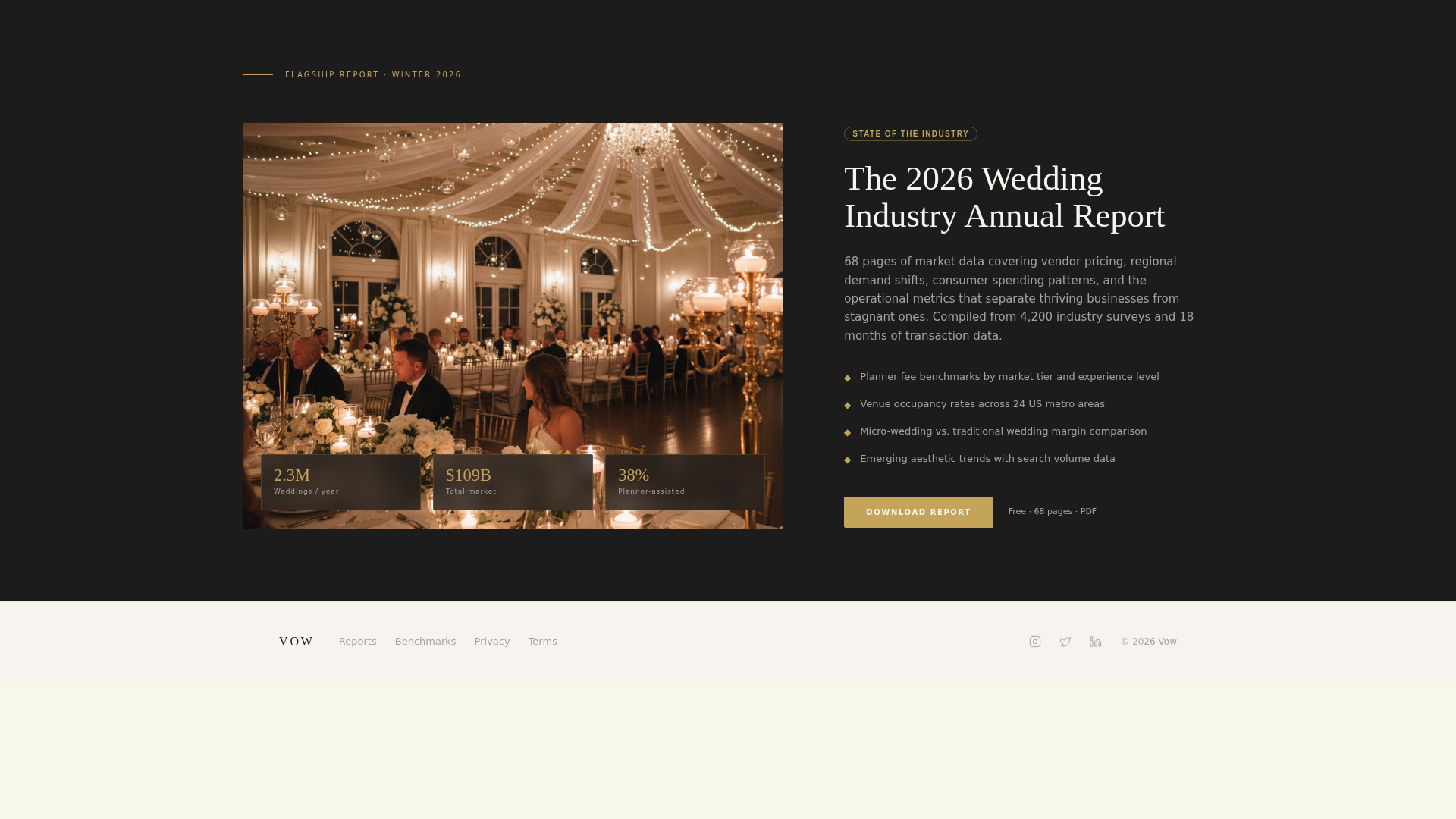
- A masonry grid of report cards with varying heights, each styled to reflect a different content type such as trend forecasts, vendor statistics, and regional map snapshots
- A persistent quiz call-to-action bar labeled "Find Your Market Position" that appears after the third scroll depth and opens a layered five-question modal
- An embedded email capture card integrated directly into the masonry grid, styled identically to content cards but containing a single field and a tatami gold submit button reading "Send Me the Data"
Feature list
This template was designed from the ground up for one specific use case: a wedding industry report blog that earns the trust of professional readers through visual restraint and editorial precision.
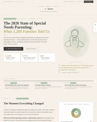
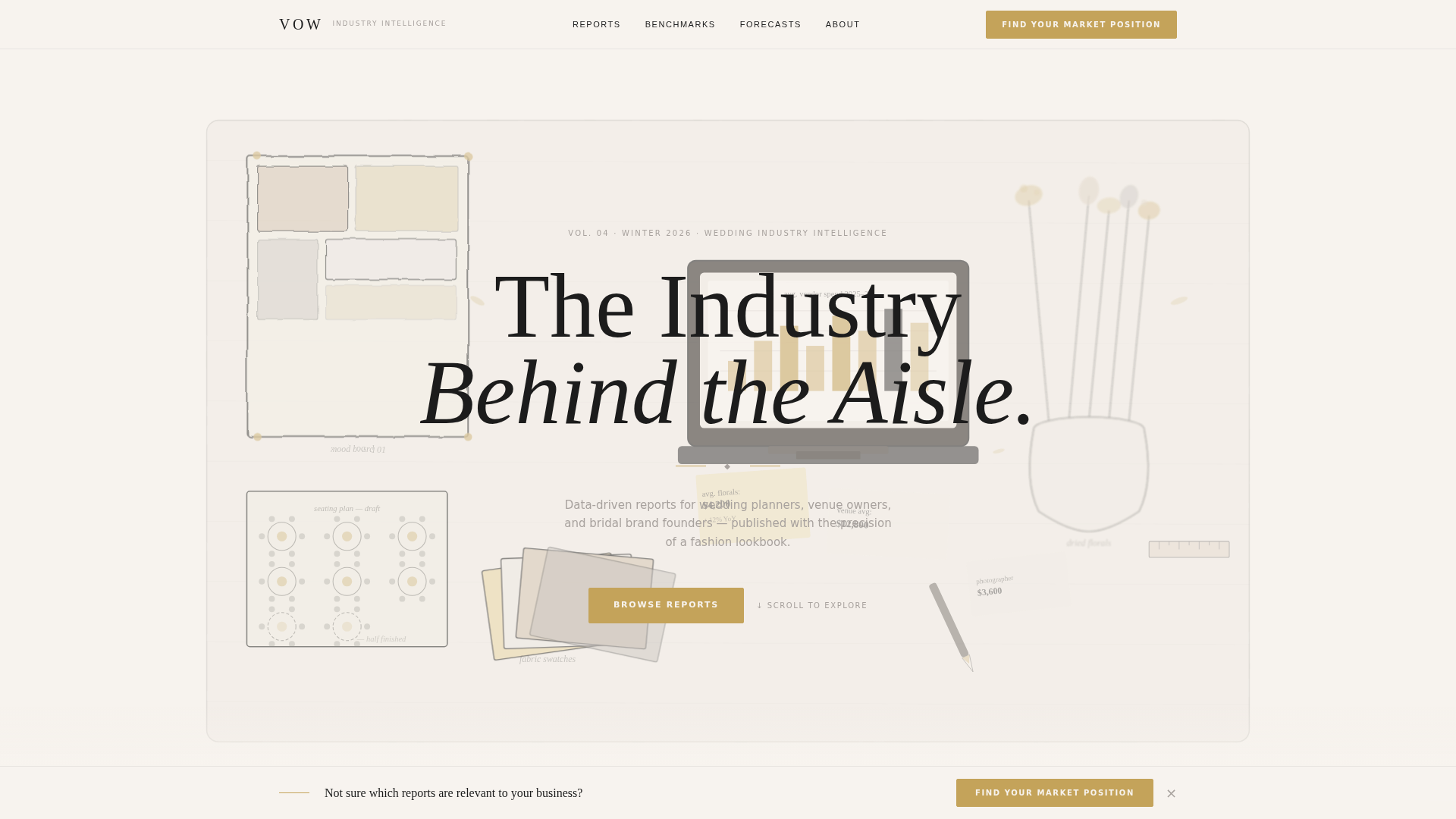
Hand-Drawn Ink-Wash Header Illustration
The header features a custom illustration rendered in sumi ink. It depicts a wedding atelier workspace from above, with scattered mood boards, fabric swatches, an open laptop displaying a chart, dried florals, and a half-finished seating plan. Selective tatami gold leaf accents highlight key objects. The editorial headline "The Industry Behind the Aisle" sits across the composition in serif type.
Masonry Pinterest-Style Content Grid
Below the header, report cards of varying heights are arranged in a masonry grid that functions like a curator's pinboard. Each card represents a distinct content type. Scrolling deeper shifts the collection from broad industry overviews to hyper-specific niches such as micro-wedding economics and destination venue return on investment.
Persistent Quiz Call-to-Action Bar
A minimal sticky bar anchors the primary conversion element to the page. It appears after the reader scrolls past the third depth threshold. Clicking it opens a modal styled like a folded card, with five sequential questions covering role, revenue range, primary region, operational challenge, and content preference. Results deliver a personalized reading list sent to the reader's inbox.
Layered Five-Question Assessment Modal
The quiz modal presents questions in a clean, layered interface. Role identification comes first (planner, venue, vendor, or brand), followed by progressively specific questions. The result is a segmented reading list matched to the reader's exact business context, delivered by email.
Embedded Subscription Card in Grid
One masonry card in the grid functions as a "Subscribe to the Brief" email capture. It shares the same dimensions and typographic system as the surrounding report cards, keeping the layout coherent. The tatami gold submit button is the only visual signal that this card is interactive.
Japanese Zen Color and Typography System
The entire template operates within a four-color palette: washi white (#F7F3EE), sumi ink (#1C1C1C), tatami gold (#C4A35A), and stone garden gray (#A8A29E). Sumi ink carries all body and headline typography with calligraphic weight. Tatami gold marks interactive states and highlighted data points. Stone gray separates cards like raked gravel between stepping stones.
Page sections overview
| Section | Purpose |
|---|---|
| Ink-Wash Header | Sets editorial tone with a custom illustration and headline |
| Masonry Report Grid | Presents curated report cards of varying types and heights |
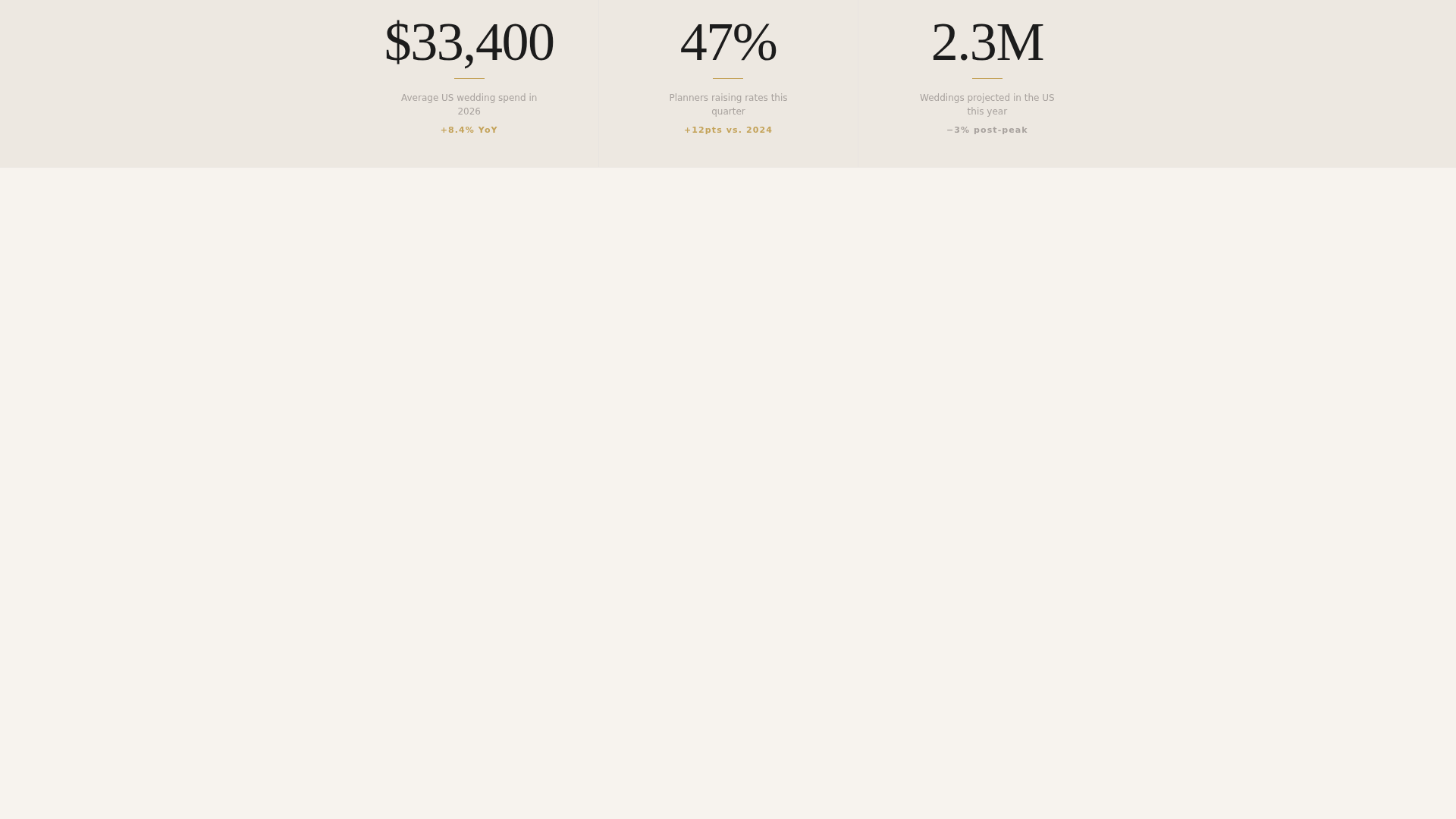
| Trend Forecast Cards | Highlights forward-looking industry data with miniature charts |
| Vendor Benchmark Cards | Surfaces a single striking statistic per vendor salary topic |
| Regional Snapshot Cards | Displays map details for geographic market context |
| Persistent Quiz Bar | Anchors the primary call-to-action after third scroll depth |
| Assessment Modal | Captures role and preference data through five questions |
| Embedded Capture Card | Collects email subscriptions from within the content grid |
| Niche Deep-Dive Cards | Shifts focus to micro-wedding, South Asian, and destination topics |
Design & branding system
The visual identity follows an Atelier Studio theme built entirely on a Japanese Zen color system. The result is a page that feels like handmade paper laid across a cedar table: unhurried, textural, and deliberate.
- The four-color palette uses washi white (#F7F3EE) as the dominant background, sumi ink (#1C1C1C) for all typography, tatami gold (#C4A35A) for interactive states and data highlights, and stone garden gray (#A8A29E) for card separation and secondary surfaces
- Serif typography carries calligraphic weight throughout, from the header headline down to individual card labels, reinforcing the editorial precision of the content
- Spacing and surface area are treated as active design elements, with generous breathing room between cards that echoes the quiet of a Japanese stationery shop
Mobile & speed optimization
The masonry grid layout and layered modal are structured to adapt across screen sizes without losing the editorial feel that defines the template.
- Card proportions and typography scale gracefully so that report cards remain readable and visually distinct on smaller screens
- The persistent quiz bar is designed to stay unobtrusive on mobile, taking up minimal vertical space while remaining accessible at all scroll depths
- The embedded subscription card within the grid maintains its disguised-content appearance on mobile, preserving the seamless visual flow of the overall layout
How this template helps you convert
Vow treats conversion as a natural extension of the reading experience rather than an interruption. Two distinct conversion paths are built directly into the page structure.
- The "Find Your Market Position" quiz bar captures high-intent professionals by offering a personalized reading list in exchange for role and preference data, turning a passive scroll into an active segmentation event.
- The "Subscribe to the Brief" card embedded inside the masonry grid captures readers at the moment of content discovery, when their interest in the data is highest and the ask of a single email field feels frictionless.
Other information about this template
Vow is part of a curated template collection designed around precise intersection matches between niche, style, and conversion intent. A few additional details worth noting:
- The template style is classified as Masonry and Pinterest layout, making it well suited for content-heavy editorial pages where variety in card height adds visual rhythm
- The header concept uses a Custom Illustration rather than photography, which means the editorial identity is immediately distinctive and not dependent on stock image licensing
- The quiz direction follows a Quiz and Assessment pattern, a format that works especially well for professional audiences who expect content tailored to their specific business context
- The Curated Collection creative direction ensures the grid never feels random; content moves from broad to niche as the reader scrolls, creating editorial gravity
- This template is a single landing page, not a multi-page site, making it ideal as a campaign or launch page for a new report publication or subscription product

Theme
Atelier Studio
Creative direction
Curated Collection
Color system
Japanese Zen
Style
Masonry/Pinterest
Direction
Quiz/Assessment
Page Sections
Custom Ink-wash Header Illustration
Masonry Report Card Grid
Persistent Quiz Conversion Bar
Embedded Grid Subscription Card
Japanese Zen Four-color Palette
Layered Five-question Assessment Modal
Related questions
Who is the ideal reader this landing page is designed to attract?
Can I use this template if I am just launching my wedding industry report blog?
How does the 'Find Your Market Position' quiz work within the page?
Is the email capture card visually separate from the content cards?
What makes this template visually different from a standard wedding blog layout?