Beta & Early Access Pre-Launch Website Template
A pre-launch landing page built for closed beta signups. It leads with an interactive comparison table that shows visitors exactly what they stand to gain before asking for anything. The design runs on a dark Tech Glass aesthetic, and every element points toward one action: claiming a spot before the beta fills up.
by Rocket studio
Quick summary
This is a single-page, pre-launch beta signup template built for software teams that need to capture early adopters before going public. It leads with an interactive comparison table, builds urgency through a live slot counter, and channels every scroll toward one action: submitting an email address to claim priority access.
Who this template is for
Early-stage software founders and product teams need a way to generate demand before their product launches. This template was built for exactly that moment, when you have something real to show but nothing ready to ship.
- Startup founders running a closed beta for a new software product
- Product teams validating demand before a public launch
- Indie developers and small teams who want a waitlist before opening access
What problem this template solves
Most pre-launch pages ask for trust before they earn it. They lead with a signup form and a vague promise, giving early visitors no reason to hand over their email address. The result is a high bounce rate and a thin waitlist.
- Visitors leave without signing up because the value is never made concrete
- There is no urgency mechanism to make waiting feel like a real loss
- Generic signup pages fail to create the sense that something exclusive is happening
What you get with this template
This template gives you a fully structured pre-launch landing page with a clear visual hierarchy and purpose-built conversion flow. Every section is designed to move a skeptical early adopter toward a single action.
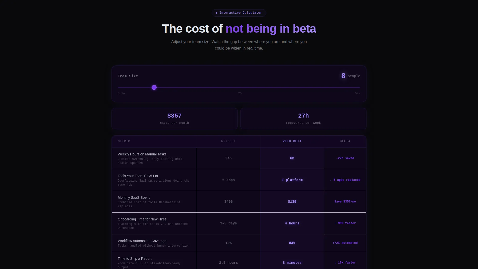
- An interactive comparison table with a team-size input and real-time metric animation
- A sticky bottom call-to-action bar and a full-width email capture section with a live beta-slot counter
- A secondary "Follow the Build" path for visitors who are curious but not yet ready to commit
Feature list
This template is built around a handful of components that work together to earn trust and push toward signup.
Interactive Comparison Table
The table lets visitors input their team size and toggle between a "Without" and "With" state. Metrics like time saved, tools replaced, and cost reduction animate in real time as the rows shift. The gap between the two states widens with every row, making the cost of not signing up feel tangible.
Dashboard Preview Header
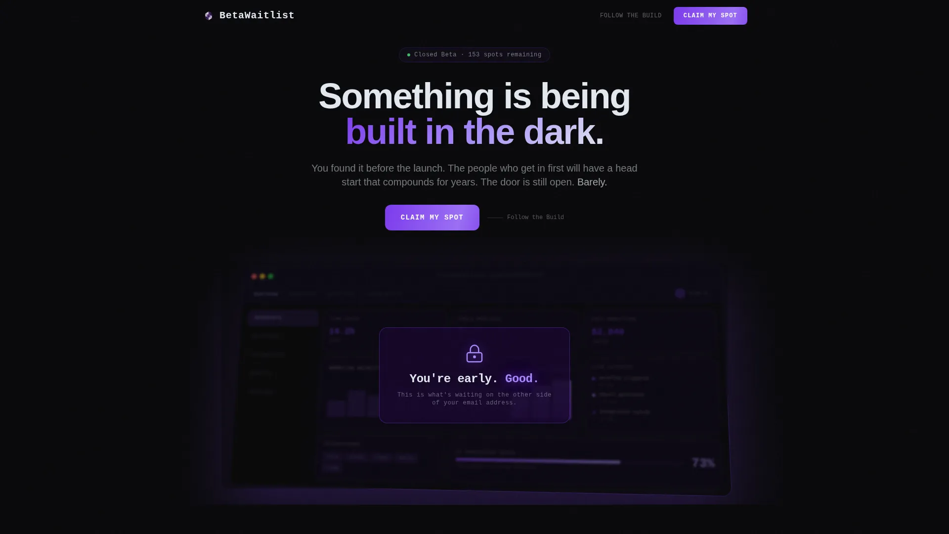
The header shows a fully rendered product interface floating at a slight isometric tilt. Charts appear mid-animation, notifications are stacked, and labels are close enough to read. A frosted overlay with a lock icon and the phrase "You're early. Good." sits center-frame, creating immediate intrigue.
Scarcity-Driven Email Capture
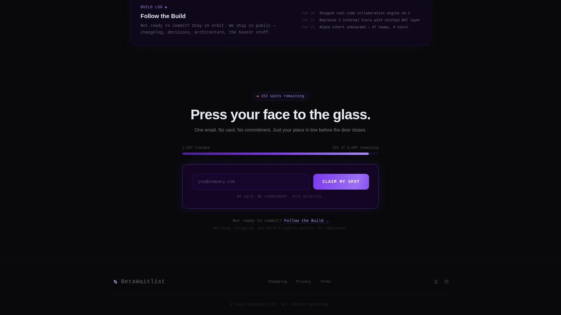
After the comparison table, a full-width section presents a single email input field. A live counter displays the remaining beta slots, making the scarcity feel real and time-sensitive. A supporting line reads "No card. No commitment. Just priority." to remove friction.
Sticky Call-to-Action Bar
Once a visitor interacts with the calculator, a sticky bar appears at the bottom of the screen. The primary call-to-action reads "Claim My Spot" in electric violet. It stays visible through the rest of the scroll so the action is always one tap away.
Secondary Engagement Path
Visitors who are not ready to commit have a clear alternative. A "Follow the Build" link leads to a changelog or dev blog, keeping curious early adopters in orbit without forcing them into a decision they are not ready to make.
Page sections overview
| Section | Purpose |
|---|---|
| Dashboard Preview Header | Opens with a product user interface visual and a frosted overlay to create immediate intrigue |
| Interactive Comparison Table | Lets visitors calculate their own value gap before any signup ask |
| Sticky call to action Bar | Surfaces the primary signup action after calculator interaction |
| Email Capture Section | Full-width single-field form with live slot counter and scarcity copy |
| Secondary Follow Path | Offers a low-commitment alternative for visitors not yet ready to sign up |
Design & branding system
The visual identity follows a Tech Glass theme built on the Void and Violet color system. The palette uses absolute void black, deep ultraviolet, electric violet, and frosted glass white to create the feeling of a monitor glowing in a dark room.
- Backgrounds layer void-to-ultraviolet gradients with glassmorphic panels floating above them, borders catching violet light like refracted edges
- Text uses frosted white at less than full opacity, giving everything a slightly smoked-glass quality
- Interactive elements pulse in electric violet, and the primary call-to-action button uses the same hue to stay visually prominent throughout the scroll
Mobile & speed optimization
The layout is built to hold its structure and visual impact on smaller screens. The comparison table, sticky bar, and email capture section are all designed to remain functional and readable on mobile viewports.
- The isometric dashboard header scales responsively so the product preview remains legible without cropping critical user interface details
- The sticky call-to-action bar is touch-friendly and stays anchored to the bottom of the screen on mobile devices
- The single-field email capture form keeps the input and submit action visible above the fold on most phone screen sizes
How this template helps you convert
Every design and copy decision in this template is pointed at one outcome: converting a curious visitor into a confirmed beta signup.
- The comparison table builds the value gap before asking for anything, so by the time visitors reach the email form, they have already convinced themselves that signing up is the rational move.
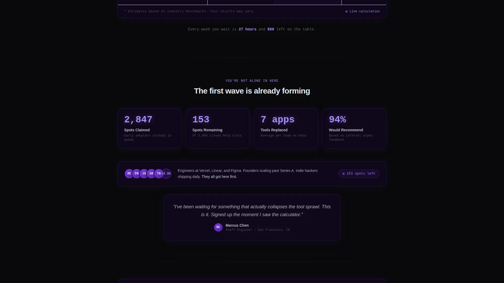
- The live slot counter and scarcity copy create a real cost to waiting, turning passive interest into an active decision to claim a spot now rather than later.
Other information about this template
This template sits within the Startup and Launch category, specifically designed for the Beta and Early Access subcategory and the Closed Beta Signup niche. It is a single-page template, not a multi-page website.
- The template style is a Comparison Table layout, which leads with a calculator-first creative direction rather than a hero-and-feature-list structure
- The landing page direction is optimized for click-through, meaning the page is structured to move visitors from discovery to action in a single session
- The header concept is a Dashboard Preview, which is a deliberate choice for software products that cannot yet show a live demo
- This template works well for product-led growth strategies where showing value before asking is the primary acquisition tactic
- The "Follow the Build" secondary path is designed to retain visitors across a longer consideration window, not just capture the ones ready to sign up today
Theme
Tech Glass
Creative direction
Calculator/Tool First
Color system
Void & Violet
Style
Comparison Table
Direction
Click-Through
Page Sections
Interactive Comparison Table with Team Input
Dashboard Preview Header with Frosted Overlay
Scarcity-driven Email Capture Section
Sticky Call-to-action Bar
Secondary Follow Path for Undecided Visitors
Related questions
Do I need a working product to use this template?
Can I customize the metrics in the comparison table?
What is the live beta-slot counter and how does it work?
What is the 'Follow the Build' option in the template?
Is this template suitable for a solo founder or indie developer?



