SaaS Product Waitlist & Animated Dashboard Preview Website Template
A high-performance SaaS waitlist landing page built for products launching into momentum. The template leads with a fully animated dashboard shell, renders simulated real-time data above the fold, and gates the sign-up form until the visitor has already tried to interact. Every section reads like a technical spec sheet that earns trust before it asks for anything.
by Rocket studio
Quick summary
A SaaS coming soon landing page built around a live dashboard preview, a scrolling spec sheet layout, and a conversion flow optimized for early access sign-ups. The Carbon Fiber color system, monospace typography, and animated architecture diagram make the product feel real before it ships. Signal green calls to action pulse at timed intervals and never interrupt the discovery experience.
Who this template is for
This template is designed for technical founders, operations leads, and developer advocates who are building anticipation before a product launch. It speaks directly to early adopters who want proof before they commit their email address.
- Technical founders who have outgrown their current stack and are evaluating what comes next
- Operations leads managing multiple tools and looking for one platform to consolidate them
- Developer advocates and builders who want early access before a public launch
What problem this template solves
Most coming soon pages ask for trust before they offer anything. Visitors arrive, see a tagline and a form, and leave. This template flips that sequence by showing the product first and asking nothing until the visitor has already tried to click inside it.
- Early-stage products struggle to build credibility before launch without showing a finished product
- Generic waitlist pages fail to qualify early adopters or communicate what makes the product worth waiting for
- Developers and technical buyers distrust marketing copy and respond better to data and architecture detail
What you get with this template
You get a single-page landing experience structured as a technical reveal. The layout is deliberate and sequential, moving the visitor from interactive preview to spec data to architecture to sign-up without a single decorative section.
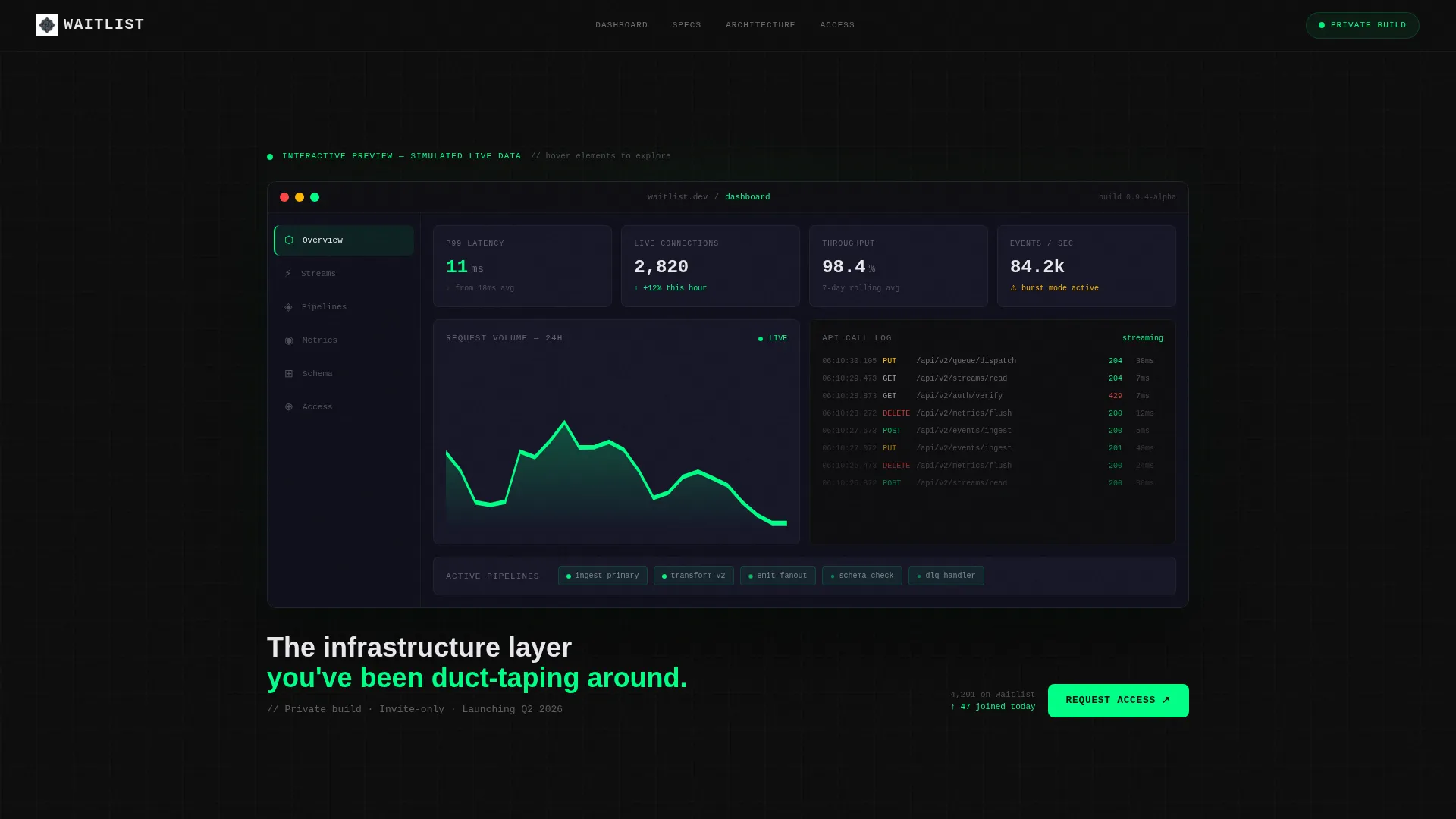
- An animated dashboard shell in the header, populated with simulated real-time metrics including latency counters, usage graphs, and scrolling API call logs
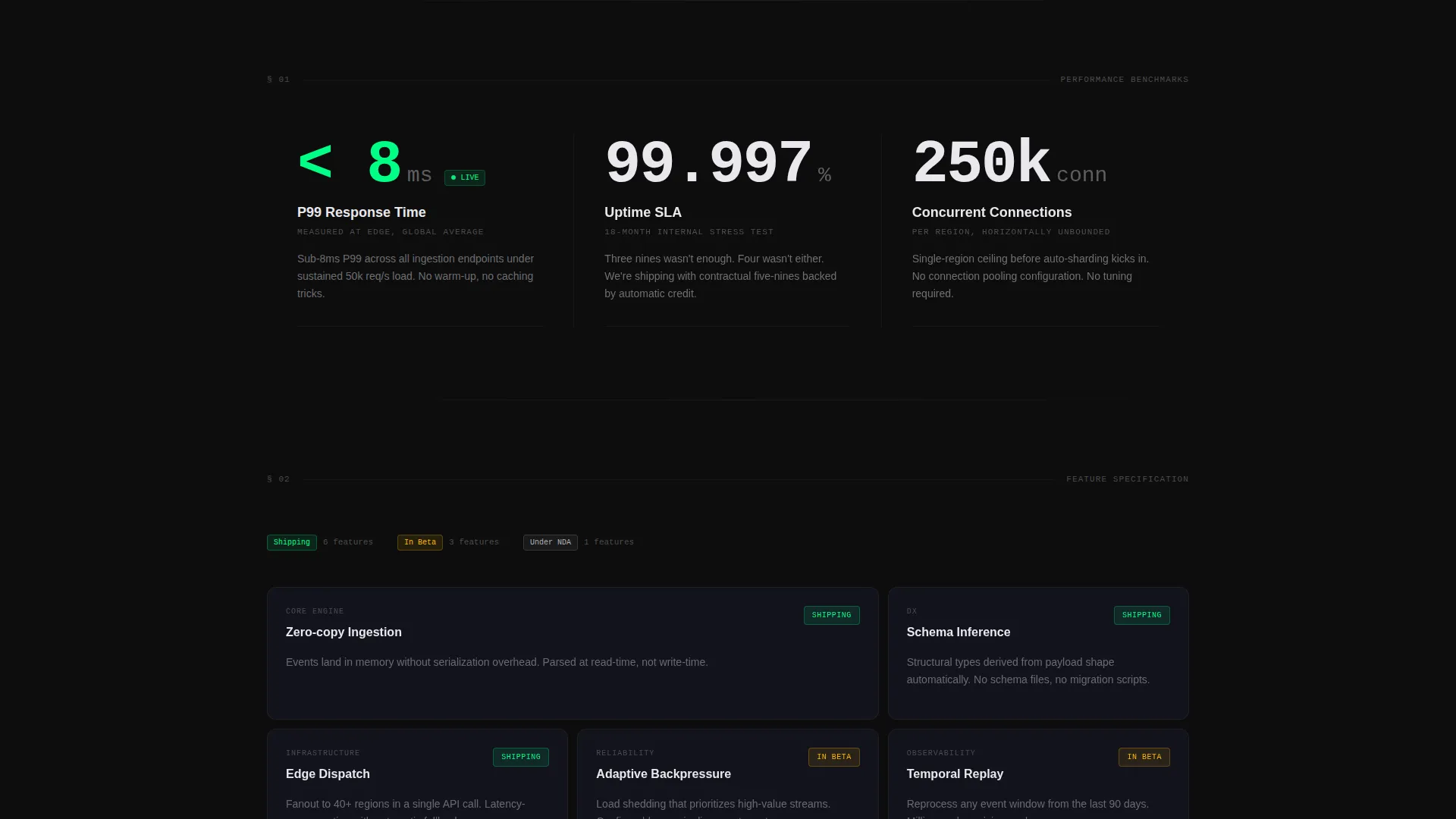
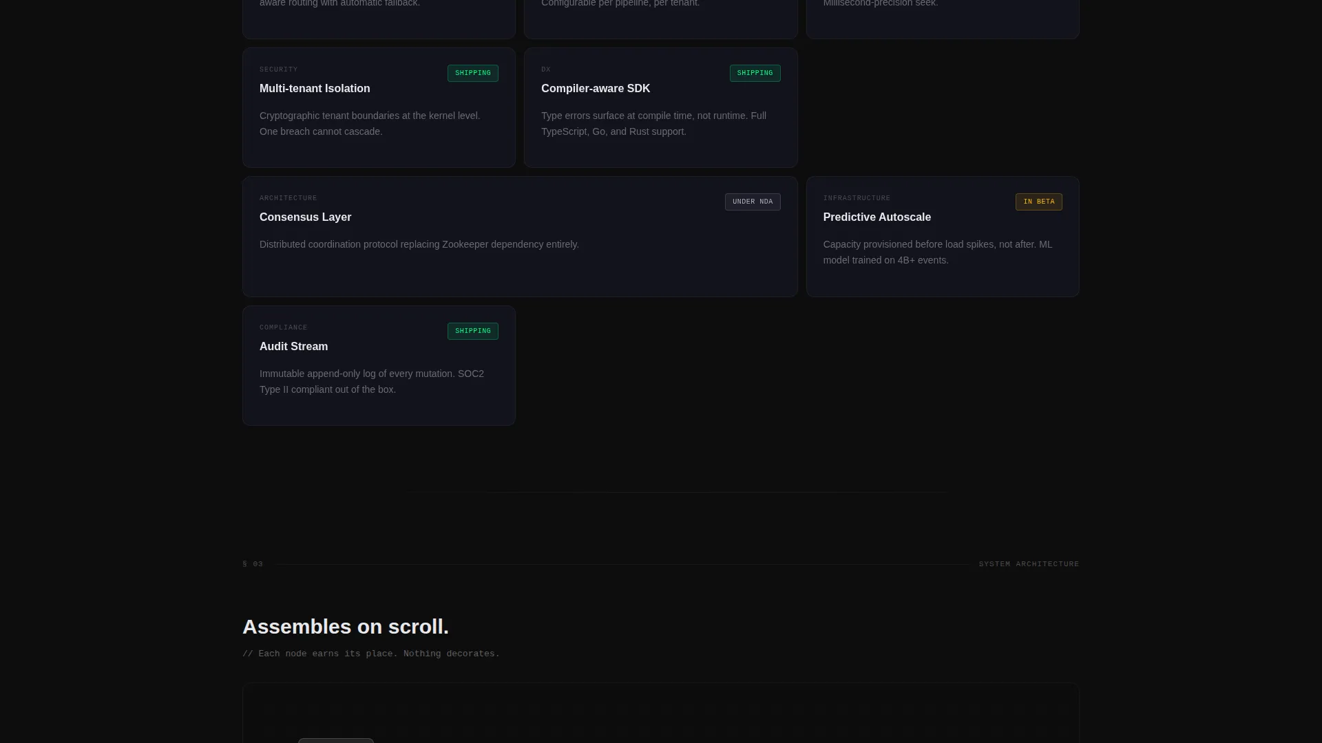
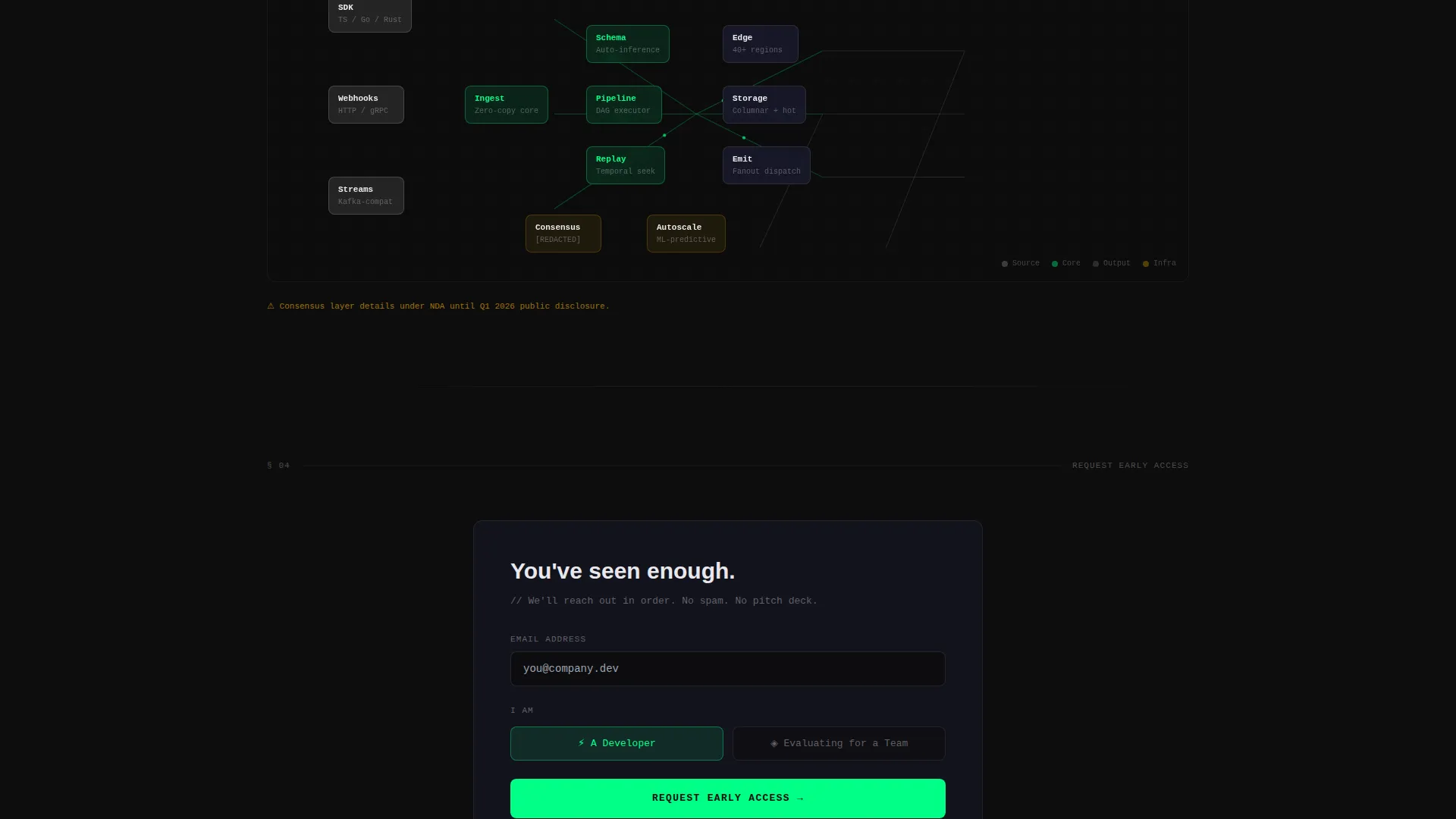
- A three-part spec sheet scroll featuring oversized monospace metrics, a feature grid with status chips, and a self-assembling architecture diagram
- A sticky early access form with a single email field, a developer or team toggle, and a post-submission confirmation screen showing queue position and a Discord invite
Feature list
A brief walkthrough of the core capabilities built into this template.
Interactive Dashboard Header
The header renders a full-fidelity dashboard shell with animated simulated data. Latency counters tick down, usage graphs climb in real time, and an API call log scrolls continuously. Hovering over elements inside the shell triggers tooltip previews labeled "Available at launch," making the product feel tangible before it exists.
Monospace Metrics Section
Three key performance indicators are displayed in oversized monospace type with unit labels. Response time in milliseconds, uptime percentage, and concurrent connection count are each presented as raw numbers with no surrounding decoration. The format reads like a spec sheet and communicates precision immediately.
Feature Grid with Status Chips
Each feature card shows a spec name, a single-sentence definition, and a status chip indicating shipping state. Chips are labeled "Shipping," "In Beta," or "Under NDA," giving visitors a clear picture of what is ready and what is still in progress. The grid rewards careful reading without demanding it.
Scroll-Animated Architecture Diagram
The architecture diagram builds itself on scroll, assembling node by node and connecting line by line as the visitor moves down the page. This pacing creates a sense of reveal that mirrors the product's own story. The diagram communicates technical depth without requiring a written explanation.
Sticky Early Access call to action
The primary call to action is a signal green button pinned to the bottom of the viewport. It pulses once every eight seconds, staying visible without becoming intrusive. The form collapses to a single email field with a secondary toggle for developer or team context, keeping friction minimal.
Post-Submission Confirmation Screen
After a visitor submits their email, the page replaces the form with a confirmation screen. The screen displays an estimated queue position and an invitation to a private Discord channel. This gives early adopters a concrete sense of their place in the community before the product launches.
Page sections overview
| Section | Purpose |
|---|---|
| Interactive Dashboard Header | Renders animated simulated metrics above the fold as the primary product preview |
| Key Metrics Block | Displays three performance figures in oversized monospace type with unit labels |
| Feature Grid | Lists spec cards with single-sentence definitions and shipping-status chips |
| Architecture Diagram | Assembles a technical system diagram node by node as the visitor scrolls |
| Early Access Form | Captures email with a developer or team toggle and minimal friction |
| Confirmation Screen | Shows queue position and Discord invite after form submission |
Design & branding system
The visual identity follows a Startup Velocity theme built on a Carbon Fiber color palette. Every color choice reinforces the sense of a precision-built product in active development.
- Core palette: deep cockpit black (#0D0D0D) for backgrounds, woven graphite (#1A1A2E) for surface layers, and machined aluminum (#B0B0B8) for text and secondary elements
- Signal green (#00FF87) is reserved exclusively for interactive states, live data pulses, and call-to-action surfaces, making every active element immediately identifiable
- Typography uses monospace letterforms throughout data-heavy sections, reinforcing the spec sheet aesthetic and distinguishing technical content from navigational copy
Mobile & speed optimization
The template layout is structured to remain legible and functional at smaller viewport sizes. The animated dashboard shell and architecture diagram are designed to adapt without losing their core effect.
- The sticky call to action remains pinned at the bottom of the viewport on all screen sizes, keeping the early access form accessible throughout the scroll
- The feature grid reflows from a multi-column layout to a single-column stack on narrower screens, preserving the status chip and definition structure on mobile
How this template helps you convert
This template is built around a conversion philosophy: show value first, ask later. Every structural decision delays the sign-up request until the visitor has already engaged with the product preview.
- The interactive dashboard header creates immediate product curiosity by letting visitors click inside a simulated interface before any form appears, building investment before commitment
- The spec sheet scroll qualifies visitors naturally, so the people who reach the early access form are already technically aligned with the product's positioning and more likely to convert
Other information about this template
This template sits at the intersection of the Startup and Launch category with a coming soon and waitlist subcategory, purpose-built for a SaaS product coming soon scenario. It pairs well with pre-launch announcement strategies where the audience is technical and skeptical of marketing language.
- The template style is a Dashboard and Data Grid layout, making it a strong fit for analytics tools, developer platforms, API products, and infrastructure services
- The creative direction follows a Spec Sheet approach, meaning every section communicates precision and restraint rather than persuasion or lifestyle imagery
- The header concept is an Interactive Preview, which is distinct from static hero sections and is specifically designed to make visitors feel like they are using the product before it launches
- The landing page direction is Freemium and Trial optimized, with the form and confirmation flow designed to capture high-intent early adopters rather than casual browsers
Theme
Startup Velocity
Creative direction
Spec Sheet
Color system
Carbon Fiber
Style
Dashboard/Data Grid
Direction
Freemium/Trial
Page Sections
Interactive Dashboard Shell Header
Oversized Monospace Metrics Block
Feature Grid with Status Chips
Scroll-triggered Architecture Diagram
Sticky Pulsing Early Access Call to Action
Queue Position Confirmation Screen
Related questions
Can I replace the simulated dashboard data with my own product metrics?
How does the developer or team toggle work on the sign-up form?
What does the post-submission confirmation screen display?
Is this template suitable for a product that is still under active development?
Can the sticky call to action pulse timing be adjusted?


