Powerful Creator Landing Page Template
A dashboard-style creator waitlist landing page built for solo creators who need a fast, branded pre-launch presence. The template features a tabbed hero mockup, a feature comparison grid, milestone reward displays, and a minimal two-field signup form. It turns pre-launch curiosity into committed signups without any tool-stacking.
by Rocket studio
Quick summary
This is a single-page creator waitlist landing page built around a Tech Glass visual theme. It uses a tabbed dashboard mockup, a structured feature comparison grid, and a sticky call-to-action bar to guide visitors toward signing up. The layout is dark, data-forward, and designed to make a pre-launch feel like an event worth joining.
Who this template is for
This template is built for independent creators who are preparing to launch something new and need a polished waitlist page fast. It suits anyone in the creator economy who wants pre-launch momentum without patching together multiple tools.
- Solo creators including YouTubers, newsletter writers, course builders, and podcast hosts
- Indie developers teasing a software beta or early-access product
- Fitness coaches, cohort program hosts, or paid-tier newsletter writers gating upcoming releases
What problem this template solves
Most creators cobble together a waitlist from a form tool, an email platform, and a spreadsheet. The result looks rough, breaks easily, and does nothing to encourage sharing. This template replaces that patchwork with one focused landing page.
- No clear referral loop or viral incentive built into a typical DIY setup
- Competitor tools lack milestone rewards, branded pages, or embeddable widget support in one place
- A scattered tool stack makes it hard to show social proof or live signup momentum
What you get with this template
You get a complete, structured landing page ready to represent a creator waitlist. Every section serves a specific conversion role, from the interactive hero to the proof-backed footer.
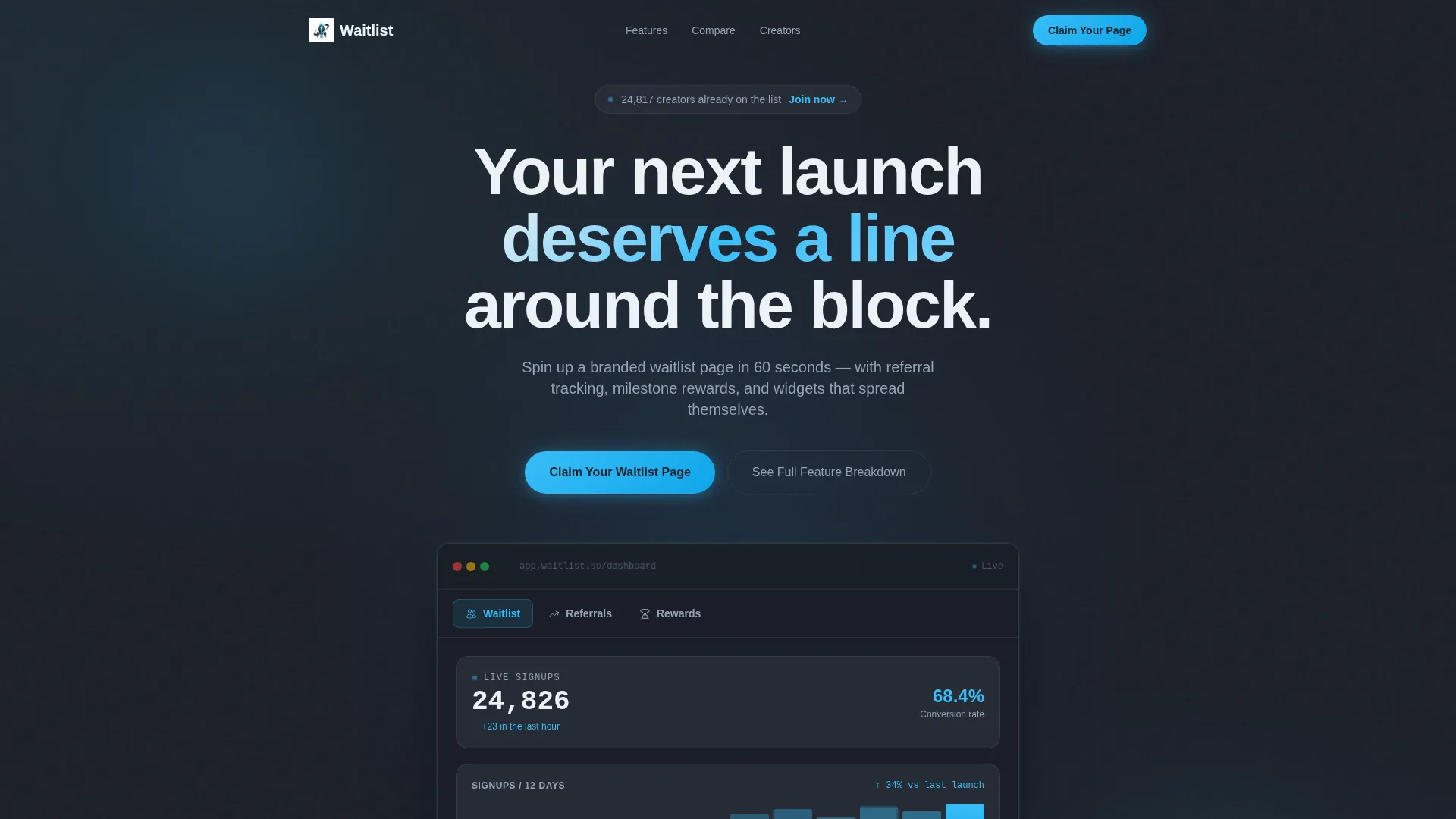
- A tabbed hero section with three switchable dashboard views: Waitlist, Referrals, and Rewards
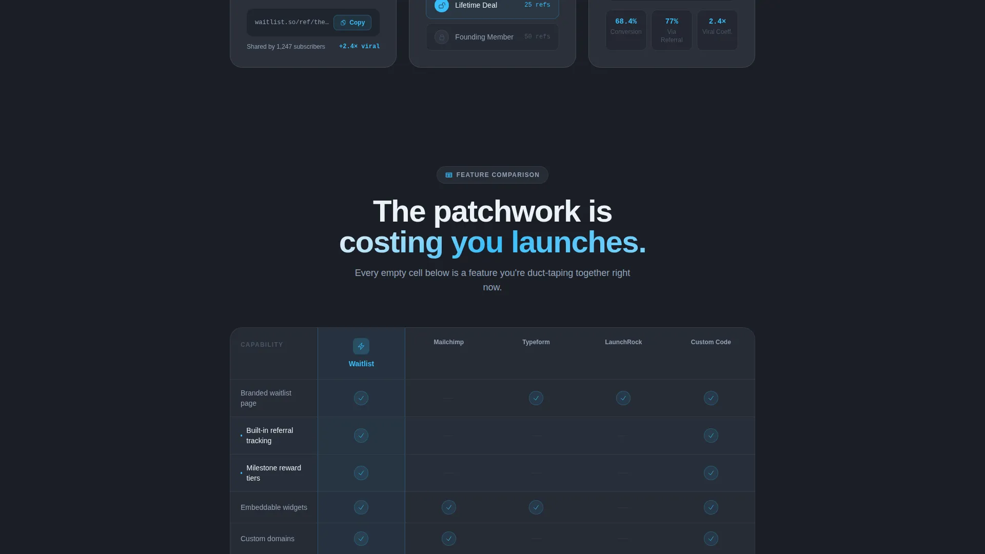
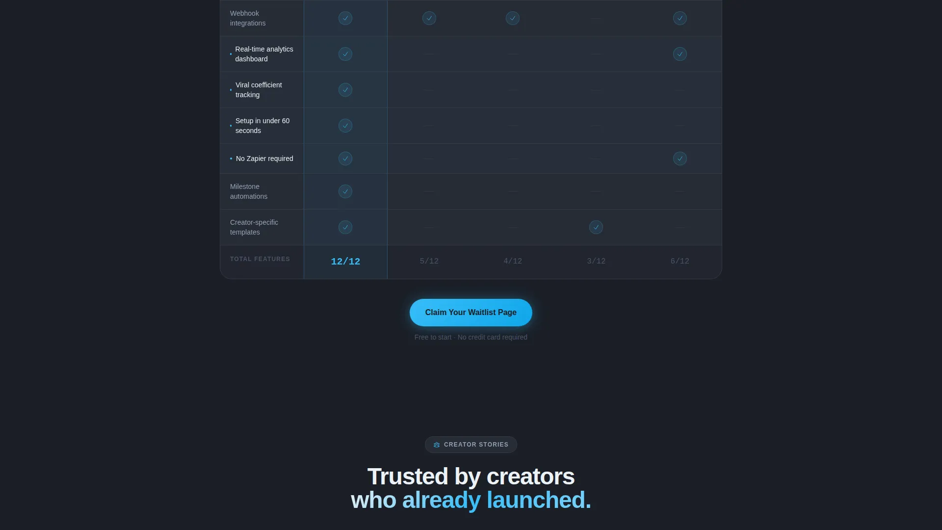
- A feature comparison grid that stacks the platform against patchwork alternatives row by row
- A sticky call-to-action bar, a two-field inline signup form, and a social proof testimonial row
Feature list
This template ships with six distinct design and layout features, each grounded in the source brief.
Tabbed Feature Switcher Hero
The header uses a frosted-glass browser chrome mockup with three clickable tabs: Waitlist, Referrals, and Rewards. Each tab reveals a different dashboard view beneath it, complete with live counters, leaderboard rows, and milestone achievement cards. Glass reflections shift subtly as tabs switch, reinforcing visual depth.
Live Signup Counter Display
The Waitlist tab view shows a signup counter ticking upward alongside a conversion graph. This gives visitors a real-time sense of demand and momentum, making the waitlist feel active rather than static.
Referral Leaderboard Panel
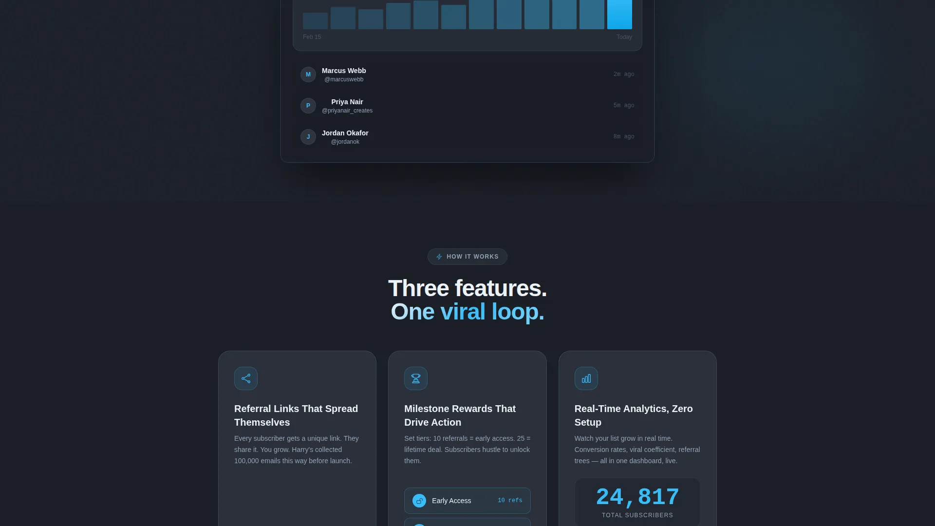
The Referrals tab reveals an avatar-row leaderboard with share-link statistics and a viral coefficient badge. Creators can see at a glance how referrals are spreading, making the sharing mechanic feel competitive and rewarding.
Milestone Reward Card System
The Rewards tab displays tiered achievements rendered as unlockable cards with progress rings. Examples like "10 referrals equals early access" and "25 referrals equals a lifetime deal" are shown as visual goals, motivating continued sharing.
Feature Comparison Grid
Scrolling past the hero drops visitors into a structured matrix grid. The platform is compared column by column against alternatives across rows covering referral tracking, custom domains, embeddable widgets, webhook integrations, analytics dashboard, and milestone automations. Sky-blue checkmarks fill the platform column; muted slate cells mark competitor gaps.
Sticky Call-to-Action Bar
After the first grid section, a sticky bottom bar keeps the primary call-to-action in view. The "Claim Your Waitlist Page" button appears both below the hero and in this persistent bar, so the signup path is never more than a glance away.
Page sections overview
| Section | Purpose |
|---|---|
| Tabbed Hero Mockup | Introduces the platform through three interactive dashboard views |
| Live Signup Counter | Shows real-time waitlist momentum to build urgency |
| Referral Leaderboard | Displays sharing stats and viral growth indicators |
| Milestone Reward Cards | Visualizes tiered referral rewards as unlockable achievements |
| Feature Comparison Grid | Compares platform capabilities against patchwork tool alternatives |
| Glass-Card Callouts | Highlights individual features with micro-animation moments between grid sections |
| Sticky call to action Bar | Keeps the primary signup action visible throughout the scroll |
| Inline Signup Form | Captures creator name and email in a two-field frictionless form |
| Testimonial Row | Shows three creator quotes with bold sky-blue signup count figures |
Design & branding system
The visual identity follows a Tech Glass theme built on a Slate and Sky color system. The palette is designed to feel like a cockpit instrument panel: dark, precise, and alive with glowing readouts.
- Deep graphite slate (#1B1F27) as the primary background, mid-tone gunmetal (#2E3440) for card surfaces, and crisp cloud white (#EDF2F7) for typography and dividers
- Sharp sky-blue (#38BDF8) used sparingly on interactive elements, hover states, active tabs, progress bars, and live counters to imply motion
- Frosted-glass card surfaces, subtle reflections on tab switches, and progress rings on reward cards reinforce the translucent depth of the Tech Glass direction
Mobile & speed optimization
The template layout is structured for responsive display, keeping the dashboard mockup and grid sections readable across screen sizes.
- The tabbed hero mockup and comparison grid are designed to reflow cleanly on smaller viewports
- The sticky call-to-action bar and inline two-field form remain accessible without horizontal scrolling
How this template helps you convert
The page is built around a Comparison/Versus conversion direction. Every design decision moves a skeptical visitor closer to clicking the primary call-to-action.
- The tabbed hero creates immediate curiosity and shows product depth before a visitor reads a single line of body copy, reducing early bounce.
- The feature comparison grid accumulates visible evidence row by row, making the gap between this platform and stitched-together alternatives undeniable by the time the call-to-action button reappears.
- The testimonial row closes the page with peer validation, pairing one-line creator quotes with bold sky-blue signup counts that function as live social proof data points.
Other information about this template
This template sits within the Startup and Launch category, specifically the Creator Economy Startup subcategory. It is designed for the Creator Economy Waitlist Landing Page niche and carries an intersection match score of 13, indicating a strong alignment between the theme, creative direction, and conversion goal.
- The template style is Dashboard and Data Grid, meaning the visual language borrows from product analytics interfaces rather than typical marketing pages
- The Tech Glass theme and Slate and Sky color system are consistent across all sections, from the hero chrome mockup to the comparison grid card surfaces
- The Feature Matrix creative direction and Comparison/Versus landing page direction work together: the grid builds rational conviction while the micro-animation callouts between sections maintain emotional engagement
- Secondary navigation is handled through the "See the Full Feature Breakdown" anchor link, giving skeptical visitors a low-commitment path to proof before they commit to signing up
Theme
Tech Glass
Creative direction
Feature Matrix
Color system
Slate & Sky
Style
Dashboard/Data Grid
Direction
Comparison/Versus
Page Sections
Tabbed Dashboard Hero with Glass Chrome
Feature Comparison Grid with Checkmark Cells
Milestone Reward Achievement Cards
Referral Leaderboard with Viral Badge
Sticky Call to Action Bar and Inline Signup Form
Testimonial Row with Live Signup Counts
Related questions
How many tabs does the hero section include?
What does the comparison grid actually compare?
How many fields does the signup form include?
Can this template work for creators across different niches?
Where does social proof appear on the page?



