Powerful D2C Landing Page Template
The Waitlist landing page template is a bento grid pre-launch engine built for direct-to-consumer brands. It combines animated live-data counters, a referral leaderboard mechanic, and industry-report-style content cards to turn curiosity into committed signups. Visitors lock their spot with a single email, see their waitlist position instantly, and earn higher placement by sharing a unique referral link.
by Rocket studio
Quick summary
This is a single-page bento grid waitlist landing page designed for direct-to-consumer (D2C) pre-launch campaigns. It uses live animated metrics as the hero visual, data-card content cells to build market credibility, and a referral-driven signup mechanic. The goal is simple: make visitors feel like being early is their only remaining advantage.
Who this template is for
This template is built for founders and operators who are preparing a product launch and need to build an audience before day one. It suits people who want substance over hype.
- Indie brand founders preparing a D2C product launch who need validated demand before shipping
- In-house DTC operators building a pre-launch waitlist without relying on an agency
- Product designers with a prototype who want to gauge market interest and grow a committed early-access list
What problem this template solves
Most pre-launch pages feel static. They show a logo, a vague tagline, and a form. Visitors have no reason to sign up urgently and no incentive to share. This template flips that dynamic entirely.
- Visitors arrive to a page that already shows real-time social proof through live signup counters and spots-remaining countdowns
- There is no passive pitch; the bento data cards brief visitors like an analyst, making the launch feel inevitable
- Without a referral mechanic, early signups have no motivation to spread the word, so growth stalls before launch
What you get with this template
You get a complete, ready-to-customize bento grid landing page structured around urgency, credibility, and viral growth. Every section earns its place by either proving demand or accelerating signups.
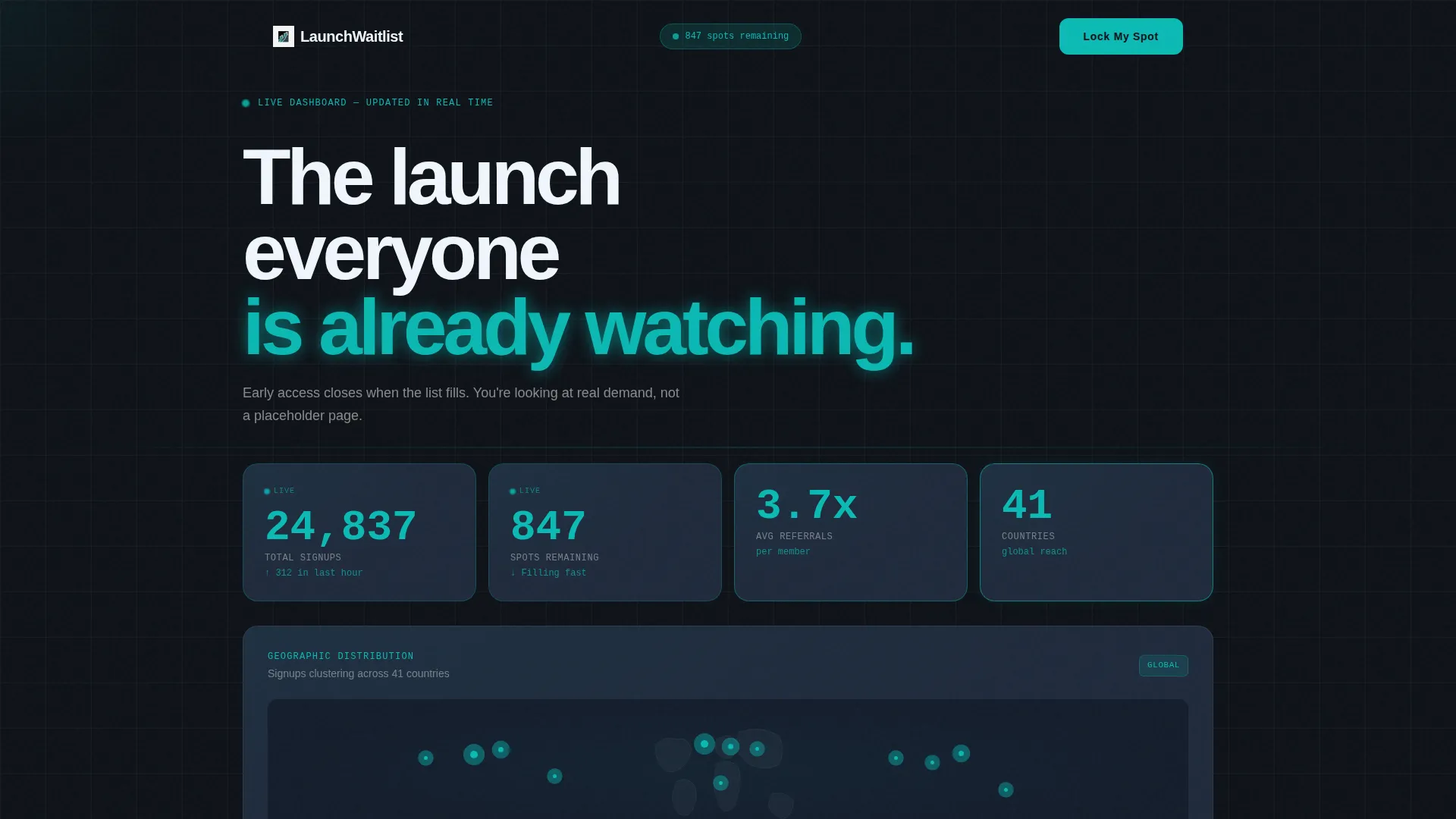
- A live Stats and Metrics header wall with animated counters for total signups, spots remaining, referral rate, and a geographic heat dot map
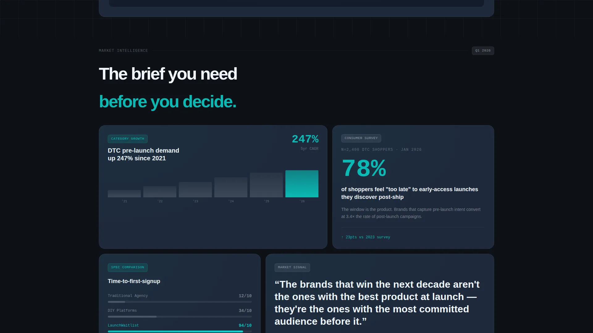
- Bento grid content cells styled as industry data cards with chart fragments, pull-quote statistics, and micro-visualizations
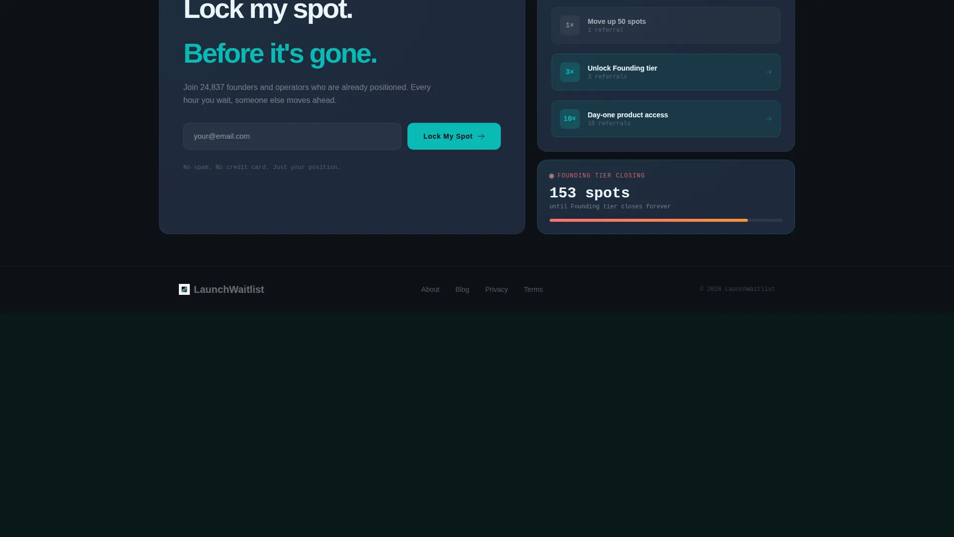
- A primary "Lock My Spot" call-to-action with an expandable email field, referral code input, post-submission position reveal, and a unique share link
Feature list
This template is built around a focused set of components that work together to create urgency, build trust, and drive sharing.
Animated Live Metrics Header
The header is a full-width grid of animated counters displaying real waitlist data. Total signups tick upward, remaining spots count down, average referral rate updates, and a geographic heat dot map shows where interest is clustering. Numbers render in oversized monospaced teal type against deep black, pulsing faintly on each increment. The data itself is the visual hero.
Bento Grid Content Layout
Below the header, the page is organized into a bento grid of individual data cards. Each cell presents one focused insight: a category growth curve, a consumer pain point backed by a survey statistic, or a product differentiator shown as a spec comparison. The layout scrolls like an analyst briefing, not a sales pitch.
Industry Report Creative Direction
Every content card follows the Industry Report visual style. Chart fragments, pull-quote statistics, and micro-visualizations give each cell the authority of market research. This framing makes the case that the launch is inevitable and that being early is the remaining competitive edge.
Referral Leaderboard Mechanic
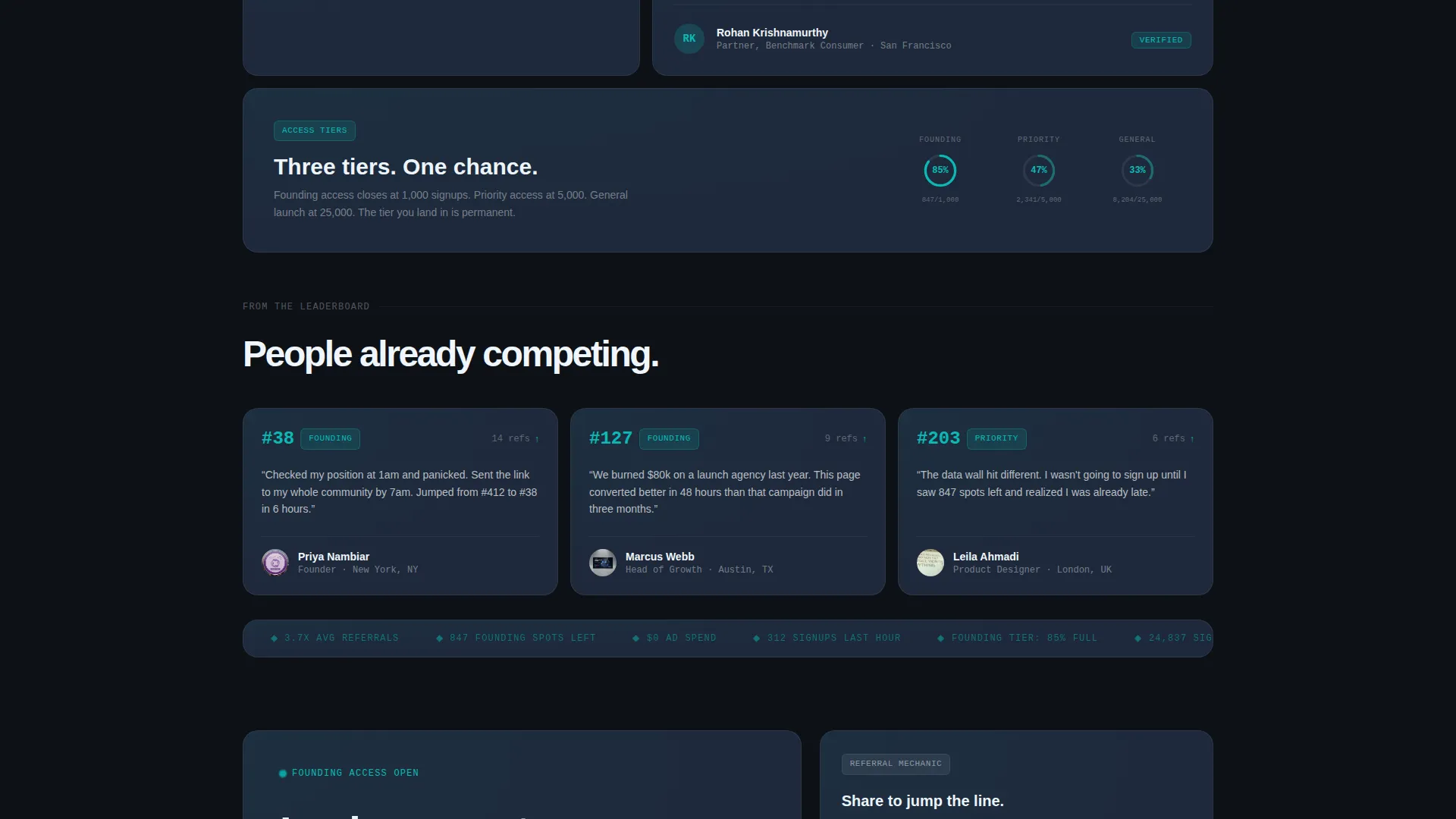
The page includes a "Share to Jump the Line" secondary conversion path. Each successful referral moves the visitor up the waitlist. This mechanic turns every new signup into a potential recruiter, compounding list growth without any additional outreach from the brand.
Lock My Spot call to action with Position Reveal
The primary call-to-action uses a single email field that expands on focus to reveal an optional referral code input. After submission, visitors immediately see their waitlist position number and receive a unique share link. The experience rewards action and gives visitors a reason to return and check their rank.
Dashboard Pro Visual Theme
The entire page uses the Teal Catalyst color system. Deep command-center black (#0D1117) forms the base, signal teal (#0ABAB5) drives interactive pulses and live data highlights, cool slate (#1E293B) surfaces the card backgrounds, and crisp registration white (#F0F6FC) handles typography and dividers. Every color communicates status, urgency, or action.
Page sections overview
| Section | Purpose |
|---|---|
| Live Metrics Header | Displays animated real-time waitlist counters and geographic heat dot map |
| Category Growth Card | Shows the market growth curve for the product category |
| Consumer Pain Point Card | Presents a survey-backed stat isolating the core customer problem |
| Product Differentiator Card | Compares the product's key spec against existing alternatives |
| Lock My Spot call to action | Captures email signups with an expandable referral code field |
| Post-Submission Position | Reveals the visitor's waitlist rank and unique share link |
| Share to Jump the Line | Secondary call to action driving referral sharing to climb the leaderboard |
Design & branding system
The visual identity is built around the Dashboard Pro theme using the Teal Catalyst color system. Every color in the palette is purposeful, communicating a specific state rather than decorating the page.
- Deep command-center black (#0D1117) as the base background, signal teal (#0ABAB5) for live data pulses and interactive elements, cool slate (#1E293B) for card surfaces, and registration white (#F0F6FC) for all body typography and dividers
- Monospaced teal type is used for all numeric counters, reinforcing the data-terminal aesthetic and making live figures feel authoritative
- The bento grid card layout creates a modular, information-dense structure that keeps the page visually scannable without relying on a traditional hero image
Mobile & speed optimization
The bento grid layout is designed to reflow cleanly across screen sizes. The data-card structure means each cell remains readable and self-contained at any viewport width.
- Animated counters and pulsing elements are scoped to individual card cells, keeping visual weight manageable on smaller screens
- The single-field email form with an expandable referral input keeps the mobile conversion flow frictionless and thumb-friendly
How this template helps you convert
This template is engineered to move visitors from passive interest to active commitment. Every design and copy decision reinforces one outcome: the signup.
- The live metrics header creates immediate social proof and scarcity. Visitors see real numbers moving in real time, which signals that other people are already competing for limited spots.
- The bento data cards shift the emotional frame from "should I sign up?" to "can I afford not to?" by presenting the launch as a market inevitability backed by data.
- The referral mechanic extends conversion beyond the individual visit. Every person who signs up becomes a motivated recruiter, growing the list organically before the product ever ships.
Other information about this template
This template is well-suited for D2C brand waitlist landing pages across a wide range of product categories, from consumer goods to lifestyle and tech accessories. It is also a strong fit for any startup and launch context where building pre-launch momentum is the primary objective.
- The template is designed for a D2C brand startup context and fits the Startup and Launch category broadly
- Founders using platforms like Shopify for their storefront can use this landing page as a standalone pre-launch gate before their store goes live
- The bento grid format and Dashboard Pro theme are designed to feel credible and premium without requiring custom design work
- This template functions as a complete pre-launch system: it captures intent, quantifies demand, and activates word-of-mouth before a single unit ships
Theme
Dashboard Pro
Creative direction
Industry Report
Color system
Teal Catalyst
Style
Bento Grid
Direction
Freemium/Trial
Page Sections
Animated Live Metrics Header
Bento Grid Data Card Layout
Referral Leaderboard Mechanic
Lock My Spot Call to Action with Position Reveal
Industry Report Creative Direction
Teal Catalyst Visual Identity
Related questions
Can I customize the colors and typography to match my brand?
Does the referral mechanic work automatically after someone signs up?
Is this template suitable for a product that is not yet named or fully designed?
What makes the header different from a standard hero section?
Can this template be used for a physical product launch as well as a digital one?



