Travel Blog Professional Website Template
Wander is a literary backpacking landing page template built around a memoir-style narrative scroll. Its asymmetric 60/40 grid, Ink and Paper color palette, and CSS page-turn animation make it feel like a real travel journal. It earns email signups by delivering three chapters of authentic story before ever asking for a name.
by Rocket studio
Quick summary
Wander is a single-page backpacking blog template that reads like an open travel journal. It uses a 60/40 asymmetric grid, aged parchment tones, and a CSS page-turn hero to pull readers through an origin story. The primary call to action, "Unpack the Free Trail Guide," arrives naturally after three chapters of real narrative.
Who this template is for
This template suits writers and creators who want their backpacking blog to feel earned, not assembled. It is built for people with real stories to tell and an audience who will stay to read them.
- Gap-year planners and thru-hike beginners who want a trust-building content destination
- Travel writers and solo adventurers ready to turn trail notes into an email list
- Career-break travelers who want a landing page that reflects the weight of the decision they made
What problem this template solves
Most travel blog templates look like every other one. They lead with a hero image, drop a subscribe button, and expect the reader to care. Wander does the opposite. It earns attention before it asks for anything.
- Generic templates ask for an email before giving the reader a reason to stay
- Standard grid layouts cannot hold the texture of a real travel memoir
- Flat, symmetrical designs undermine the handcrafted, hard-won tone that backpacking stories need
What you get with this template
You get a fully structured, single-page literary landing page with five major scroll sections and a complete visual identity. Every section is designed to feel like turning a page, not scrolling a feed.
- A leather-bound hero cover with a CSS page-turn animation that opens into Chapter I
- Three 60/40 chapter sections alternating layout orientation, each holding narrative prose and visual artifacts
- A full-width postcard-style email signup spread and a minimal horizontal footer
Feature list
This template is built around specific, prompt-defined components. Each one earns its place in the layout.
CSS Page-Turn Hero Animation
The header opens as a leather-bound book cover with subtle grain texture and a hand-lettered title. A thin red ribbon bookmark descends from the top. A CSS animation then "creaks" the cover open, revealing the first journal entry complete with a date stamp, a location in small caps, and a drop-cap serif opening paragraph.
Asymmetric 60/40 Chapter Grid
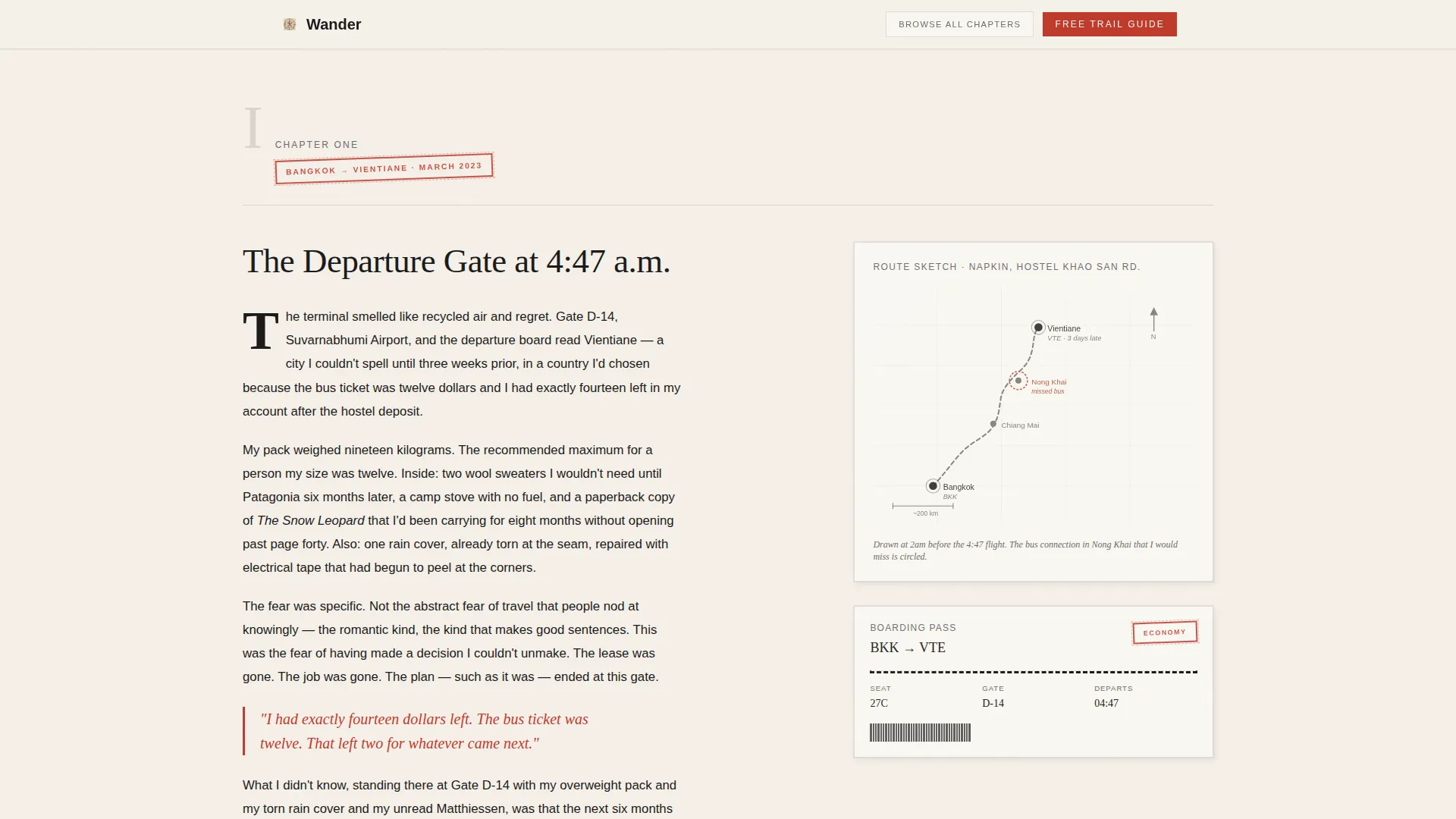
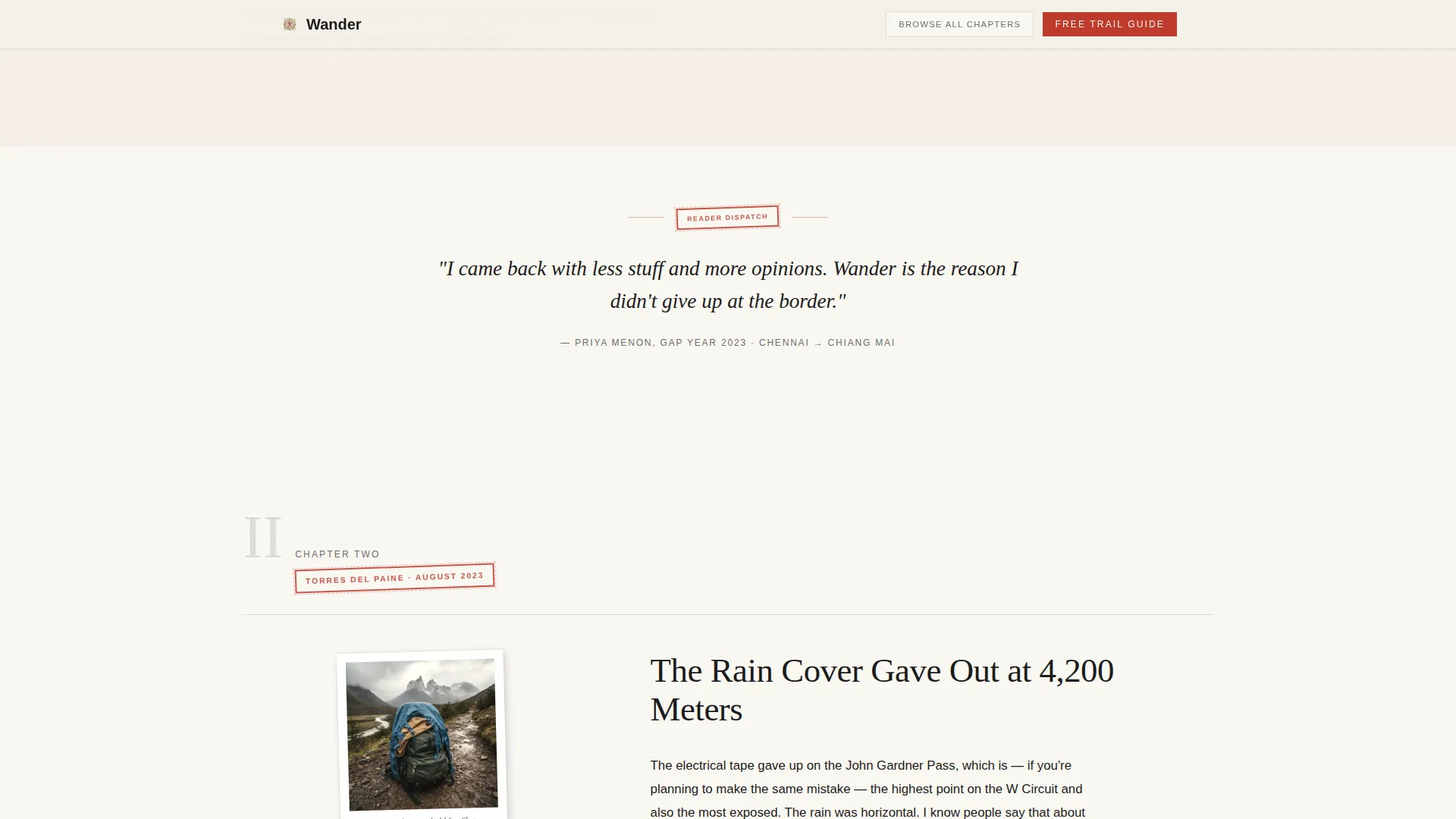
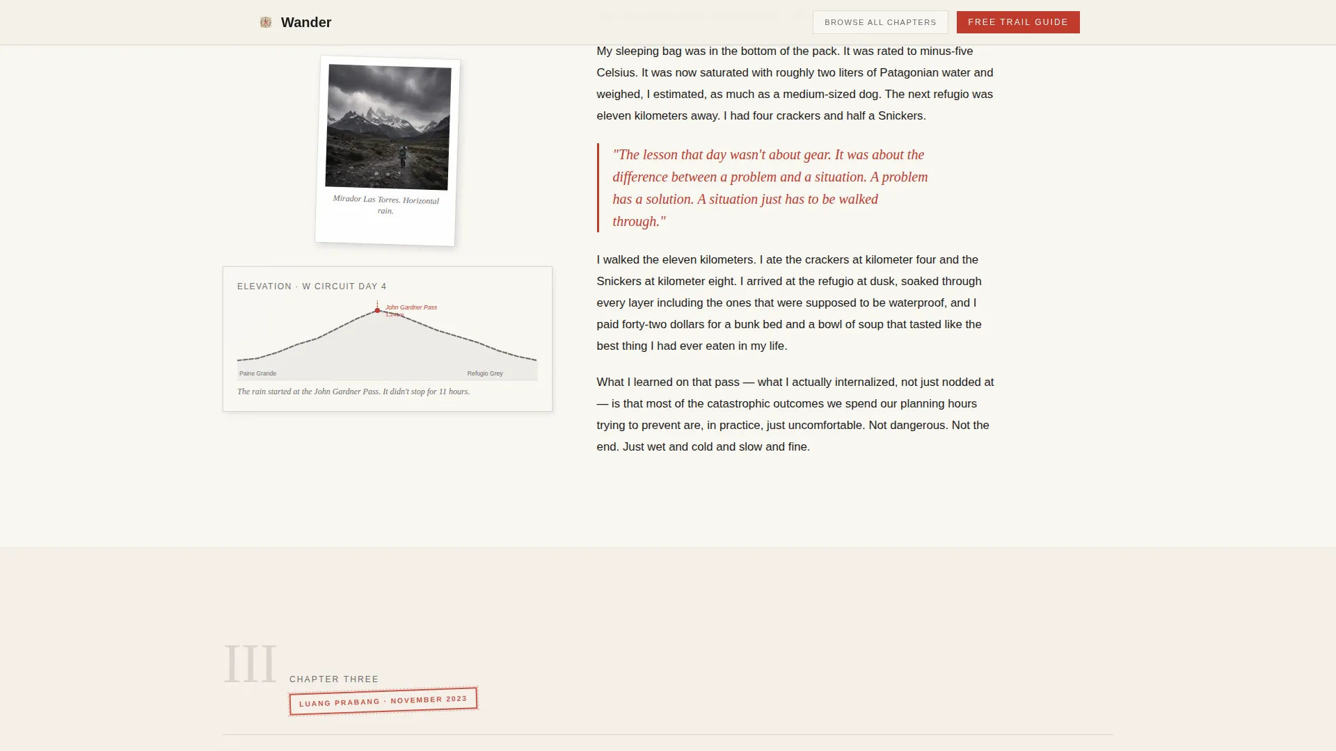
Three chapter sections use a 60-column narrative side and a 40-column artifact side. Chapter II flips the orientation. The artifact column holds scanned boarding passes, gear polaroids, and pencil-drawn elevation profiles. This layout creates a spread that feels like a physical journal, not a blog post.
Scroll-Linked Chapter Reveals
Each chapter section animates in as the reader scrolls. The effect mimics turning a page in a memoir. Parallax artifacts move at a different rate from the prose, giving the layout depth without distraction.
Postcard-Style Email Signup Form
The endpaper call-to-action section spans the full width of the page. The signup form is styled as a postcard, with handwritten-style fields asking only for a first name and an email address. The form design reinforces the analog, airmail aesthetic of the entire page.
Margin Note Call to Action
Before the full signup spread appears, the primary call to action surfaces naturally as a margin note beside Chapter III. It reads "Unpack the Free Trail Guide" and feels like a recommendation scrawled in the border of the journal, not an interruption.
Inline Pull Quotes and Artifact Aesthetic
Stamped-red pull quotes appear inline within the narrative prose. They carry specific dates and locations to reinforce authenticity. The overall artifact aesthetic, including faint ruled-line dividers instead of hard borders, makes the page feel like a scanned, well-traveled document.
Page sections overview
| Section | Purpose |
|---|---|
| Hero book cover | Opens as a leather-bound journal cover with page-turn animation |
| Chapter I spread | Origin story with drop cap, date stamp, and route map artifact |
| Chapter II spread | First disaster narrative with flipped 60/40 grid and scanned artifacts |
| Chapter III spread | Trail lesson with margin note call to action beside the prose |
| Endpaper signup | Full-width postcard email form collecting first name and email |
| Minimal footer | Horizontal flow footer with navigation and secondary archive link |
Design & branding system
The visual identity is built on an Ink and Paper theme. Every color, type choice, and texture decision reinforces the feeling of a letter that arrived by airmail.
- Color palette: aged parchment (#F5F0E8), fountain-pen black (#1A1A1A), pencil-graphite gray (#6B6B6B), and stamped red (#C0392B) reserved for links, pull quotes, and interactive elements
- Typography: Fraunces serif for headlines and drop capitals, DM Sans for body text and navigation, with generous leading throughout
- Backgrounds alternate between warm parchment and soft ivory; section dividers render as faint ruled lines rather than hard borders
Mobile & speed optimization
The template is designed desktop-first to honor the literary spread layout. On smaller screens, the 60/40 columns stack gracefully into a single readable column.
- The chapter artifact columns reorder below their paired prose sections on mobile
- Static chapter content is built with server components to keep initial load light; animations run on the client side
- The postcard signup form adapts to a full-width single-column layout on narrow viewports
How this template helps you convert
Wander earns the email address by making the reader feel they have already received something valuable before the form appears.
- Three full chapters of narrative prose build genuine investment before any call to action asks for a name or email address
- The margin note call to action in Chapter III feels like a natural recommendation, not an interruption, lowering the psychological barrier to clicking
- The postcard form asks for only two fields, first name and email, keeping friction as low as the template's tone is high
Other information about this template
This template is a strong fit for content creators who want a backpacking blog that doubles as a lead generation destination. It is equally useful for travel writers launching a newsletter, outdoor gear reviewers building an audience, or anyone turning a long trip into a long-form content platform.
- The "Browse All Chapters" secondary navigation link sits in the top-right corner like a table of contents tab, giving archive browsers a clear path without distracting from the main scroll
- The template's creative direction follows an Origin Story arc, moving from the personal ("I was lost") to the universal ("here is what I learned so you will not be"), a structure proven to hold attention in long-form editorial content
- The Wander template is well-suited for creators building on modern front-end frameworks, given its use of server components for static sections and client-side rendering for scroll-linked animations
Theme
Ink & Paper
Creative direction
Origin Story
Color system
Ink & Paper
Style
Asymmetric Grid (60/40)
Direction
Content/Resource
Page Sections
CSS Page-turn Hero Animation
Asymmetric 60/40 Chapter Grid
Scroll-linked Chapter Reveals
Postcard-style Email Signup Form
Margin Note Call to Action
Inline Pull Quotes and Ruled Dividers
Related questions
What kind of content works best in this template?
Can I use this template if I am just starting my backpacking blog?
What does the postcard email signup form collect?
Is the visual identity customizable to match my own brand?
Does the template include the archive navigation link?



