Advanced Travel Blog & Media Blog & Content Website Template
Wander is an editorial travel landing page template built for thought leadership blogs and literary travel journals. It combines a book-opening hero, alternating essay card layouts, and a torn-paper subscription insert to turn curious visitors into loyal dispatch subscribers. The warm parchment-and-rust design system gives every section the feel of a well-traveled, beautifully typeset journal.
by Rocket studio
Quick summary
Wander is a single-page editorial travel template styled like a literary magazine. It opens with a cinematic chapter-title hero, flows through curated essay cards, and closes with a layered subscription call to action. The design is warm, unhurried, and built for writers who want their voice to do the converting.
Who this template is for
This template is made for writers and creators who take travel seriously as a subject worth exploring in depth. It suits anyone building a content-led presence around slow, thoughtful travel storytelling.
- Mid-career professionals publishing sabbatical diaries or long-form travel essays
- Couples and independent travelers launching a meaningful trip journal or editorial blog
- Aspiring travel writers looking for a polished, voice-forward landing page to grow a readership
What problem this template solves
Most travel blog templates feel rushed. They push generic grid layouts and stock-photo carousels that say nothing about the writer behind them. Wander solves that disconnect.
- Readers cannot quickly sense the voice or editorial depth of a travel journal from a generic layout
- Writers lose potential subscribers because their landing page feels like every other travel site
- There is no clear moment where casual visitors are invited to commit and subscribe
What you get with this template
You get a complete single-page layout built around content pacing, voice, and lead generation. Every section is designed to keep readers moving through the page the way they would move through a magazine.
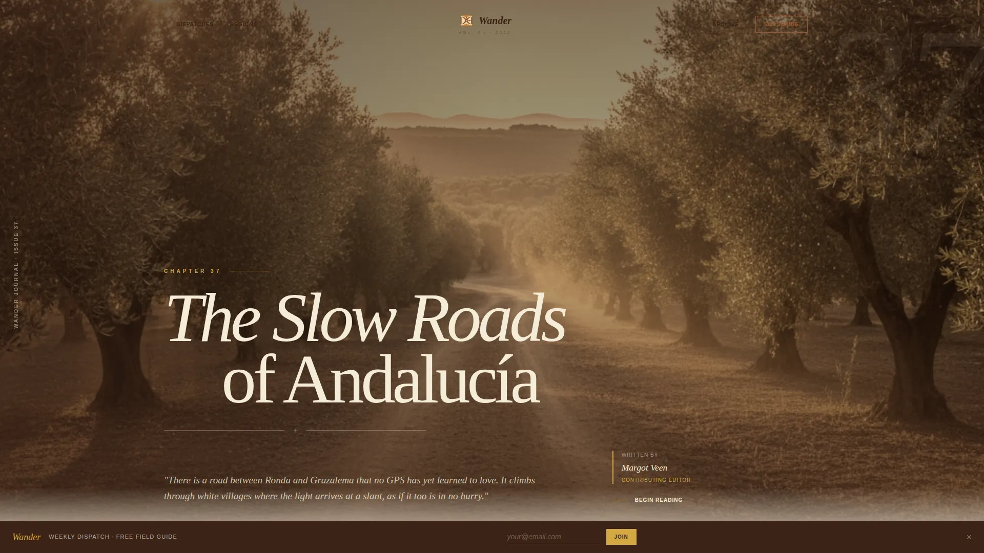
- A full-bleed chapter-style hero section with serif typography and a desaturated editorial photograph
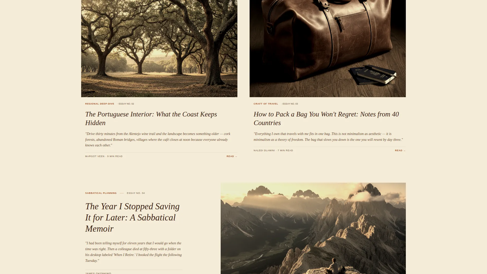
- An alternating essay card grid with full-width feature pieces and two-column shorter dispatches
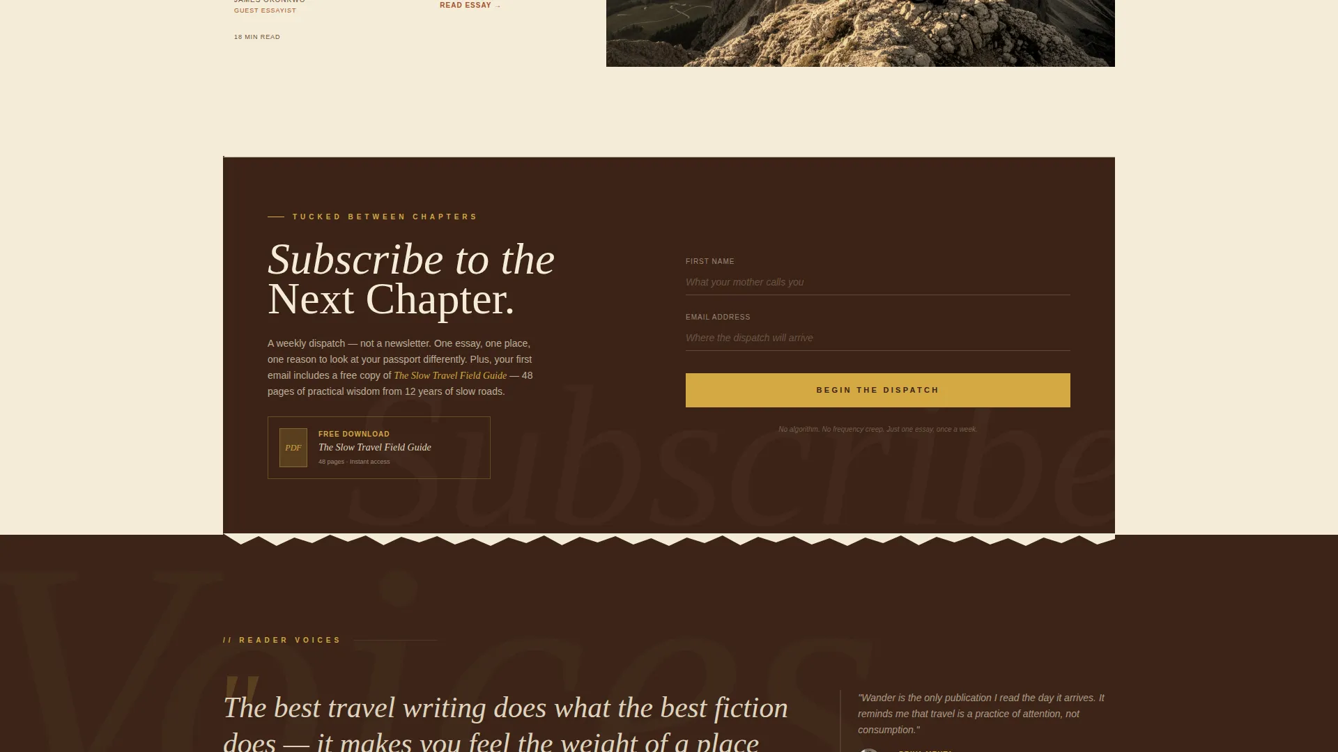
- A torn-paper subscription insert with a first-name and email field, positioned between essay cards and repeated as a footer ribbon
- A pull quote and reader testimonial block styled in deep walnut, plus an accordion dispatch archive
Feature list
This template bundles editorial layout intelligence with practical lead generation components. Each feature comes directly from the design brief and serves a specific conversion or storytelling purpose.
Chapter-Opening Hero Section
The hero fills the full viewport like the interior cover of a hardbound book. It includes a serif chapter title, a thin decorative rule, and an author byline set in small caps. A desaturated, grain-heavy photograph bleeds to the edges as an endpaper illustration, keeping the mood still and painterly.
Curated Essay Card Layout
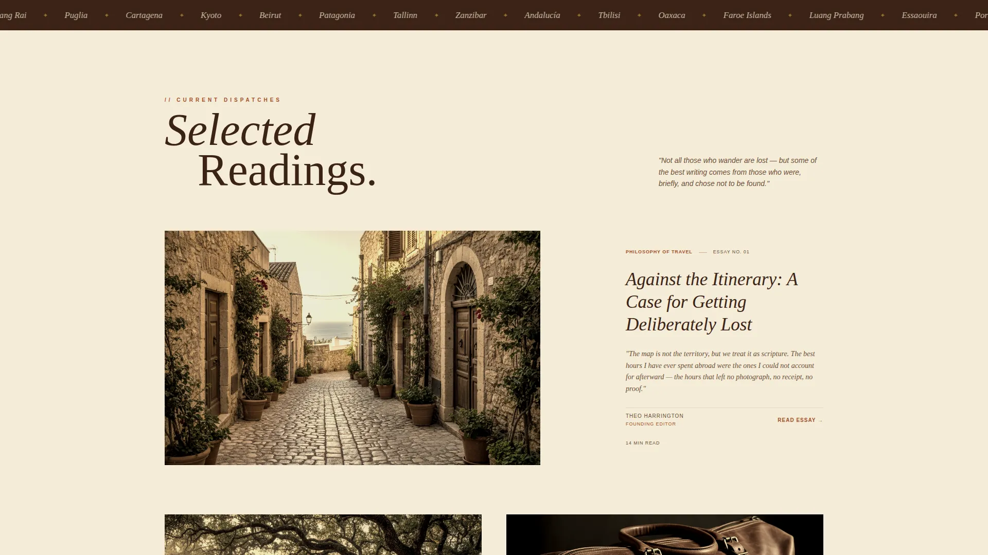
The scroll rhythm alternates between full-width feature essay cards and a two-column grid of shorter dispatches. Each card includes an editorial illustration, a two-line italic serif excerpt, and a region tag. This pacing mirrors a literary magazine where long reads breathe beside quick marginalia.
Scrolling Destinations Marquee
A marquee strip beneath the hero scrolls a ticker of destination names, giving visitors an immediate sense of the journal's geographic range. It adds quiet motion to an otherwise still, reading-focused page without disrupting the editorial tone.
Torn-Paper Subscription Insert
The primary lead generation moment is a form styled as a torn-paper insert tucked between chapters. It collects a first name and email address and frames the offer as a weekly dispatch rather than a newsletter. A secondary incentive, a free downloadable PDF called "The Slow Travel Field Guide," is gated behind the same form.
Reader Voices and Dispatch Archive
A dark walnut testimonial block displays reader quotes with bylines, reinforcing the journal's credibility through social proof. Below it, an accordion-style dispatch archive shows past issues with issue numbers, proving editorial depth and giving new visitors a reason to trust the publication.
Saffron Accent System for Interactive Moments
Pull quotes and highlighted links use a faded saffron color to draw the eye at key reading moments. This accent acts like a gold ribbon bookmark, guiding readers toward interactive elements without breaking the warm, tactile visual atmosphere.
Page sections overview
| Section | Purpose |
|---|---|
| Chapter Hero | Sets literary tone and voice |
| Marquee Destinations Strip | Shows geographic editorial range |
| Full-Width Essay Card | Features flagship long-form content |
| Two-Column Dispatch Grid | Presents shorter editorial pieces |
| Subscribe Insert | Captures email and first name |
| Pull Quote Block | Reinforces editorial credibility |
| Reader Voices | Displays social proof via testimonials |
| Dispatch Archive | Proves depth with past issues |
| Footer Subscription Ribbon | Provides final conversion moment |
Design & branding system
The visual identity is built around a Warm Artisan theme using a four-color Parchment and Rust palette. The overall feel is that of a leather-bound atlas left open on a sunlit wooden desk, warm, tactile, and rich with character.
- Aged parchment cream (#F5ECD7) dominates the reading surface; deep walnut ink (#3B2316) carries body text; terracotta rust (#A0522D) marks chapter headings and navigational anchors; faded saffron (#D4A843) highlights pull quotes and interactive links
- Typography uses Fraunces for serif display headlines, DM Serif Display for pull quotes, and Plus Jakarta Sans for body copy, creating a layered editorial typographic system
- Scroll reveals, image hover zoom, and the marquee strip add low-to-medium motion that never overwhelms the reading-first experience
Mobile & speed optimization
The template is designed desktop-first for long-form reading comfort, with full mobile optimization built in. The layout adapts cleanly so the editorial pacing reads well on any screen size.
- Images are lazy-loaded and the build favors a static-first approach, avoiding heavy JavaScript libraries that would slow the reading experience
- The two-column dispatch grid collapses gracefully for smaller viewports, keeping the curated collection feel intact on mobile devices
How this template helps you convert
Every layout decision in this template is made with a specific conversion moment in mind. The page does not ask for attention; it earns it through pacing, then converts through trust.
- The torn-paper subscription insert appears after the third essay card, reaching readers once they have already experienced the editorial voice and are primed to want more
- The free downloadable PDF, framed as a tangible field guide artifact, gives hesitant readers a concrete reason to share their email address
- A fixed footer ribbon repeats the subscription offer at the final scroll, catching visitors who read to the end without acting earlier
Other information about this template
This template is categorized under Blog and Editorial, within the Travel Blog and Media subcategory, and is purpose-built for the Travel Thought Leadership Blog niche. It is a strong fit for creators who want a landing page that reflects a distinct editorial identity rather than a generic blog theme.
- The footer follows an Arc Browser Split pattern, giving the page a clean and modern close that contrasts gently with the aged-paper aesthetic of the main scroll
- The header concept is classified as a Chapter and Book opening, making it well suited for journals, essay collections, and dispatch-based content publications
- The creative direction follows a Curated Collection approach, ideal for writers with an existing body of work who want to present it with the authority of a curated bookshop shelf
- The landing page direction is Lead Generation, meaning every section is arranged to support email capture as the primary business outcome
Theme
Warm Artisan
Creative direction
Curated Collection
Color system
Parchment & Rust
Style
Editorial/Magazine
Direction
Lead Generation
Page Sections
Chapter-opening Hero Section
Curated Essay Card Layout
Torn-paper Subscription Insert
Scrolling Destinations Marquee
Reader Voices and Dispatch Archive
Fixed Footer Subscription Ribbon
Related questions
Who is this template best suited for?
Can I use this template to offer a free download as a lead magnet?
Does the template include reader testimonials?
Is this a single-page or multi-page template?
What makes this design feel editorial rather than like a standard travel blog?



