Personal Blog Specialist Pre-Launch Website Template
Wander is an editorial gap year landing page built as a single-column, magazine-style waitlist experience. It combines a full-width newspaper masthead, data-driven credibility sections, and article preview cards to earn signups before launch. The "Save My Seat" form and sticky bottom bar capture first names and emails from curious readers who feel like early insiders.
by Rocket studio
Quick summary
Wander is a coming-soon landing page for an editorial gap year journal. It reads like a literary travel quarterly, with a newspaper masthead, gap year data callouts, and three article preview cards. A minimal waitlist form collects first names and emails, and a sticky bottom bar appears after 40% scroll to keep the call to action in reach.
Who this template is for
This template suits anyone building editorial credibility before a blog or digital journal goes live. It works especially well when your audience spans curious planners and nostalgic returnees.
- Gap year bloggers and travel writers preparing a pre-launch waitlist
- Independent editors and writers building an audience before their first issue drops
- Personal brand founders using a story-led, data-backed approach to earn early subscribers
What problem this template solves
Most coming-soon pages ask for an email before proving they are worth it. Wander earns the signup first. It builds trust through editorial tone, real-feeling data, and article previews that make readers feel they have found something before the crowd.
- Visitors leave blank waitlist pages because there is no proof of quality before the ask
- A single-column flow keeps readers reading deeper instead of bouncing at the hero
- The sticky call to action bar solves the timing problem by keeping signup visible without interrupting the read
What you get with this template
You get a fully structured, single-column landing page designed around editorial storytelling and waitlist conversion. Every section earns the reader's attention before asking for anything in return.
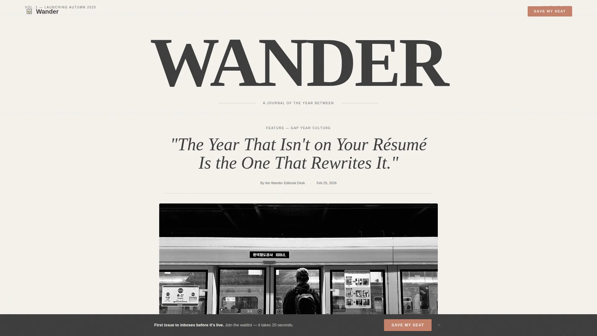
- A full-width newspaper masthead with display serif headline and editorial sub-headline
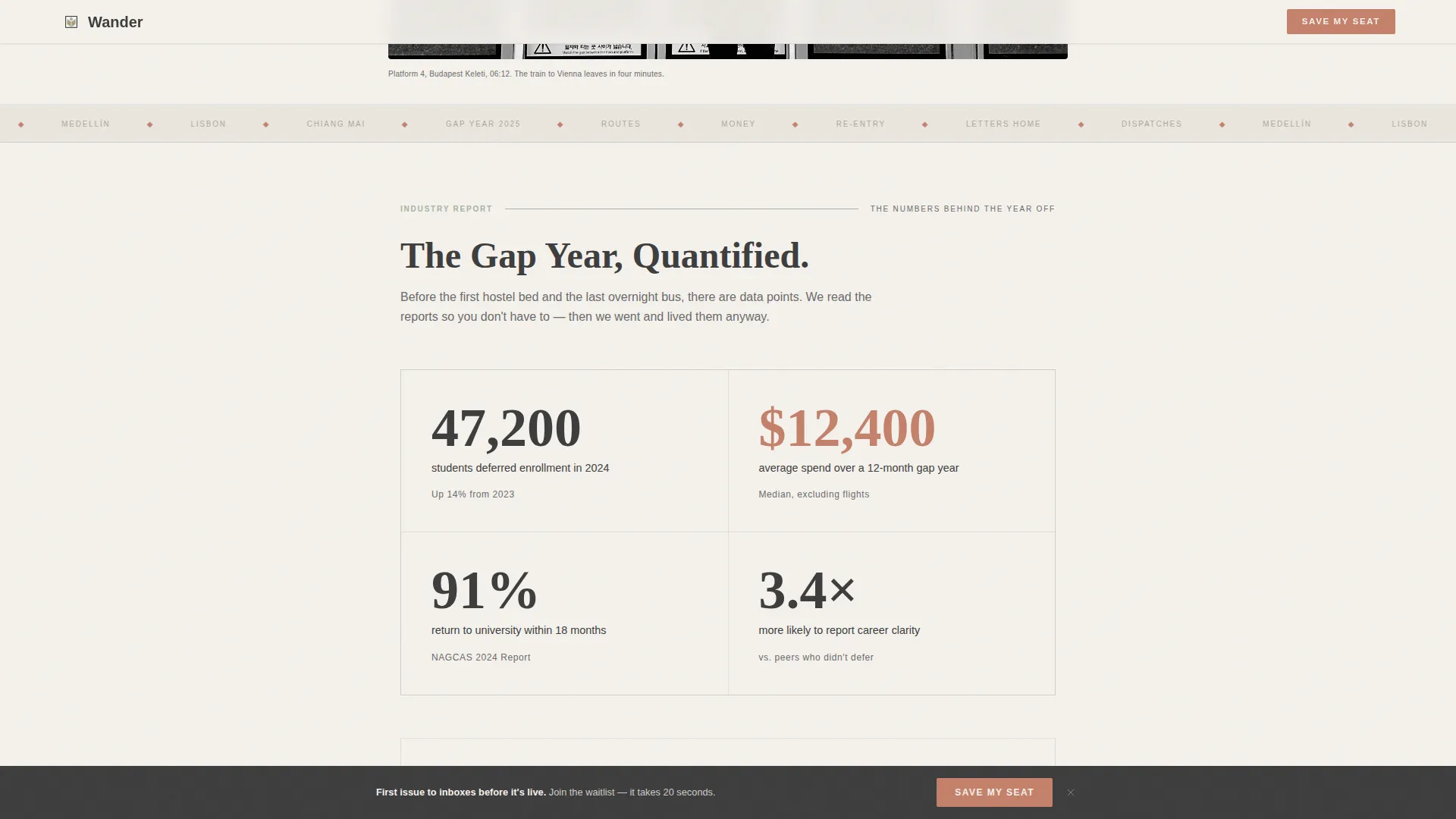
- A data report section with typographic callouts and minimal sage-and-terracotta line charts
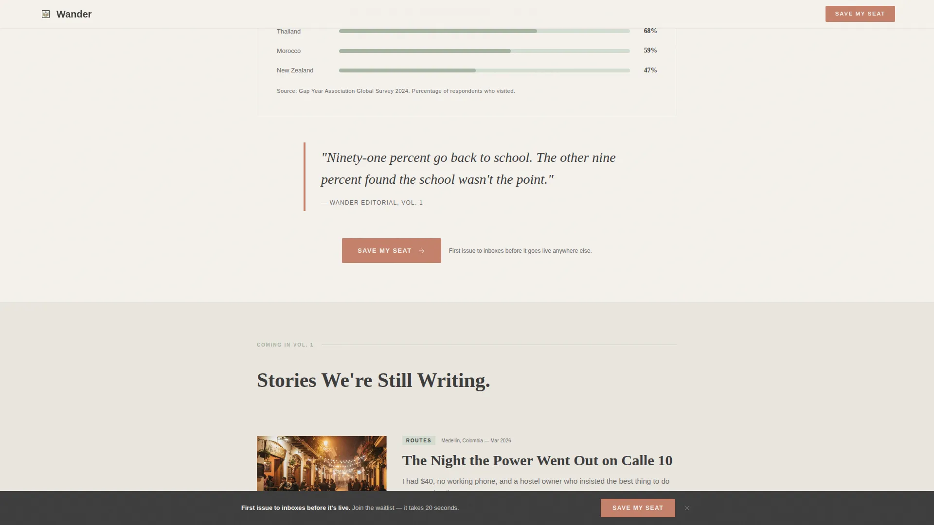
- Three article preview cards with datelines, plus a magazine table of contents and a two-field waitlist form with sticky bottom bar
Feature list
This template ships with six purpose-built sections and a cohesive visual system. Each piece is designed to move a first-time visitor from curiosity to commitment.
Full-Width Newspaper Masthead
The header renders "WANDER" in a tall, elegant serif across the full page width, styled like the front page of a literary travel quarterly. Below the masthead sits a large italic editorial headline, a byline, a thin rule, and a black-and-white hero photograph of a traveler at a train platform.
Gap Year Data Report Section
This section presents gap year statistics as elegant typographic callouts. Deferred enrollment numbers, average spend, top destination countries, and return-to-university rates are laid out as minimal line charts and oversized figures in sage and terracotta, establishing editorial authority before the first ask.
Editorial Article Preview Cards
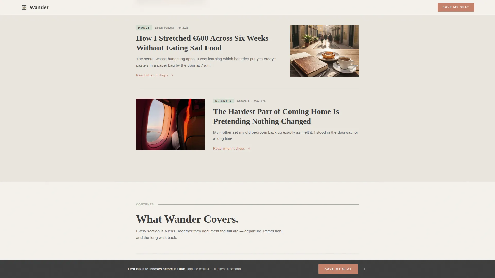
Three upcoming article cards show datelines and single-sentence opening hooks that read like the first line of a feature essay. Each card gives readers a taste of the journal's voice and signals the quality of what is coming.
Magazine Table of Contents
A structured contents section lists named editorial departments: Routes, Money, Re-Entry, and Letters Home. This anchors the journal's scope and shows readers exactly what kind of stories they are signing up to receive.
Waitlist Form with Sticky Bar
The primary call to action is a minimal form requesting only a first name and email. One optional checkbox asks if the reader is currently planning a gap year. A sticky bottom bar carrying the same "Save My Seat" action appears after 40% scroll and stays visible without blocking reading.
Scroll-Reveal Animation System
The template uses CSS scroll-behavior and Intersection Observer to animate sections into view as the reader scrolls. Marquee text, parallax effects, and hover states on cards add motion that matches the editorial energy without distracting from the content.
Page sections overview
| Section | Purpose |
|---|---|
| Hero Masthead | Sets editorial tone and introduces the journal identity |
| Data Report | Builds credibility through gap year statistics and charts |
| Editorial Previews | Shows article quality through datelines and essay hooks |
| Table of Contents | Maps the journal's departments and coverage scope |
| Waitlist Call to Action | Collects first name and email with minimal friction |
| Sticky Bottom Bar | Keeps signup visible after 40% scroll without interrupting |
| Footer | Closes with a minimal horizontal layout |
Design & branding system
The Soft Mist color system keeps every surface warm, slightly desaturated, and intimate. Typography pairs a display serif for headlines with a clean sans-serif for body text, matching the feel of a literary travel quarterly.
- Fog white (#F4F1EC) backgrounds, graphite (#3D3D3D) body text, sage (#A8B5A2) dividers and category tags, and terracotta (#C4816B) for links, pull quotes, and interactive moments
- Fraunces handles all display headlines; DM Sans handles body copy and form labels
- Black-and-white photography in the hero keeps the palette unified and the mood intimate
Mobile & speed optimization
The template is built desktop-first with strong mobile adaptation. The single-column flow makes the reading experience consistent across screen sizes without requiring layout changes.
- Scroll reveals and parallax effects use Intersection Observer and CSS scroll-behavior for smooth, lightweight animation
- The sticky bottom bar reflows cleanly on smaller screens, keeping the "Save My Seat" action accessible
- Typography scales down gracefully so the masthead and data callouts remain readable on phone screens
How this template helps you convert
Every design and content decision in Wander is built around earning trust before asking for anything. The conversion path is deliberate and sequential.
- The data section establishes editorial authority early, giving readers a reason to believe the journal is worth following before they see a form.
- Article preview cards create anticipation and a sense of exclusivity, making readers feel they have discovered something early rather than being sold something.
- The sticky bottom bar ensures the "Save My Seat" call to action is always one tap away once reader interest is established, without forcing the ask before it is earned.
Other information about this template
This template is categorized under Blog and Editorial, Personal Blog, and aligns with gap year content strategy for writers launching a journal-style publication. A few additional details worth knowing:
- The page is localized for English (United States) with USD formatting and MM/DD/YYYY date style
- The footer follows a minimal horizontal layout, consistent with clean publication-style closings
- The form copy reads "First issue drops to inboxes before it goes live anywhere else," reinforcing early-access positioning without promising a specific launch date
- The dateline in the masthead reads "Vol. 1, Launching Autumn 2025," giving the page a publication-ready identity
Theme
Editorial Magazine
Creative direction
Industry Report
Color system
Soft Mist
Style
Single Column Flow
Direction
Waitlist/Coming Soon
Page Sections
Full-width Newspaper Masthead
Gap Year Data Report Section
Editorial Article Preview Cards
Magazine Table of Contents
Waitlist Form with Sticky Bar
Scroll-reveal Animation System
Related questions
Can I change the masthead name from Wander to my own journal title?
Does the waitlist form connect to an email platform?
Can I remove or replace the data report section?
Is the sticky bottom bar easy to disable?
How much customization is needed before this template is ready to publish?



