Personal Blog Pre-Launch Website Template
Wander is a single-column editorial landing page built for a pre-launch gap year blog. It combines a literary magazine aesthetic with a waitlist capture flow, guiding readers from a bold newspaper masthead through data-rich callouts and essay-style article previews to a focused signup form. The result feels like discovering a quarterly journal before its first issue.
by Rocket studio
Quick summary
Wander is a coming-soon landing page template designed for a gap year editorial journal. It opens with a full-width publication masthead, moves through an industry-report data section, and closes with a waitlist form that earns the signup through editorial credibility. Every section scrolls like a feature-length magazine piece, not a promotional page.
Who this template is for
This template suits creators who want to launch a gap year blog or editorial project with a strong first impression before publishing a single post. It works best when the goal is building an early-reader list rather than driving immediate traffic to live content.
- Gap year bloggers and travel writers preparing a pre-launch content brand
- Students, recent graduates, or returning travelers starting a personal editorial project
- Creators who want a waitlist page that feels like a real publication, not a placeholder
What problem this template solves
Most coming-soon pages feel thin. They make a promise but give the visitor no reason to believe it. Wander solves this by front-loading editorial credibility through real-feeling data callouts and essay-quality article hooks before asking for anything.
- Visitors leave waitlist pages early when there is nothing compelling to read first
- A blank "notify me" form fails to communicate what the publication actually stands for
- Launching without a clear visual identity makes it hard to attract the right early readers
What you get with this template
You get a fully structured single-column landing page built around five distinct sections, each serving a different stage of the reader journey. The layout moves from curiosity to identification, earning trust before presenting the signup.
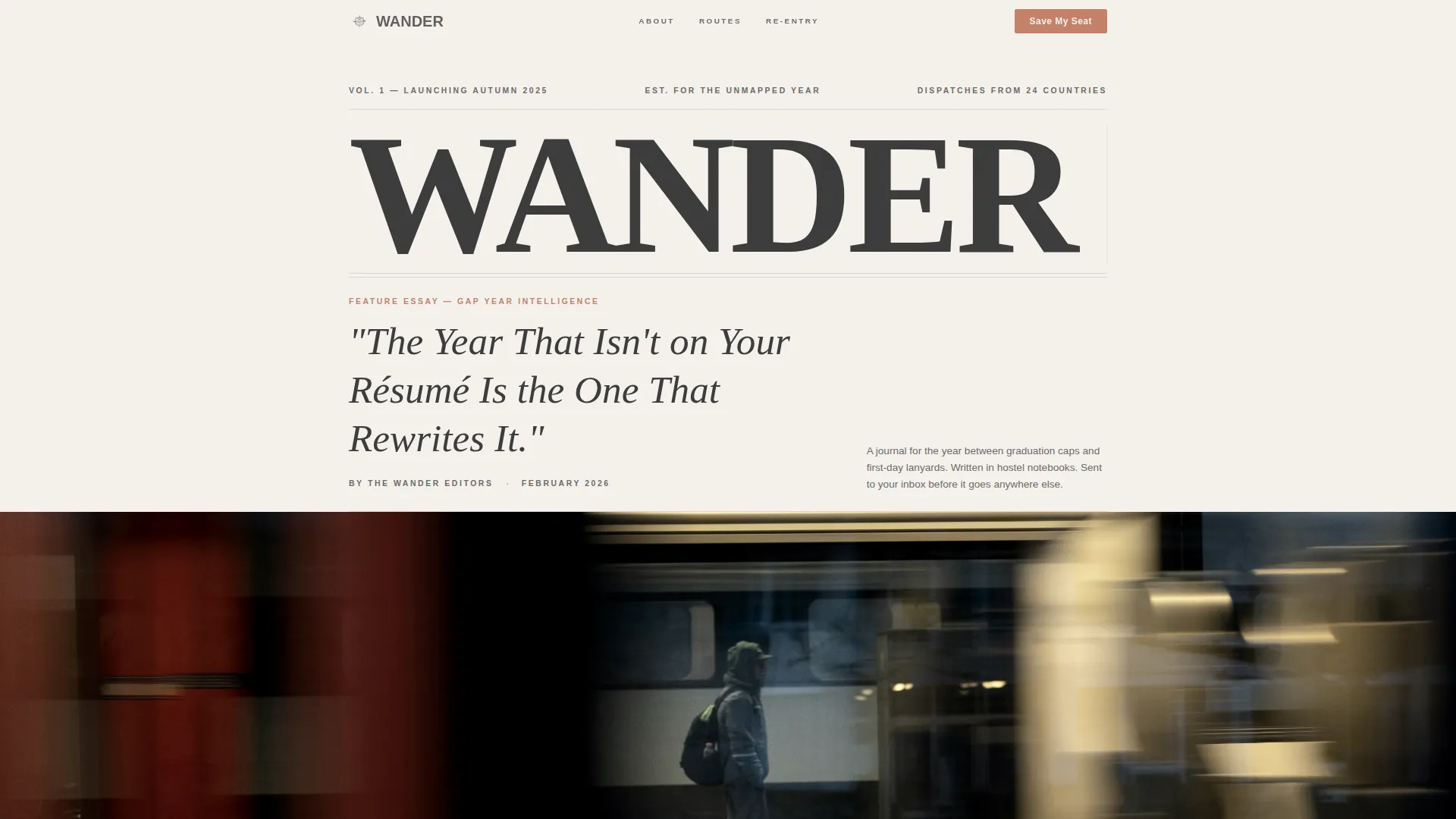
- A newspaper-style masthead hero with an editorial headline, byline, thin rule, and a black-and-white traveler photograph
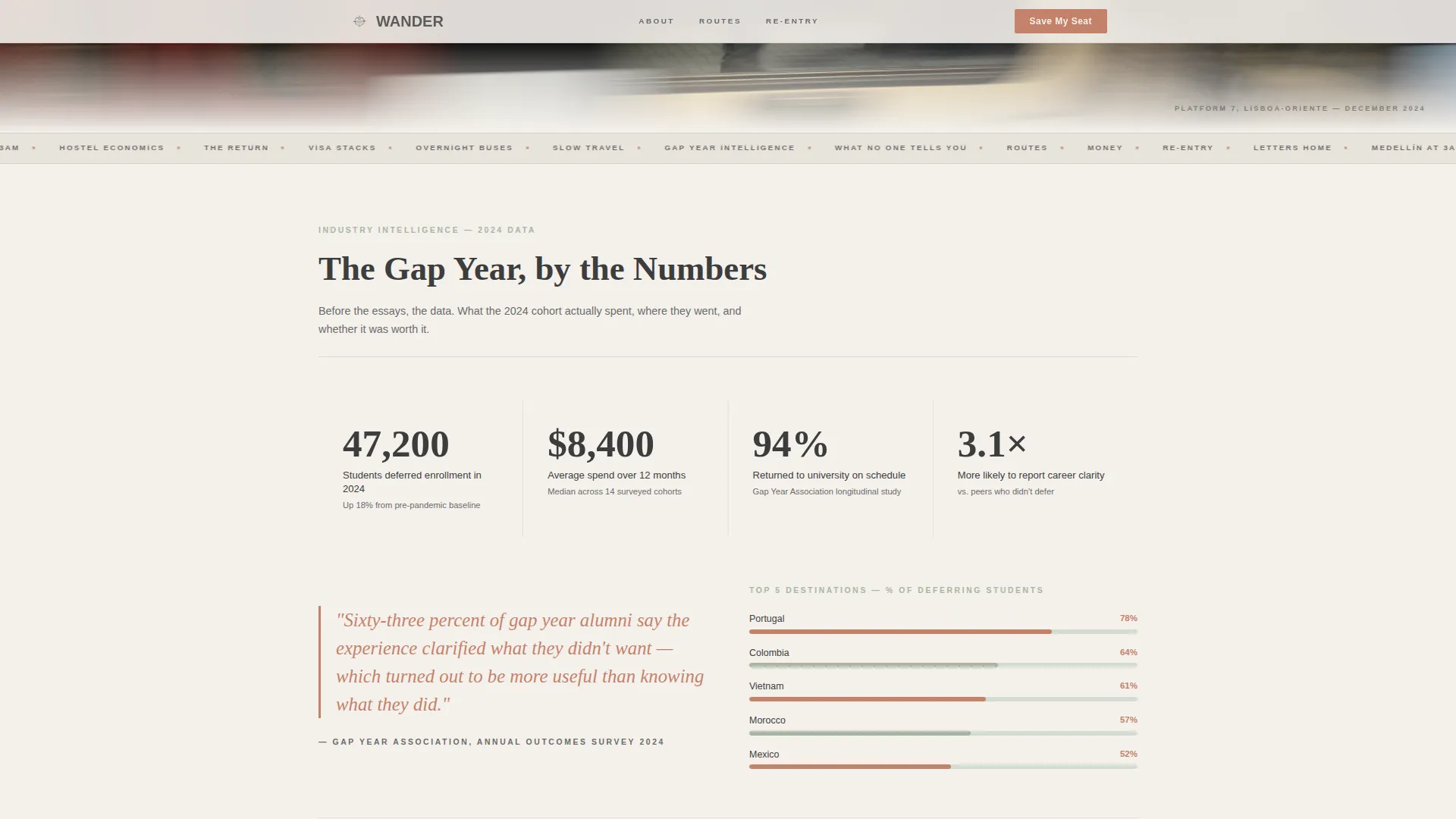
- A data section with typographic callouts and minimal line charts styled in sage and terracotta
- Three upcoming article preview cards with datelines and essay-opening hooks, a magazine table of contents block, a dual-placement waitlist form, and a sticky bottom bar that appears after 40 percent scroll
Feature list
This section covers the core built-in capabilities delivered by the Wander template as described in the source brief.
Full-Width Publication Masthead
The header renders "WANDER" in a tall elegant serif across the full page width, styled like the front page of a literary travel quarterly. A dateline, large italic editorial headline, byline, thin rule, and a black-and-white hero photograph complete the opening.
Data Section with Typographic Callouts
The second section presents gap year statistics as elegant typographic callouts and minimal line charts. Figures covering student deferral numbers, average spend, top destinations, and return-to-university rates are rendered in the sage and terracotta palette for visual hierarchy.
Essay-Style Article Preview Cards
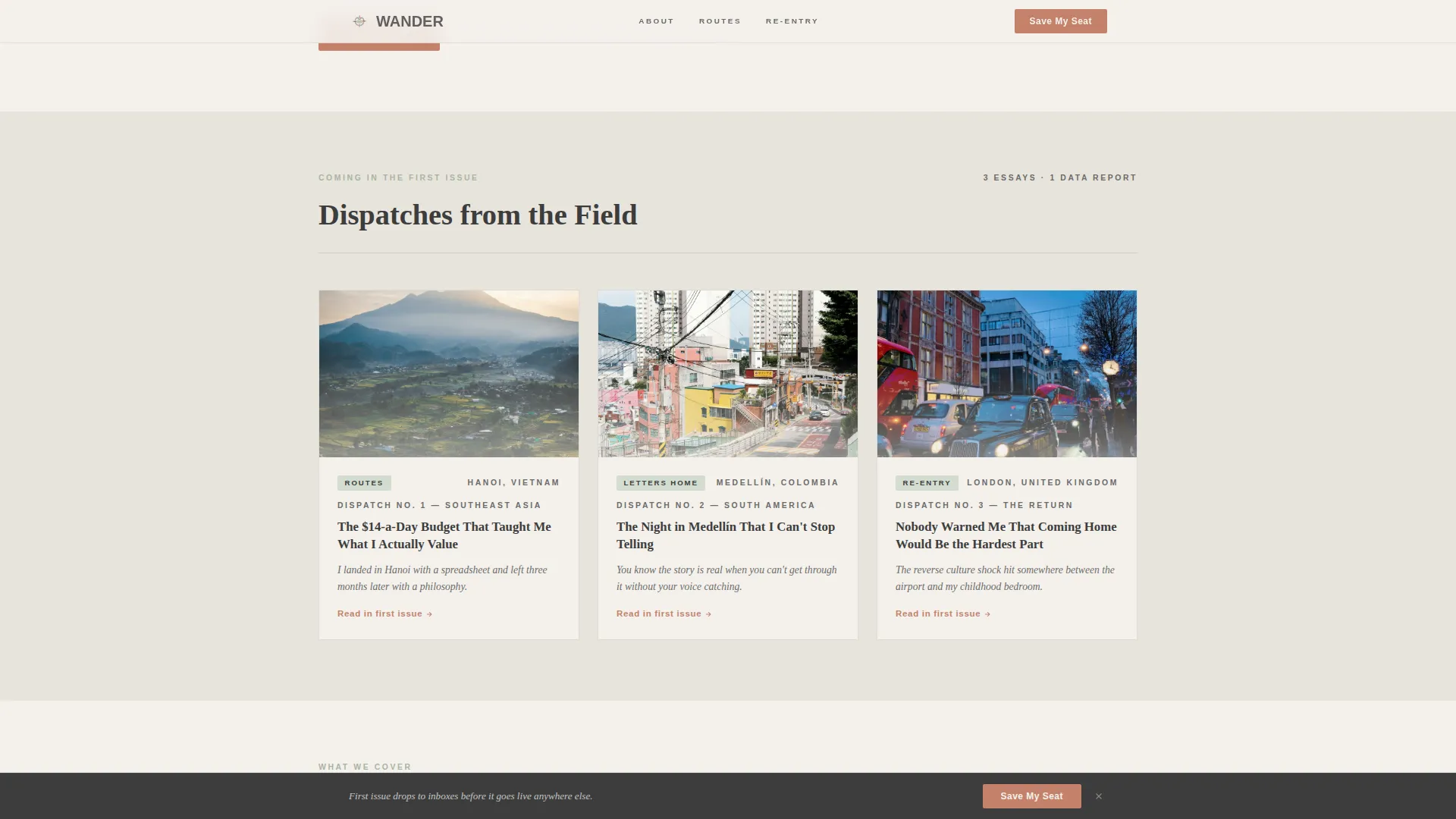
Three upcoming article cards each carry a dateline and a single-sentence hook written to read like the opening line of a long-form essay. This section signals editorial ambition and gives visitors a preview of the publication's voice before it launches.
Magazine Table of Contents Block
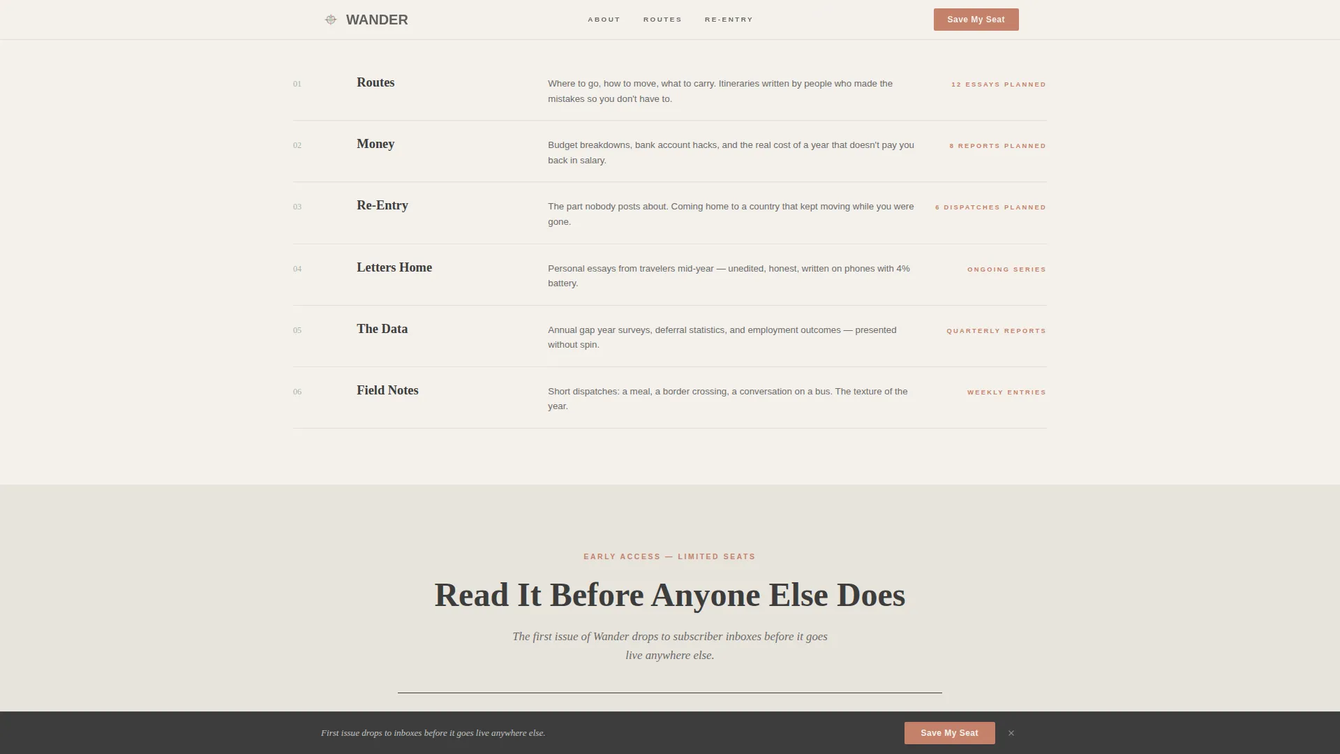
A structured "what we cover" section organizes the journal's planned coverage into named departments: Routes, Money, Re-Entry, and Letters Home. The layout mirrors a print magazine contents page and communicates editorial scope at a glance.
Dual-Placement Waitlist Form
The waitlist form appears once below the data section and again as a sticky bottom bar triggered after 40 percent scroll. It asks only for a first name and email, with one optional checkbox for readers currently planning a gap year. No launch date is promised.
Scroll-Triggered Sticky Bar
A sticky call-to-action bar rises into view once the reader has scrolled past 40 percent of the page. It keeps the signup option visible without interrupting the reading experience earlier in the scroll flow.
Page sections overview
| Section | Purpose |
|---|---|
| Masthead Hero | Establishes publication identity and tone with editorial headline and hero photo |
| Gap Year Data | Builds credibility through statistics, typographic callouts, and minimal charts |
| First Call to Action | Captures early signups immediately after the data section proves editorial weight |
| Article Preview Cards | Shows upcoming essay hooks and datelines to communicate the journal's voice |
| Table of Contents | Outlines coverage departments so readers know exactly what the publication will cover |
| Waitlist Signup Form | Final conversion section with exclusivity framing and optional planning checkbox |
| Sticky Bottom Bar | Persistent signup prompt visible after 40 percent scroll without disrupting reading |
| Footer | Horizontal flow footer closing the page cleanly |
Design & branding system
The Soft Mist color system gives Wander the feel of a photograph left on a windowsill: warm, slightly desaturated, and intimate without effort. Typography pairs a tall serif display face with a clean sans-serif body to balance literary and editorial registers.
- Fog white (#F4F1EC) for backgrounds, pencil graphite (#3D3D3D) for body text, faded sage (#A8B5A2) for section dividers and category tags, and quiet terracotta (#C4816B) reserved for links, pull quotes, and interactive moments
- Display type is set in a tall elegant serif; body copy uses a clean humanist sans-serif; the combination echoes a literary quarterly without feeling decorative
- Scroll reveal animations and hover states add medium-level motion; a marquee element supports the editorial rhythm of the page
Mobile & speed optimization
The template is built desktop-first with a mobile-responsive layout, reflecting the editorial reading experience as the primary intent. The codebase prioritizes static delivery with minimal JavaScript to keep the page light.
- Static-first build with minimal JavaScript keeps load overhead low for a content-heavy single-column layout
- The sticky bar, scroll reveal animations, and waitlist form are all designed to function cleanly on smaller viewports without breaking the reading flow
How this template helps you convert
Wander earns the signup before asking for it. The page structure moves the reader through three stages: credibility, identification, and invitation.
- The data section establishes that the publication takes gap years seriously, giving readers a reason to trust the source before any form appears
- Article preview cards and the table of contents let the reader see themselves as the intended audience, moving from curiosity to personal connection
- The dual-placement waitlist form with exclusivity framing ("first issue drops to inboxes before it goes live anywhere else") creates a low-friction, high-motivation moment to sign up
Other information about this template
This template was designed specifically for the gap year editorial niche, where the audience spans active planners, curious graduates, supportive parents, and nostalgic returning travelers. The layout and tone are calibrated for that range.
- The page works as a standalone pre-launch asset and does not require any live blog posts to be effective
- The optional "I'm currently planning a gap year" checkbox gives early list data without adding form friction
- Typography uses Fraunces for serif display headings and DM Sans for body copy, both chosen for their editorial warmth and screen readability
- The footer follows a horizontal flow pattern suited to a single-column editorial layout
- The template is categorized under Blog and Editorial, Personal Blog, within the gap year content niche
Theme
Editorial Magazine
Creative direction
Industry Report
Color system
Soft Mist
Style
Single Column Flow
Direction
Waitlist/Coming Soon
Page Sections
Full-width Publication Masthead
Data Section with Typographic Callouts
Essay-style Article Preview Cards
Magazine Table of Contents Block
Dual-placement Waitlist Form
Scroll-triggered Sticky Bar
Related questions
Do I need existing blog content to use this template?
Can I change the waitlist form fields?
What does the sticky bottom bar do?
Is this template suitable for a personal gap year journal?
Can I update the statistics in the data section?



