Expert Travel Blog & Media Blog & Content Website Template
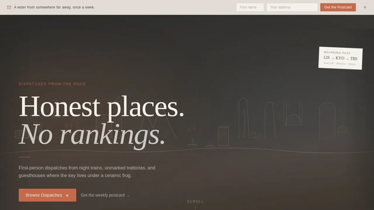
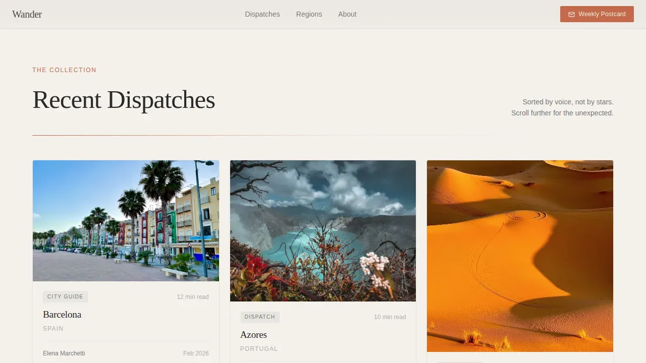
Wander is a masonry-style travel blog landing page built for editorial journals and voice-driven travel writers. It pairs a custom illustrated hero with a Pinterest-style dispatch grid, a sticky email signup bar, and terracotta hover states that earn every click. The design feels like a well-traveled notebook, warm, unhurried, and perfectly curated for discerning travel enthusiasts.
by Rocket studio
Quick summary
Wander is a single-page editorial travel blog landing page template designed for writers who trade in honest first-person dispatches. A hand-illustrated full-viewport hero sets the tone. Below it, a masonry grid of destination cards earns clicks through writer voice fragments. A sticky postcard signup bar converts curious visitors into loyal readers.
Who this template is for
This template is perfect for travel writers, editorial blogs, and content-led travel publishers who want a landing page that reads as distinctly as it looks. The design suits anyone whose audience trusts a writer's voice more than an algorithm's recommendation.
- Mid-career travel writers launching or refreshing a personal travel blog
- Editorial travel agencies and small media teams wanting a stunning landing page
- Solo travelers and couples building a curated content site around one strong voice
What problem this template solves
Most travel blog landing pages force readers to choose between beautiful design and compelling writing. They either drown the blog in full-bleed stock images or reduce every dispatch to a thumbnail and a headline. Neither approach earns the click.
- Generic travel landing page layouts flatten every destination into the same visual formula
- Standard templates make it hard for a writer's voice to surface before the reader leaves
- Bland grid designs fail to reward curiosity or pull visitors toward less familiar destinations
What you get with this template
This template gives you a complete, ready-to-use travel landing page with every section already designed and structured. The layout balances inspirational storytelling with a conversion-focused structure so visitors stay longer and explore more.
- A full-viewport custom illustration header with a serif headline and a sticky postcard signup bar
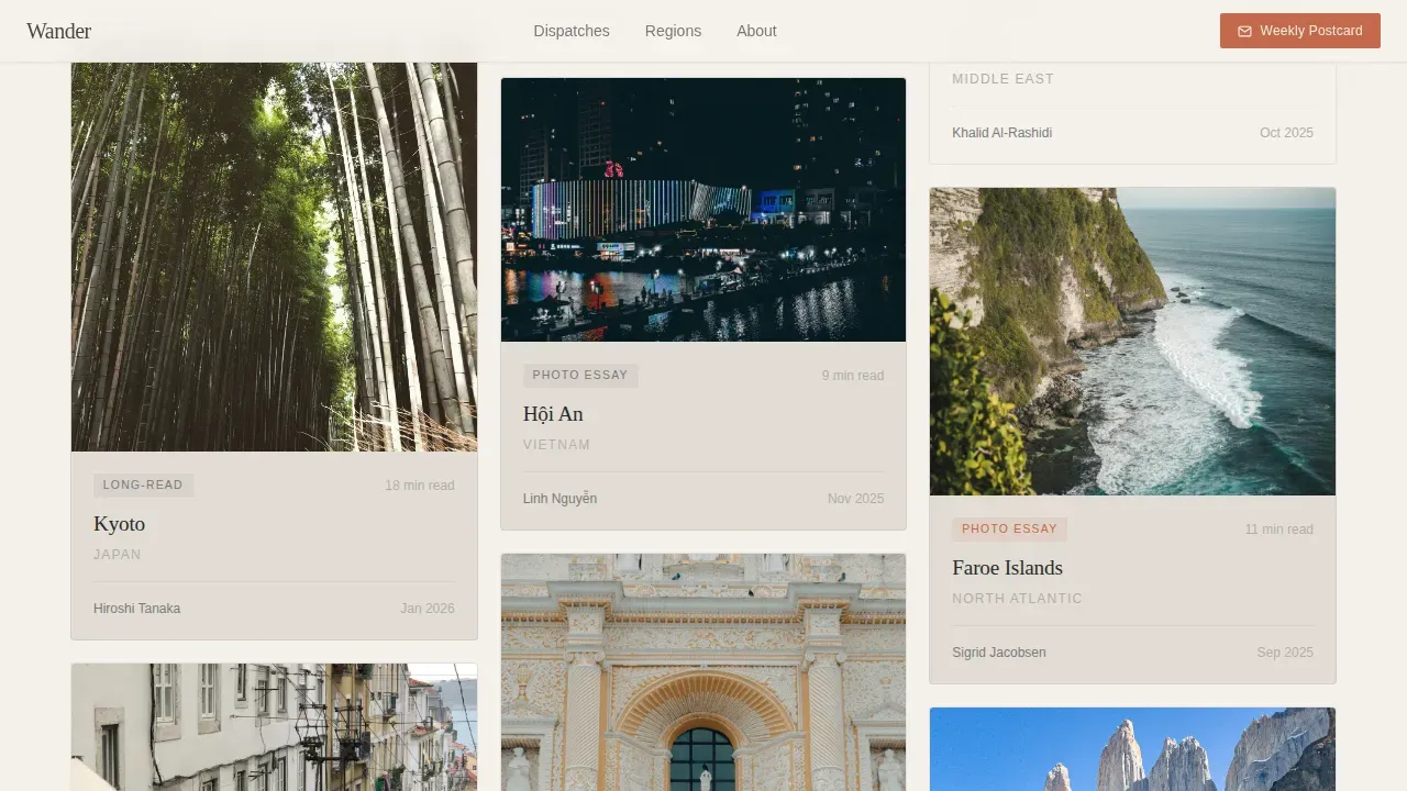
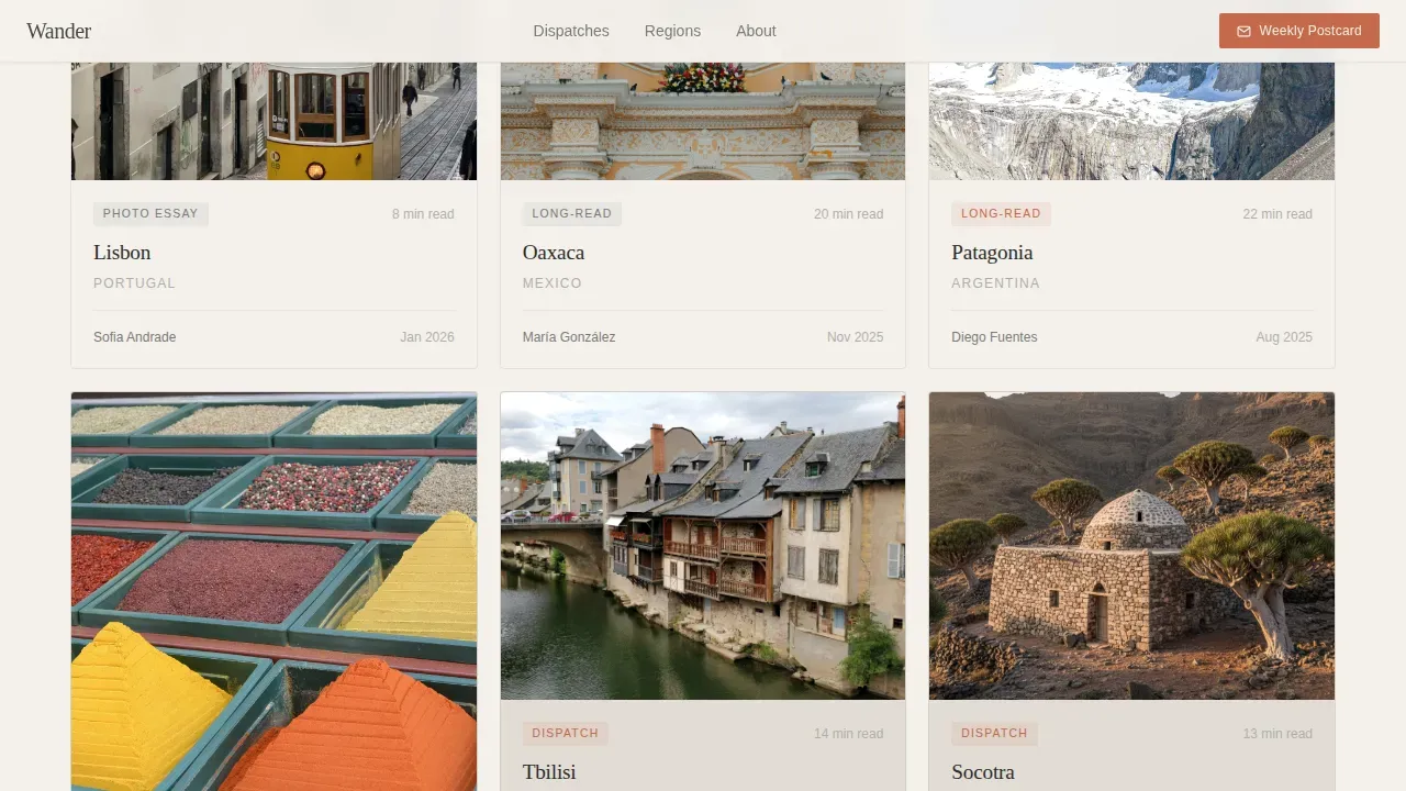
- A masonry grid of destination review cards in varied sizes, each with a hover voice-hook and a terracotta call-to-action
- A Weekly Postcard email signup section framed as a letter from a friend, requiring only a first name and email address
Feature list
This travel blog landing page template ships with six carefully considered features. Each one serves the editorial adventure the template is designed to create.
Hand-Illustrated Panoramic Hero
The header spans the full viewport with a custom ink-and-watercolor illustration blending a dozen breathtaking destinations into one continuous horizon. A single serif headline, "Honest places. No rankings," sits low in the frame. This hero shot immediately reflects the blog's aesthetic and sets the editorial tone before a visitor reads a single word.
Masonry Destination Card Grid
The Pinterest-style masonry grid mixes vertical long-reads, square photo essays, and wide-format city guides at varied sizes. High-impact masonry image galleries are crucial for showcasing travel experiences, and this layout delivers exactly that. Cards appear in a staggered entry animation as users scroll, and the collection subtly shifts from popular to unexpected destinations the further down the page they go.
Hover Voice-Hook Reveals
Each card reveals a one-sentence writer voice fragment on hover, not a summary but a taste of tone. The primary call-to-action, "Read the Full Dispatch," appears in terracotta red on the same hover state. This interaction makes the blog feel alive and gives every card a pull that a static title never could.
Sticky Postcard Signup Bar
A persistent top bar offers the secondary conversion path throughout the entire page. It invites visitors to "Get the Weekly Postcard" with minimal friction, asking only for a first name and email address. The bar stays visible as users scroll without interrupting the reading experience.
Soft Mist Editorial Color System
The four-color palette uses fog white, faded linen, pencil-sketch graphite, and terracotta postmark red. Terracotta appears sparingly, reserved for links, pull quotes, and hover states, so every instance feels deliberate. A minimalist layout with ample white space and a neutral color palette helps photos and articles stand out across the entire page.
Scroll-Linked Animation Layer
Scroll-linked parallax, staggered card entries, and hover reveal interactions are built into the page using Intersection Observer and CSS-only parallax techniques. These animations create a reading rhythm that feels editorial rather than mechanical, keeping travel enthusiasts engaged as they explore deeper into the grid.
Page sections overview
| Section | Purpose |
|---|---|
| Illustrated Hero Header | Sets editorial tone with a panoramic custom illustration and serif headline |
| Sticky Postcard Bar | Offers persistent email signup without interrupting scroll |
| Masonry Dispatch Grid | Showcases destination reviews in varied card sizes with hover interactions |
| Weekly Postcard Signup | Converts readers with a letter-framed, low-friction email form |
| Footer | Closes the page with horizontal flow layout and navigation links |
Design & branding system
The design follows an Editorial Magazine theme, referencing the feel of a sun-bleached postcard found between the pages of a secondhand paperback. Every design decision serves the writing, never competes with it.
- Typography pairs Fraunces serif for headlines with DM Sans for body text and interface elements, keeping the page easy to read at any size
- The Soft Mist color system alternates fog white (#F4F1EC) and faded linen (#E2DDD5) backgrounds, with graphite (#4A4A48) for text and terracotta (#C46A4A) used sparingly as a deliberate accent
- The overall visual language is loose and editorial, referencing dog-eared Moleskine notebooks, boarding passes, and ink-line illustrations that would anchor a magazine's annual travel issue
Mobile & speed optimization
A well-designed travel landing page must perform on the devices where readers actually explore. Mobile optimization matters because over 70% of travel research happens on mobile devices, and fast loading speeds protect the reader's attention from the first second onward.
- The masonry grid is desktop-first in design but restructures responsively so mobile users can explore cards and access hover-triggered content through tap interactions
- Scroll animations use Intersection Observer so they activate only when elements enter view, keeping the page light and the experience smooth
- The sticky postcard bar and email form remain easy to reach and simple to complete on any screen size
How this template helps you convert
This travel landing page is built around a single, focused conversion goal: turn curious visitors into engaged readers and email subscribers. The design balances adventure and editorial storytelling with deliberate conversion touchpoints.
- Every masonry card acts as a doorway, with a voice-hook crafted to start a sentence the reader's brain needs to finish, pulling them toward "Read the Full Dispatch" in terracotta red
- The sticky postcard bar keeps the email signup path visible at every scroll depth without breaking the reading experience, making it easy for adventure seekers to subscribe the moment they feel ready
- The page rewards exploration by shifting from familiar to unexpected destinations as users scroll deeper, building trust and extending time on page before the next adventure begins
Other information about this template
This template is ready to adapt for a wide range of travel blog and editorial agency website projects. It functions equally well as a personal writer's site or as the public face of a small travel agency. Users can find and replace placeholder content with their own dispatches, images, and voice-hooks without needing technical skills.
- This template is compatible with design tools like Figma, Adobe XD, and Sketch, making it easy to customize colors, typography, and card content for your next project
- The Wander curated editorial travel blog landing page template is a strong starting point for any editorial agency website or travel blog that wants to protect its voice while growing its audience
- High-visibility newsletter signup forms are essential for building a loyal audience, and the postcard bar in this template is designed to do exactly that, with simple copy and minimal fields
- The website template supports a range of travel tips and exploration content formats, from long-form dispatches to short photo essays, giving the site flexibility as the blog grows
- No-code tools and drag-and-drop platforms make it easy for users to launch a travel website quickly, and this template is structured to work within those workflows without sacrificing design quality
Theme
Editorial Magazine
Creative direction
Curated Collection
Color system
Soft Mist
Style
Masonry/Pinterest
Direction
Click-Through
Page Sections
Hand-illustrated Panoramic Hero
Masonry Destination Card Grid
Hover Voice-hook Reveals
Sticky Postcard Signup Bar
Soft Mist Editorial Color System
Scroll-linked Animation Layer
Related questions
Who is this travel blog landing page template best suited for?
Can I change the destination cards and written content?
Does this template include the email signup functionality?
Is the masonry grid responsive for mobile users?
How many sections does this landing page include?



