Auto & Mobility Blog Portfolio & Case Study Website Template
Waypoint is an editorial landing page template built for autonomous vehicle publications. It uses a 60/40 asymmetric grid, a Warm Artisan color palette, and Gallery Walk creative direction to deliver a reading experience that feels like a curated exhibition. Feature excerpts, sensor diagrams, subscriber inputs, and contributor portraits are all laid out with letterpress-broadsheet precision.
by Rocket studio
Quick summary
Waypoint is a single-page editorial template for autonomous vehicle journals. It pairs long-form feature writing with annotated imagery inside a 60/40 asymmetric grid. The Ink and Paper color system and serif-led typography give every section the weight of a printed broadsheet. It is built to earn article click-throughs and newsletter subscriptions from technically minded readers.
Who this template is for
This template is written for publishers, independent editors, and editorial teams who cover self-driving technology with genuine depth. It suits readers who expect rigorous prose alongside visual precision.
- Embedded engineers and perception-stack developers who need a publication they can trust technically
- Mobility-policy analysts and municipal researchers who need narrative clarity alongside factual depth
- Curious early adopters who experienced a robotaxi for the first time and want serious context
What problem this template solves
Most blog templates are built for listicles and product roundups, not for long-form technical journalism. Autonomous vehicle coverage deserves a layout that holds complex ideas without losing the reader's attention.
- Generic blog grids flatten every article into the same visual weight, killing editorial hierarchy
- Standard newsletter sections look like transactional forms, not editorial invitations
- Sensor diagrams and annotated photographs have nowhere natural to live alongside flowing editorial prose
What you get with this template
You get a complete single-page layout that reads more like an exhibition than a scroll. Every component is designed to serve the writing first and the reader second, never the other way around.
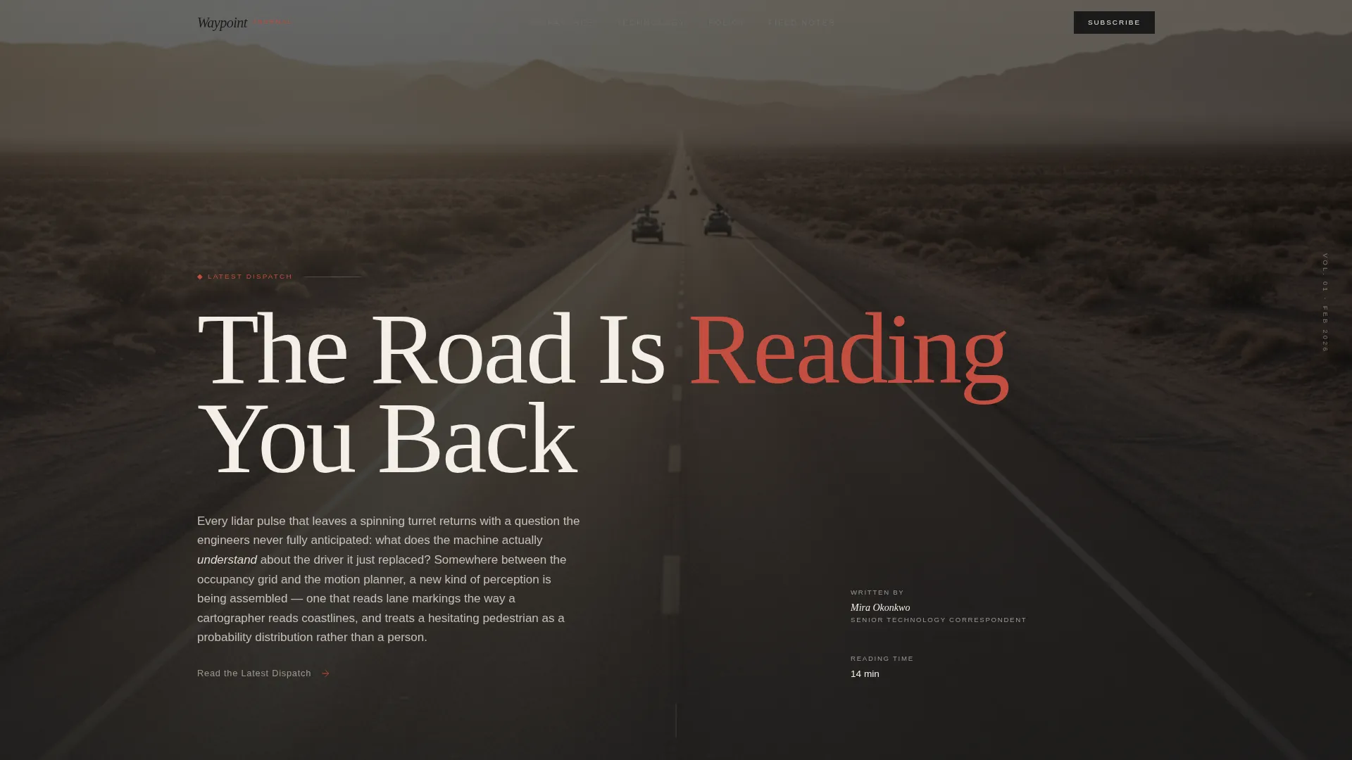
- A Type Over Image hero with a massive serif headline over a desaturated desert road photograph
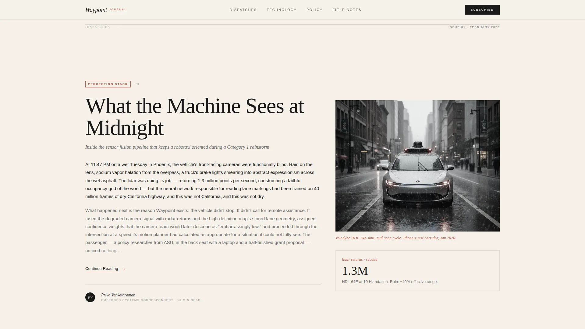
- A 60/40 asymmetric editorial grid with three feature previews, sensor diagrams, and marginalia-style data callouts
- A persistent 40-column gutter email subscription input with a blinking cursor and annotation-red send arrow
Feature list
This section describes the core built-in capabilities of the Waypoint template as defined in the source brief.
Type Over Image Hero Section
A wide desaturated photograph of an empty desert road at golden hour anchors the top of the page. Over it, a massive Fraunces serif headline sits unhurried and heavy, with a single word picked out in annotation-red. The image gives the words a landscape to breathe against rather than competing with them.
60/40 Asymmetric Editorial Grid
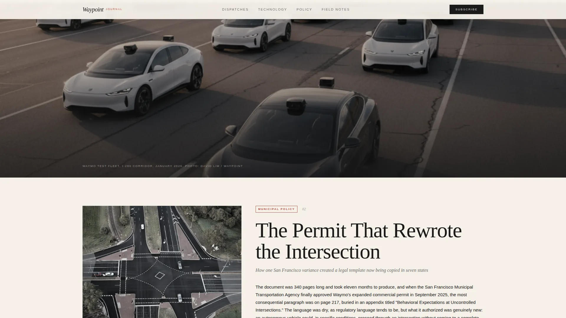
The primary layout divides the page into a 60-column editorial track and a 40-column visual track. Long-form feature excerpts live in the wider column. Sensor diagrams, annotated test-fleet photographs, and data callouts styled like handwritten marginalia shift through the narrower column as the reader scrolls.
Gallery Walk Scroll Rhythm
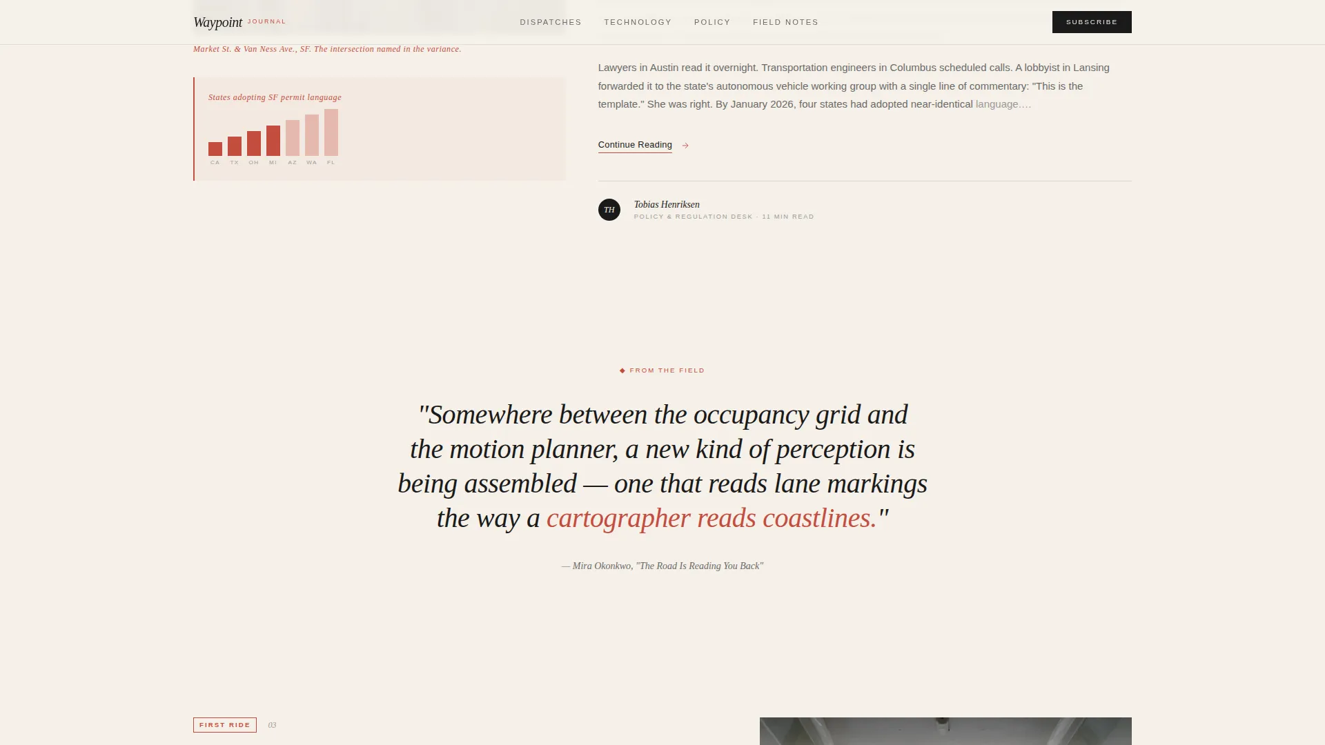
Each scroll section is treated as a new room in an editorial exhibition. A wide image bleeds full-width, then the grid reasserts itself, then a single blockquote floats in white space. The rhythm changes section by section so the reader strolls rather than scrolls.
Click-Through Call-to-Action System
The primary call to action, "Read the Latest Dispatch," appears first as a subtle text link beneath the header excerpt. It resurfaces as a full-width banner after the third editorial preview, styled with a torn-paper edge that visually separates sections. The template earns the click by giving away rich feature paragraphs before cutting mid-insight.
Persistent Newsletter Subscription Input
A secondary conversion path lives in the 40-column gutter throughout the page. It is a single email input field with no surrounding box, just a blinking cursor and a send arrow rendered in annotation-red. The minimal form feels editorial rather than transactional.
Contributors and Masthead Section
Natural-light contributor portraits and bylines appear in a dedicated section before the footer. Publication count and reader-demographics callouts add social proof without breaking the editorial tone.
Page sections overview
| Section | Purpose |
|---|---|
| Hero Type Over Image | Serif headline over desert road photo establishes editorial identity and surfaces the first click-through link |
| Editorial Trio Grid | Three feature previews in a 60/40 grid with sensor diagrams and marginalia callouts |
| Full-Width call to action Banner | Torn-paper-edge banner resurfaces the primary "Read the Latest Dispatch" call to action |
| Field Notes Subscription | Persistent gutter email input captures newsletter subscribers with minimal friction |
| Contributors and Masthead | Natural-light portraits and bylines build editorial credibility and social proof |
| Footer Horizontal Flow | Minimal horizontal footer closes the page cleanly without visual noise |
Design & branding system
The Warm Artisan theme drives every visual decision. The palette is drawn from letterpress printing on cotton stock: tactile warmth placed directly against the mechanical precision of the subject matter.
- Color system uses aged parchment (#F5F0E8) as the background, fountain-pen black (#1A1A1A) as the primary ink, soft pencil graphite (#6B6B6B) for secondary text, and annotation-red (#C44D3F) reserved strictly for highlights, pull-quotes, and hover states
- Typography pairs Fraunces as the serif display face for headlines and blockquotes with DM Sans as the clean body and interface face
- Interactive states include image grayscale-to-color transitions on hover and annotation-red hover states on links and navigation elements
Mobile & speed optimization
The template is designed desktop-first to serve engineers and analysts reading on monitors, with full mobile support built in from the start.
- Scroll-linked parallax, staggered text entrances, and image reveal animations are set at a medium intensity level that remains smooth on mobile viewports
- Server Components handle static editorial content, keeping JavaScript minimal so page load stays light even with rich imagery
- The 60/40 grid collapses gracefully at smaller breakpoints so feature excerpts and visual callouts remain readable on any screen size
How this template helps you convert
Waypoint is built around a deliberate two-path conversion strategy. It gives readers enough to trust the writing, then directs them clearly toward the next step.
- The editorial trio cuts each feature excerpt mid-insight, giving readers a compelling reason to click through to the full article rather than treating the landing page as a destination
- The torn-paper-edge full-width banner reintroduces the primary call to action after enough reading to earn the click, positioned at the moment of peak curiosity
- The persistent gutter subscription input means the newsletter option is always visible without interrupting the reading flow, making sign-up feel like a natural continuation rather than an interruption
Other information about this template
Waypoint is a strong fit for editorial projects in the autonomous vehicle space that need a layout with both technical credibility and literary warmth. It is equally suited to independent publishing ventures and branded editorial arms of mobility companies.
- The template is built with Fraunces and DM Sans, both available via Google Fonts, making typography setup straightforward
- Animation intensity is set at a medium level and can be adjusted to match the publication's pacing preference
- The footer uses a Vercel Horizontal Flow minimal pattern, keeping the close of the page clean and uncluttered
- The template is localized for English-language publications with no currency or e-commerce dependencies
Theme
Warm Artisan
Creative direction
Gallery Walk
Color system
Ink & Paper
Style
Asymmetric Grid (60/40)
Direction
Click-Through
Page Sections
Type Over Image Hero with Serif Headline
60/40 Asymmetric Editorial Grid
Gallery Walk Scroll Experience
Persistent Gutter Newsletter Input
Torn-paper-edge Call to Action Banner
Contributors and Masthead with Social Proof
Related questions
Who is this template designed for?
How does the 60/40 asymmetric grid work in practice?
How does the newsletter subscription section work?
Is this template suitable for a publication that updates content regularly?
What role does annotation-red play in the design?



