Travel Blog Careers Website Template
Waypoint is an adventure travel blog landing page built for serious explorers and mid-career professionals ready to trade resort comfort for real terrain. The editorial magazine design pairs cinematic typography with a warm field-journal aesthetic. Five content spokes, a manifesto block, and a free Field Guide signup form make this a complete content hub from the first scroll.
by Rocket studio
Quick summary
Waypoint is a hub-and-spoke adventure travel blog landing page. It opens with a full-bleed cinematic hero, flows into a manifesto prose block, and branches into five editorial content spokes. The primary goal is earning email signups through a free downloadable Field Guide. The design feels like a worn field journal brought to life on screen.
Who this template is for
This template is built for adventure travel bloggers and editorial content creators who write for a discerning, experience-driven audience. It suits creators who want their content hub to feel like a publication, not a portfolio.
- Solo trekkers, sabbatical planners, and national park completionists launching a travel blog
- Travel writers who want an editorial magazine aesthetic with real conversion structure
- Content creators building an email list around a niche adventure travel audience
What problem this template solves
Most travel blog templates feel generic. They prioritize grid layouts and category pages over voice, conviction, and reader trust. Waypoint solves this by leading with a manifesto before it asks for anything.
- Readers arrive at a polished hub but find no clear editorial identity or compelling reason to subscribe
- Standard blog layouts scatter attention across too many links before trust is established
- A free resource offer gets ignored when it appears before the reader believes in the voice behind it
What you get with this template
You get a fully structured, single-page adventure travel content hub ready to customize. Every section is purposeful, ordered to build trust before asking for an email address.
- A full-bleed hero with a scroll-triggered serif headline fade-up animation
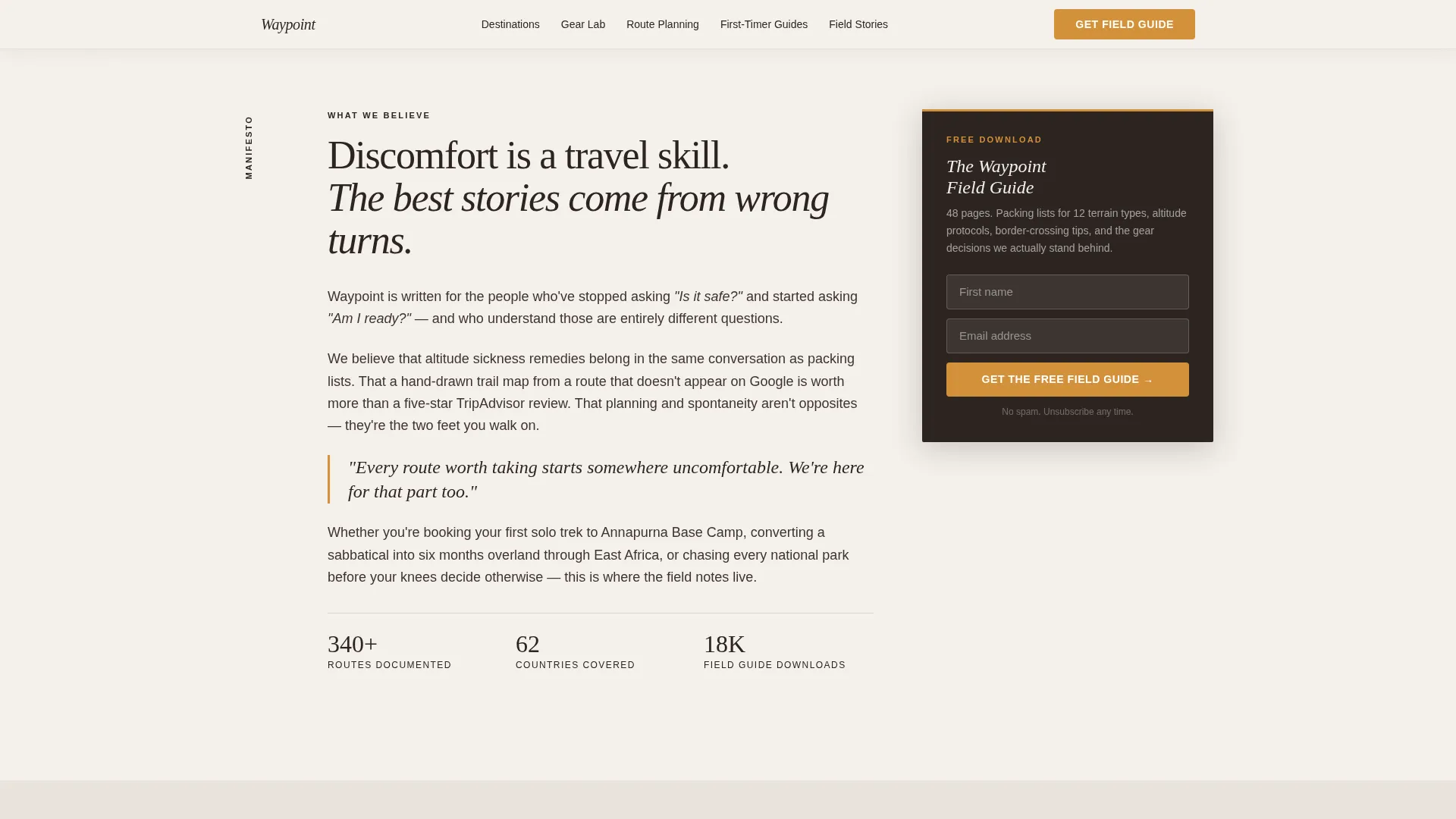
- A manifesto prose block followed immediately by the primary email signup form
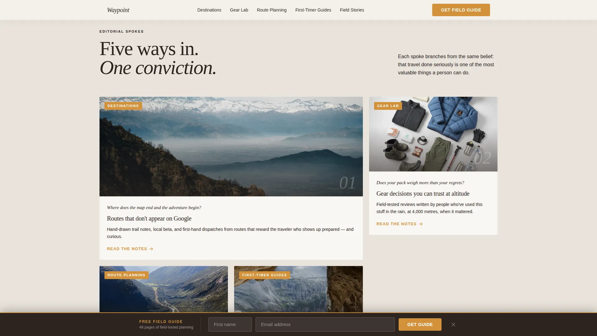
- Five editorial spoke sections in an asymmetric bento layout, each opening with a question or photograph
- A marquee scrolling Field Stories section with reader dispatches and pull quotes
- A sticky bottom bar email form that appears after 40 percent scroll depth
- A minimal footer using a horizontal flow pattern
Feature list
This section covers the core capabilities built into the Waypoint template as described in the source brief.
Full-Bleed Cinematic Hero
The hero section fills the entire viewport with a single photograph. No logo and no navigation appear here. A tall serif headline fades up from the image as the reader arrives, setting tone before anything else loads.
Manifesto Prose Block
Below the hero, a short editorial letter speaks directly to the reader. It declares what the blog believes about travel, discomfort, and wrong turns. The primary Field Guide email form sits immediately after this block, placed where conviction is highest.
Five-Spoke Editorial Hub Grid
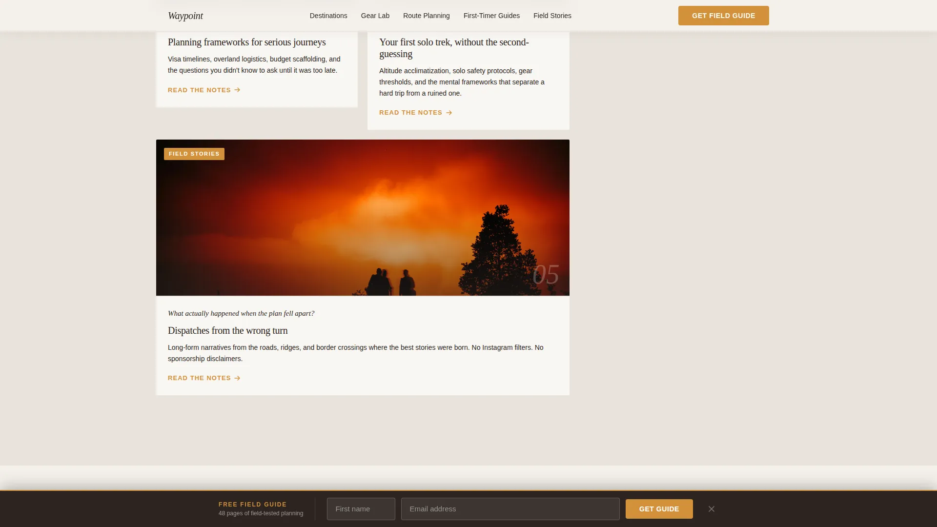
The spoke grid branches into five named sections: Destinations, Gear Lab, Route Planning, First-Timer Guides, and Field Stories. Each spoke opens with a provocative question or a single arresting photograph rather than a plain article list.
Sticky Bottom Bar Call to Action
After the reader scrolls past 40 percent of the page, a sticky bar appears at the bottom of the screen. It presents the Field Guide signup form again without interrupting the reading flow.
Marquee Field Stories Section
A scrolling marquee column displays reader dispatches and pull quotes from real field stories. This section provides social proof through specific route names and firsthand narrative fragments.
Scroll-Triggered Reveal Animations
Sections fade and slide into view as the reader scrolls down the page. The parallax hero, scroll-triggered reveals, and marquee columns work together to give the page a high editorial motion quality.
Page sections overview
| Section | Purpose |
|---|---|
| Full-Bleed Hero | Opens with cinematic photo and serif headline fade-up |
| Manifesto Block | Editorial letter builds trust before the signup form |
| Field Guide Form | Primary email capture placed at peak conviction |
| Spoke Hub Grid | Links five editorial content categories in bento layout |
| Field Stories Marquee | Scrolling reader dispatches and pull quotes for social proof |
| Call to Action Closer | Final signup reinforcement with amber accent styling |
| Sticky Bottom Bar | Persistent email form visible after 40 percent scroll |
| Minimal Footer | Horizontal flow footer with essential links |
Design & branding system
The visual identity follows an Editorial Magazine theme built on the Cloud Canvas color system. The palette evokes a mountain hut at dawn, fog lifting off a valley, warm light on wood, and a sky caught between gray and blue.
- Colors: mist white (#F4F0EB) for backgrounds, summit stone (#7A7267) for supporting text, altitude blue (#4A6FA5) for primary elements, and trail-marker amber (#D4913B) reserved for links, buttons, and pull quotes
- Typography: Fraunces tall serif for headlines and display text, DM Sans for body copy and interface elements
- Visual style: editorial magazine meets worn field journal, typographically rich, dog-eared warmth, and asymmetric bento section layouts
Mobile & speed optimization
The template is built desktop-first with mobile excellence as a stated priority. Editorial magazine layouts translate well to both screen sizes when the type hierarchy and spacing are preserved.
- Server Components handle static sections to reduce interactive load on the client
- Client Components are scoped to scroll-triggered interactions, the sticky bar, and the animated marquee
- The asymmetric bento grid and full-bleed hero reflow cleanly for smaller viewports without losing visual impact
How this template helps you convert
Waypoint earns the email signup by delivering genuine editorial value before the form ever appears. The conversion path is structured deliberately so trust accumulates across every scroll.
- The manifesto block establishes a clear voice and belief system, so the reader feels understood before seeing any call to action
- The Field Guide signup form appears immediately after the manifesto, when conviction and engagement are at their peak, and again as a persistent sticky bar after 40 percent scroll
- The five editorial spokes give returning visitors clear next-step paths, reducing bounce and reinforcing the value of subscribing for more
Other information about this template
Waypoint is localized for English (US) audiences and uses imperial measurements and USD references throughout the content structure. The template is categorized under Blog and Editorial with a Travel Blog subcategory and an Adventure Travel Blog niche focus.
- The template style is Hub and Spoke with anchor navigation, meaning each spoke section is reachable from a persistent anchor nav without a full page reload
- The email form includes first name and email fields only, keeping friction minimal
- Animation intensity is set to high, with scroll-triggered reveals, parallax hero behavior, and scrolling marquee columns all included by design
- The footer follows a Vercel Horizontal Flow pattern kept deliberately minimal to avoid distracting from the content hub above

Theme
Editorial Magazine
Creative direction
Manifesto
Color system
Cloud Canvas
Style
Hub & Spoke (Anchor Nav)
Direction
Content/Resource
Page Sections
Full-bleed Cinematic Hero Section
Manifesto Prose and Email Form
Five-spoke Editorial Hub Grid
Sticky Bottom Bar Signup
Marquee Field Stories Section
Scroll-triggered Reveal Animations
Related questions
What is the primary call to action on this landing page?
How are the five editorial spoke sections structured?
Who is this adventure travel blog template designed for?
What animations and interactive features are included?
Can I customize the colors and fonts in this template?



