Wick — Premium Soy Candle Crafting Landing Page Template
Wick is an editorial landing page template for a candle-making journal. Built on an asymmetric 60/40 grid with an Editorial Magazine theme, it pairs a hand-drawn botanical illustration with curated content collections and a warm Soft Mist palette. A single waitlist form captures founding subscribers before the Spring 2025 launch.
by Rocket studio
Quick summary
Wick is a coming-soon landing page template designed for a candle-making journal. It uses a 60/40 asymmetric grid, a hand-drawn botanical header illustration, and three editorial content collections to demonstrate depth before asking for anything. One focused waitlist form captures email signups with minimal friction.
Who this template is for
This template was built for makers who have something worth saying and an audience worth gathering before launch day. It suits editorial creators who want to earn a signup rather than demand one.
- Hobbyist candle makers scaling toward an Etsy shop or small product line
- Gift-pourers and seasonal crafters building a loyal readership
- Makers from adjacent crafts such as soap or resin who want a polished editorial home for candle-making content
What problem this template solves
Most coming-soon pages promise but never prove. Visitors land, see a vague headline and a form, and leave without signing up. Wick flips that pattern by leading with editorial content that earns trust before the ask appears.
- No content depth means no reason to subscribe, so the template surfaces three real article previews first
- A single scattered form element without context fails to convert, so the waitlist card arrives after the content collections establish credibility
- Generic countdown pages feel forgettable, so the editorial magazine aesthetic creates a distinct, saveable identity from the first scroll
What you get with this template
You get a fully structured single-page layout that guides visitors through curated content previews before presenting the signup form. Every section is purposeful and sequenced to build desire progressively.
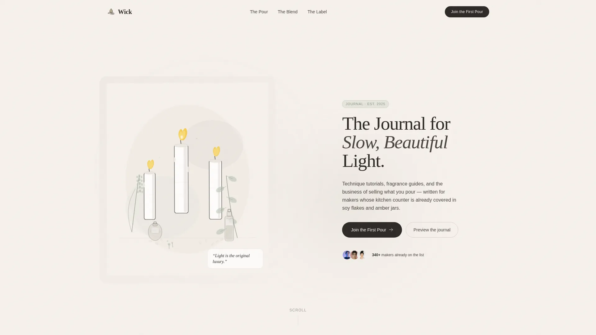
- A 60/40 asymmetric grid hero with a hand-drawn botanical illustration and a tall serif editorial headline
- Three named content collections ("The Pour," "The Blend," and "The Label") each introduced with a spot illustration and a two-line editorial description
- A torn-edge waitlist card styled form collecting first name and email, with a secondary Instagram handle link for visitors not yet ready to commit
Feature list
This template packages several specific design and layout capabilities into one cohesive editorial system.
Asymmetric 60/40 Grid Layout
The hero and article card sections use a deliberate 60/40 column split. The wider column carries illustration and content weight while the narrower column provides breathing room. This rhythm slows the scroll and encourages browsing rather than skimming.
Hand-Drawn Botanical Header Illustration
The header features a custom botanical scene rendered in fine ink lines with sage and parchment watercolor washes. Wax-dripping candles sit alongside dried lavender, eucalyptus stems, and apothecary bottles. The illustration is placed off-center in the 60-column, leaving the 40-column for a single editorial headline.
Curated Collection Navigation Structure
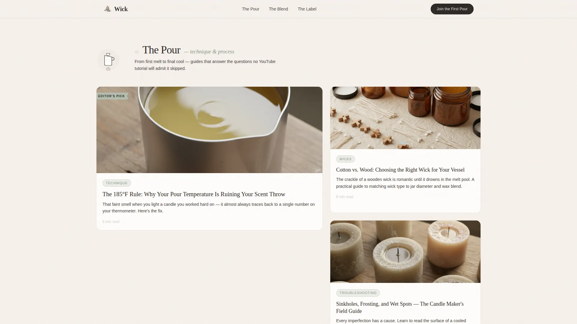
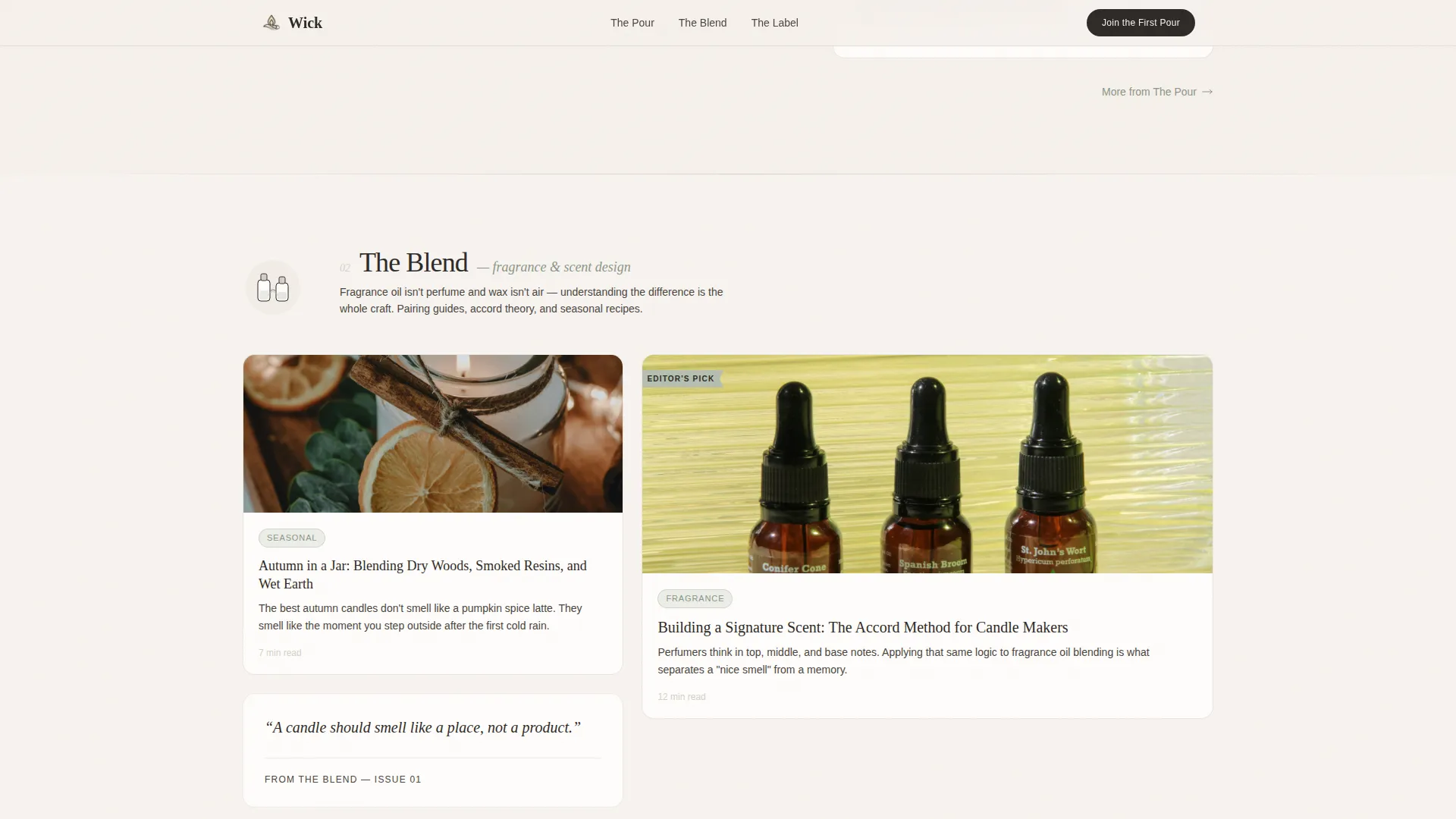
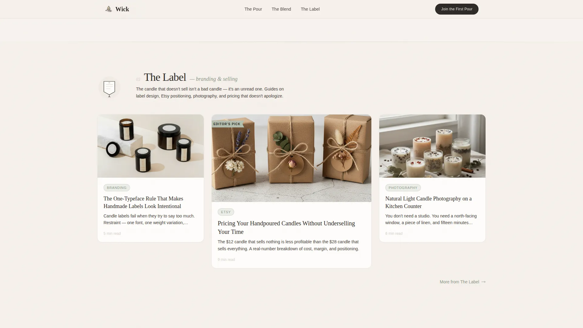
Content is organized into three named collections rather than generic category links. "The Pour" covers technique tutorials, "The Blend" covers fragrance pairing guides, and "The Label" addresses branding and selling. Each collection opens with a small spot illustration and a short editorial introduction before revealing article cards.
Torn-Edge Waitlist Form Card
The email capture form is styled as a torn-edge card pinned into the layout. It asks only for a first name and an email address. A single supporting line below the form reads "Launching Spring 2025, founding subscribers get every guide free," giving visitors a clear reason to act.
Editor's Pick Ribbon System
A recurring sage-colored ribbon marks flagship content across the article card grid. This creates visual hierarchy without relying on size or shouting typography. Visitors naturally notice which pieces carry the most editorial weight before they read a single word.
Scroll Reveal Animations with Spring Physics
Article cards and section elements animate in on scroll using spring-physics reveals and staggered timing. A subtle parallax effect applies to the header illustration. The magnetic call-to-action button and hover states on cards add tactile interactivity throughout the page.
Page sections overview
| Section | Purpose |
|---|---|
| Hero Illustration Block | Introduces journal identity with botanical art and editorial headline |
| The Pour Collection | Previews candle technique tutorial articles with asymmetric cards |
| The Blend Collection | Showcases fragrance pairing guides with spot illustration intro |
| The Label Collection | Presents branding and selling guides for makers going to market |
| Waitlist Form Card | Captures first name and email before Spring 2025 launch |
| Instagram Secondary Link | Offers a low-commitment follow path for not-yet-ready visitors |
| Footer Pattern | Closes page with horizontal flow layout |
Design & branding system
The Soft Mist color system draws from a palette inspired by morning light on a wooden worktable. Every color has a clear role in the layout hierarchy.
- Warm parchment (#F5F0EB) dominates backgrounds, smoke (#D6CFC7) separates sections like tissue paper between pages, muted sage (#B5BFB0) highlights category tags and hover states, and deep wick-char (#2E2A27) grounds headlines
- Fraunces tall serif drives all editorial headlines for a printed-broadsheet weight, while DM Sans handles body text and interface elements for clean readability
- The overall aesthetic is Editorial Magazine with a slow-living, linen-wrapped warmth that feels considered and unhurried from first glance to final scroll
Mobile & speed optimization
The template is designed desktop-first, respecting the breathing room a magazine layout needs to read properly. Mobile adaptation is handled carefully so the editorial feel is preserved at smaller sizes.
- The asymmetric grid collapses gracefully on smaller screens without losing the illustration-first hierarchy
- Scroll reveal animations and spring-physics effects use minimal JavaScript, keeping interactions smooth without burdening the browser
- Server Components handle static content delivery, reducing the amount of client-side work required on page load
How this template helps you convert
The waitlist conversion strategy here is sequential and deliberate. Trust is built before the form ever appears.
- Three real article previews with visible headlines and opening paragraphs prove editorial quality early in the scroll, giving visitors a concrete reason to subscribe
- The torn-edge waitlist card appears only after the three content collections have demonstrated depth, so the "Join the First Pour" call to action arrives when desire is already established
- The secondary Instagram link captures visitors who are interested but not yet ready to commit an email, keeping them in the audience for future touchpoints
Other information about this template
This template sits inside the Blog and Editorial category with a focus on the candle-making content niche. It is built for a coming-soon or waitlist launch context rather than a live ongoing publication.
- The template style is Asymmetric Grid (60/40) with a Curated Collection creative direction
- The header concept is a Custom Illustration, not a photography-based hero, which keeps the aesthetic distinct from content-mill templates
- The Waitlist and Coming Soon landing page direction makes it appropriate for any editorial journal, niche blog, or slow-living publication planning a future launch
- The color system is Soft Mist and the theme is Editorial Magazine, both of which translate well to adjacent niches such as soap-making, botanical wellness, or artisan food content
Theme
Editorial Magazine
Creative direction
Curated Collection
Color system
Soft Mist
Style
Asymmetric Grid (60/40)
Direction
Waitlist/Coming Soon
Page Sections
Asymmetric 60/40 Grid System
Hand-drawn Botanical Header Illustration
Three Named Content Collections
Torn-edge Waitlist Form Card
Scroll Reveal and Spring Physics Animations
Dual Conversion Path Design
Related questions
Can I edit the article preview content inside this template?
Is the botanical illustration included with the template?
Does the waitlist form connect to an email platform?
Can I adapt this template for a niche other than candle making?
What fonts does this template use?



