Automotive Blog & Media Pre-Launch Website Template
Wrench is a coming-soon landing page template built for automotive how-to editorial blogs. It uses an asymmetric 60/40 grid, a broadsheet-print visual identity, and a waitlist form with vehicle selector to capture personalized email signups before launch. The design reads like a shop manual, authoritative, grease-stained honest, and built for readers who fix their own cars.
by Rocket studio
Quick summary
Wrench is a single-page, coming-soon landing page template for an automotive how-to editorial blog. It pairs a full-bleed engine-bay hero photo with a long-form manifesto layout, a content preview grid, and a "Get On the Lift" waitlist form. The result feels like a heavy shop manual cracked open on a workbench, purposeful, credible, and ready to earn reader trust before launch day.
Who this template is for
This template is built for creators and publishers who want to launch an automotive repair editorial with a strong pre-launch presence. It suits anyone who needs to collect an engaged waitlist before their first guide goes live.
- Weekend mechanics and DIY car repair writers launching a how-to blog or publication
- Automotive content creators building a pre-launch audience of high-mileage car owners and project car buyers
- Small editorial teams or solo publishers who want a credible, print-inspired landing page to validate interest before committing to full production
What problem this template solves
Most coming-soon pages feel disposable. They promise something vague, collect an email, and disappear. For an automotive how-to publication, that is a missed opportunity. Readers who fix their own cars are skeptical and discerning. They need a reason to trust the source before handing over their inbox.
- The template replaces a generic placeholder page with a full editorial manifesto that earns the ask
- It solves the cold-audience problem by letting the publication's voice and point of view do the convincing before any content is published
- The vehicle selector in the waitlist form captures make, model, and year data so the first wave of launch content can feel personally relevant from day one
What you get with this template
You get a fully structured, single-page landing page that moves a visitor from curious browser to committed waitlist member. Every section has a defined job, and the layout holds together as a coherent editorial experience rather than a patchwork of marketing blocks.
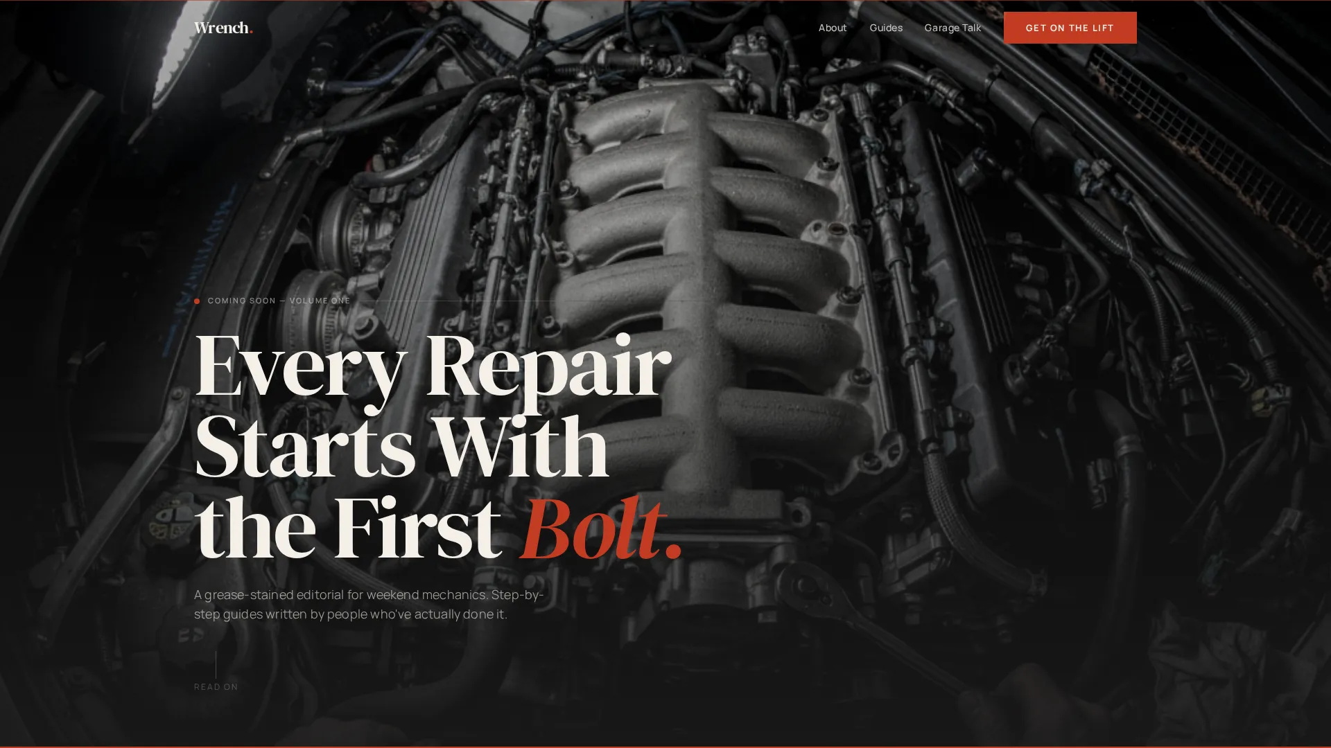
- A full-bleed hero section with a desaturated engine-bay photograph and a low-left editorial serif headline
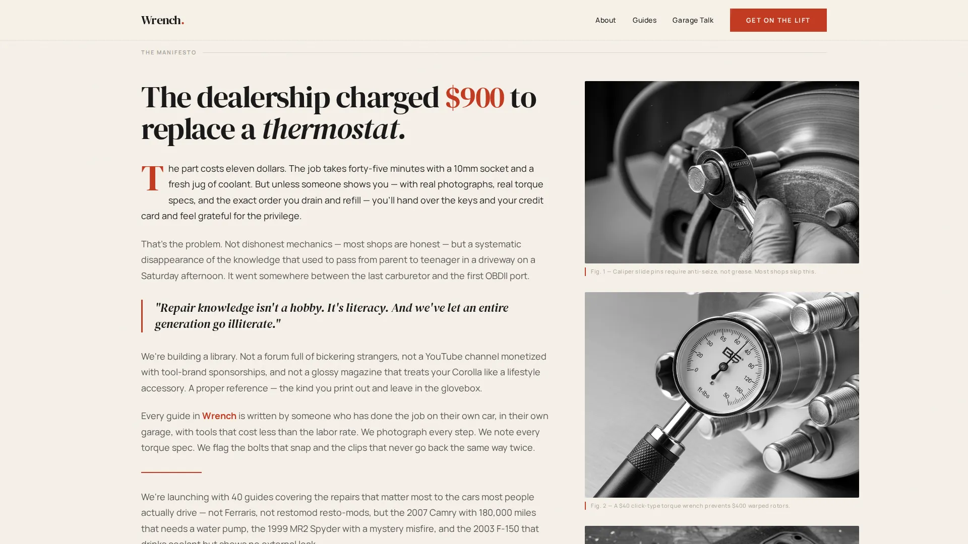
- A 60/40 asymmetric manifesto section with long-form editorial copy on the left and a vertical rhythm of black-and-white detail photography on the right
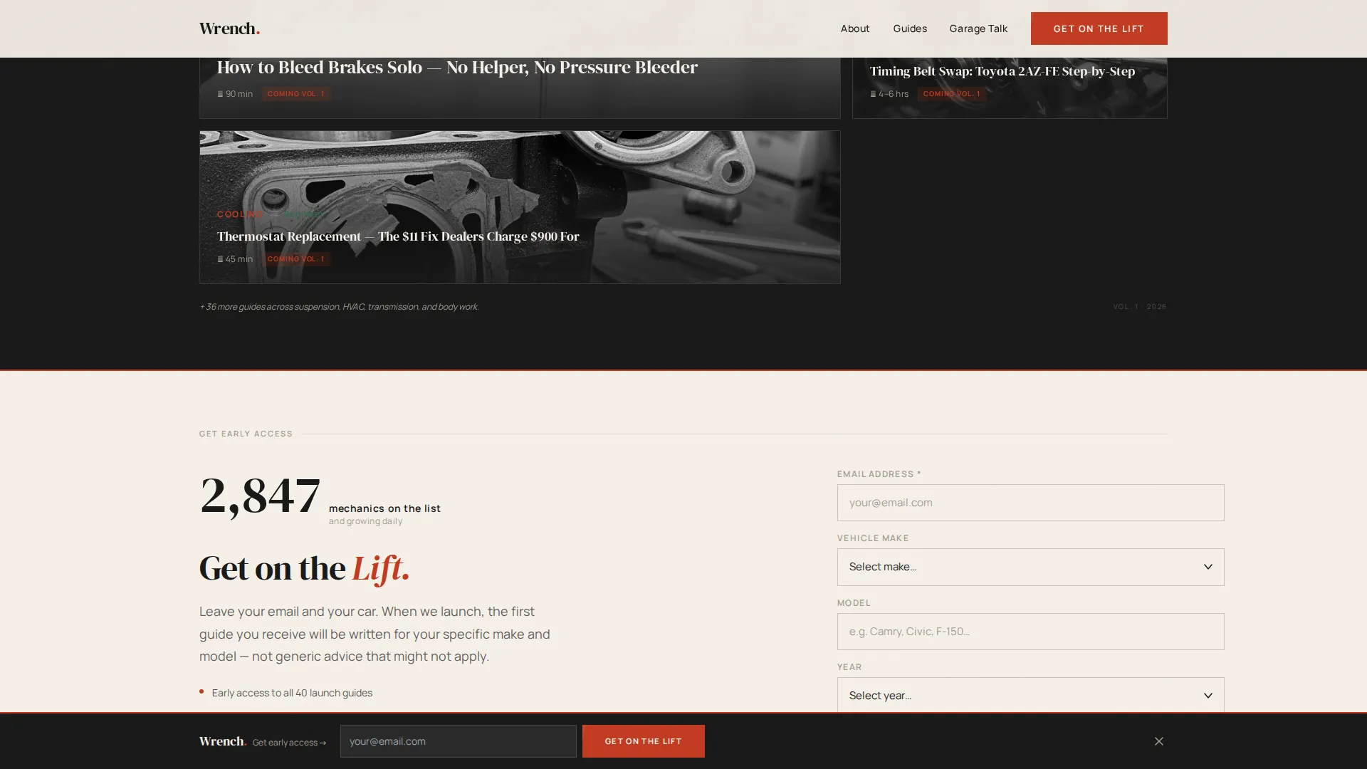
- A "Get On the Lift" waitlist form with an email field, a vehicle selector for make, model, and year, and a live signup counter displayed in plain serif numerals
- A social proof strip with horizontal-scroll reader testimonials and photographic marginalia
- A sticky bottom bar that appears once a visitor scrolls past the halfway mark, repeating the waitlist form call to action
- A minimal newsprint-toned footer using a horizontal flow layout
Feature list
This template is built around a tightly defined set of capabilities drawn directly from its editorial concept and waitlist conversion goal.
Full-Bleed Editorial Hero
The hero occupies the full viewport width with an overhead engine-bay photograph. The image is desaturated to feel printed rather than digital. A single serif headline sits low-left inside the 60-column, setting tone before the reader scrolls.
Asymmetric 60/40 Manifesto Grid
The manifesto section splits into a 60-column editorial text block and a 40-column running column of black-and-white detail photography. Captions read like magazine marginalia. The layout builds a deliberate narrative arc from diagnosis to prescription.
Vehicle-Selector Waitlist Form
The "Get On the Lift" form collects an email address alongside a vehicle selector covering make, model, and year. This allows the publication to segment its waitlist and deliver relevant repair content to each subscriber from the first send.
Live Signup Counter
A live counter displays the current waitlist number in plain serif numerals directly beneath the form. The counter provides immediate social validation and reinforces that other readers have already committed.
Sticky Bottom Bar call to action
Once a visitor scrolls past the midpoint of the page, a sticky bottom bar appears and repeats the waitlist call to action. This keeps the conversion opportunity visible without interrupting the editorial reading experience above it.
Scroll-Blur Hero Animation
The hero section uses a scroll-blur animation that transitions the full-bleed photo as the visitor moves down the page. Combined with staggered IntersectionObserver reveals throughout, the page feels alive without relying on heavy animation frameworks.
Page sections overview
| Section | Purpose |
|---|---|
| Hero photo block | Sets editorial tone and anchors the serif headline |
| Manifesto copy column | Delivers the publication's point of view and earns reader trust |
| Detail photography column | Reinforces credibility with close-up black-and-white imagery |
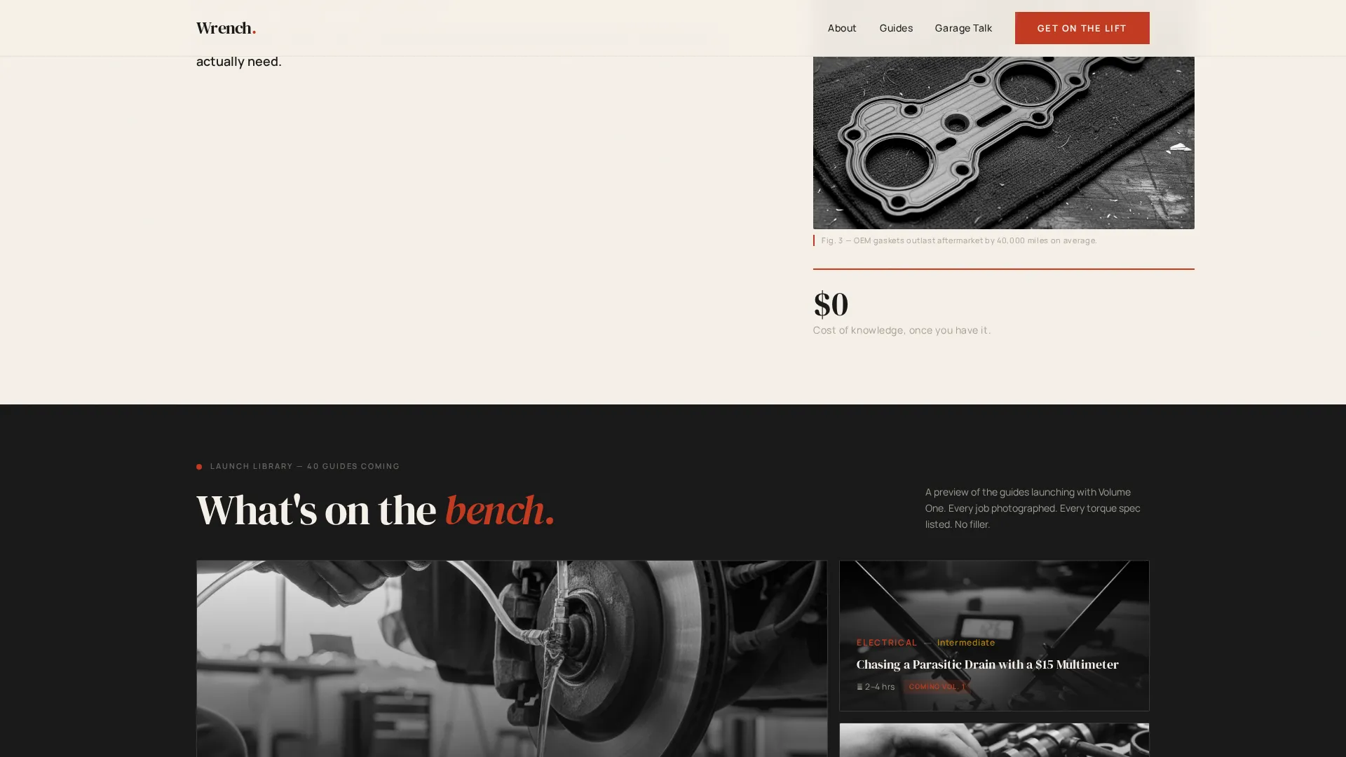
| Content preview grid | Shows the topics and guides launching soon in bento layout |
| Waitlist signup form | Captures email and vehicle data for personalized launch content |
| Social proof strip | Builds confidence with horizontal-scroll reader testimonials |
| Sticky bottom bar | Keeps the waitlist call to action visible during deep scroll |
| Minimal site footer | Closes the page with a clean, newsprint-toned horizontal layout |
Design & branding system
The visual identity follows an Editorial Magazine theme built on an Ink & Paper color system. Every design decision references the sensory experience of a freshly printed broadsheet laid flat across a workshop bench.
- Color palette: typeset black (#1A1A1A) for body text and structure, newsprint warm white (#F5F0E8) as the page ground, marginal pencil gray (#A39E93) for supporting detail, and torque-spec red (#C23B22) reserved for drop caps, callouts, and interactive highlights
- Typography: DM Serif Display for all headlines and editorial display text, paired with Manrope for body copy and user interface elements such as form fields and labels
- Photography treatment: all imagery is desaturated toward a printed-page feel, with hard directional shadows and tight mechanical close-ups that read like plates inside a workshop manual
Mobile & speed optimization
The template is built desktop-first, reflecting the reality that mechanics most often browse repair content on a desktop or tablet while working in the garage. The layout adapts cleanly for smaller viewports without losing its editorial character.
- Animations use native CSS smooth scroll and IntersectionObserver reveals, avoiding heavy third-party scroll libraries for leaner performance
- The sticky bottom bar and horizontal-scroll testimonial strip are both implemented with high-interactivity intent but kept lightweight through native browser APIs
- The asymmetric grid reflows gracefully on tablet-width screens, preserving the relationship between the editorial text column and the detail photography column
How this template helps you convert
The page is structured as a deliberate persuasion sequence. Nothing asks for commitment before it has been earned. The layout moves a skeptical reader through understanding, belief, and action in a single scroll.
- The hero and manifesto sections do the heavy lifting first, they establish credibility and voice so the reader feels they have found a trustworthy source before they ever see a form field
- The waitlist form appears only after the mission statement, and the vehicle selector makes the act of signing up feel useful rather than extractive, because the reader knows their data will shape the content they receive
- The sticky bottom bar ensures the conversion path stays available for readers who finish the page and decide to sign up on the way back up, without requiring a disruptive popup or interstitial
Other information about this template
This template is part of a broader editorial and blog category of landing page designs. A few additional details are worth knowing before you choose it.
- The content preview section uses an asymmetric bento grid to hint at the guide topics planned for launch, giving the waitlist a sense of what is coming without requiring finished articles
- The footer uses a horizontal flow pattern that keeps the page feeling intentional and complete rather than cut off
- The template is suited to any automotive how-to editorial project, from a solo mechanic-writer to a small team building a repair-focused media brand
- The design language is intentionally distinct from standard automotive media, which often leans toward glossy performance marketing; this template is built to feel like a working reference, not a showroom
Theme
Editorial Magazine
Creative direction
Vision & Mission
Color system
Ink & Paper
Style
Asymmetric Grid (60/40)
Direction
Waitlist/Coming Soon
Page Sections
Full-bleed Editorial Hero Section
Asymmetric 60/40 Manifesto Layout
Vehicle-selector Waitlist Form
Live Signup Counter Display
Sticky Bottom Bar Call to Action
Scroll-blur Hero Animation
Related questions
Can I change the waitlist form fields to match my own data needs?
Does the live signup counter connect to a real database automatically?
Is this template suitable for a blog that is already live, not just coming soon?
Can I replace the engine-bay hero photo with my own image?
What makes the design feel different from a standard automotive blog template?



