Accredit - Powerful Compliance Landing Page Template
Accredit is a compliance-focused landing page template built for education quality management platforms. It uses a Data Command visual theme, scroll-reveal animations, and a sharp Monochrome Steel palette to communicate precision and control. The layout guides compliance officers, provosts, and quality assurance directors from the chaos of manual reporting to a clear, audit-ready solution.
by Rocket studio
Quick summary
Accredit is a single-page, scroll-reveal landing page template designed for education quality management platforms. It pairs a high-contrast Monochrome Steel color system with a Data Command theme to create an immediate sense of control. Every section builds on the last, moving institutional buyers from recognition of the problem to confident action.
Who this template is for
This template is built for software platforms that serve higher education compliance and accreditation workflows. It speaks directly to the professionals inside those institutions who carry the reporting burden every cycle.
- Compliance officers preparing evidence packages before a site visit
- Provosts and academic administrators defending program outcomes to oversight boards
- Quality assurance directors at community colleges managing multiple accreditation frameworks with lean teams
What problem this template solves
Accreditation preparation is notoriously fragmented. Institutions collect enrollment figures, faculty credentials, outcome metrics, and student satisfaction scores across disconnected systems. When review season arrives, that data has to be assembled manually, cross-referenced, and formatted to match each accrediting body's specific standards. The result is late nights, duplicated effort, and avoidable submission errors.
- Buyers cannot immediately see how a platform closes the gap between scattered data and a passing review
- Generic software landing pages fail to reflect the urgency and precision that compliance professionals expect
- Comparison with the status quo is rarely shown clearly, leaving buyers unconvinced before they ever reach a form
What you get with this template
This template delivers a complete, production-ready landing page layout with every section pre-structured for an education quality management platform. The design language, animation system, and conversion flow are built in and ready to customize.
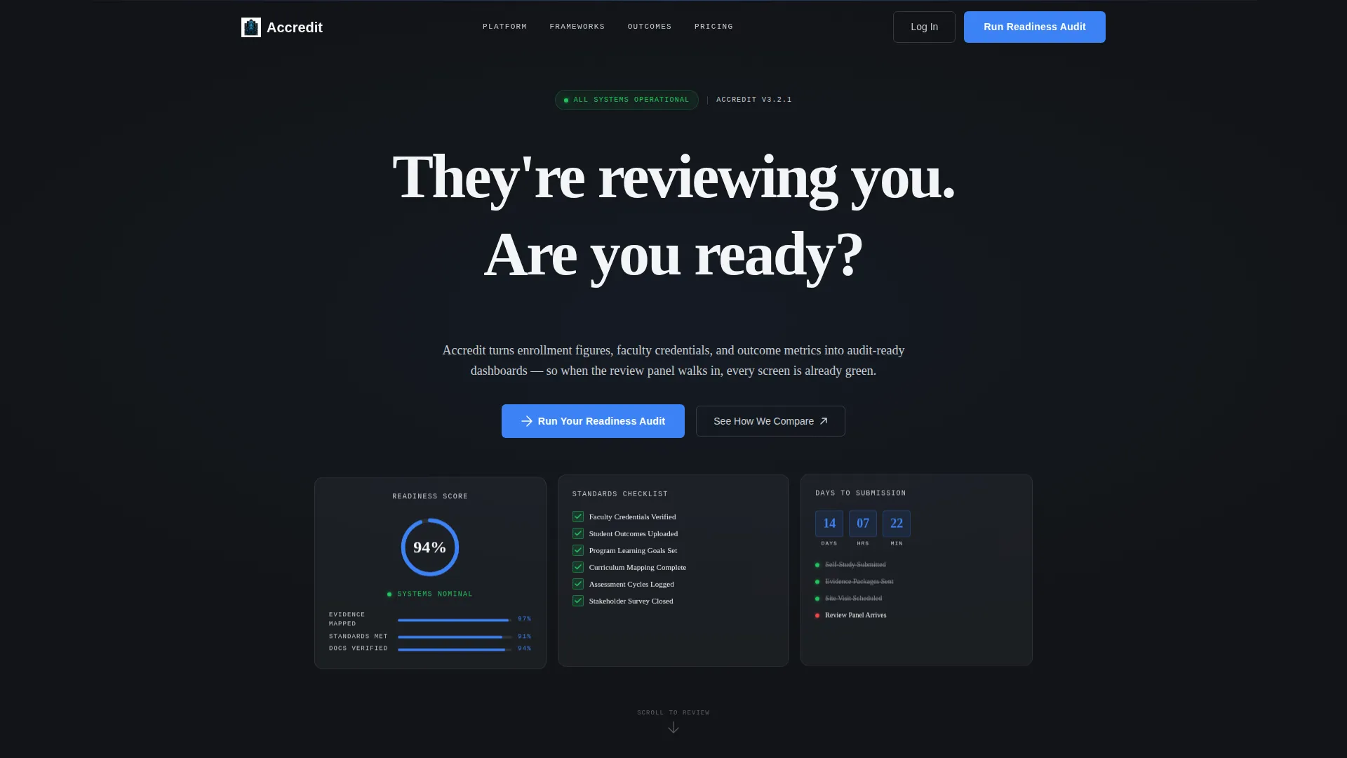
- A Dark Glass Panels header with three live-data visualization panels, parallax depth, and a self-typing headline
- A scroll-reveal section architecture where each reveal carries upward momentum and scale animation, making the page feel like systems coming online
- A progressive lead capture form that asks for institution name and accrediting body first, then discloses additional fields as the buyer engages
Feature list
This template is built around specific design and functional decisions that match how compliance buyers think, evaluate, and decide.
Dark Glass Panels Header
Three translucent, frosted-glass rectangles float over a near-black background. Each panel holds a distinct live data visualization: a radial accreditation readiness score at 94%, a cascading standards checklist with green check marks ticking in, and a days-to-submission countdown timeline. Subtle parallax depth and faint grid lines beneath the glass reinforce the command-terminal aesthetic.
Scroll-Reveal Animation System
Every section enters with upward momentum and a slight scale animation, creating a countdown-sequence energy as the buyer scrolls. The pacing is intentional. Each reveal feels like unlocking the next system, keeping attention high from header to form.
Comparison Split View
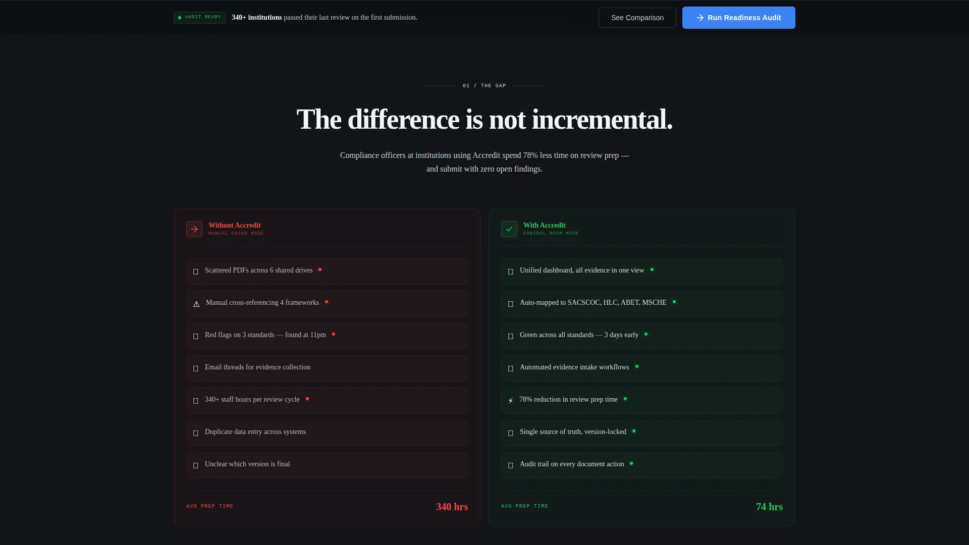
The first content section places "Without Accredit" and "With Accredit" side by side. The left shows scattered PDFs, manual cross-referencing, and red flags. The right shows a unified dashboard, auto-mapped evidence, and green across the board. This contrast lands the core value proposition before the first call to action appears.
Accreditation Framework Panel Section
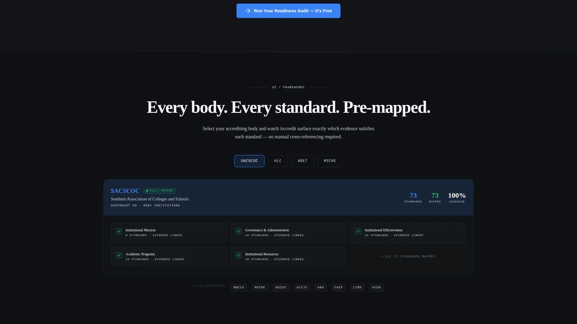
A dedicated section displays framework identifiers for major accrediting bodies. Each one triggers a panel revealing how the platform maps to that body's specific standards. This section addresses the multi-framework challenge that quality assurance teams face directly.
Progressive Lead Capture Form
The primary form mirrors the platform's own philosophy. It opens with just two fields: institution name and accrediting body. Enrollment size and next review date appear progressively, qualifying the lead while reducing initial friction.
Persistent Conversion Bar
After the second scroll section, a bottom bar stays visible as the buyer continues reading. It repeats the primary call to action, keeping the conversion path accessible without interrupting the content flow.
Page sections overview
| Section | Purpose |
|---|---|
| Dark Glass Header | Establish command-room credibility and urgency with live data panels and a self-typing headline |
| Comparison Split View | Show the before-and-after gap between manual reporting and the platform's unified dashboard |
| Primary Call to Action | Place "Run Your Readiness Audit" directly after the comparison to capture high-intent buyers |
| Framework Mapping Section | Demonstrate compatibility with major accrediting bodies through standard-specific panels |
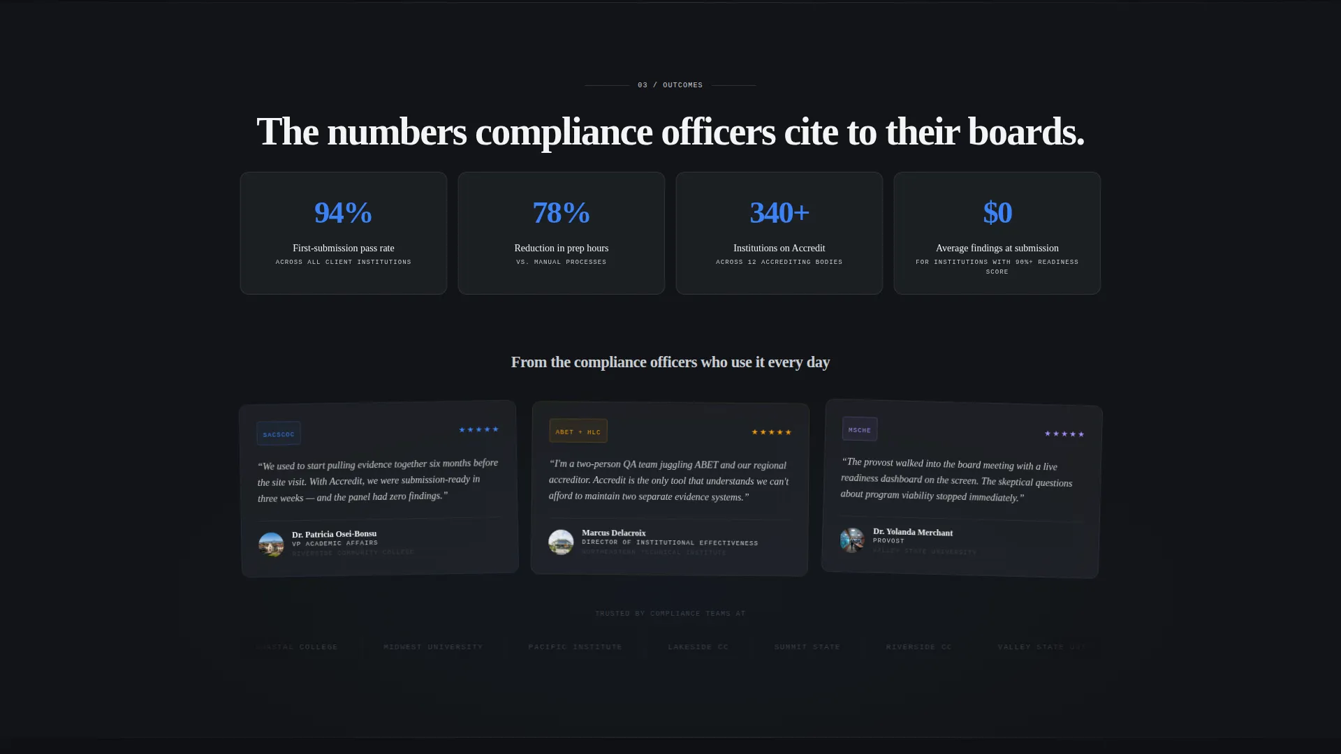
| Outcome Data Flow | Display institutional metrics arriving in real time to reinforce the platform's live data capability |
| Persistent Bottom Bar | Repeat the primary call to action as a fixed bar once the buyer passes the second scroll section |
| Progressive Lead Form | Capture institution name and accrediting body first, then disclose remaining fields progressively |
Design & branding system
The visual identity follows a Data Command theme using a Monochrome Steel color system. Every shade is chosen for hierarchy and function, with no decorative warmth anywhere in the palette.
- Core palette: forge black (#121417), brushed gunmetal (#3A3F47), polished chrome (#C8CDD3), and signal white (#F4F5F7)
- Electric accent: compliance blue (#3B82F6) used exclusively for interactive states and pass or fail indicators, ensuring every blue element carries meaning
- Texture language: machined surfaces, smoked glass panels, and faint grid lines reinforce an engineered precision aesthetic throughout
Mobile & speed optimization
The template is structured with a mobile-first layout approach. Scroll-reveal animations and the parallax header are designed to scale gracefully across screen sizes without losing the command-room atmosphere.
- Panel layouts reflow cleanly on smaller screens, keeping data visualizations readable and the comparison split view scannable
- The persistent conversion bar and progressive form remain fully functional on touch devices, preserving the qualification flow on mobile
How this template helps you convert
This template is built around a Comparison/Versus conversion strategy. It earns the click by showing the cost of the status quo before it ever asks for information.
- The comparison split view creates immediate recognition for compliance professionals. Buyers see their current reality on the left and the resolution on the right, generating intent before the first call to action appears.
- The progressive form reduces drop-off at the lead capture stage. Asking only for institution name and accrediting body first lowers the barrier to entry, while the additional fields qualify the lead once the buyer is already engaged.
Other information about this template
This template is a strong fit for platforms competing in the education quality management space. The secondary conversion path, "See How We Compare," links to a detailed feature matrix that addresses buyers evaluating alternatives.
- The template is built to position against established tools in the compliance software category, giving buyers a clear comparative frame before they leave the page
- The "Run Your Readiness Audit" primary call to action is repeated twice: once after the comparison section and once in the persistent bottom bar, maximizing coverage without disrupting the scroll flow
- The template style is Scroll Reveal (Progressive), the header concept is Dark Glass Panels, the creative direction is Launch Energy, and the landing page direction is Comparison/Versus
Theme
Data Command
Creative direction
Launch Energy
Color system
Monochrome Steel
Style
Scroll Reveal (Progressive)
Direction
Comparison/Versus
Page Sections
Dark Glass Panels Header
Scroll-reveal Animation System
Comparison Split View Section
Accreditation Framework Panels
Progressive Lead Capture Form
Persistent Conversion Bottom Bar
Related questions
What type of platform is this template designed for?
Can the color system and branding be customized?
How does the progressive lead capture form work?
What accrediting body references are included in the template?
Is this a single-page template or a multi-page template?



